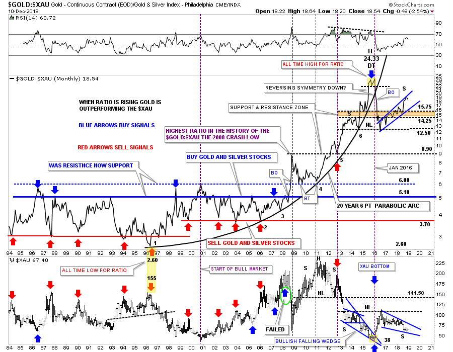
Tonight I would like to show you some charts from the PM complex we havent looked at in a long time. Some of these charts will look familiar to some of our long term members as they were very helpful in the past to help us figure out what the PM complex was up to. This first chart is a ratio combo chart which has the GOLD:XAU on top and the XAU on the bottom. When the ratio is rising gold is outperforming the XAU. During the bull market years starting around 1999 or so the ratio would trade between roughly 5.10 on top, blue horizontal line, and 3.70 on the bottom, red hormonal line. When the ratio rallied up to the blue line around the 5.10 area it was a good time to back up the truck and buy your favorite PM stocks and when the ratio got down to the red line around the 3.70 it was a good time to sell your PM stocks.
That worked out very well until the crash in 2008 which changed everything in regards to the ratio chart. As you can see the ratio broke out above the blue horizontal trendline and rallied all the way up to 8.90 which was the highest this ratio had been in history. There was no way to know back then that this was the start of the massive underperformance of the XAU to gold or PM stock in general to gold. The ratio sold off down to the 6.00 area that reversed its role to what had been resistance at the all time high for the ratio, to now support from above in September of 2009. The ratio chart on top finally topped out in its 20 year six point parabolic arc in January of 2016 which began the baby bull market, yellow shaded area at the top of the chart. When that small double top broke down is when we took our first PM stock positions which at the time was a good buy signal. The price action sliced right through the parabolic arc like a hot knife through butter and things were once again good for the bull market in the precious metals stocks.
The brown shaded S&R zone was the first place we began to look for initial support, but the ratio broke down a little further and finally found support at the previous low at 12.50. Looking at that massive decline off of the double top high at 24.33 you can see why the 2016 rally was so strong, as shown on the bottom chart for the XAU. We got a nice bounce off the 12.50 area which looked like we could see the ratio start building out a H&S top but that wasnt going to happen. As the ratio kept drifting higher and higher the XAU drifted lower and lower which brings us up to our current situation. Currently the price action on the ratio chart on top is testing the top rail of a rising blue flag, while the XAU on the bottom chart is testing the bottom rail of its possible bullish falling wedge. To really get this rally going in the precious metal stocks we need to see the ratio chart on top break to the downside in no uncertain terms. If the ratio chart ever trades back into its old trading range between 3.70 at the bottom and 5.10 at the top the PM stocks should be massively higher than where they are trading today. The very first thing we need to see happen is for the blue falling wedge on the XAU to breakout and move higher in an impulse type of move. The setup is there now we just need to see some follow through to the upside on the XAU.
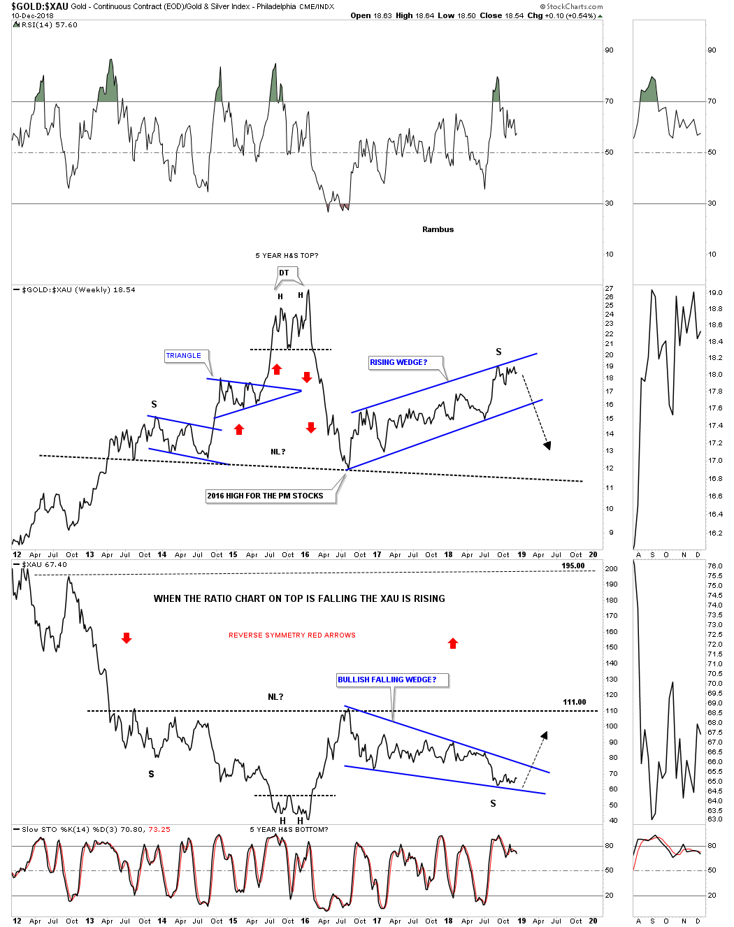
This next chart is a weekly ratio combo chart for the GOLD:XAU ratio on top and the XAU on the bottom. This chart shows the last seven years of the ratio combo chart above. Here you can see how the possible H&S top is building out on the ratio chart which in turn will show a possible H&S bottom on the XAU. After we got the initial bounce in the ratio chart in July of 2016, and the high on the XAU, I was looking for a possible right shoulder to build out that would show some symmetry to the left shoulder in both the ratio and the XAU charts. That began to fall apart at the beginning of this year as both have been trading inside of their 2016 trading ranges. Again, for the bullish case, its possible that we could be seeing the price action testing the top rail of the potential bearish rising wedge on the ratio chart with the potential test of the bottom rail of the bullish falling wedge on the XAU chart.
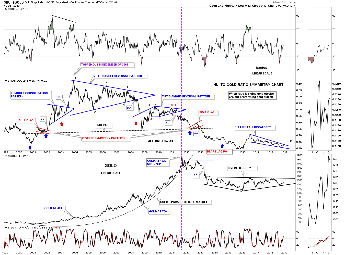
Below is another long term ratio combo chart we havent looked at in ages which has the HUI:GOLD ratio on top and the HUI on the bottom. This chart really sums up how badly the HUI has done vs GOLD. When the bull market began for the HUI back in November of 2000, the HUI kicked golds butt on the initial thrust and for the next three years until December of 2003. Believe it or not that was the last time the HUI has outperformed gold in a meaningful way right up to the present. Note the price of gold when the ratio topped out in December of 2003 which was just $400. Note where the ratio was trading back in September of 2011 when gold topped out at 1920.
When the ratio broke down from that 7 point diamond reversal pattern, it had to be a reversal pattern because it formed above the previous low, another impulse move to the downside began once again. How could this be happening? The ratio finally found support in 2012 and built out the small red rising flag. At the time I labeled the red rising flag as a reverse symmetry pattern which is related to the small Red Bull flag which was the very first consolidation pattern in the new bull market back in 2000. I remember just like yesterday we kept waiting for the price objective of the small red bear flag to be hit at .13 which was the all time low up until that point. As you can see we got a couple of small bounces off .13 but the ratio had to shakeout the last holders of the HUI stocks and traded below the .13 S&R line. We now have a potential bullish falling wedge on the ratio chart which is the best setup in many years. Hopefully if this is the true bottom well see something like what happened at the beginning of the 2000 bull market where the HUI kicked golds butt for three full years.
The bottom line is that the ratio is now lower today with the price of gold at $1250 than it was at the beginning of the HUIs bull market in Year 2000 when the price was almost exactly $1000 lower . Pretty amazing when you think about it.
All the best Rambus