-- Published: Monday, 27 July 2020 | Print | Disqus
Rambus/Plunger
During the bull market years between 2000 and 2011 the US dollar and currencies played a key role in the PM complex bull market. Tonight I would like to go back and visit some of these old charts and see how they pertain to our current bull market.
Lets start with a simple GOLD:USD ratio chart that goes back to the 2011 all time high in gold. The bottom for the ratio came in toward the end of 2015 and has been slowly rising in what we can now call a bullish rising 5 point rising wedge reversal pattern. The 2011 bear market in the ratio ended in June of 2019 when the top rail was broken to the upside. Less than a year later the price action took out the top rail of the blue bullish rising wedge reversal pattern and is starting to impulse higher. This is a very bullish development.
Click on charts to enlarge..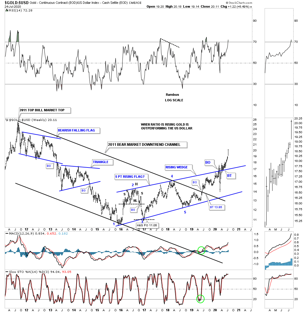
How did the GOLD:USD ratio look during the 2000 to 2011 bull market in gold? From a Chartology perspective the price action showed a classic bull market for gold vs the US dollar with one consolidation pattern forming on top of the previous one with a perfect parallel uptrend channel.

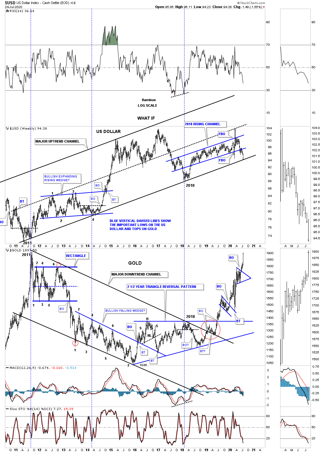
Lets look at a combo chart which actually shows what the USD and gold have done since gold peaked at 1920 in September of 2011. As you can see the USD has enjoyed an almost 10 year uptrend channel while gold was stuck in its downtrend channel until it broke out above the top rail of its 2011 bear market downtrend channel in January of 2019 where the two have been moving somewhat together until recently, red circle. Note how the US dollar is trading right on top of its 2011 bull market uptrend channel. Its possible we could see a small bounce off the bottom rail before breaking through to the downside. That bottom rail on the US dollar is the most important trendline on the planet as it will affect so many other areas like the PM complex, commodity complex, and most of the important currencies in the world.
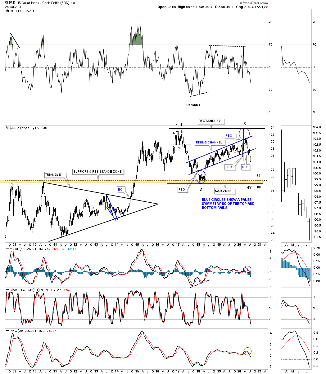
This next chart I posted just one time shortly after reversal point #3 was confirmed which was showing a possible large rectangle forming. There should be major support at the brown shaded S&R zone between 88 and 89. There isnt much in the way of support until that area is hit.
Below is a combo ratio chart which has the USD:XJY on top with gold on the bottom. Note how these two generally run inversely to each other. The ratio chart on top just completed its 4th reversal point and is starting to move lower in a possible 5th reversal point if the price action breaks below the bottom rail which would be very bullish for gold. It appears gold is leading the XJY. The bottom rail on the bullish or bearish falling wedge is going to be an important inflection point if or when it is hit.
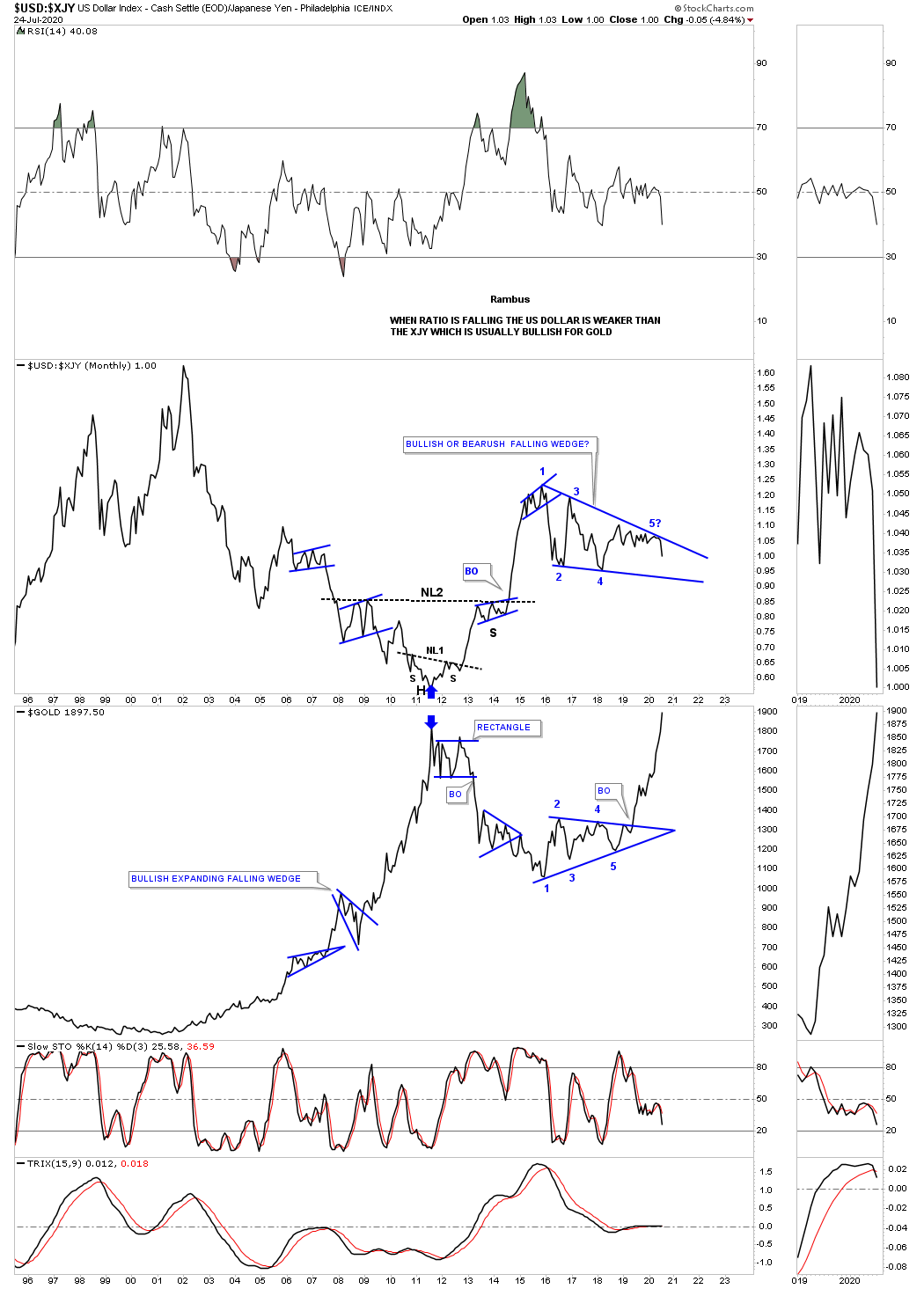
The XJY has been building an 11 point triangle that began to form in the middle of 2015. The 2 sets of blue circles show how the original triangle has morphed into a slightly bigger triangle as shown by the black dashed trendlines. A breakout above the top rail would be very bullish long term for gold.
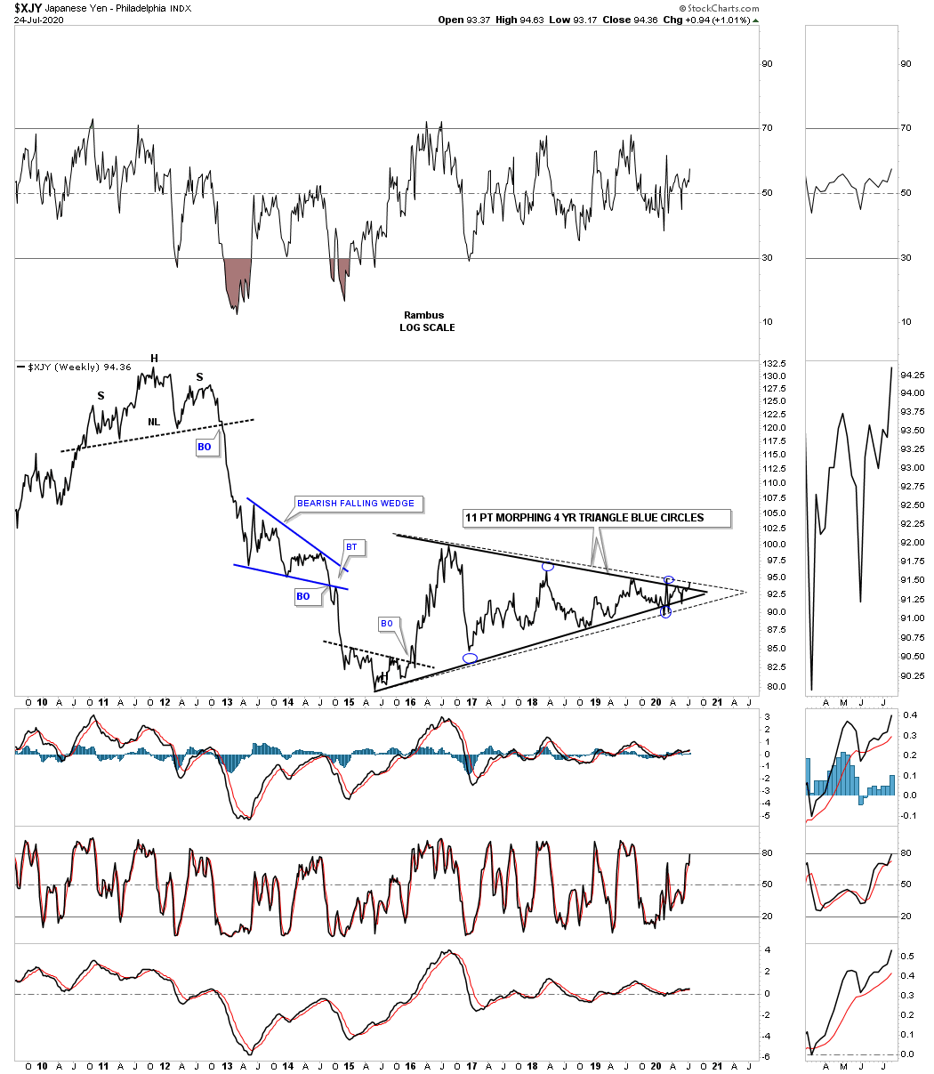
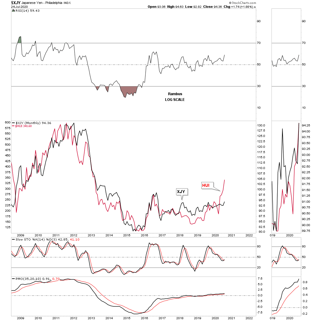
This next chart is a combo chart which has the XJY on top with the HUI on the bottom. Looking at the brown shaded area as a whole you can see how these two basically had the same bear market in time. Here again you can see how the HUI has already broken out and backtested the top rail of its 2016 five point triangle reversal pattern while the XJY is just now attempting to breakout from is own 2016 triangle. This combo chart also shows you how the XJY and the HUI tend to move together.

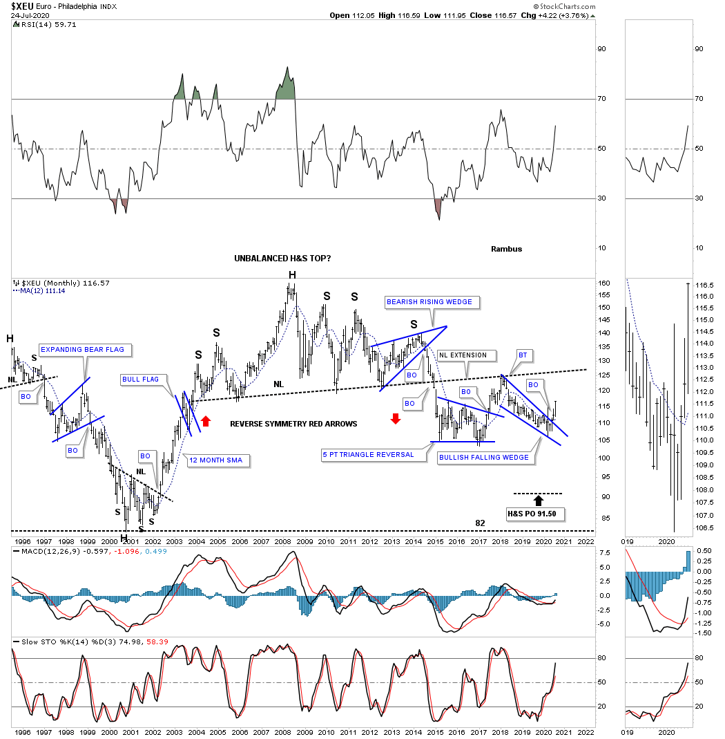
Weve been following that massive H&S top on the XEU when the right shoulder bearish rising wedge was still under construction. The neckline gave way in 2014 which completed the H&S top. Then after a 3 month decline the XEU threw us a curve ball and formed the 5 point triangle reversal pattern which sent the XEU higher to backtest the neckline in February of 2018. From that point the price action has been declining in what is now a bullish falling wedge after the top rail gave way. A price objective for the falling wedge is where it began to form which would be back up to the neckline as a possible 2nd backtest.
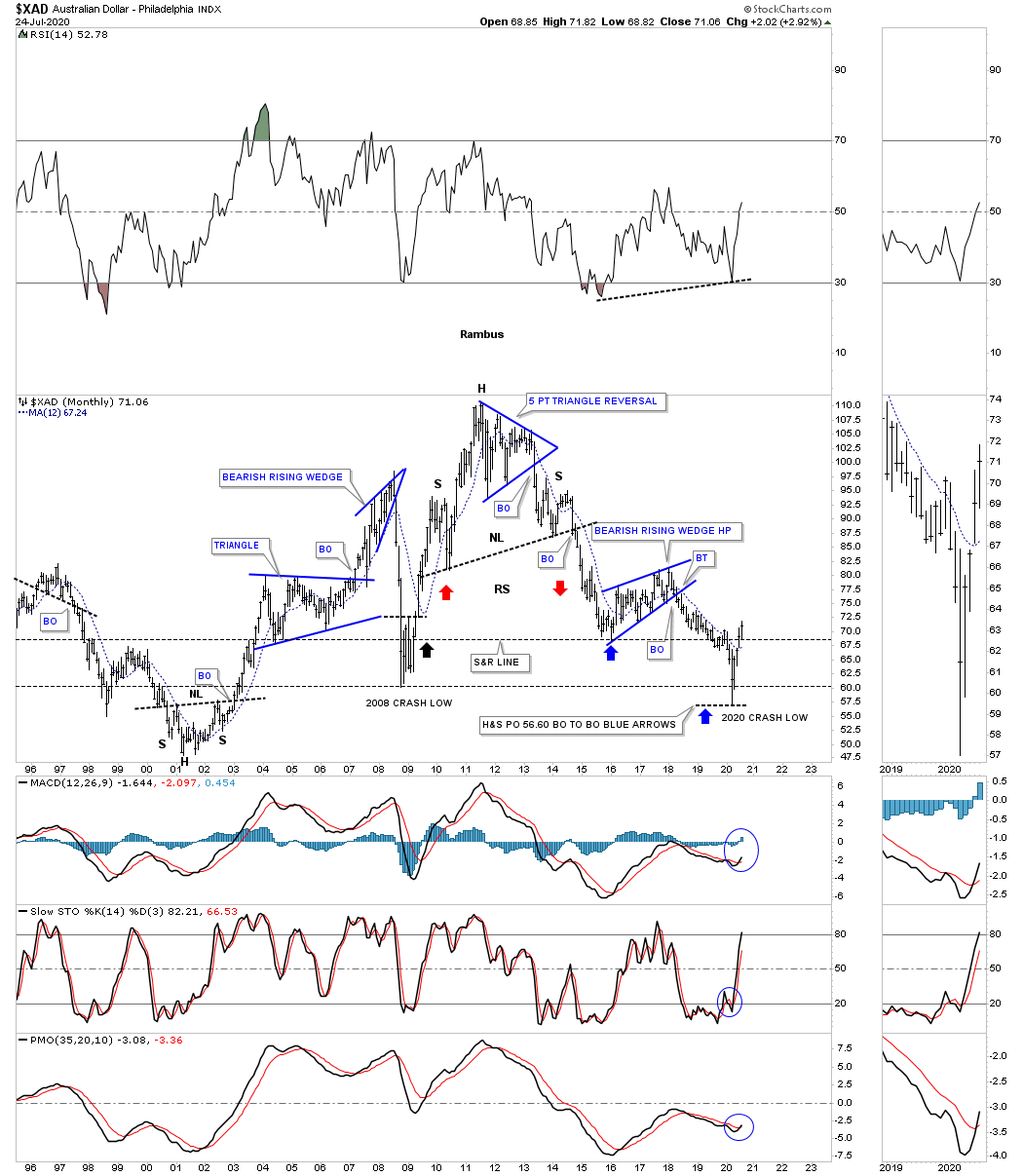
This long term monthly chart for the XAD, Australian dollar, just recently reached the H&S price objective at 56.50 using the breakout to breakout method using the bearish rising wedge as a halfway pattern. Since the H&S top price objective has been met could we see a rally similar to the one we saw back at the 2009 crash low?
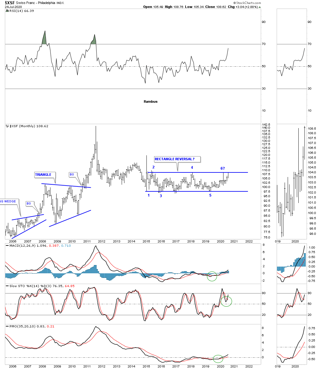
The XSF, Swiss franc, has traded sideways in the 2015 rectangle which has completed 5 reversal points so far which technically puts the rectangle into the reversal category to the upside if the top rail can give way which would be very bullish for gold.
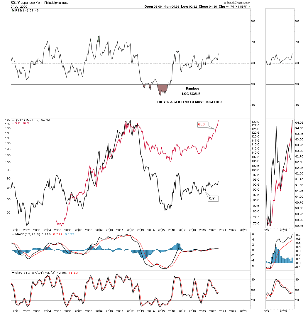
To see how well the GLD and the XJY track each other below is a long term monthly chart where Ive overlaid GLD on top of the XJY. We are not looking for a perfect correlation but the similarities of the big trends.
This next chart shows a pretty close correlation between the XJY and the HUI.
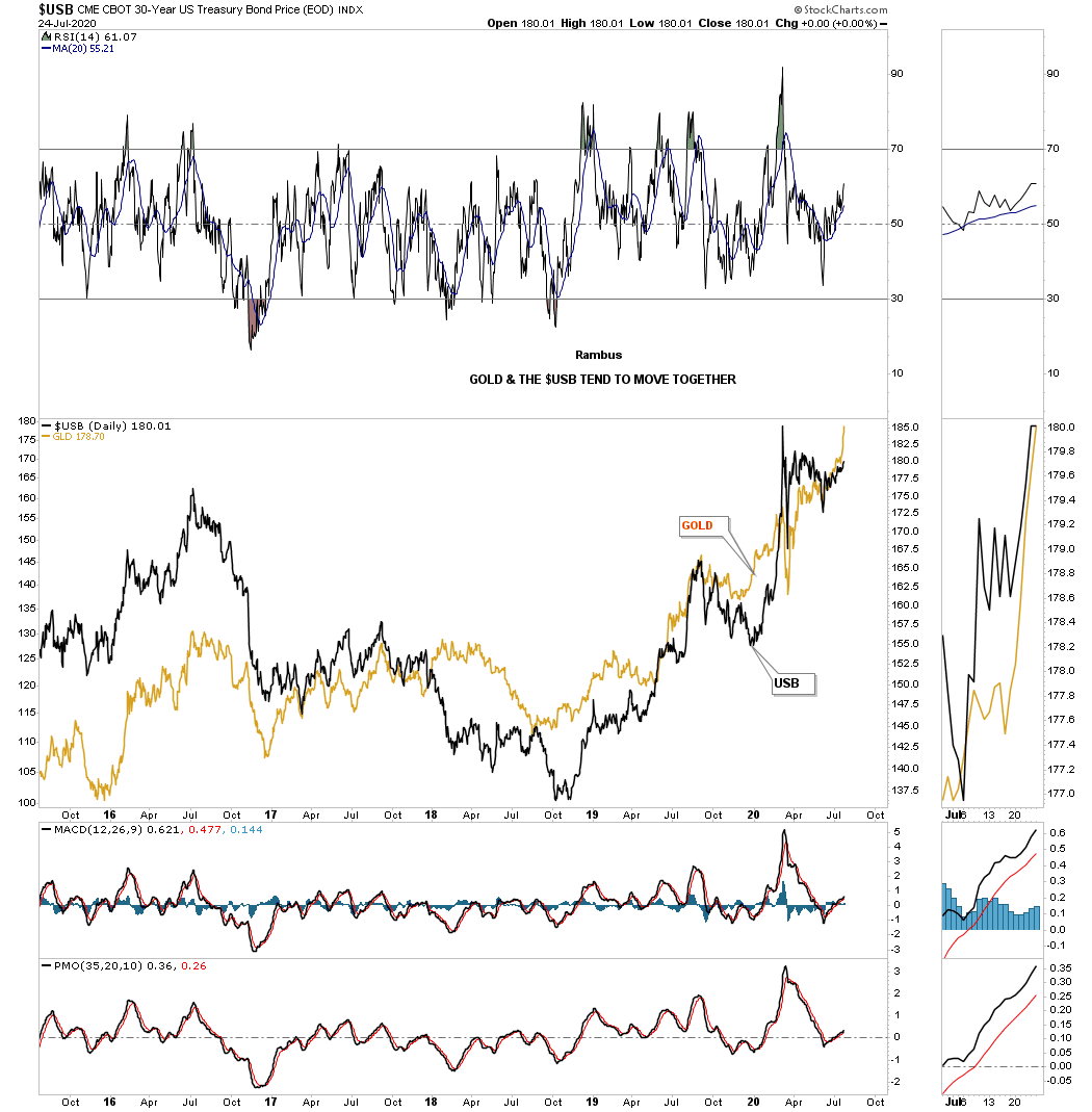
This next chart shows a pretty close correlation between the USB 30 year bond and the price of gold.
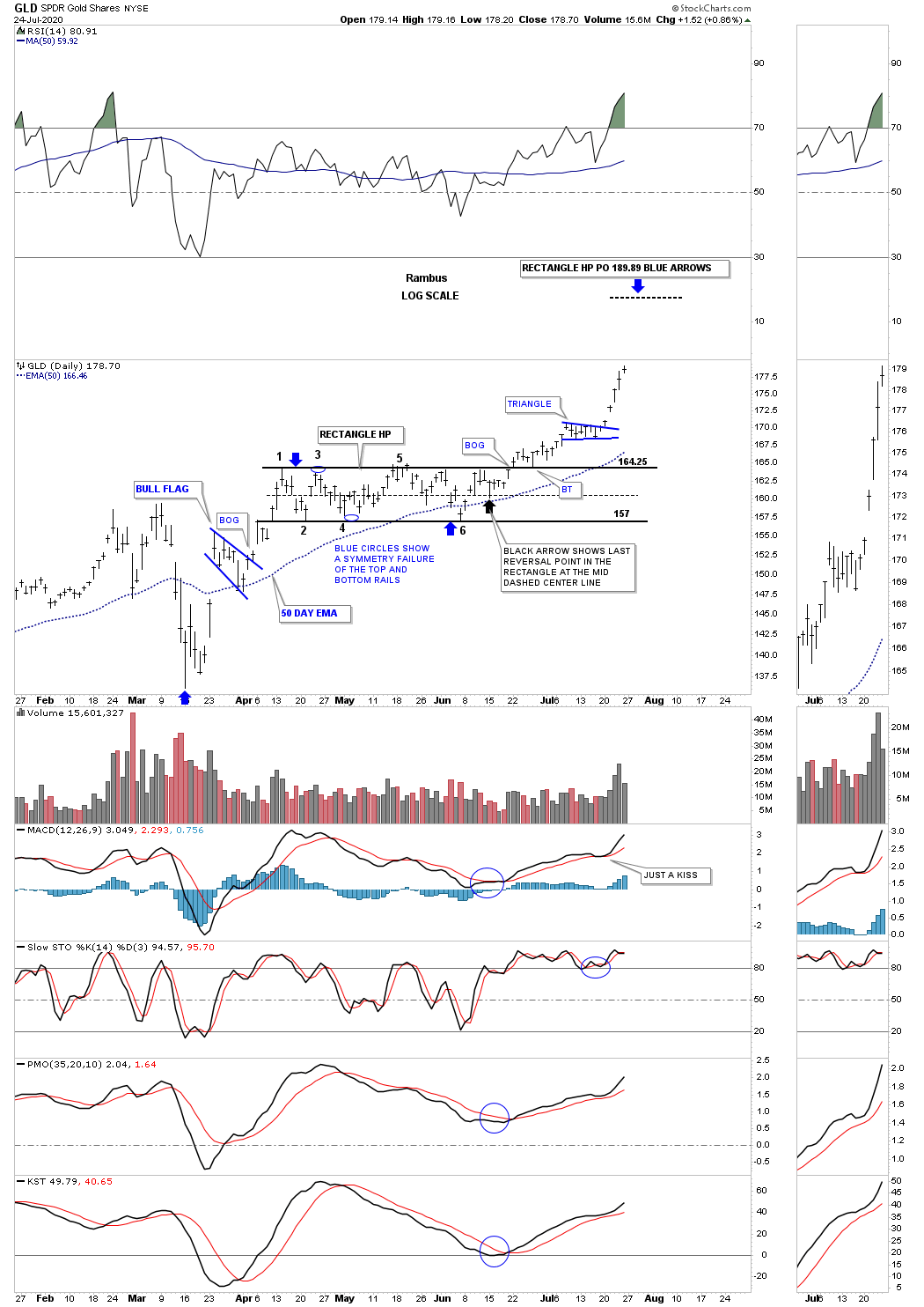
I would like to finish up by looking at 2 price objective charts, one for GLD and the other for Silver. This first chart for GLD makes sense from a Chartology perspective as it has some classic chart patterns. Starting at the March 23rd low which is the beginning of our current impulse move the first consolidation pattern that formed was the blue bull flag that formed roughly in the middle of the initial leg up to the first reversal point in the black 6 point rectangle which Ive labeled as a halfway pattern. The blue arrows show the impulse method for a price objective which is up to the 189.89 area.
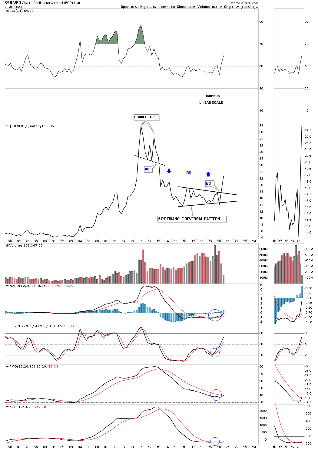
Below is a daily chart for Silver which is showing us an unbalanced H&S bottom with 2 necklines. The price objective for NL #2 is up to the 30.45 area.

I would like to leave you with a few long term quarterly line charts that I post at the end of each quarter which shows the big chart patterns that are so important to understanding the big picture to know if you are in a bull or bear market. If you recall Ive been showing you how these quarterly line charts are reversing symmetry to the upside over the same area on the way down. I said we are in the sweet spot right now with very little in the way of overhead resistance. This is about as bullish as it can be from the long term perspective.
HUI quarterly:

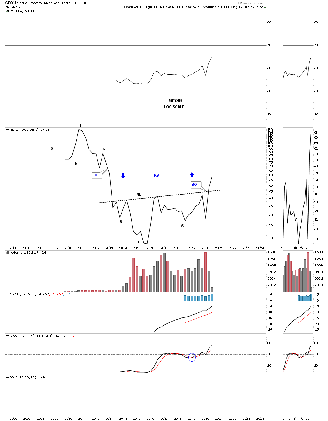
The GDXJ was one of the last of the PM stock indexes to breakout from its massive H&S base.
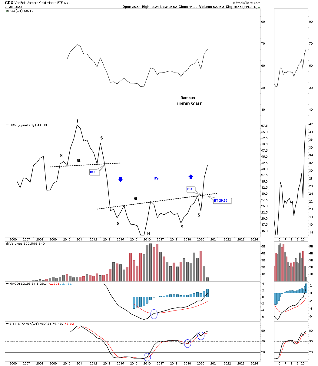
GDX is moving through the sweet spot.
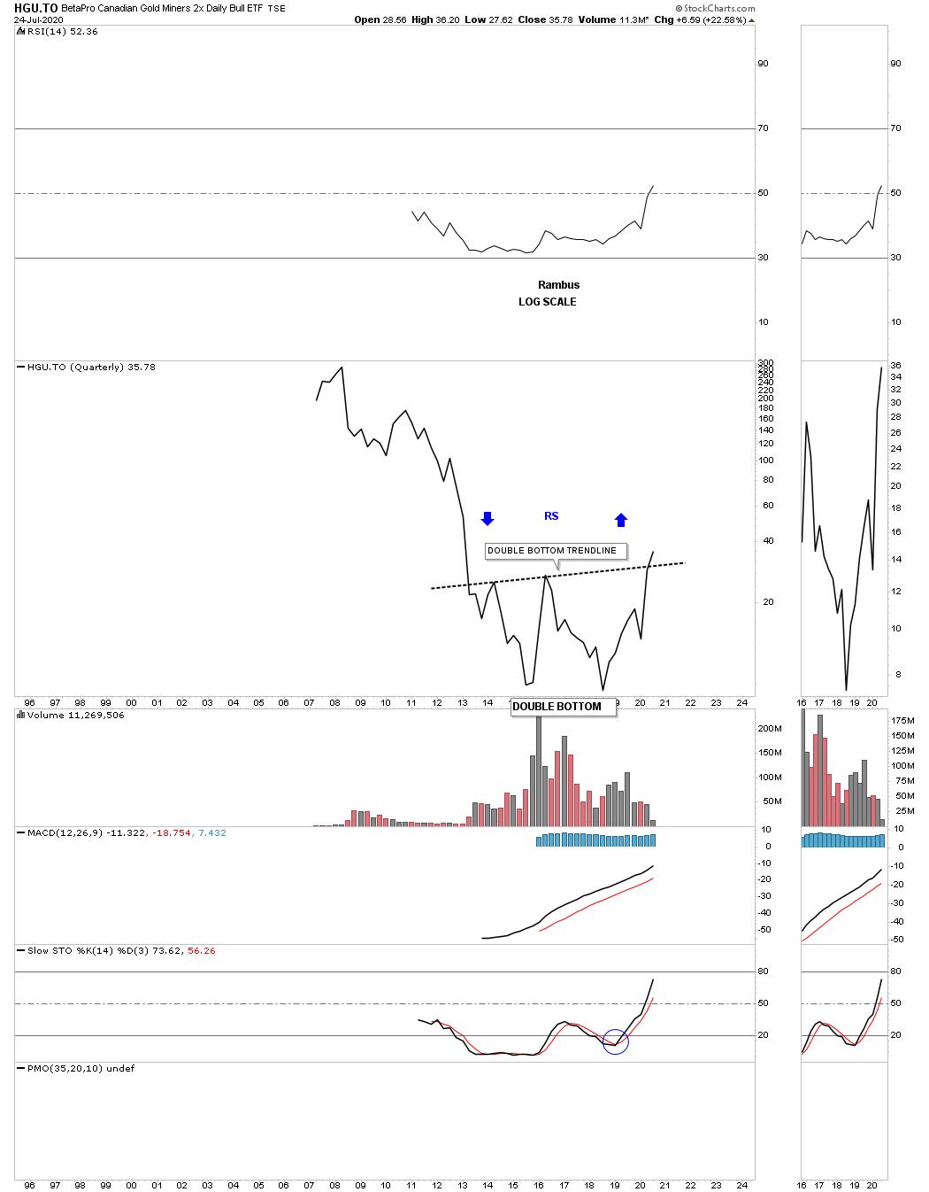
The HGU.TO is now breaking out above its double bottom trendline.
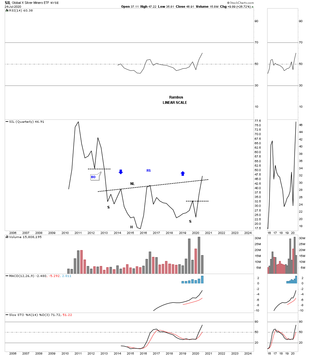
SIL is finally breaking out above its H&S neckline.
Silver has just competed its 2016 five point triangle reversal pattern.
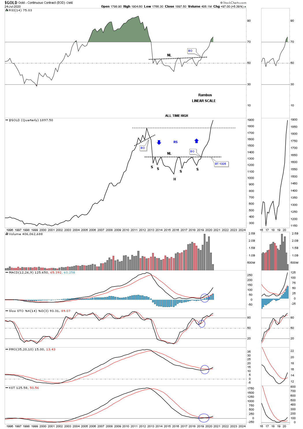
If there was only one chart I could use to make a case for the PM complex bull market it would have to be this quarterly line chart for gold. First note the beautiful and symmetrical H&S consolidation pattern we followed in real time and the reverse symmetry over the same area on the way down as shown by the blue arrows. On a quarterly time basis you can see gold is trading at new all time highs. The last thing to observe is the 2000 to 2011 bull market which made higher highs and higher lows on a quarterly basis.
All the best
Rambus
https://rambus1.com/
| Digg This Article
-- Published: Monday, 27 July 2020 | E-Mail | Print | Source: GoldSeek.com


