-- Posted Sunday, 9 June 2013 | | Disqus
By Rambus
In this weekend report I would like to go into the Rambus Chartology tool box and bring out a tool that you will only find in my tools of the trade tool box. Ive shown you some charts recently that show reverse symmetry but I would like to dig a little deeper in the subject and show you in more detail some charts that are showing some beautiful reverse symmetry right now.
When I speak of reverse symmetry Im referring to how a stock goes up, especially in a fast moving advance, will reverse back down in a similar fashion, once a top is put in place. In fast moving trends either up or down there is little time to create much in the way of consolidation patterns. Consolidation patterns are the key to keeping an uptrend or downtrend intact as they produce support or resistance zones when there is a correction. Without those consolidation patterns a stock can have very fast moves in the opposite direction similar to the way it went up. This is what I call reverse symmetry.
Head & Shoulder patterns are good examples of how reverse symmetry starts out, at least to the neckline. You have the formation of the left shoulder followed by the rally to the head then another decline that sets up the neckline with one last rally attempt that stalls out before reaching the top of the head. The price action then rolls over in reverse symmetry down that is similar to the rally on the left side of the head.
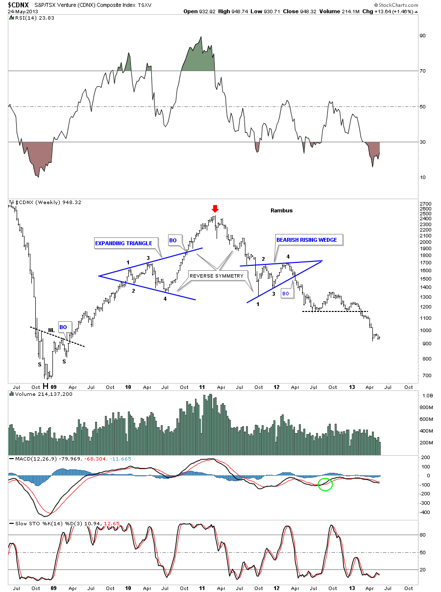
The CDNX shows you a good example of what I described above. Note the rally on the left side of the chart created the expanding triangle that is the left shoulder. As the bulls were still in charge the expanding triangle broke out and rallied to the red arrow which was the top. The bulls now were exhausted and had no energy left to take prices higher so the bears took over and took charge to the downside. The first really big clue that a H&S top could be forming is when the bulls failed to hold support at the top of the expanding triangle on the way down from the Head. As you know the top of consolidation patterns normally offers strong support for the next leg higher. When you see a failure like this this is a big warning that the trend is changing from up to down. As you can see the bears took the price action all the way down to point #4 at the bottom of the expanding triangle. By this time the bears were becoming exhausted and couldnt push prices lower so the bulls came back in and a made a feeble rally attempt that could only push the price up to point #2 on the bearish rising wedge. As you can see the bulls and the bears fought it out creating the bearish rising wedge. For those that can visualize this, if you take the H&S pattern and fold it to the left side like a book, using the red arrow as your center point, you can see how the two sides match up, reverse symmetry. You can see how the bearish rising wedge, on the right side of the chart, lays on top of the expanding triangle on the left side of the chart.

Below is the same chart above that shows all the annotations and chart patterns. You can see once the big neckline was broken to the down side CDNX formed a H&S consolidation pattern that was the backtest. There is also a very large 5 point bearish falling wedge that broke out to the downside about 6 weeks ago and had a backtest 3 weeks ago. I expect the reverse symmetry to play out fairly hard to the downside since the breakout of the 5 point falling wedge that should take prices down to the 2008 bottom.

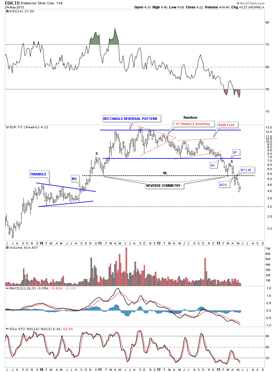
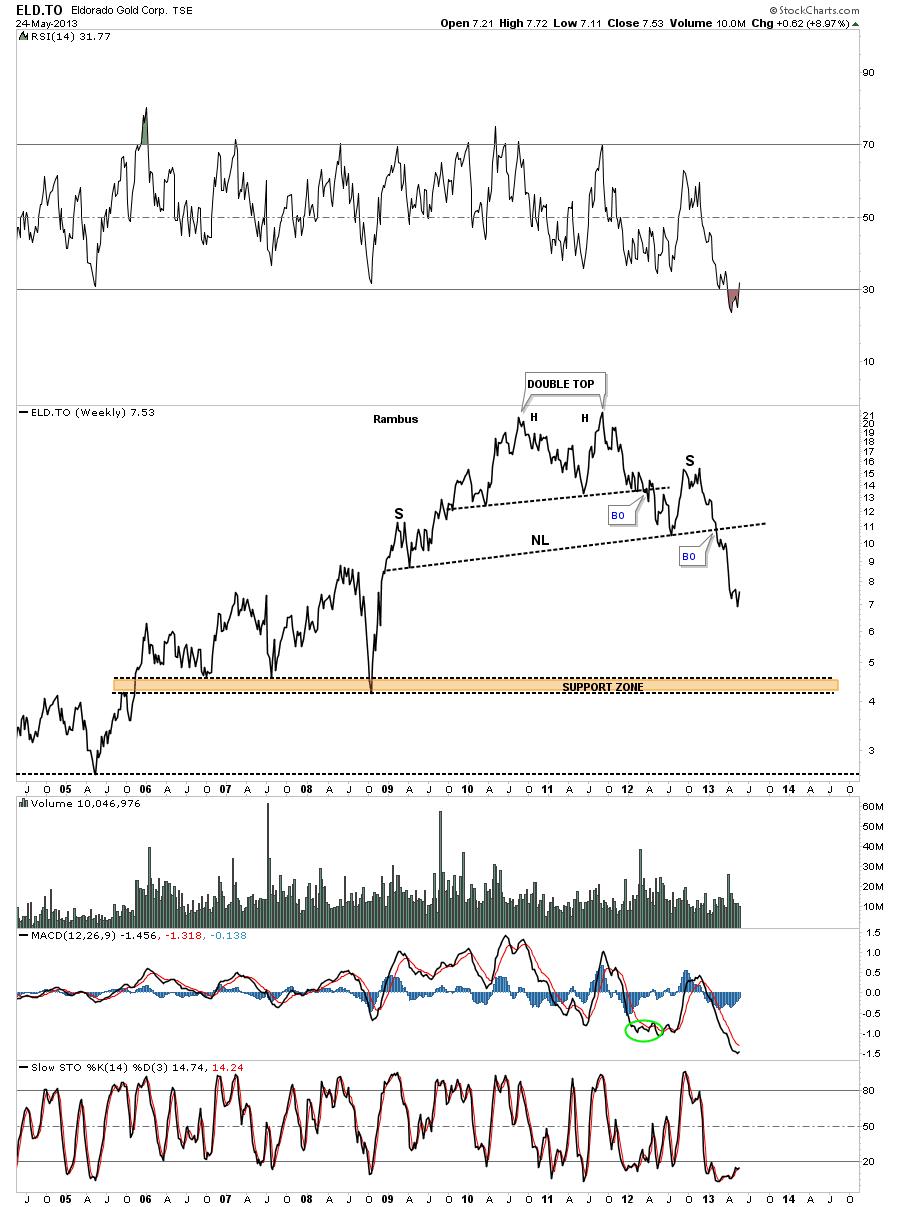
There are several precious metals stocks that have created large rectangle reversal patterns for their bull market highs. Reverse symmetry is showing up here as well. The first chart is a weekly look at EDR.To that shows the big blue rectangle reversal pattern. You can see where it broke down from the rectangle and had its backtest to the underside of the blue rail, that is now acting as resistance that corresponds to the price action leading into the rectangle on the left side of the chart. Ive labeled the two symmetry points with a S that now shows a H&S top.

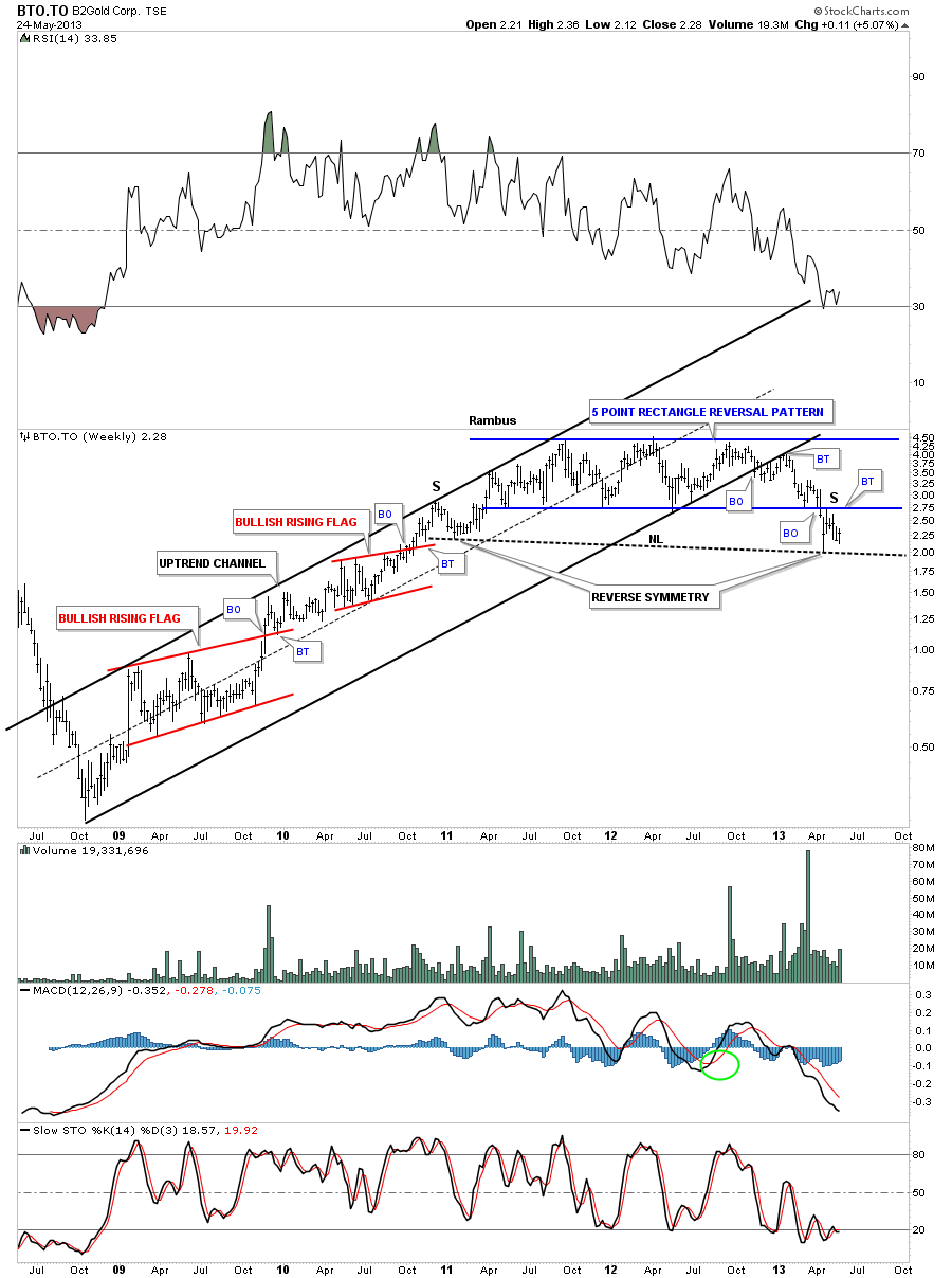
You can see a very similar setup on this weekly chart for BTO.To with the breakout and backtest on the right side of the chart that matches the same area on the left side of the chart.

CSI.To shows a similar setup that is a little bigger with more reverse symmetry taking place. Note the 7 point diamond head reversal pattern that has a red expanding bull flag on the left side of the chart and the red 6 point diamond consolidation pattern on the right side of the chart. Keep in mind its more of an art than a science sometimes. Even though the patterns are different in size its where they formed is the key. Again note the price action around the neckline that Ive labeled with two heavy black Ss that shows the reverse symmetry on the left and right side of the chart. One last important note on this chart. Notice the rally off the 2008 low that started out in a vertical move before it created the inverse H&S bottom. That vertical move up in 2008 will offer very little resistance for this next leg down that is now starting. There is a good chance this stock will fall like a rock until it hits the 2008 low.

Lets look at one more example of a rectangle reversal pattern that showed reverse symmetry and is quite a bit further along in its move down than the charts above. Again the heavy black Ss shows the reverse symmetry. Note our current price action that is taking place right now on the right side of the chart. It looks like FNV has put in a small double top with a backtest over the last 3 days. For the more experienced trades this is a good low risk entry point for puts or shorting this stock. The double top trendline is your line in the sand.

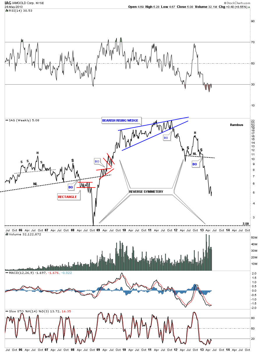
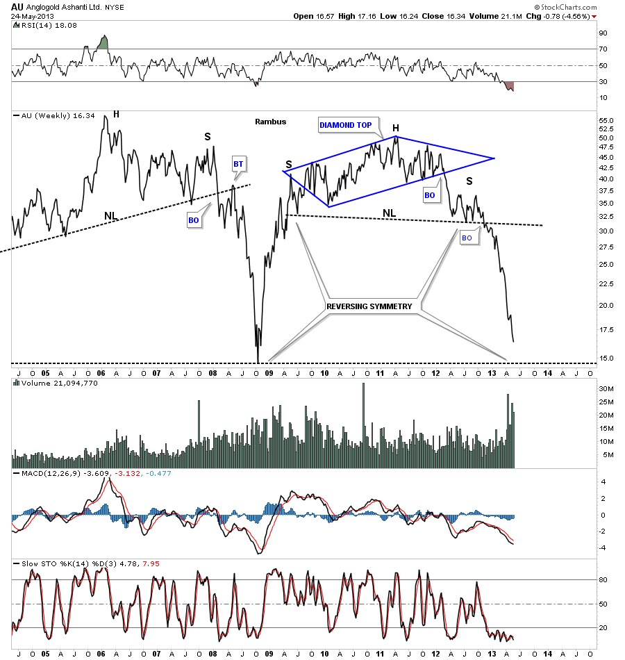
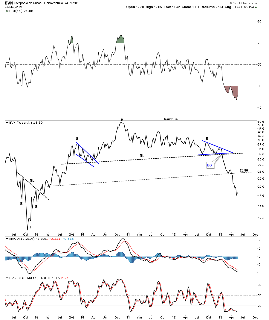
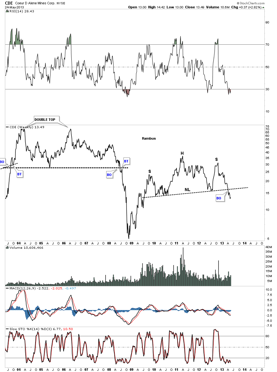
Now that you should have a fairly good grasp of what Im referring to when I talk about reverse symmetry I want to show you some weekly line charts for some of the precious metals stocks that will drive home the point of what Im trying to get across here. These chart arent for the faint of heart as they show the carnage that has and is taking place right now regardless of all the reason the precious metals stocks should be bottoming and going up. Im still in total amazement of all the bottom callers, all the way down, that fail to look at the most basic principals of technical analysis. Lower lows and lower highs equals a downtrend. Folks you dont have to be the brightest bulb in the room to see what a downtrend looks like. Below are some examples of what I mean.
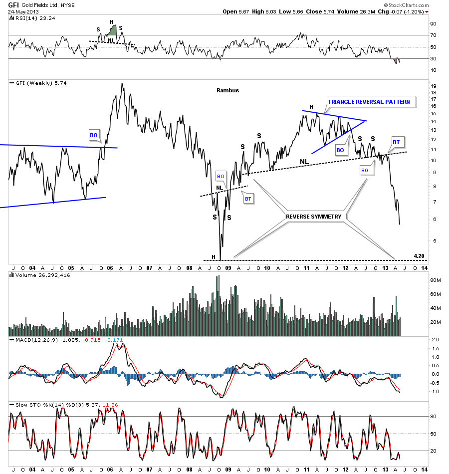
These charts will speak for themselves. First GFI weekly line chart.

IAG

AU

BVN

CDE

ELD.To

NEM

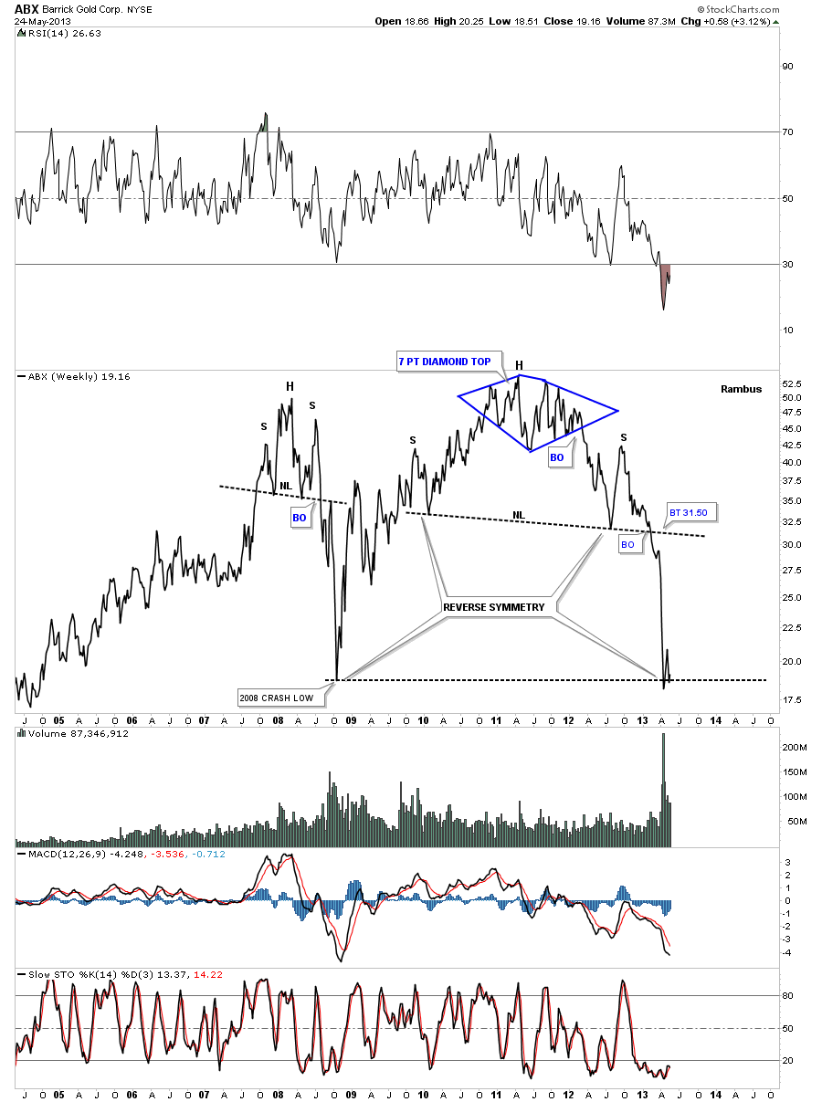
On a weekly closing basis ABX is testing its 2008 crash low. Its supposed to be the leader. What does that say about the rest of the precious metals stocks?

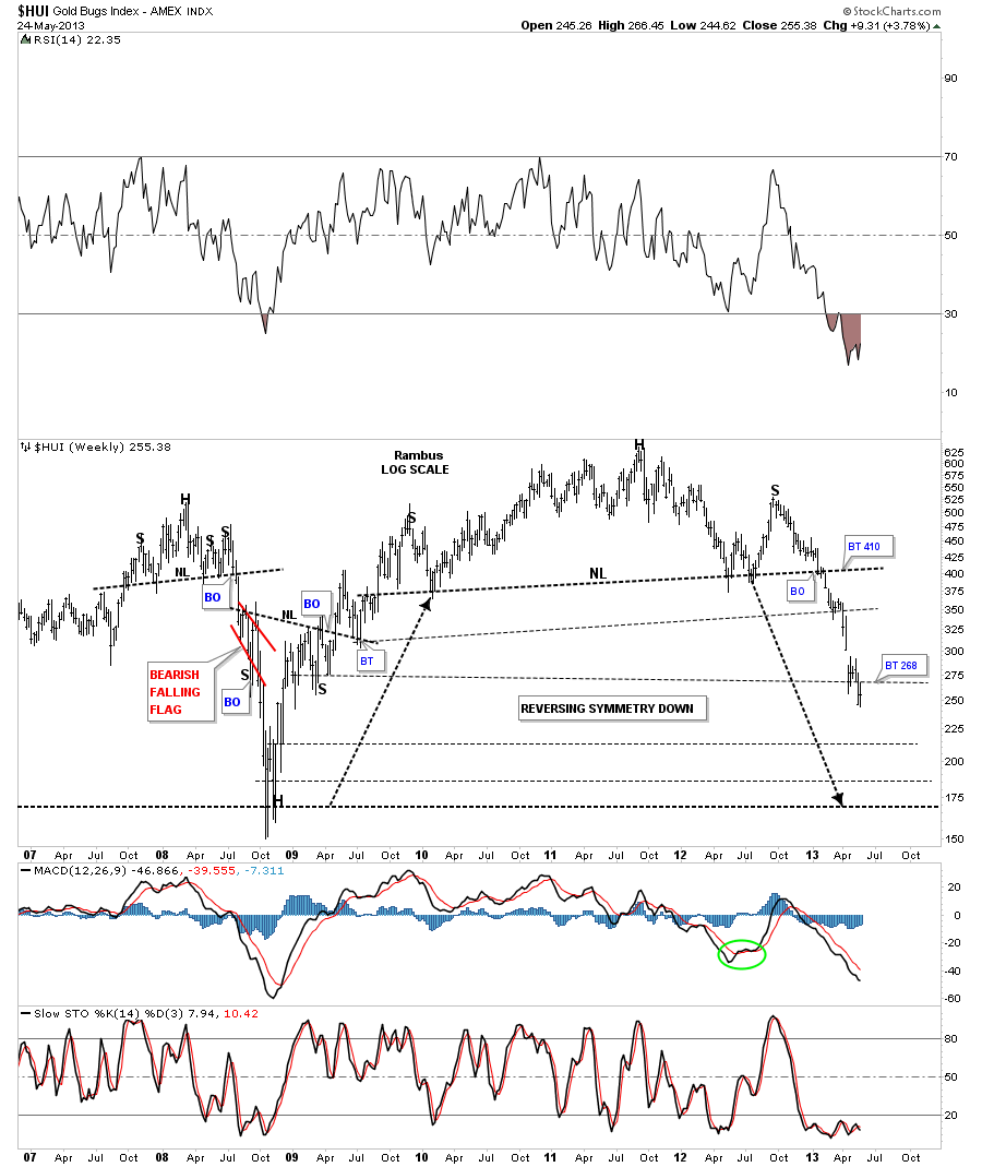
Lets take a quick look at the weekly line chart for the HUI. It could still backtest the 268 area just above at the previous S&R rail on a weekly closing basis. If I switched this line chart to a bar chart you would see that 268 was hit last week as the high

This chart below is exactly the same chart above only Ive made it a bar chart instead of a line chart. Note how the price action rallied up to the 268 that showed resistance on the line chart.

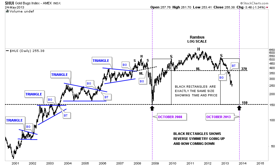
HUI daily line chart

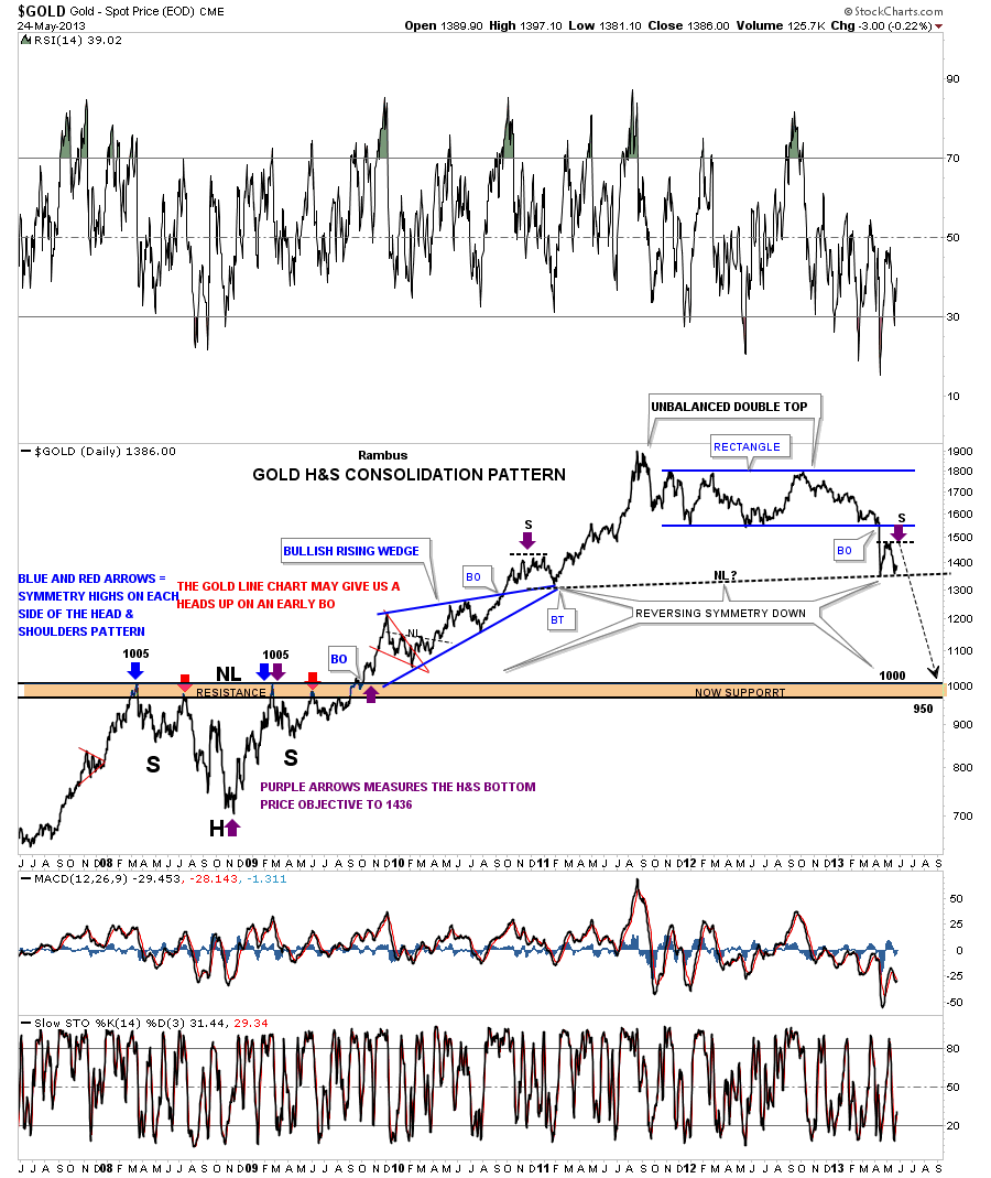
Ive shown you this daily line chart for gold that shows how Ive been looking for some reverse symmetry down once the big rectangle was broken. Its finding support right now on the symmetry rail that goes back to the left side of the chart with the purple arrow. A break below this latest support rail will usher in the next leg down.

There are few times in the markets when they present such a clear picture of what is happening. The precious metals complex has been showing itself since the October 2012 highs with one of the most relentless moves down I can remember. Just look at those weekly line charts. Anybody looking for strength to get out of their precious metals stocks are trapped and they know it. They are now at a point where there are few options for them. They either sell and cut their loses or they have to ride the whole thing down. The problem is there is no law that says the 150 area on the HUI is going to be THE bottom. It looks like a good place for a bounce but will it be just that? Im just glad we are not trapped in that situation right now. Even if you havent traded any of the short etfs you have your hard earned capital intact. There will come a time when we get an intermediate term rally in which we can take advantage of but until we see some kind of bottoming pattern there is no bottom. Have a great week
All the best
Rambus
Editors Note
Rambus Chartology is Primarily a Goldbug TA Site where you can watch Rambus follow the markets on a daily basis and learn a great deal of Hands on Chartology from Rambus Tutorials and Question and Answers .
Most Members are Staunch Goldbugs who have seen Rambus in action from the 2007 to 2008 period
and now Here at Rambus Chartology since early 2012 where he has prepared us for this debilitating PM smackdown.
What is he seeing now ?
http://rambus1.com/
-- Posted Sunday, 9 June 2013 | Digg This Article | Source: GoldSeek.com


