-- Published: Monday, 21 April 2014 | Print | Disqus
By Rambus
In todays Weekend Report Im going to post a ton of charts so you can see what Im seeing and why the Kamikaze Portfolio is fully invested in the 3 X short the precious metals complex etfs. Before we look at the charts we need to discuss why its so important to hold your ground during this impulse move lower. I dont know how many times its been posted at the forum but the great trader Jessie Livermore said The real money he made was identifying the big trend and SITTING TIGHT!!! That means you dont try to trade every little wiggle the market throws at you. When you try to do that you will eventually find yourself on the outside looking in. If you are an experienced trader thats a different story but for most folks trading in and out of an impulse move is a loosing proposition as some of you are already finding out.
We took our initial positions on the 3 X short the PM complex on March 21 which is just one month ago. We have made close to 40% on our JDST trade and 25% on DUST. During that time we had a counter trend rally that took back alot of the profits we had made but there was nothing broken from a Chartology perspective. We still had some nice gains but not as nice as they were. Since that ten day correction to the upside we are now back to where we were before the correction began up about 40% on JDST and 25% or so on DUST.
The point Im trying to make is that markets go up and down period. There is no way of getting around that. One has to have faith in whatever system they follow the markets with or they will get scared out of a potential life changing trade because you let your emotions get in the way. You have to be able to feel the pain and not get shaken out every time the market goes against you for a period of time as long as your trading system is saying stay the course. The Chartology has been telling me to stay the course, short the PM complex, unlike our short move into the stock markets reversal weeks ago. In that case the Chartology said to exit the short positions because the price action was breaking back above critical resistance. If that short position, in the stock market had been correct, we would still be short looking for lower prices.
Ive been showing you countless H&S topping patterns in the PM sector from the long term to the short term, like right now, that are giving us important clues that the long to intermediate term trend is down. Now, the short term trend looks like its getting ready to exert itself again within the context of the intermediate and long term trends. All three will be in sync once more.
I hope you have the time to catch SA Vikings post at the forum on how the Kamikaze stocks are doing. The point here is that DUST is up 23% and JDST is up 42% since the top of our latest 2 week correction. In order for you to have gotten those results you would have have to buy the exact bottom and sold the exact top which is virtually impossible to do. By sitting tight we were able to catch those percentage gains in our Kamikaze Portfolio which we were able to add to our existing gains. In other words we are right back to where we were before the two week correction started with our original positions and the new positions weve added last week based on new clues that are surfacing.
OK lets look at some charts that are giving us some important clues that the short term trend is getting close to getting underway again after a two week correction. Believe it or not there are still some precious metals stocks that are working on their massive H&S topping patterns unlike most that have already broken down long ago.
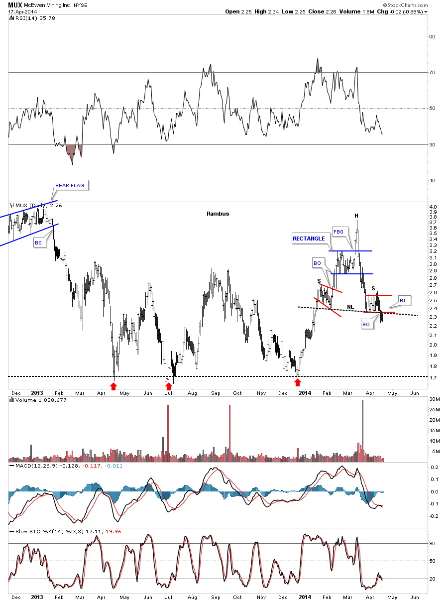
Lets start with MUX that is a favorite PM stock , held in high esteem because of its founder. The daily chart shows a nice H&S top that broke down three days ago and had been backtesting the neckline. When the December rally started MUX looked like it was going to fly high as there was a triple bottom in place, red arrows. This is one reason you always hear me talk about follow the price action. As you can see MUX was trading above the previous peaks and had built an nice tight blue rectangle that looked like another big move was just getting underway again. But like so many PM stocks and indexes Ive shown you, this was a false breakout move, or bull trap. How many gold bugs do you think are still holding on, that bought that three month counter trend rally off the December low to the March high, that dont have a clue what is happening.
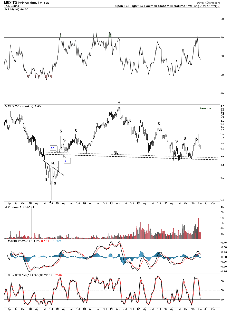
The weekly chart for MUX shows it has come down a long way but it still hasnt broken below its neckline on its own massive H&S top. Use log scale with these smaller price stocks.
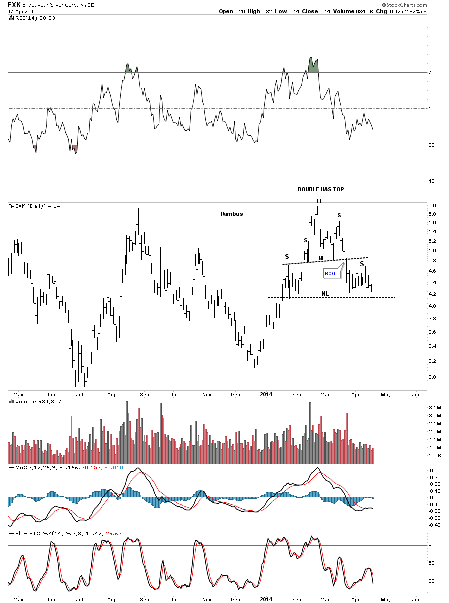
EXK is another favorite PM stocks that usually does pretty good in a bull market. But were not in a bull market anymore so its no different from all the other PM stocks. A bear market takes no prisoners. It has a nice double H&S top that is waiting for the lower neckline to be broken before it gives the all clear.
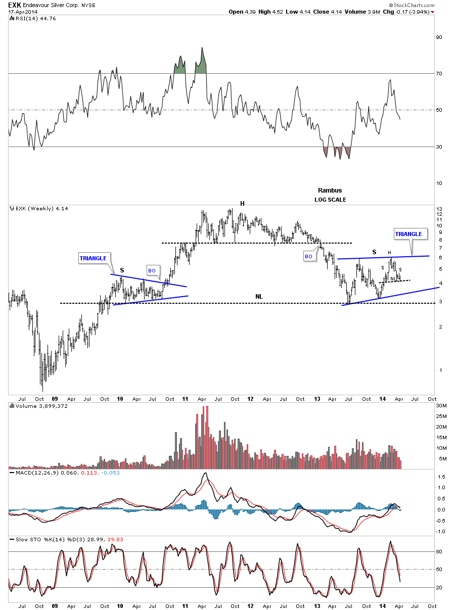
The weekly chart for EXK shows three patterns in play right now. If you look to the far right hand side of the chart you will see our little H&S top, on the daily chart above as the fourth reversal point in the blue triangle that will be the right shoulder of its own massive H&S top.
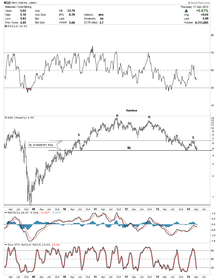
NGD is another PM stock that is still waiting for its turn to breakout from a big H&S top formation. Its very beautiful as shown by the neckline symmetry rail.
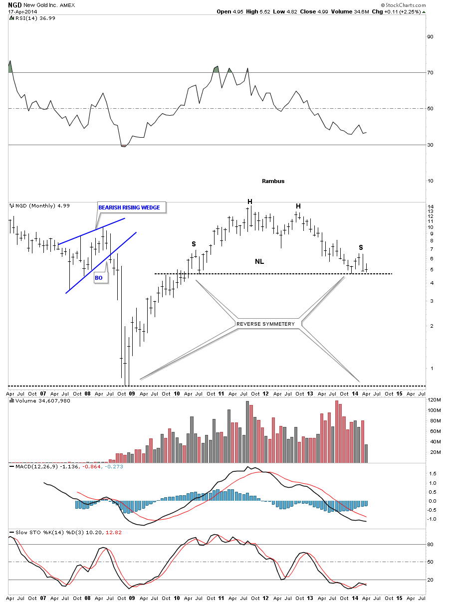
The monthly chart for NGD shows a massive H&S top very similar to all the other massive H&S tops on the precious metals stocks. This one is just taking a little longer to breakout but its there for all to see.
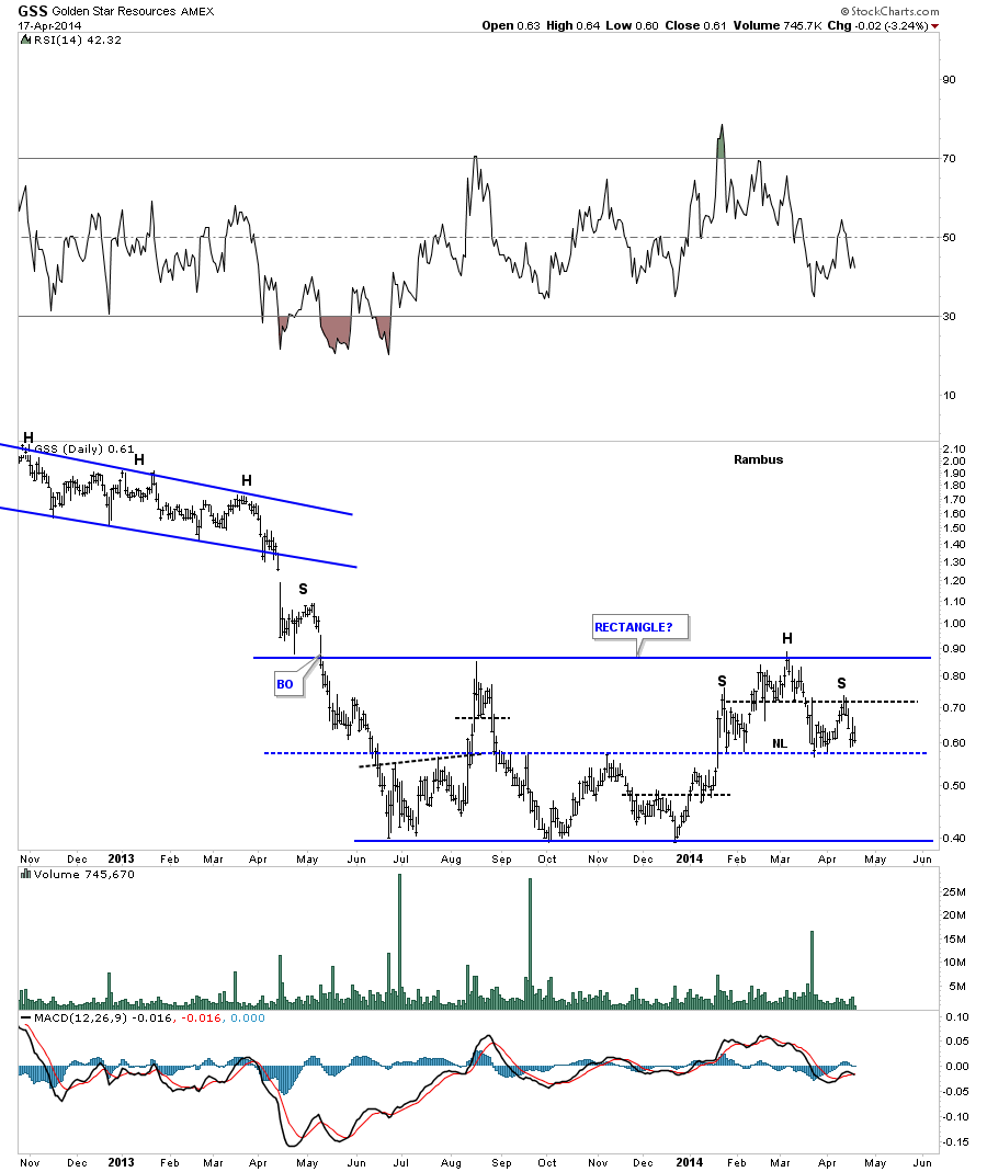
The daily look at GSS shows a very nice blue rectangle with a H&S top at the fourth reversal point. Notice how the center dashed blue mid line has worked as support and resistance during the formation of the rectangle.
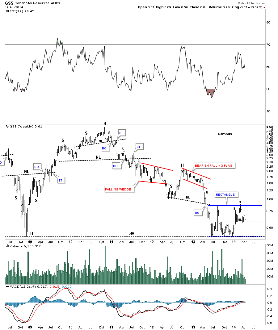
The weekly looks shows our our potential blue rectangle fits into the bigger picture. Note our little H&S top as the last reversal point in that blue rectangle.
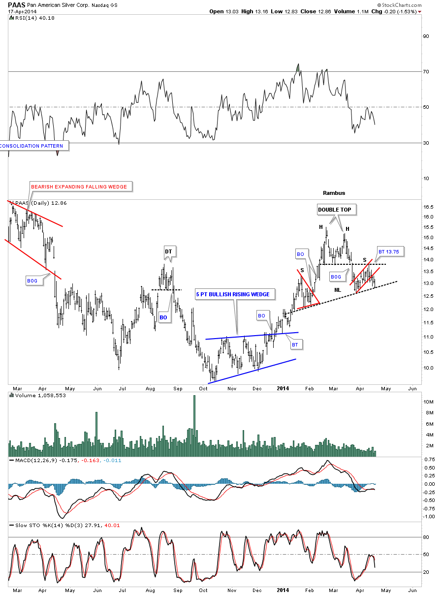
PAAS was one of the strongest PM stocks off of the December low but it actually bottomed a bit earlier than most as it bottomed in October. It built out a beautiful blue 5 point bullish rising wedge reversal pattern. As you can see PAAS has a 5 point bullish rising wedge as a reversal pattern off the bottom with a rally that followed and now we can see a H&S top reversal pattern. You can classify that as a bear market rally.
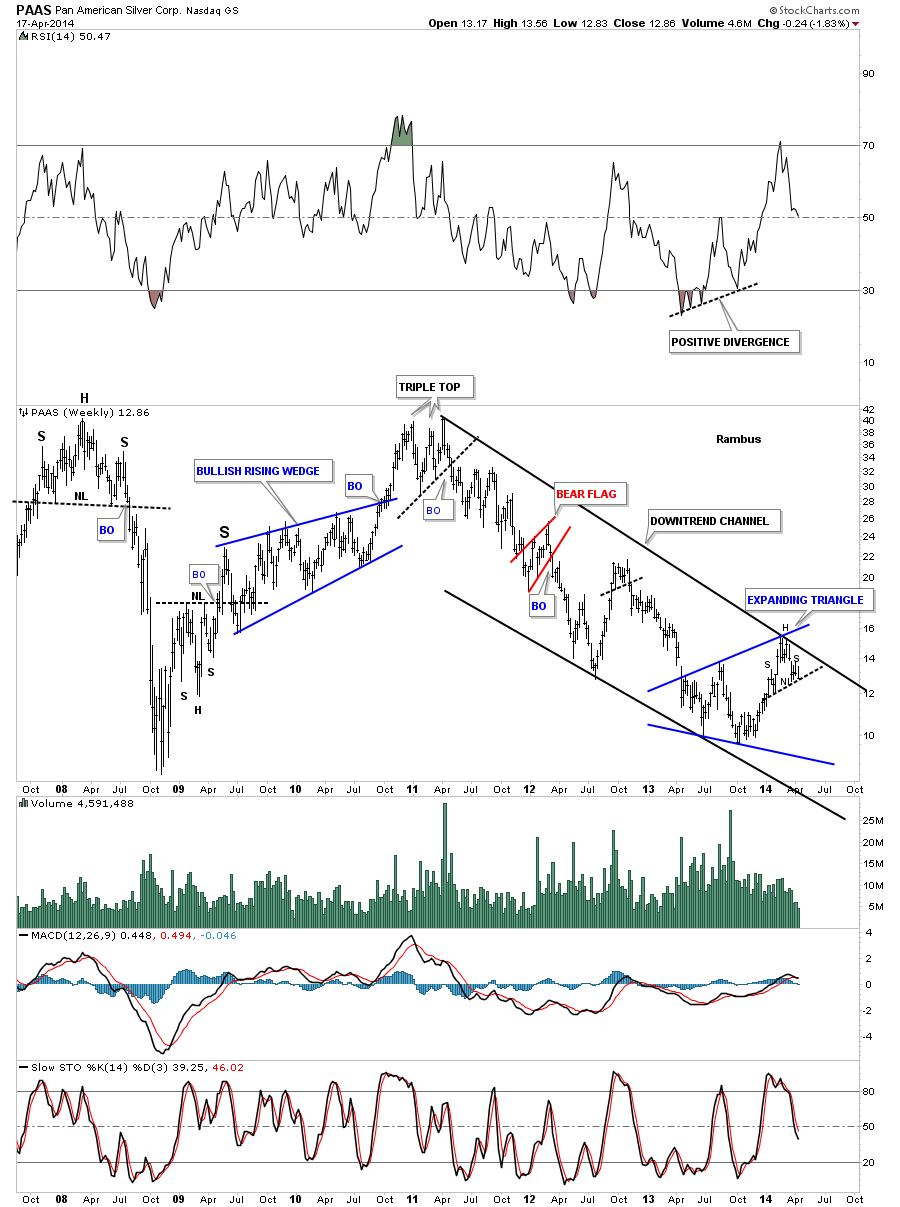
The weekly chart for PAAS shows the long term downtrend channel that started way back in 2011 that was the starting point for many of the PM stocks bear markets. You can see where our little daily H&S top has formed at the revised top black rail of the downtrend channel. I say revised because if your were to follow the price action, in real time starting at the top in 2011, you will see your original top rail would have connected two other tops in the downtrend channel, the red bear flag and the little double top. They worked out fine at the time but our latest counter trend rally was stronger than the others so it pouched the top rail up a little bit where you can now see where our current H&S top should mark the next reversal point in that downtrend channel.
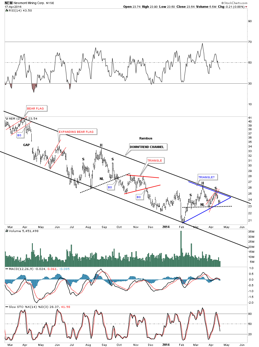
Weve been following this very long term downtrend on NEM for sometime now. The last time we looked at this chart we were waiting to see which way a small red rising wedge was going to break. As you can see it broke to the downside and the price action is sitting on the bottom red rail of a triangle consolidation pattern. If you dont like the blue triangle I can make a case for a H&S top. Take your pick.
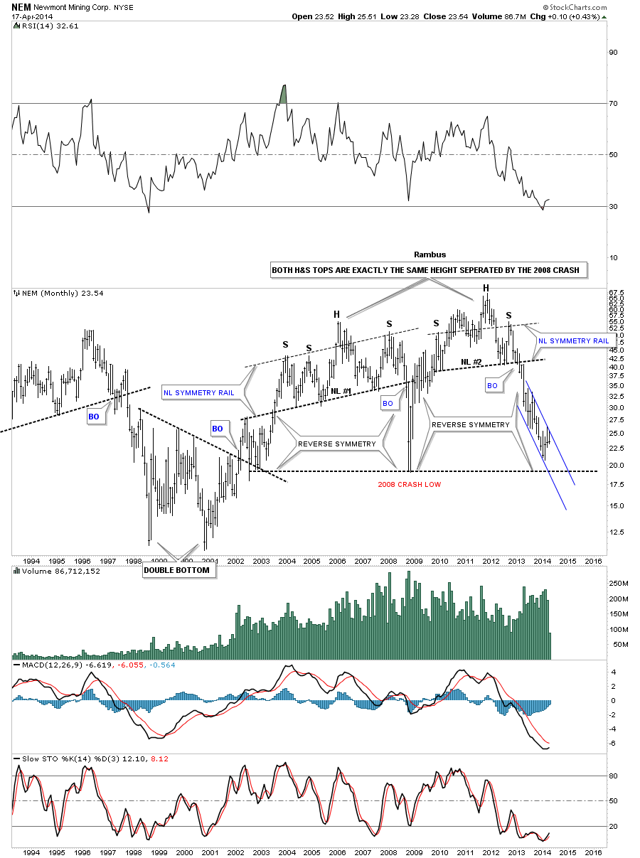
The long term monthly chart for NEM shows no signs of a bottom or reversal pattern.
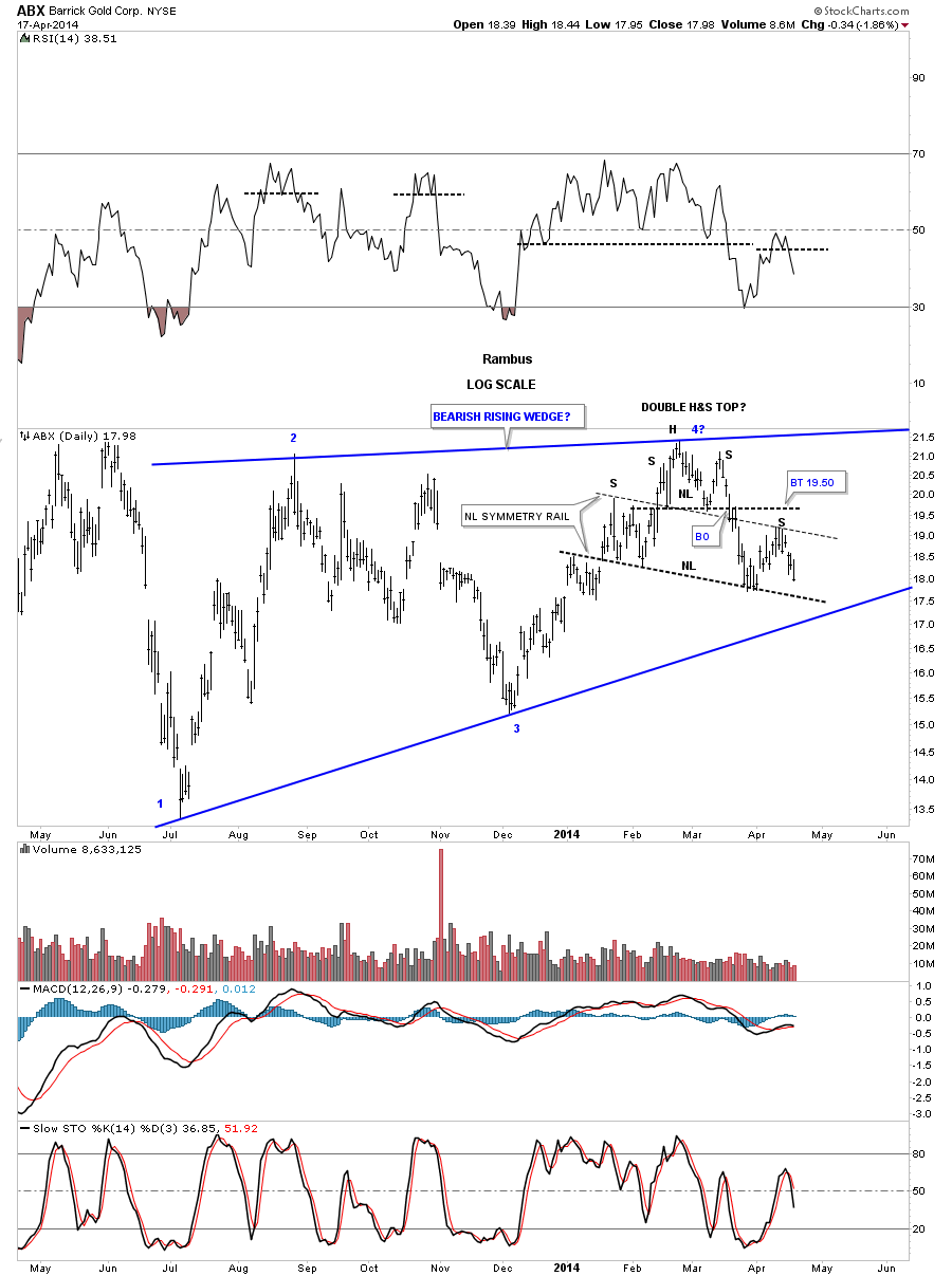
Weve been following this H&S top on ABX that has been forming out toward the apex of a rising wedge for quite awhile now. This H&S top continues to mature as it now looks like its going to be a double H&S top. Note the neckline symmetry rail that is showing us the height for the right shoulder. If that is the case it will ensure a break of the bottom blue rail of the rising wedge which we will then be able to call a bearish rising wedge.
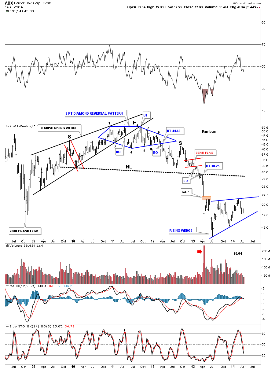
The weekly chart shows the critical placement of the blue rising wedge. Will it be a halfway pattern to the downside. Stay tuned.
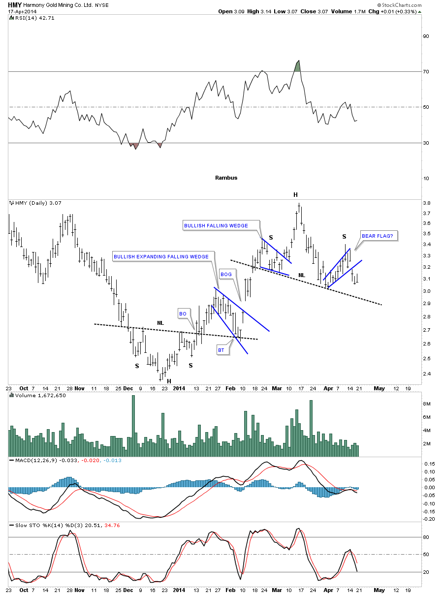
HMY had a decent rally off the December low with a nice inverse H&S bottom that reversed the downtrend. As you can see its building out a H&S top that should reverse the three month the counter trend rally from the December low.
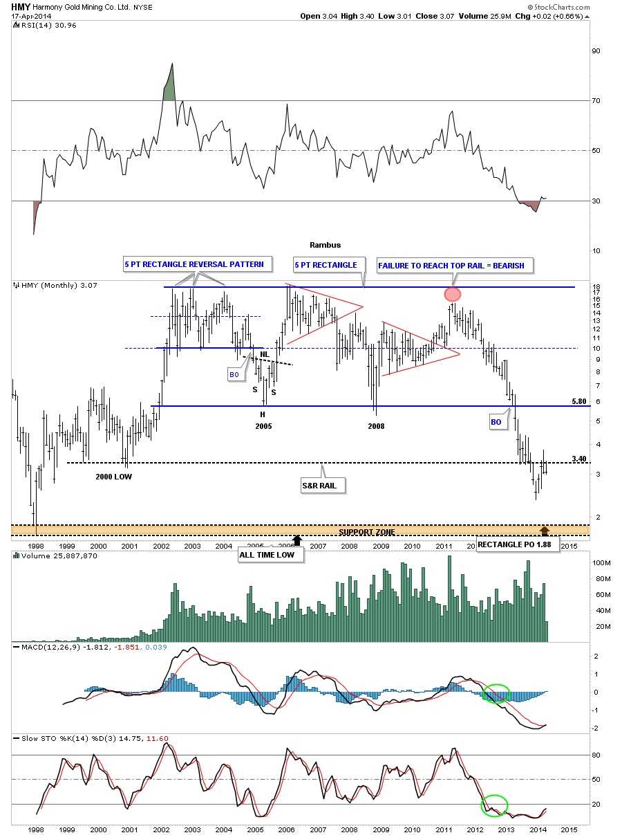
The monthly chart for HMY shows its probably the weakest big cap precious metals stock out there. It has formed a massive rectangle reversal pattern that Ive been personally following for years. I put that red circle, at the top of the chart, when it failed to rally all the way up to the top. It was a subtly warning that this stock maybe in trouble. I had no idea the kind of trouble HMY would have but its got serious issues. Note the breakout from the horizontal rail that shows the 2005 and 2008 lows. If you look real close you will see it had a small bounce and then broke through to the downside. The same thing happened at the 2000 low at 3.40. It got a four month bounce and then fell through the 2000 low. It has recently rallied back up to the 2000 low which should now work as resistance which is the case so far. This is one sick puppy.
SAND is another PM stock that built an inverse H&S bottom at the December low and had a nice counter trend rally to the March high. As you can see with so many of the PM stocks it toO has built out a H&S top and broke out with a nice breakout gap reversing the uptrend that began in December.
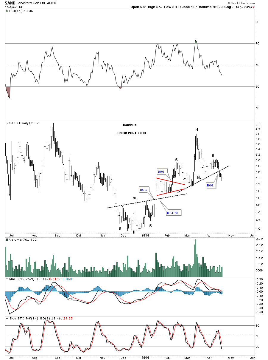
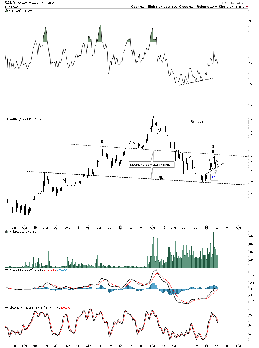
Again as with so many charts Ive shown you in this Weekend Report, our little H&S tops that have been forming since the counter trend rally off of the December low, are forming at a critical area on the charts. Here you can see how the counter trend rally that started off of the December low is now finishing up with the small H&S top that I showed you on the daily chart above but is also forming the right shoulder.
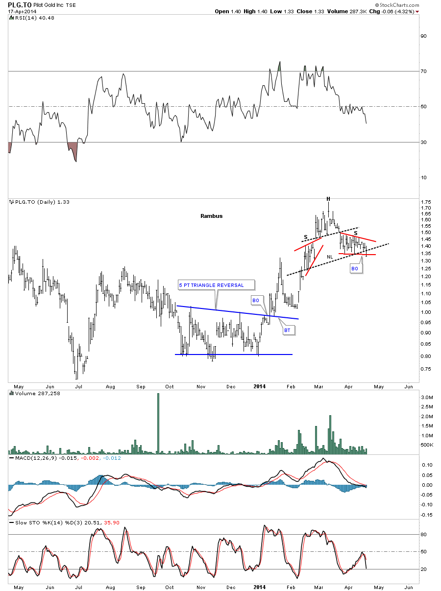
PLG.To has just broken down from a H&S top that is reversing the counter trend rally made off the December low.
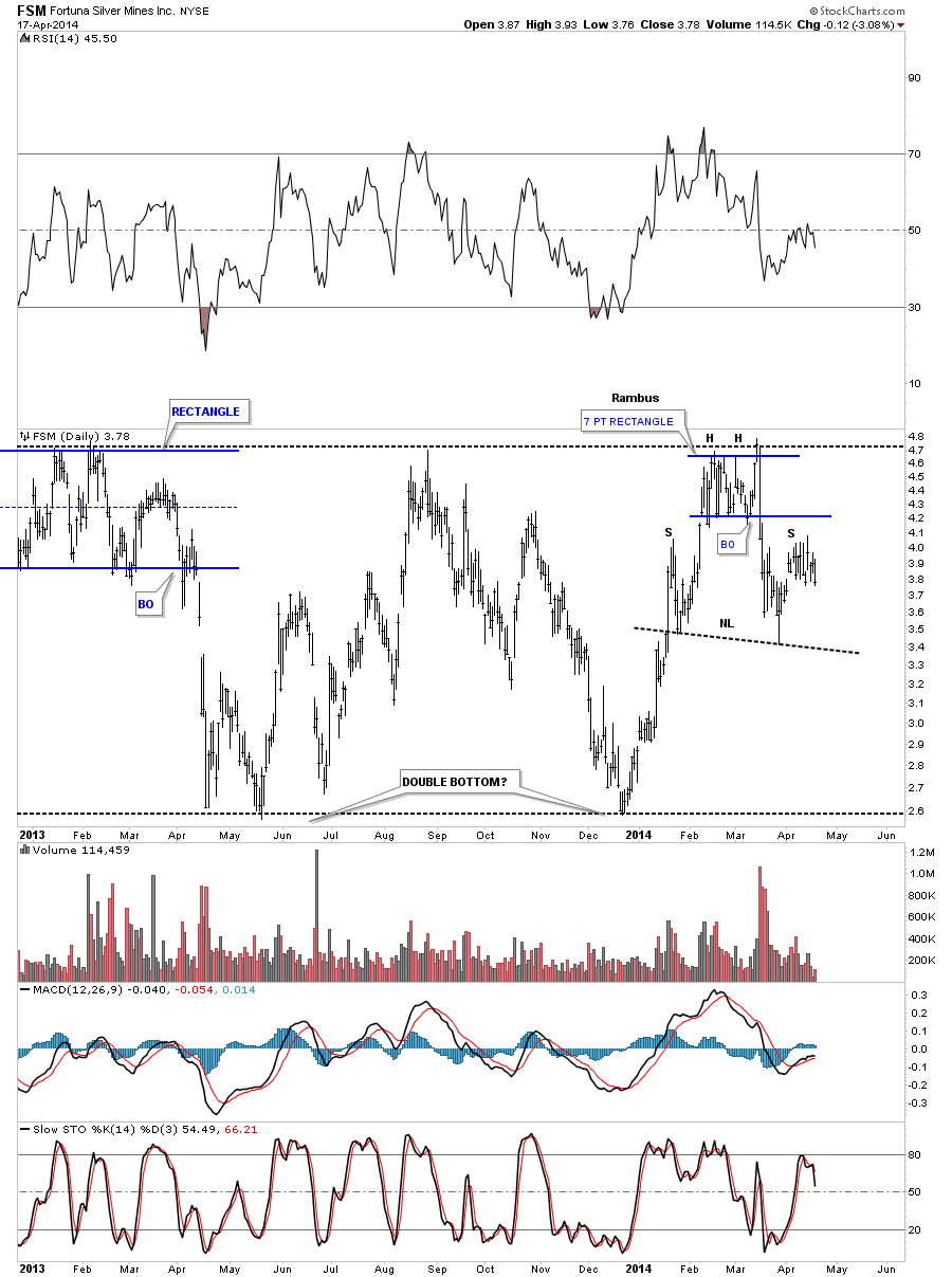
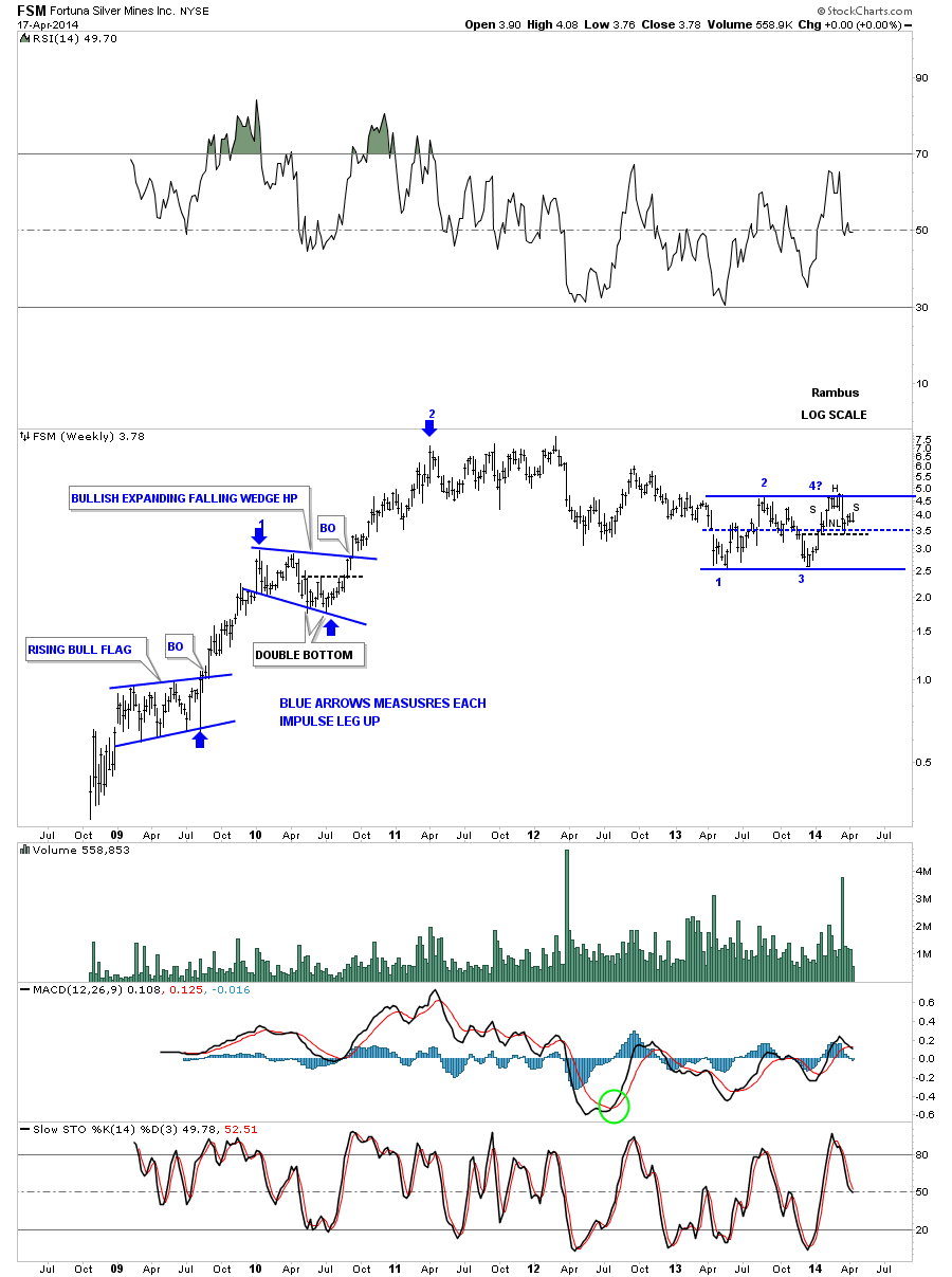
Lets look at one last stock, FSM that is building out a rather large H&S topping pattern on the daily chart. As you can see it had a very nice rally off of the December low that took the price action back up to the previous high.
The weekly chart shows the blue rectangle and our little H&S top as the fourth reversal point.
If you understand Chartology like I do you would be bearish on the PM complex. These charts cant make it anymore clear what has taken place in the long term, intermediate term and now the short term. You either believe what the charts are telling you or you dont. Trends like this dont reverse overnight it takes time and price to reverse a major trend. The big trend reversed basically three years ago already which few want to believe. Weve just experienced a three month counter trend rally that ran from the December low to the March high. All these smaller H&S tops on the daily charts are telling you the counter trend rally is over.
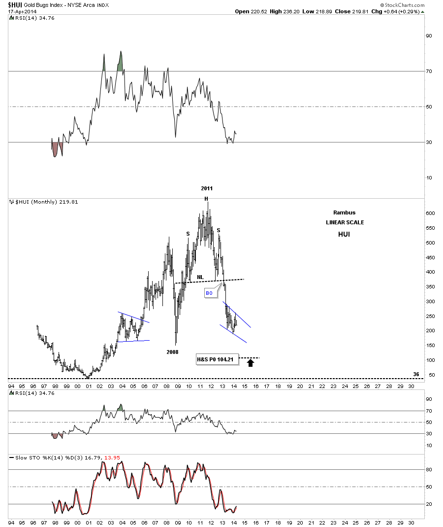
If you think trading in a bull market is easier then youre so wrong. The only thing different in trading a bear market or bull market is that you have more trading instruments on the bull side but its not any easier. Just take this long term chart for the HUI and invert it, turning it upside down. You will see one helluva bull market with a huge H&S base.
Its up to you on how you want to play this move, its a personal choice. All I can do is show you in real time when I buy and sell these stocks. The rest is up to you if you want to follow along. Trading in the stock markets can be a life changing pursuit that can change your life forever if you know what youre doing. They have changed my life in ways I never knew possible but I never gave up when the going got tough. It takes time and study to become comfortable with your decisions in the markets but the decisions you make are ultimately yours to live with. All the best
Rambus
http://rambus1.com/
| Digg This Article
-- Published: Monday, 21 April 2014 | E-Mail | Print | Source: GoldSeek.com

