

(Wed - Dec 24)
I have a busy night ahead but I just wanted to post a few long term charts to show you the relative nature of a chart pattern. I know most of you know that the bigger the consolidation or reversal pattern the bigger move to expect. If one is looking at a minute chart and sees a triangle the move is relative to that time frame. On the other end of the spectrum when you see a big reversal pattern, that takes a year or longer to complete, then you know the move is not going to be a flash in the pan. When looking at a big impulse move from the monthly perspective I like to use the black and white candlesticks that will general confirm the impulse move your are expecting or are currently in.
Lets start with the US dollar which broke out of its huge base four months ago already. Its hard to believe because we had to wait at least a year, since recognizing that big base, for the breakout to occur. You can see a string of six white candles, all in a row, telling us this is an important impulse move taking place. Also note the size of that big base. That is a huge base that tells us the US dollar is in a bull market that is going to last for quite awhile.
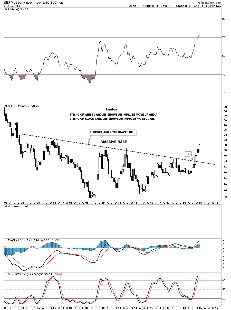
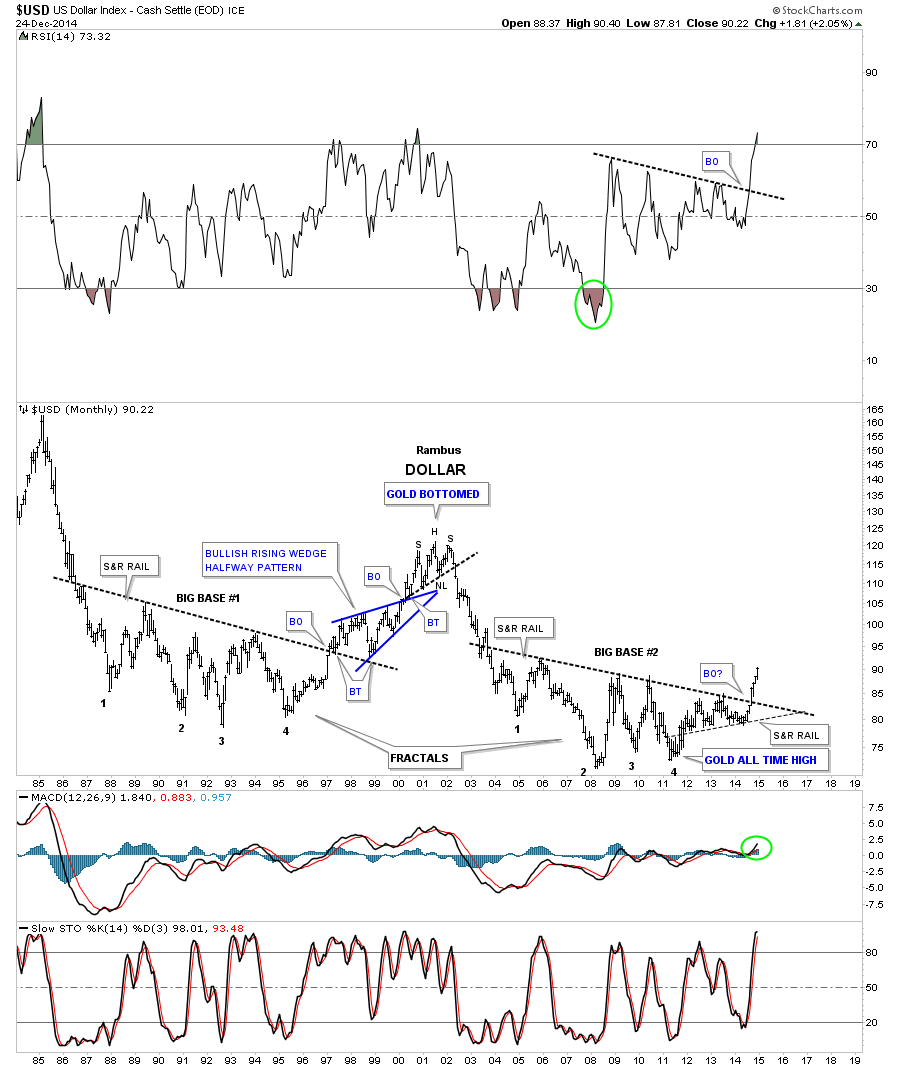
To give you an idea of what happened in a similar move for the US dollar we can look at a 20 year monthly chart that shows a fractal base that was made back in the 1980s and 1990s which took about three years to reach its bull market peak at 120 in 2001 or so once the support and resistance rail was broken to the upside.
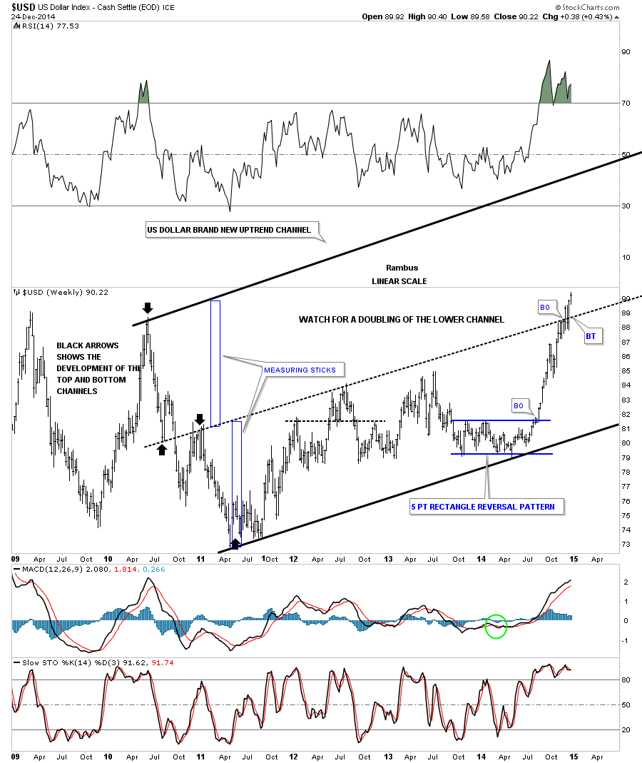
Before we leave the US dollar there is one more chart I would like to update that I showed you about a month or so ago where the US dollar could be doubling the size of its uptrend channel. I believe the dollar was just cracking the mid black dashed trendline. I said I would like to see some confirmation of the center dashed mid line if it got backtested from above and held. You can see the backtest was a little strong but held beautifully so far.
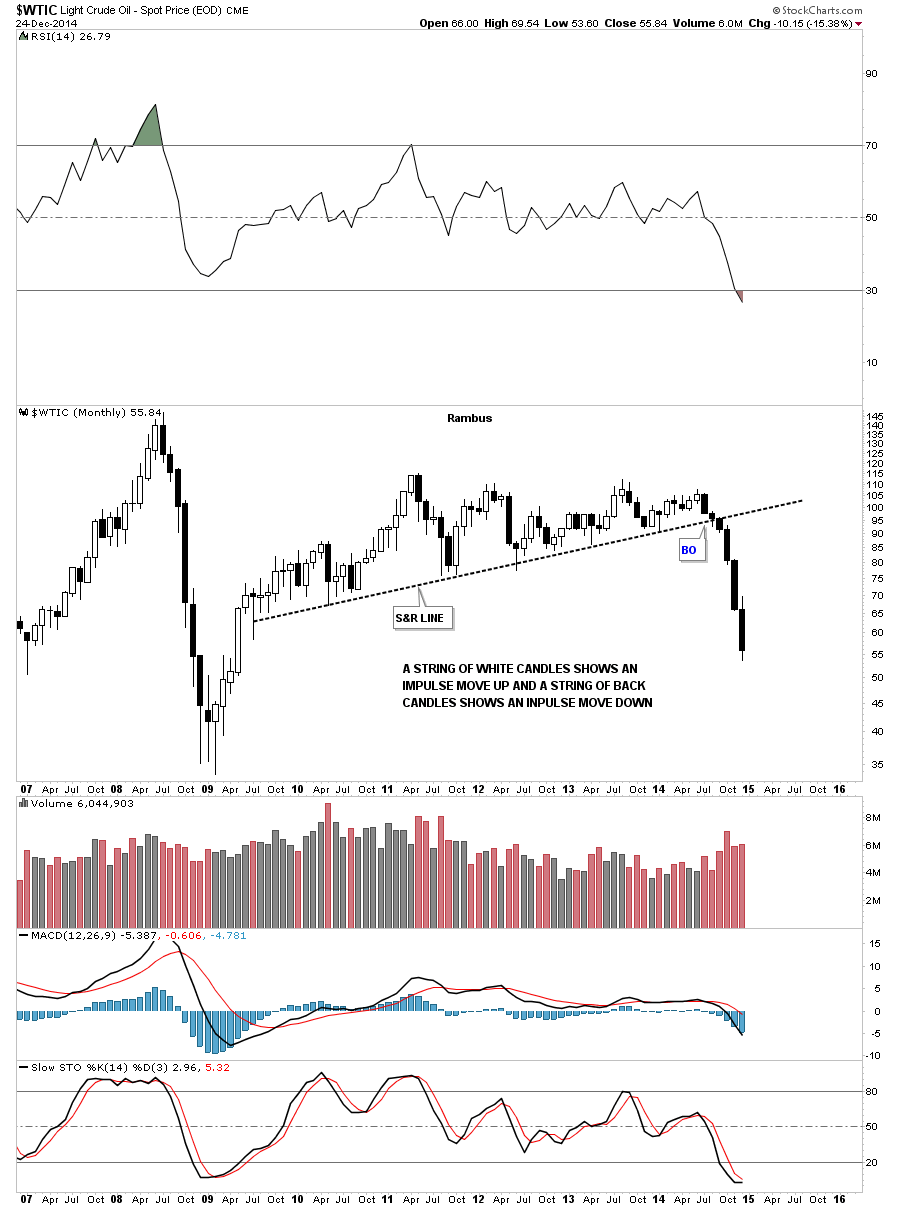
For those that think the US dollar isnt affecting the commodities lets take a look at a monthly chart of oil using the black and white candles. We counted six white candles on the US dollar which is also the number of back candles on oil. Coincidence? Again keep in mind the size of that huge topping pattern on oil which tells us to expect a big move down which were getting.
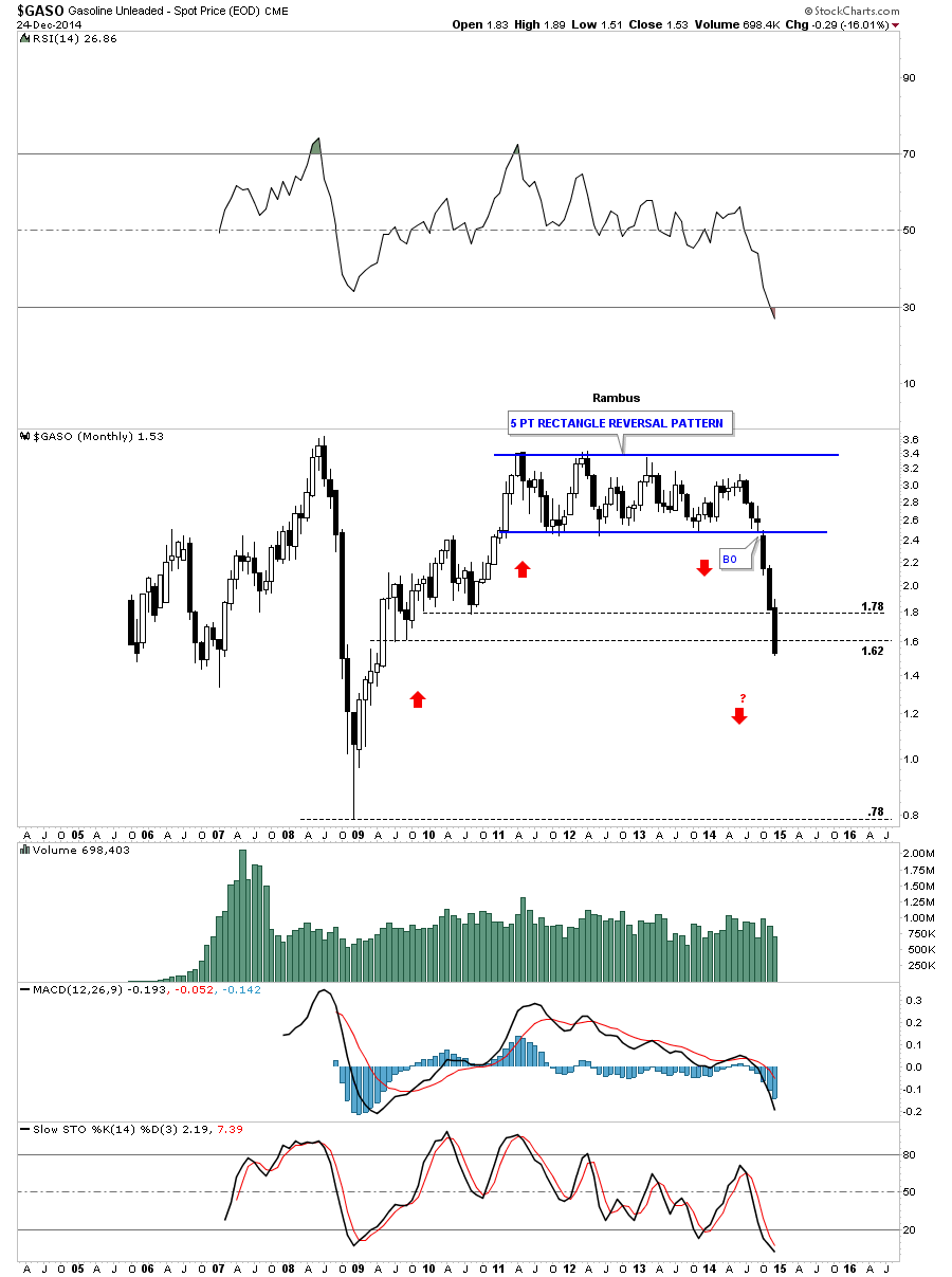
If you recall I showed you this monthly chart for GASO when it broke below the bottom rail of the blue 5 point rectangle reversal pattern. Count the number of black candles. I also showed you how the red arrows may show us some reverse symmetry to the downside relative to the way GASO went up. Were at a spot where we could some consolidation take place but until we do follow the price action.
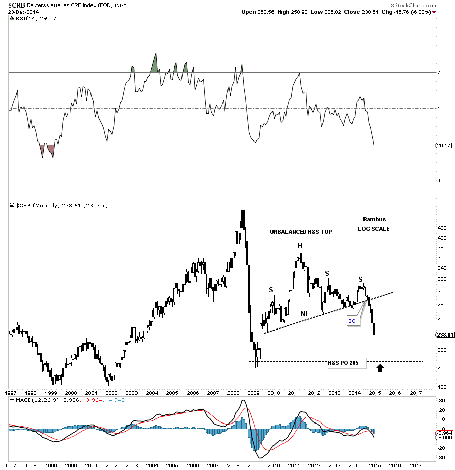
Lets take a look at the CRB commodities index and see how the US dollar is affecting it. Here you can see the CRB index has built out an unbalanced H&S top and now has six black candles, in a row, to the downside. That unbalanced H&S top is about 5 years in the making so we know the move still has a ways to go yet before it burns itself out.
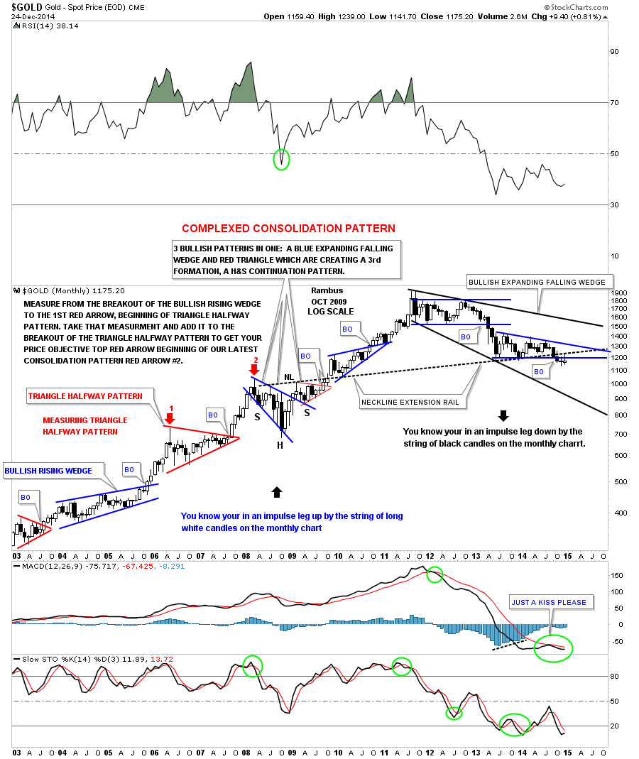
Below is a long term weekly chart for gold that I havent posted in probably close to a year or so which shows all the beautiful consolidation patterns that gold made during its bull market. This weekly chart also shows the black and white candles that accompanied the bull and bear impulse moves. During the bull market years, once one of the consolidation patterns broke out you can see the string of white candles that formed the impulse move. Where you see a black candle in the impulse move up there is a small consolidation pattern that shows up on the daily chart. Note the sting of black candles that formed during golds first leg down in its new bear market. If you look real close youll see one small white candle that formed just before gold broke below its big rectangle consolidation pattern back in April of 2013. As you can see since gold started it latest consolidation pattern, about 18 months ago, there is a mix of black and white candles that tells us the impulse move hasnt begun yet but when it does well see a string of black candles just like the first impulse move down off of the rectangle high. One last note on this weekly chart below. Notice the blue expanding falling wedge that formed as part of a complex bottom back in 2008. I think there is a good chance that we may see the final low for gold when it touches the bottom rail of the much bigger black expanding falling wedge which could turn out to be a huge halfway pattern in the secular bull market. Just something to think about right now. There is still a lot of work to do yet.
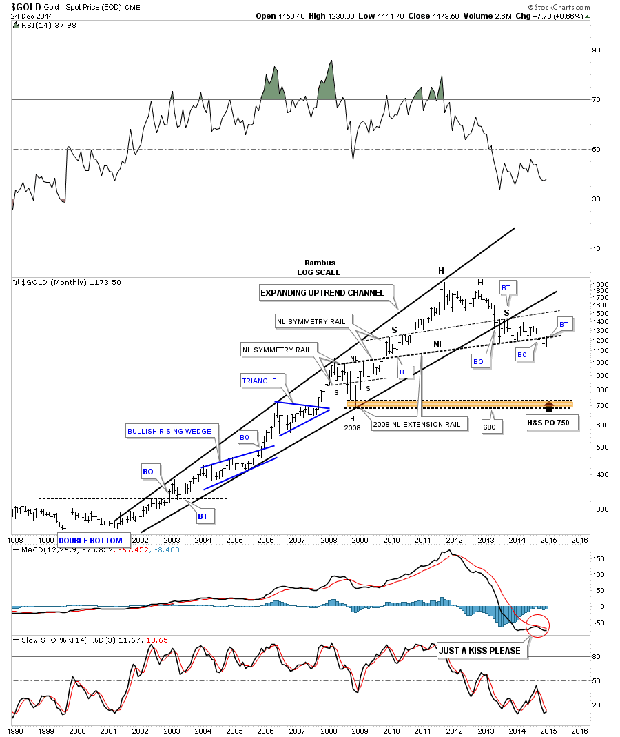
Below is a beautiful monthly chart for gold that weve been following for well over a year or so. This is the chart where I extended the neckline from the 2008 crash H&S consolidation pattern to the far right hand side of the chart, think reverse symmetry, labeled neckline extension rail. Note the last bar on this chart which shows gold backtested the neckline from below again this month. December marks the third month now that gold has been trading below that neckline.
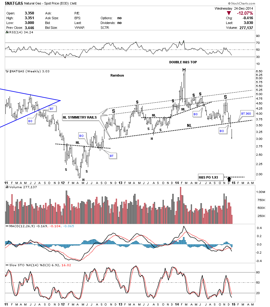
Lets look at one more chart for natural gas that shows the big H&S top that broke down last week. Keep in mind the relative size of that big H&S top that shows you this move down in natural gas isnt going to be a flash in the pan type of move. It took over two years to build out that H&S top and the impulse move isnt going to end in one or two weeks or months. Its all relative.
I want to wish everyone a Merry Christmas and a happy holiday season. I also want to thank everyone who has joined Rambus Chartology. I want to thank Sir Fullgoldcrown, Audept and my wife, who takes care of the Pay Pal accounts, because without these folks there would not be a Rambus Chartology. All the best Rambus.


