-- Published: Thursday, 23 July 2015 | Print | Disqus
By Rambus
There is a lot to go over tonight in regards to commodities and the precious metals complex. A while back I wrote a report on the commodities in general getting ready for the next possible leg down which will fuel the deflationary pressures that really took hold last about this time. Thats when the US dollar finally broke out of its massive base and charged higher topping out in March of this year and has been consolidating those gains ever since. Lets start by looking at the big base the US dollar broke out of last year at this time and the strong impulse move up as shown by the string of white candlesticks. Thats what a strong impulse move looks like when all the pent up energy finally has a change to escape.
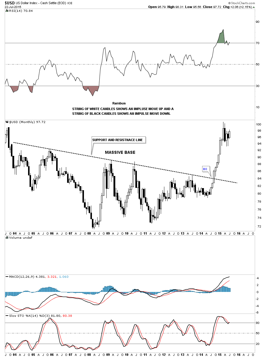
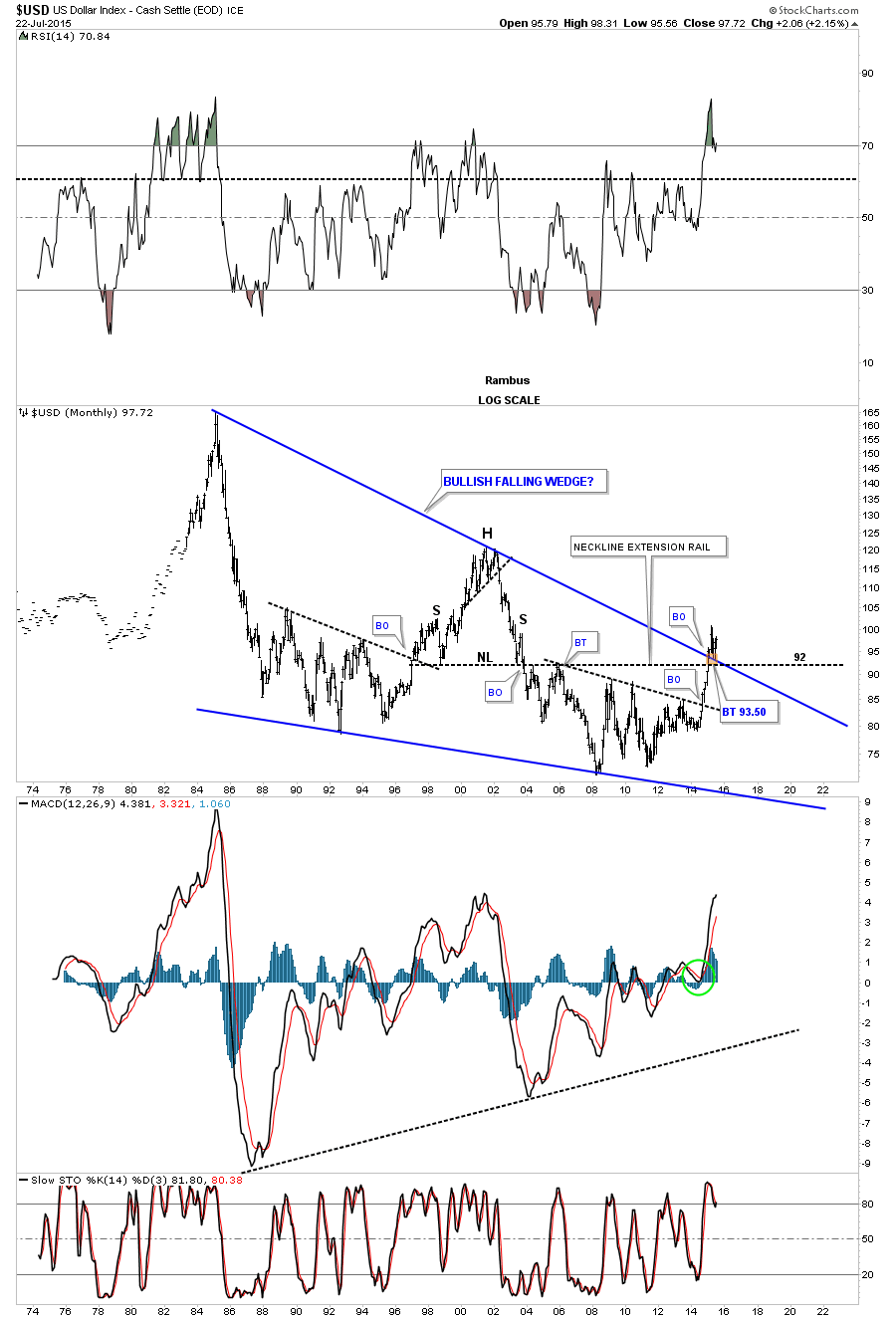
That powerful impulse move out of that big base was strong enough to take out a very long term trendline going all the way back to 1985 or so. That thirty year top rail of the bullish falling wedge has now reversed it role to what had been resistance to now support during this consolidation phase the US dollar has been going through since March of this year.
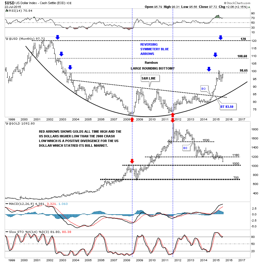
Below is a 15 year combo chart that has the US dollar on top and gold on the bottom. Notice how the US dollar is reversing symmetry back up based on the decline that started at the 2000 top as shown by the blue arrows. Once the dollar takes out our current high the next area Ill be looking some resistance to show up will be the 108 area. This combo chart also shows you the big positive divergence the US dollar had with gold which was the first real big clue for me that the dollar was ready to rumble. Note the low for the US dollar in 2008 and the high for gold which was normal at the time. From that point in 2008 gold almost double in price but the US dollar actually made a higher low vs the 2008 low. Thats what really got my attention. Note the last bar on the monthly gold chart which is now trading below the previous lows of the last two years. They say a picture is worth a thousand words but I think this combo chart is worth a whole lot more.
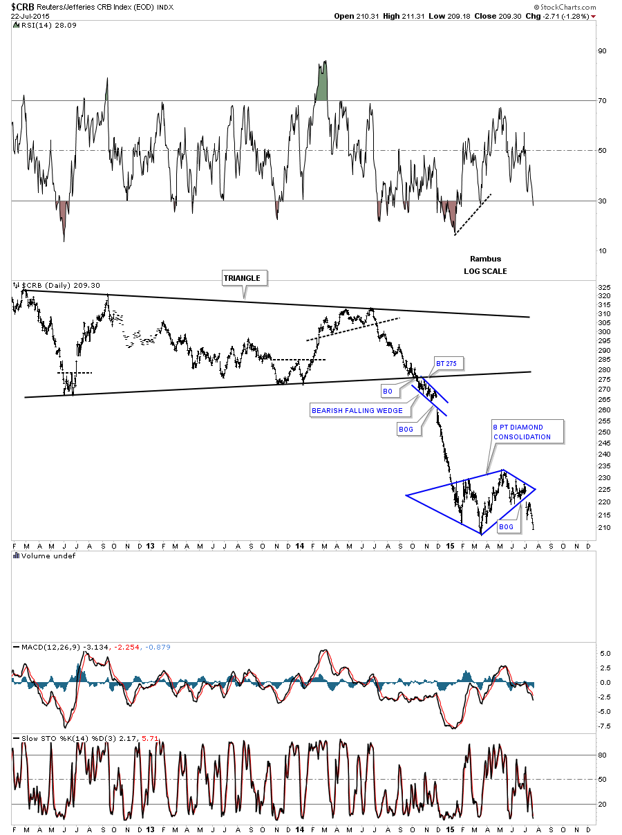
Knowing what the commodities did during the US dollars big impulse move out of that big base, lets review some of the commodities indexes I showed you a while back, when I suggested the the other shoe maybe getting ready to drop in regards to the ongoing deflationary spiral. The first chart is a daily look at the CRB index which gapped out of an eight point diamond consolidation pattern. Its now approaching the low made back in March.
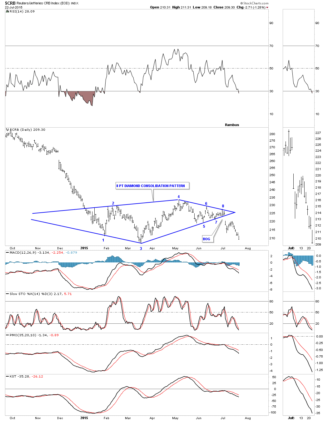
Stepping back about four years or so you can see how the diamond consolidation pattern fits into the big decline. Im viewing this diamond consolidation pattern as a halfway pattern to the downside. Notice the decline that occurred during the first impulse move down out of the big black triangle. I expect a similar move to take place that matches the first leg down in time and price. It doesnt have to be exactly the same but we can use it as a guide to let us know where were at once the impulse move breaks the March low.
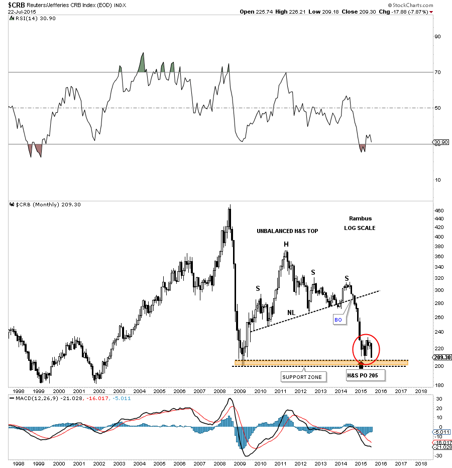
Below is a long term monthly candlestick chart which shows us the massive H&S top the CRB built out before the first impulse move down I showed you on the daily chart above. The diamond, red circle, has formed on a very important support and resistance zone, brown shaded area. As I have shown you many times in the past a stock will make a small consolidation pattern just above an important support and resistance line before it finally breaks it. The moment of truth has now arrived for the CRB index. One last note on this long term monthly chart for the CRB index. With the US dollars monthly candlestick chart I showed you a string of white candlesticks in its strong impulse move up. Here you can see this monthly chart for the CRB index shows a string of black candlesticks during its first impulse move down showing us the inverse correlation is alive and well.
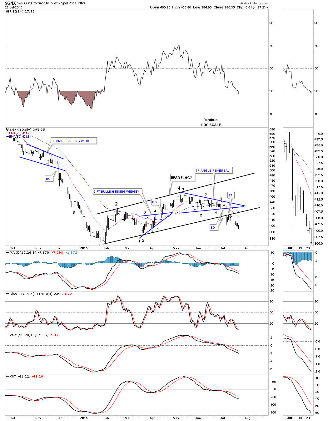
Another commodities index I follow is the $GNX commodities index. This index bottomed out a bit earlier than the CRB index as it first bottomed in February of this year. This daily chart has some very nice Chartology which is showing us a seven month black bear flag that is made up of bullish rising wedge and a triangle reversal pattern. The breakout from the bottom rail of the bear flag was picture perfect with a nice clean backtest.
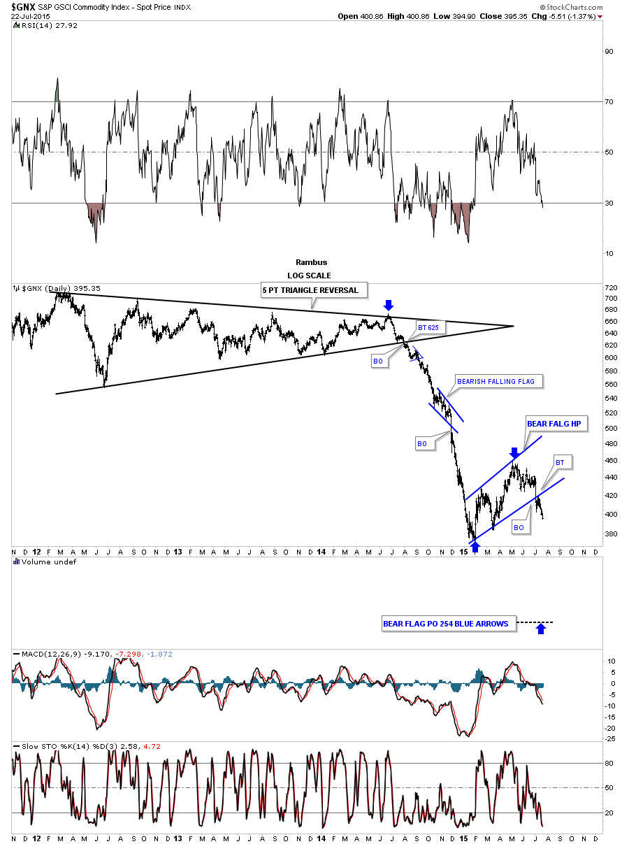
The long term daily chart for the GNX puts the bear flag in perspective within the context of the big move down out of the black triangle. Longer term members should remember the little blue bearish falling flag that formed roughly at the halfway point in the first impulse move down that was also showing up on most of the currencies at the time. I know it seems impossible that we could experience another leg down equal to the first impulse move down with the blue bear flag showing up somewhere in the middle but until something changes this scenario this is my game plan.
Now I would like to show you some charts for the energy sector to give you a feel on how we maybe just at the halfway point in this next deflationary episode. The first chart is daily look at the $SPEN which is the SPX 500 energy sector chart. As you can see it bottomed out in December of last year and has consolidated that decline by building out a seven month bear flag. Again it had a perfect breakout and backtest before moving making new lows for this move.
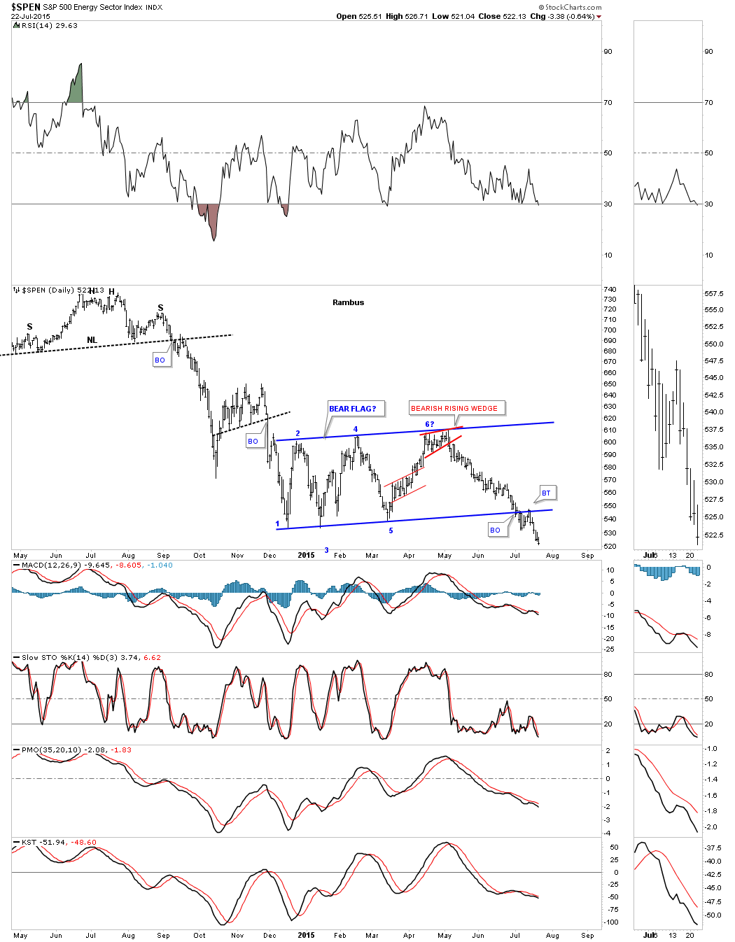
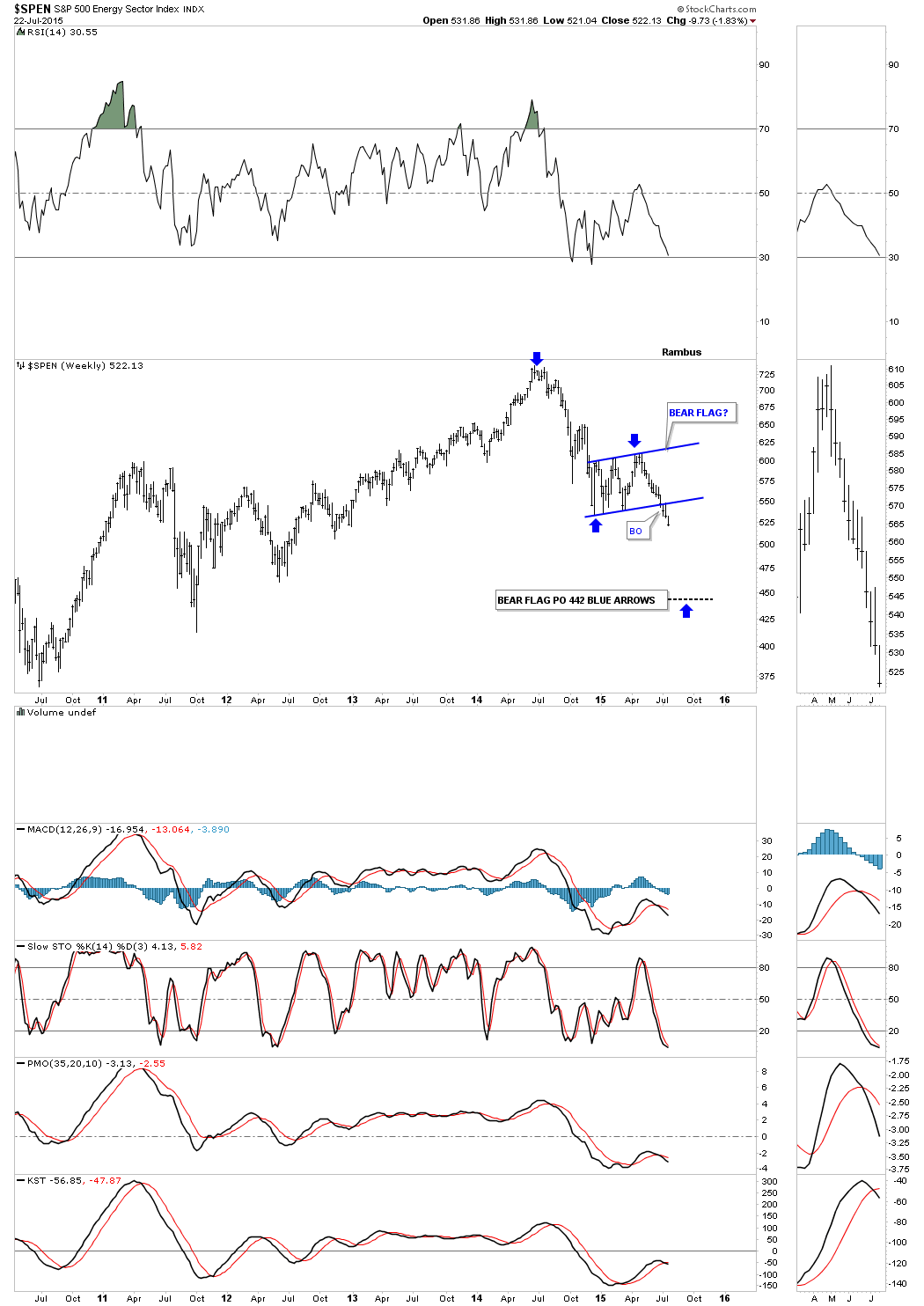
To put the bear flag in perspective we need to look at the weekly chart. The blue arrows shows how I measured for the price objective which I call the impulse method.
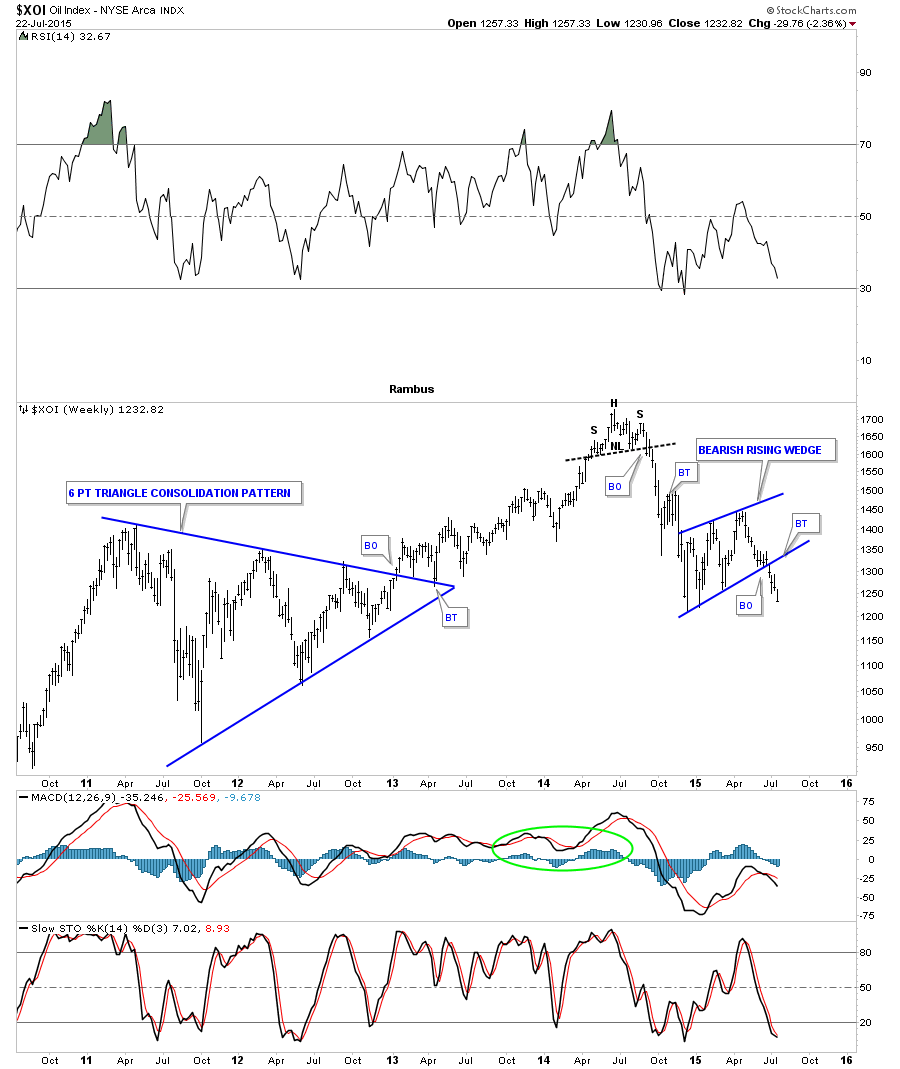
The $XOI, oil index, shows a bearish rising wedge complete with breakout and no backtest.
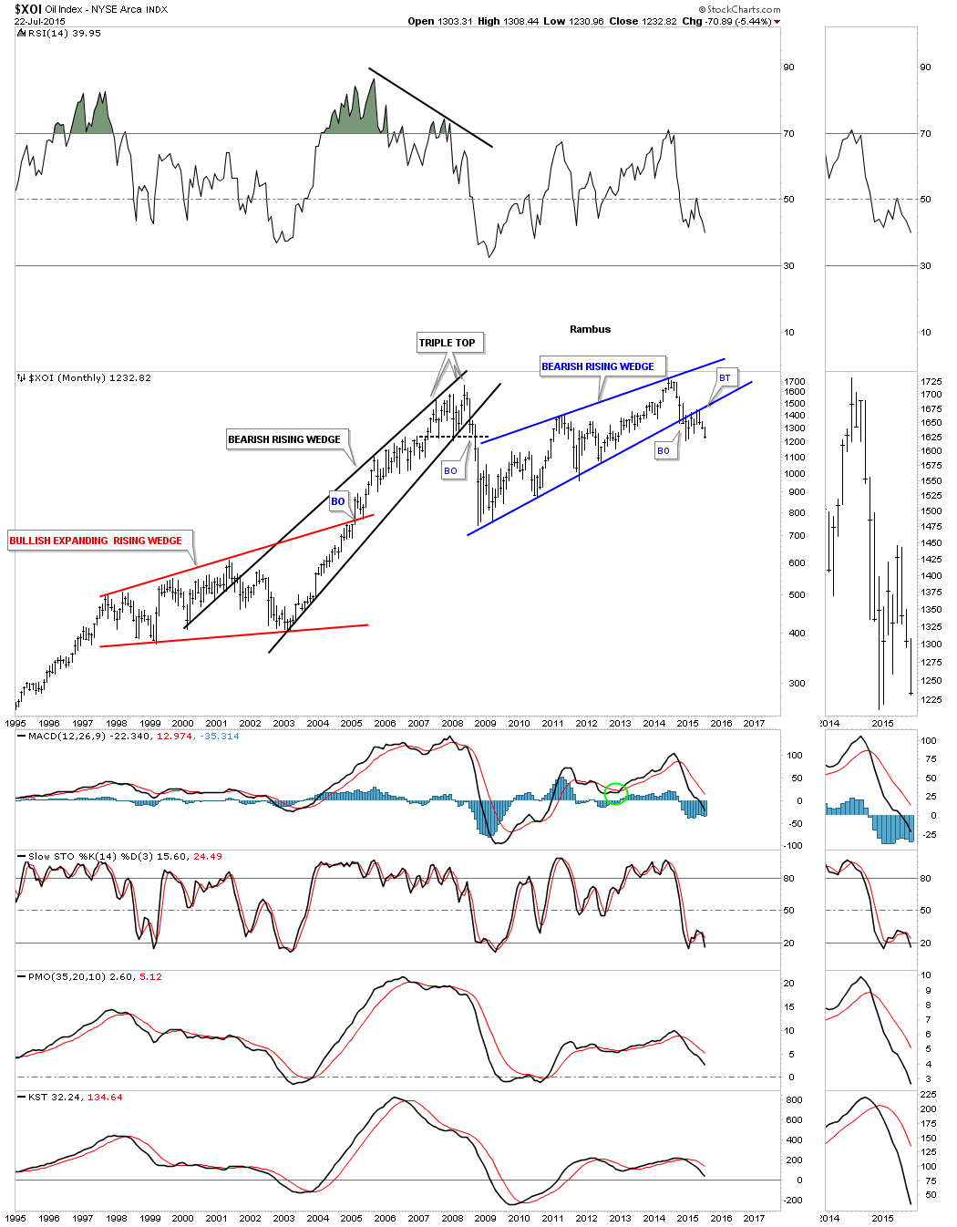
The very long term monthly chart for the XOI shows you just how dire the situation is for the index. The bearish rising wedge I showed you on the weekly chart above is just the backtest to the bottom rail of a massive bearish rising wedge reversal pattern. Note how the bottom rail of the blue bearish rising wedge held support for six years but once it was broken to the downside it reversed its role to resistance that held for six months or so.
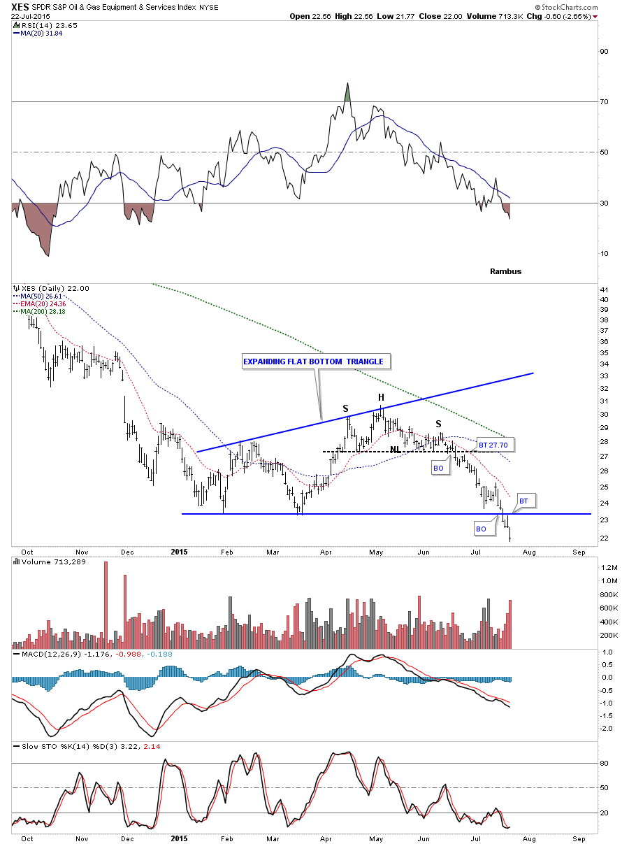
Before we move on to some precious metals charts I would like to show you one more chart that is just starting to breakdown and that is the XES, oil service index. It has formed a flat bottom triangle consolidation pattern and has just recently broken below the bottom rail which is leading the oil sector lower as its making new lows for this move.
Now I would like to update you on some the precious metals stocks weve been following very closely. The first chart is a weekly look at gold that shows the parallel downtrend channel with the black and pink rectangles that measures time and price. Ive been saying, in order to keep the symmetry going vs the impulse move out of the 2013 six point blue rectangle, I would like to see our current blue bearish falling wedge break the bottom rail by the middle of July. After two years of consolidating that first impulse move down gold finally broke below the bottom rail of its bearish falling wedge halfway pattern on Monday of this week with a nice breakout bar. I cant rule out a backtest to the bottom rail but if we do get one it should come in around the 1110 area. Long term members know that Ive been waiting for this breakout for a very long time.
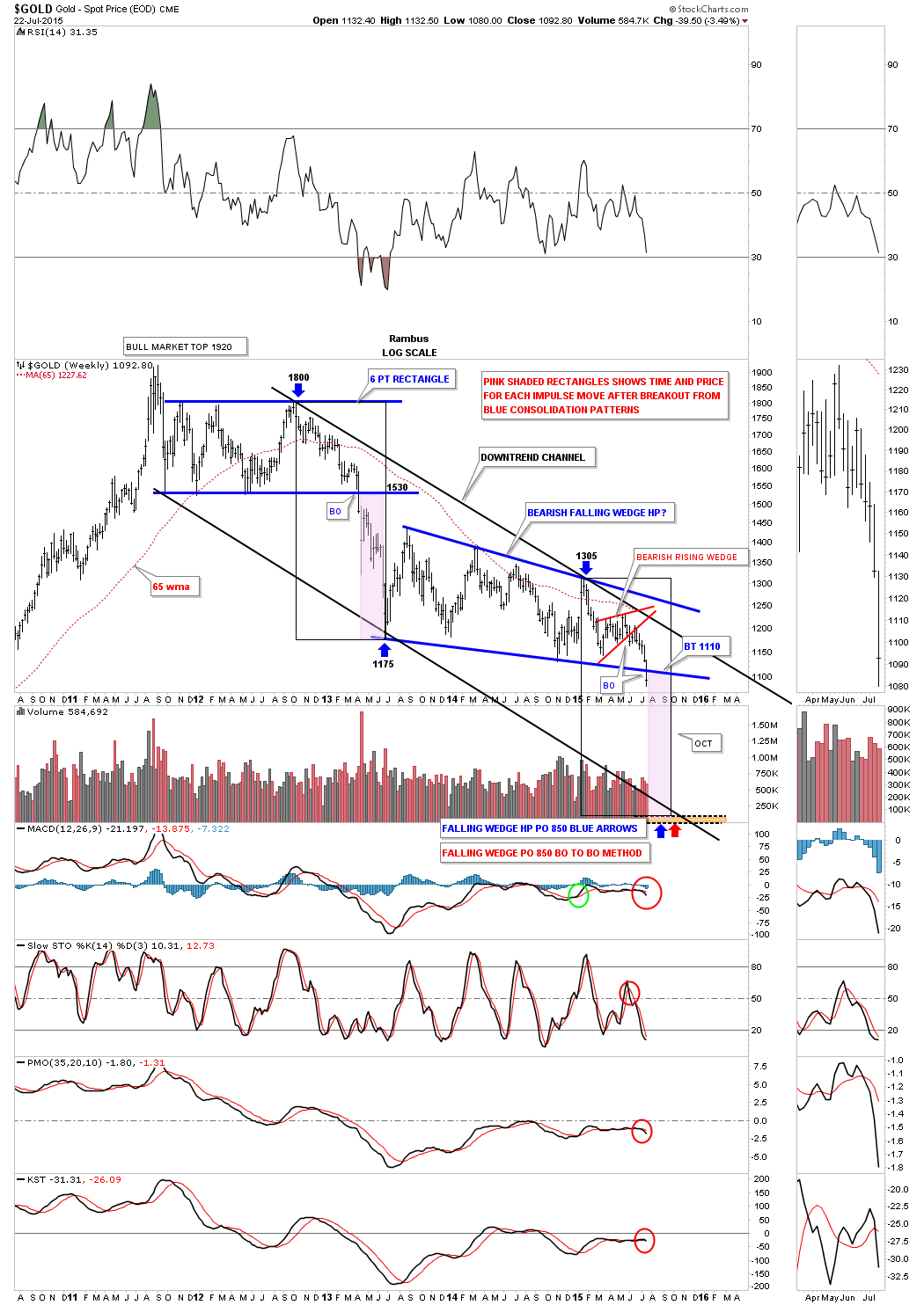
We still have two more days to trade yet but this weekly line chart shows the breakout that is underway. A weekly closing below the bottom rail would be very positive.
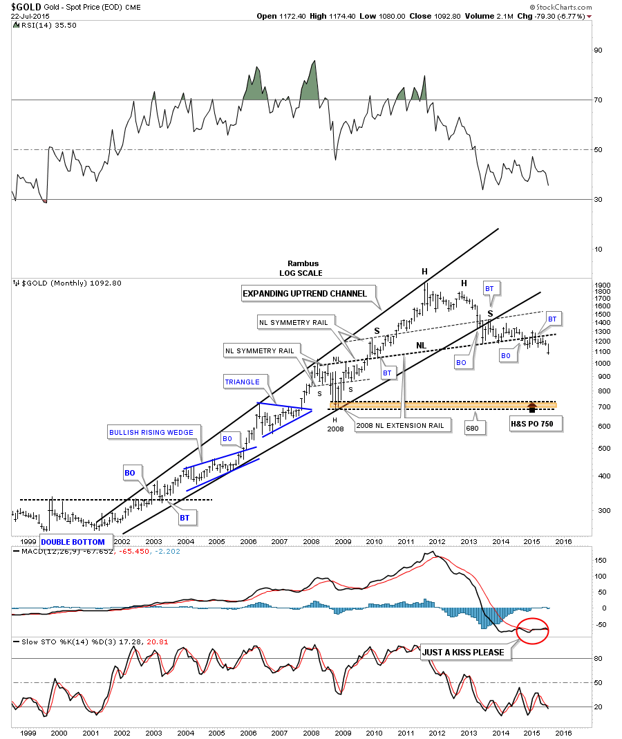
The very long term monthly chart for gold shows the massive H&S top that actually started to build out in 2010 and broke below the neckline just over a year ago and has been in backtest mode until recently. You can see the price action is now starting to fall away from the neckline now beginning its impulse move down to the possible brown shaded support and resistance zone. From a Chartology perspective the massive H&S top is a classic. Note how the left shoulder and head formed inside the expanding rising wedge, which was the bull market. Once the bottom rail was broken to the downside the backtest formed the right shoulder which we watched in real time what seems like an eternity ago.
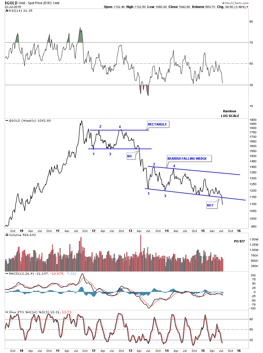
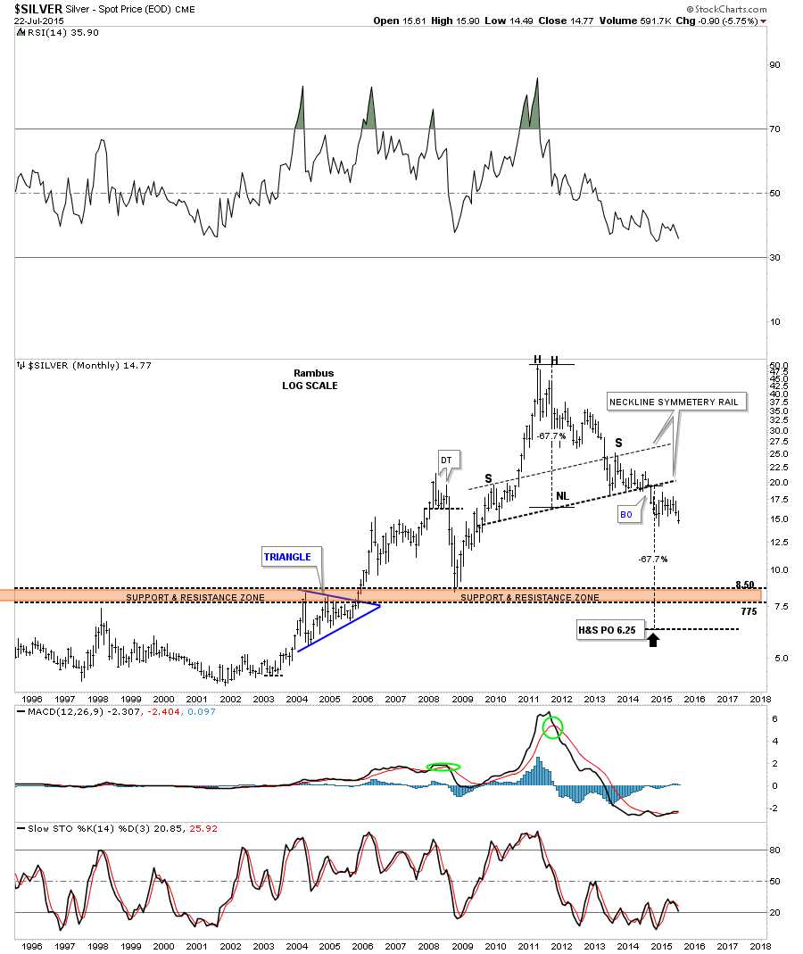
The monthly chart for silver shows a similar massive H&S top to match golds. It has some beautiful symmetry as shown by the neckline symmetry rail that shows the height for the left and right shoulders. The last time I posted this chart I said I would expect silver reaches the brown shaded support and resistance zone. But the price objective shows an even lower possibility.
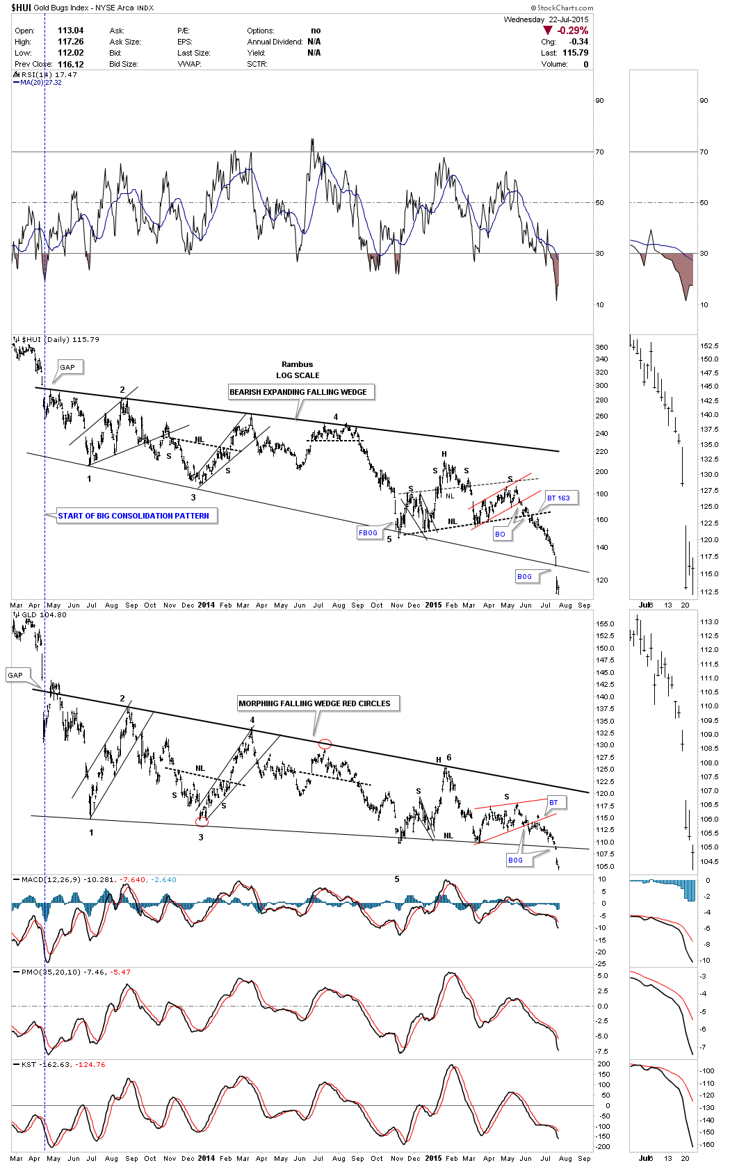
This next chart is a combo chart that Ive been posting about once a week or so so you could follow the price action in real time. As you can see both the HUI and gGLD both broke below the bottom rails of their two year consolidation patterns this week with a big breakout gap. I wish I could rule out a backtest to the bottom rail but its still a possibility.
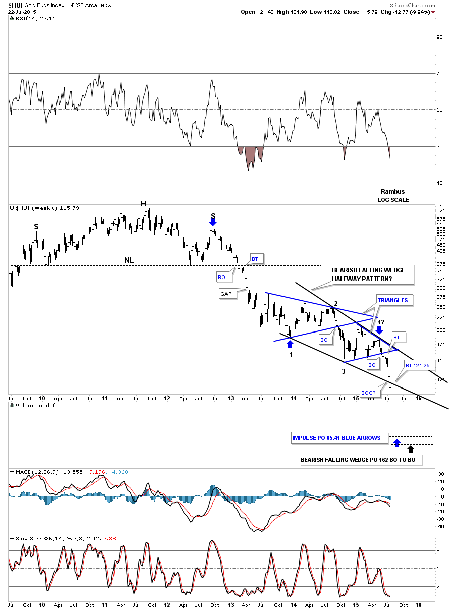
Below is a weekly chart for the HUI which is showing a possible bearish falling wedge which gapped below the bottom rail this week adding another clue to the possible validity of this potential halfway pattern. A backtest would come in around the 121.25 area for confirmation if the bottom rail is the real deal. I have taken a great deal of flak over the years from chartists who insist there is no such thing as a bearish falling wedge . As I have pointed out many times , these down sloping patterns Do often breakout in the direction of the trend . They appear in strong moving markets . To review you can read this Post , which is buried in the Timeless Tutorials section Wedges , Facts and Fictions http://rambus1.com/?p=9256 Now see below a very interesting chartology pattern , The Bearish Falling Wedge . This one is made up of several contributing patterns . As the saying goes The Whole is greater than the sum of its parts .
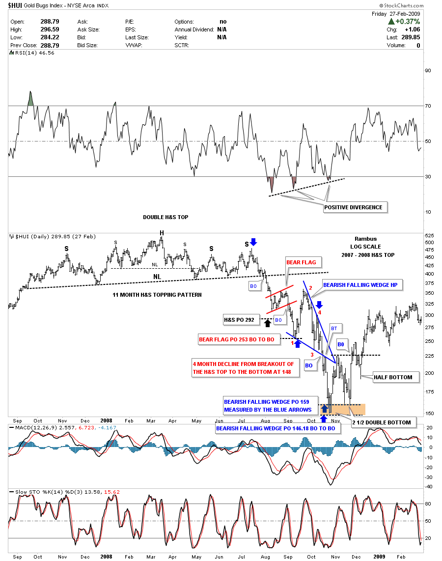
Just so you know that Im not totally crazy for thinking the HUI could be building out a bearish falling wedge halfway pattern below it the 2008 crash in the HUI. Note the double H&S top that led to the 2008 crash. After forming the little red bear flag halfway pattern the price declined down to its price objective at 253, first blue arrow point up, which was the first reversal point in the blue bearish falling wedge consolidation pattern. Note how volatile the price action was when the blue bearish falling wedge was building out. The breakout was and backtest were right on the money which led to the ultimate bottom. Is history going to repeat again?
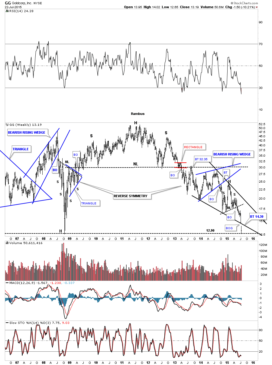
I have just enough time to update you on several PM stocks that are building out their own bearish falling wedges. Keep in mind that bigger chart patterns can be made up of several smaller ones when you look at these charts. GG formed a blue bearish rising wedge which broke down and then built out a H&S consolidation pattern which shows a potential bearish falling wedge that broke below the bottom rail this week along with the HUI.
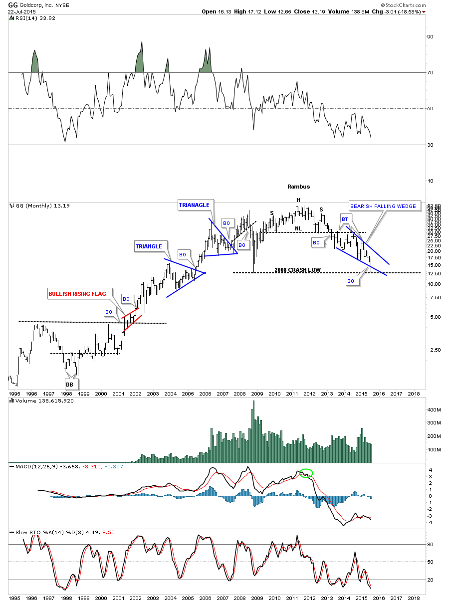
The monthly look for perspective which shows GG trading right on the 2008 crash low.
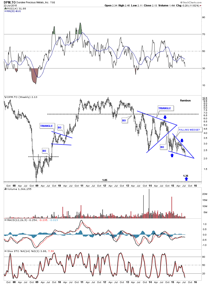
The weekly chart for DPM.to shows the price action sitting right on the bottom rail of its bearish falling wedge.
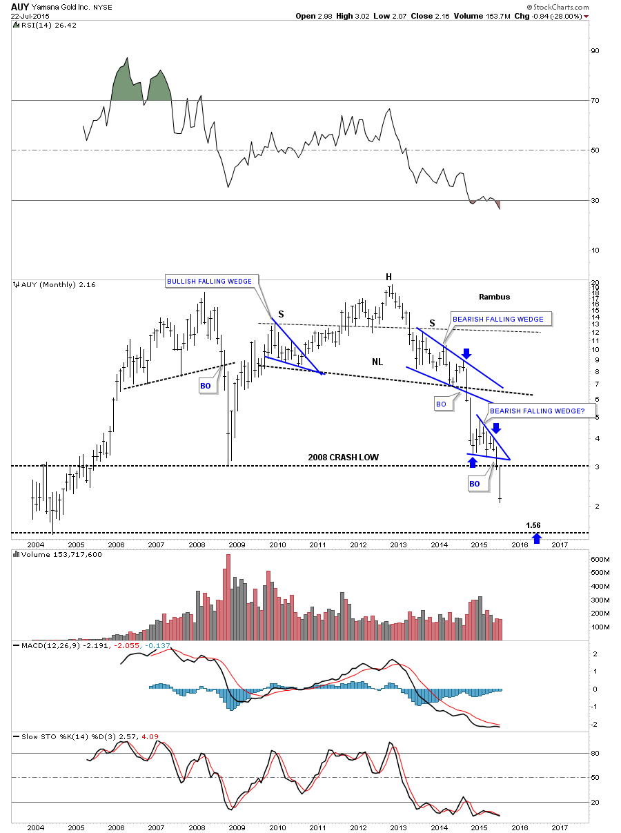
AUY broke out of its red bearish falling wedge about a month ago after forming a bigger blue bearish falling wedge last year.
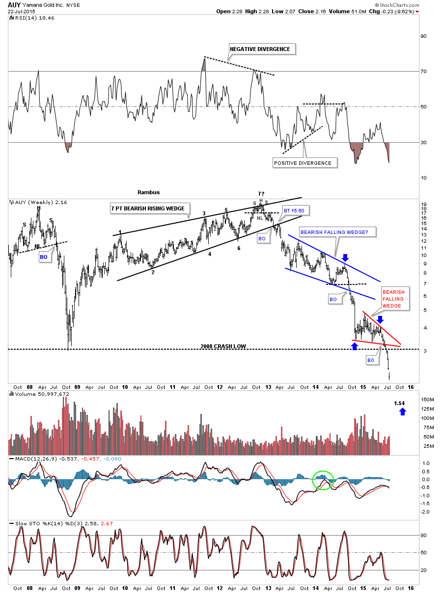
The monthly chart for AUY for perspective.
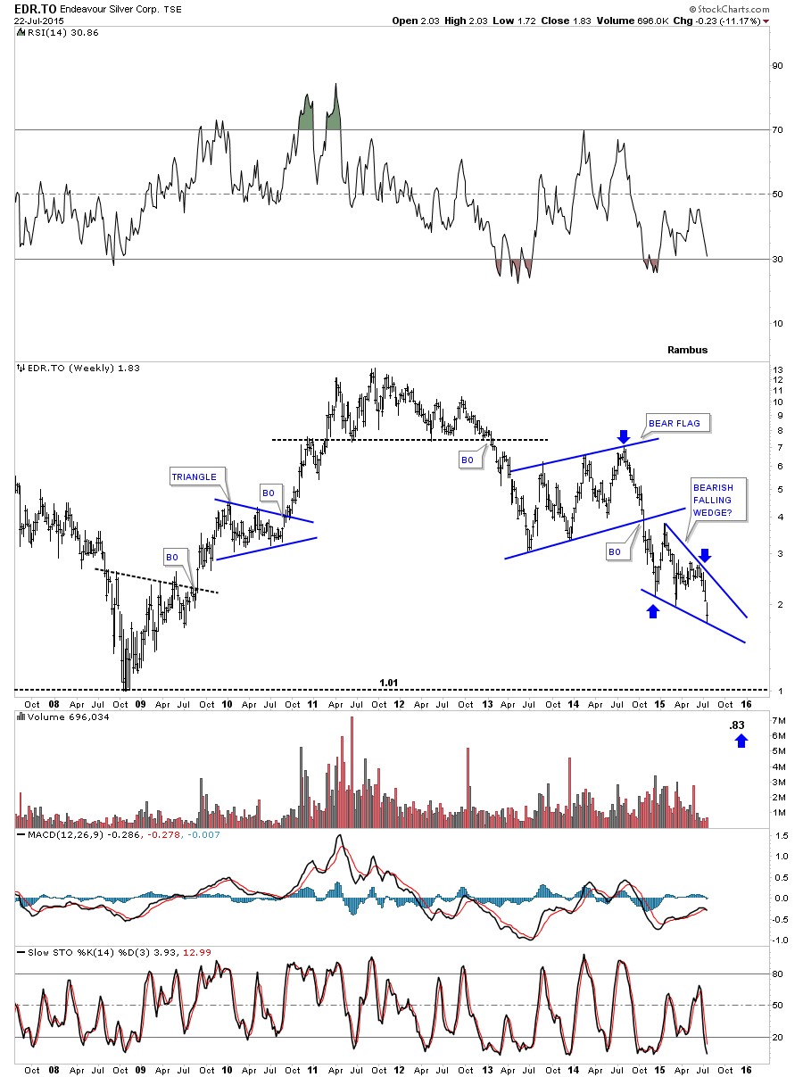
EDR.TO is testing the bottom rail of its possible bearish falling wedge.
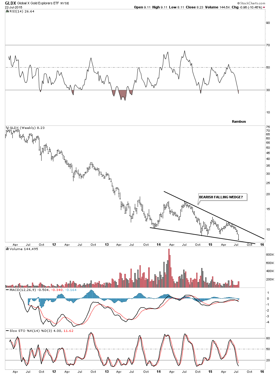
GLDX is testing the bottom rail of its potential bearish falling wedge.
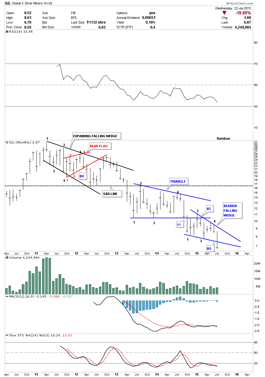
SIL cracked the bottom rail of its potential bearish falling wedge this week.
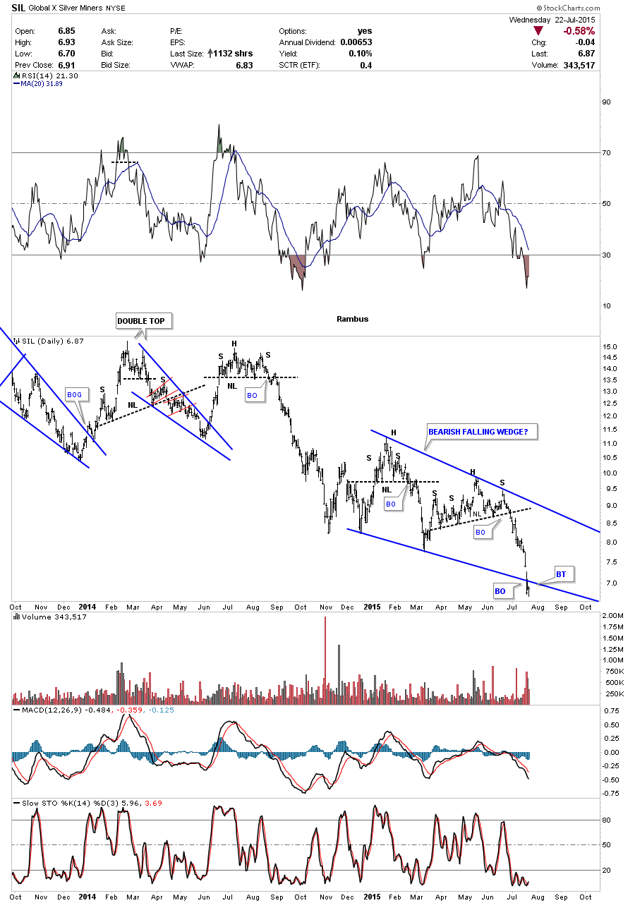
The long term monthly chart for perspective.
All these charts above should give you a feel for what maybe taking place right here and now in the commodities complex. It appears to me that the second leg down is now underway. Outside of a possible backtest in some cases most of the consolidation patterns have already broken down. Were living in interesting times to say the least. All the best
Rambus
http://rambus1.com/
| Digg This Article
-- Published: Thursday, 23 July 2015 | E-Mail | Print | Source: GoldSeek.com


