-- Published: Wednesday, 23 March 2016 | Print | Disqus
![Is the US stock market a caged bear? [By Philip Timms [Public domain], via Wikimedia Commons]](http://thegreatrecession.info/blog/wp-content/uploads/CagedBear.jpg)
Compare the Great Depression to the Great Recession, and youll see a similar pattern in how the Dow Jones Industrial Average graphs out. That pattern appears to be repeating now. The nations most notorious stock market crash in 1929 did not occur as a single fall off a cliff, but started with high points that rounded downward as the market bounced off a lowering ceiling; then it experienced a sharp plunge for about a month, then rallied, and then it experienced the huge crash weve heard about all our lives. After that, it experienced many more rallies and crashes before it found its absolute bottom.
What people forget is that each of the cliffs was made distinct by brief rallies and sometimes by extended rallies in between. The Great Depression was never a smooth path to the bottom.
Graph of the stock market crash of 1929 The Great Depression
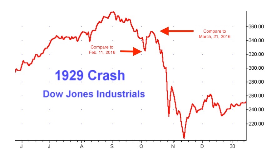
Heres a graph of the dailies leading up to the Great Crash of October 1929 the first big drop of many that constituted the Great Depression. Notice that the stock market in 1929 rounded off at the top, took an initial small plunge that lasted about a month, recovered back to the downward curved trajectory of its highest points, then rounded down more sharply and finally fell off the great cliff that became known as Black Tuesday or the Crash of 1929. Then it spiked way up over the course of a week, only to fall deeper into the abyss over the next half month. And that was just its first crash on the long road to despair.
The crash I am expecting for the Epocalypse looks like that kind of bouncy fall into the abyss. Compared to the total abyss I think we are falling into, the bottom of Januarys first plunge looks for scale like that first plunge the stock market took in 1929 before it rallied only to round downward more steeply and then go over the cliff. (The current rise in February and March is only a little higher than the first rally in 1929 as a percentage of the market.)
To put that in a little more perspective, here is a slightly longer period that includes the crash of 1929, but gives more context:
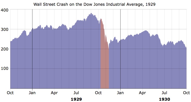
Immediately before the recessionary area shaded in mauve that surrounds the 1929 crash of the stock market, you see that the market fell off and then recovered. The big fall began playing out right after that first rally. The market started going down quickly (in the mauve zone) and finally crashed off a cliff near the end of October. That first little dip and uptick right before the mauve zone is where I think we are now.
The fall from the highest point in 1929 is January of this year. The little rally is February and March (a little bigger and longer than the rally of 29, but not much bigger as a percentage of the total market today). That gives you a sense of the scale of things that I believe are still to come. By the time the crash of 29 ended (end of the mauve zone), the market had only lost about 50% of its value. It still had a lot further to work its way down in 1931 and 32 (see graphs that follow).
Graphed even longer term and expressed as stock prices per share, the crash of 1929 looked like this:
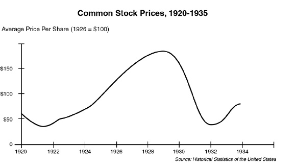
A graph of the stock market crash of 1929 over the longer term.
You can see that, as Ive been saying about the Epocalypse I envision, these kinds of major crashes play out over a fairly long timeframe. The damage doesnt all happen in a day or month or even a year. Though we speak of Black Tuesday or the Crash of 29, the real damage only began in 1929, and the US stock market didnt reach the belly of the abyss until 1932, by which time it erased all the gains of the roaring twenties.
In other words, the REALLY BIG crashes, happen like this when you string the rises and falls together:
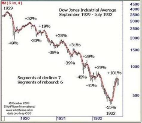
Graph of the series of stock market crashes from 1929 to 1932.
The Great Depression looks more like a run of steep rapids, and its biggest drop of all (on a percentage basis) did not happen until 1932! (The importance of looking on a percentage basis is that a 100-point drop in the market means you lose half of your money if the market was only at a total of 200 points; but when the market is at 20,000 points, a 100-point drop is only a loss of half of a percent of your money. So, the percentage of the market lost in each drop can be more important than the actual number of points lost.)
When I talk about the Epocalypse, Im talking about that full run of waterfalls and rapids all the way to whatever the final bottom is, not the first crash. As you can see, after each plunge, a rally broke out. The market didnt fall, go flat and then fall again. Every time it crashed, it bounced way back up and then fell again. (Two steps down, one step up; two steps down, one step up.)
I see this Januarys nose-dive as that first almost-invisible dip you see at the top of the Great Depressions massive run of waterfalls. The market rounded downward in late November and December, and took its first drop into the Epocalypse in January. It made people feel woozy for its small size because it is part of something much bigger, which they sense but dont grasp. February and March brought the first rally. Many feel the bear has been caged by this rally. I dont think so. Not by a long shot.
When you look at the Great Depression, you can see how something like the Epocalypse I have been describing cannot be assessed by the first drop over the edge. It is a far greater beast that is the sum of many drops, but the first one made us dizzy enough to get some major attention. That ought to tell you how big the whole monster is.
Now lets look at the most recent global economic collapse to see how the Great Recession, which we all easily remember, compared to the Great Depression.
Graph of the stock market crash of 2008-2009 The Great Recession
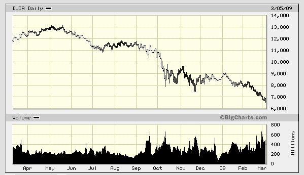
Chart of crash of the Dow Jones Industrial Average in 2008 and 2009.
In this case, you can see the market rounded off twice before it fell over the cliff, and the rounded top had a lot more duration than in 1929. Otherwise, this graph doesnt look much different than the purple graph above of the initial years of the Great Depression, other than the double rounded top. After finally falling off the cliff in October 2008, the stock market rallied sharply, recovering about half of its fall over the cliff; but, from there, it bounced its way on down the rapids. The total collapse actually took over a year to fully play out.
Graph of the stock market crash of 2015-2016
so far
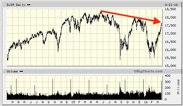
Keep in mind, we are only looking at the very top of the market in this graph (in that the graph starts at the 15,000 level, not at zero.) The drop in January was about 10% of the total height of the market (if you were to extend the graph down to see the full height of the market), which correlates to the tiniest (barely visible) blip in the percentage graph above of the Great Depression because the scale on that graph is logarithmic in order to show the markets full height and to show each drop as a percentage of total market value at the time of the drop.)
Right after the big October Surprise of 2014, which I also predicted, the bull market began to die a slow death. It rounded over the hill and finally fell off a cliff in August of 2015. (Some people still talk of the bull market today as if it exists, but they obviously need new prescriptions for their reading glasses because they cannot see a simple graph that shows the market has been falling for months and months. There has not been anything remotely resembling a true bull market for well over a year. Talk of a bull market, as if it still exists, is lower than ludicrous.)
The Dow rounded off to its highest point in June of 2015. From there, its high points establish a consistent downward trend for the markets absolute ceiling. The Dow fell off a cliff a second time in January, 2016, but it has now recovered to a high point that matches up with the downward trend of the markets ceiling. (So, in my view, we are still in a declining or bearish market (as measured by the Dow), even today, as we have not broken out of that trend.) The question that remains is whether the US stock market will break through that declining trend and become a new bull market as some are saying.
The graph of todays market doesnt look exactly like the graphs of the 1929 stock market crash or the 2008-2009 crash. The duration of a rounded top is longer than in 29, and the first bounce up after the first cliff is a little higher than either 1929 or 2008, as is the bounce after the second cliff. Id point out, however, that we have never experienced a market crash in such an artificial environment as the present; so it wouldnt make sense to demand an exact match.
While the Fed has started to reverse its course on market stimulus, we need to remember that that we are still in a period of some of the most enormous stimulus we have seen the Federal Reserve deliver in its history. While quantitative easing has stopped, we continue to hover near zero interest, which is more intense stimulus than the Fed typically applies even in a bad recession. The Fed also continues to maintain the huge money supply it created under quantitative easing. (While it has stopped Q.E., it hasnt reversed all money it created.) We are crashing this time while already being given a stimulant high! That is a first in the world of economics. The mere thought of that should scare you.
Naturally, things are going to look a little different with so much stimulant already coursing through our veins and so much money still floating around; but the rounded tops, the downward trends, the sharp falls followed by sharp rallies, still make a pretty close match to our two previous biggest crashes. What I see in the overall trend of the current market is a stock market that REALLY wants to crash (if you follow the highest points it has been able to reach), given the amount of stimulus that it is still mainlining.
The point I want to make with the graphs, however, is not that one pattern proves another will follow but that big crashes are not usually shaped like sharp peaks. They do not graph out as a long rise with an immediate drop over the cliff. Things do round off first. (So, those who are saying, Ah, youve missed your call on the Epocalyspse are premature in their own call.) The other point I want to make is that the first drop off the cliff (even when it is as infamous as 1929s Black Tuesday is
1) only one of many, 2) not usually the worst of the many falls, and 3) always broken up by bear-market rallies.
Im not big on predicting the market with graphs, but I want to illustrate that the markets recent behavior and present position remain in line with the way one would expect a major crash to begin. If you look at the graph of the infamous crash of 29, you will see that, after that cataclysmic plunge, the stock market bounced right back up to the declining trend line of its previous high peaks. (Just like where we are now in 2016.) My point is that the current market hasnt caged the bear yet. One could say, The bear is in the cage, but the door aint shut. Today (Tuesday, March 22nd) we see the Dow ended its seven-session rally and fell again exactly as it hit that declining trend line for its ceiling. Yesterday, it slipped to stall speed. Today it fell.
That could, of course, be a fluke due to todays terrorist bombing in Brussels, but my point all along has been that there is so much bad news in the hopper due to the war-ravaged Middle East, conflict with Russia, oil prices, Chinas crash, Europes recession, Canadas recession and massive debt time bombs everywhere that expected bad events and true black swans (deadly events that swoop in out of nowhere) are abundant in opportunity. More so than at any time I remember in my 56 years of living.
So, this question about the latest rally remains in the balance: Will we cage the bear by continuing to march upward, breaking the long downtrend of the stock markets ceiling, or will the market fail to close the door as it has several times when reaching this trend line and let the bear fully back out again? Is yesterdays rapid deceleration and todays reversal in the Dow a fluke or another bounce off the top of an ever-lowing ceiling?
This rally is also about 700 points short from matching the last high point from which the Dow started tumbling in November. So, I wouldnt call it a bull market, even if it cages the bear until it, in the very least, recovers all the ground it lost since its most recent major rally, which would require that it break above 18,000. And from there, its got another 400 points to climb before it breaks past its all-time high, which is when you know the bull is back in charge.
Thats why I said in my last article that we are at a critical point to see if the market rally may become a new bull market that keeps marching upward or if it has hit its ceiling again and will now collapse back into the abyss. You know there is no question in my mind about where this is going. I only point out that the jury is not in yet.
- David Haggith
http://thegreatrecession.info/
| Digg This Article
-- Published: Wednesday, 23 March 2016 | E-Mail | Print | Source: GoldSeek.com

