-- Published: Tuesday, 25 October 2016 | Print | Disqus
By Gary Tanashian
With the state of post-Op/Twist systemic dysfunction, there are no absolutes, but
Generally, a rising yield curve (after years of Goldilocks and her favored declining curve) would signal changes in financial markets. But it is not as simple as stating the curve is rising
its bearish! or the curve is rising
its bullish!. It is potentially both of those things and it will have different implications for different markets and asset classes.
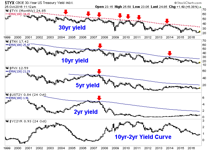
First, here is the state of yields and the yield curve currently, on the big picture view. Trends are down in the deflationary continuum on the biggest picture for all items, but have been neutral on the 5yr and somewhat up on the 2yr ever since Goldilocks gulped the bears porridge in 2013. The yield curve is in a downtrend.
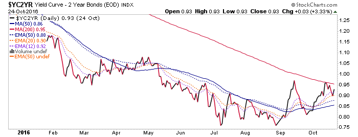
Dialing in to the daily view, we find YC2yr still looking interesting however, as it climbed above its 50 day moving average, tested it, rose again and is currently dealing with resistance at the 200 day moving average. Its constructive to a potential bottom.
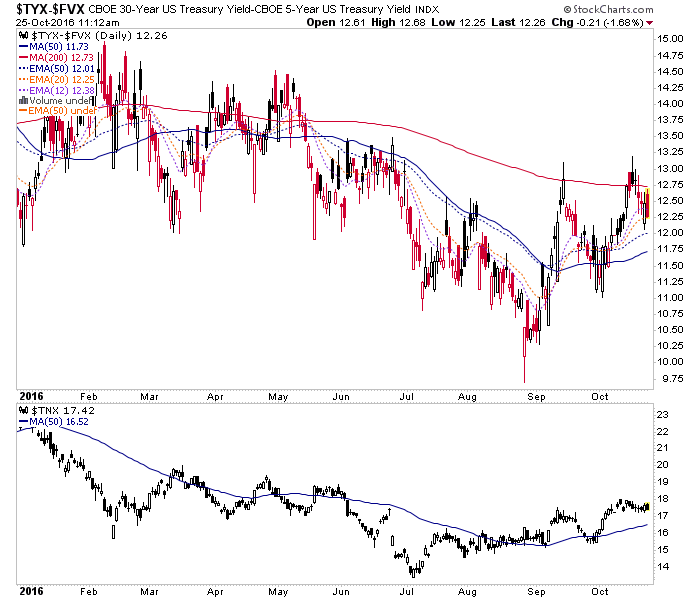
The chart above is a daily close (yesterday) but to get a similar in-day view I subtract the 5yr from the 30yr for a real time view of a longer duration yield curve. Its easing a bit today.
But again, what is the meaning of a rising curve? Well, when nominal yields are rising as they are, modestly, since July (10yr yield in the lower panel above) the implication of a rising yield curve is inflationary and so, players would seek to speculate in assets that would rise during inflation or in the case of gold, seek refuge in a monetary asset of long-term value. This speculation could well include stocks and is like a macro game of musical chairs because in reality, players are simply trying to game the inflationary policy that is ever more intensively promoted by increasingly deranged central bankers the world over.
When nominal yields are declining and the curve is rising however, the implication is systemic stress with a deflationary force at work. Here is a long-term view of the same chart, dialing back to show the last virulent deflationary episode. It also shows the benign environment for US stocks Post-2011, as global deflation manifested in the US as a Goldilocks environment with a declining curve and declining nominal interest rates. In other words, the lack of inflation signals juxtaposed against a strong-dollar-driven services economy, worked out well in keeping the tepid post-2008 recovery going.
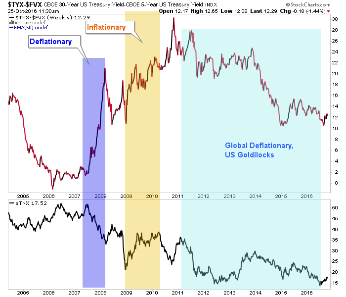
Today, referencing the 2nd and 3rd charts above, the most important thing to note is that yield curves are at least constructive to rise. Right up there in importance is the state of nominal yields. If and it is not yet nearly conclusive the yield curve establishes a new uptrend then we are likely either going to cycle into a new inflationary episode or going to face liquidity pressures on the bloated credit system (i.e. deflationary pressures).
So the 2 panels, in conjunction, on the 3rd chart above mean only everything to coming events.
NFTRH.com and Biiwii.com
| Digg This Article
-- Published: Tuesday, 25 October 2016 | E-Mail | Print | Source: GoldSeek.com


