I had a completely different post in mind for tonight, but the action in the PM complex has changed my mind. Since the US elections the PM complex has had a hard go of it trapping many bulls in their long positions. The magnitude of this decline especially in gold has been unrelenting in nature, which is how a bull trap is set. Just a short five weeks ago all looked good for this sector as it had one of the biggest rallies in history off the January low for the PM stocks. There wasnt anything to suggest that five weeks ago the plunge was coming, but since then, there have been many clues that all was not right with the PM sector.
Ive covered most of the reasons why I thought the PM complex would be having a hard time in many posts over the last five weeks or so. Tonight I would like to update some charts on why I think the bear market isnt over yet and why I think there is more pain to come. This could all go out the window tomorrow, but for right now, these charts to follow shows some of the reasons why the PM complex may need to fall further.
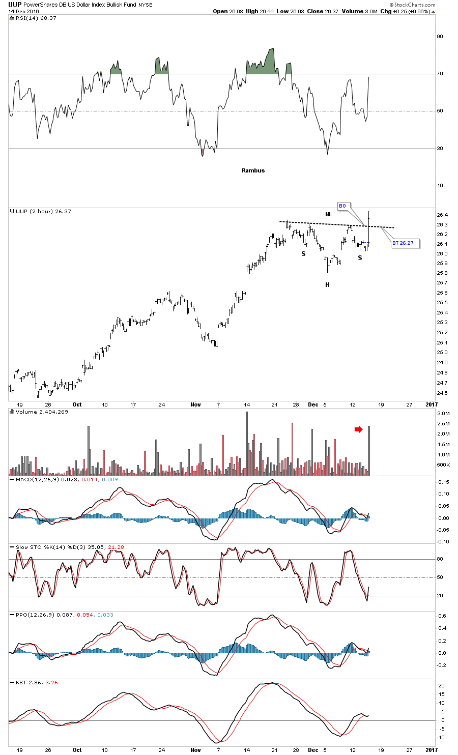
First I would like to start by looking at the two hour chart for the UUP which broke out of a H&S consolidation pattern today during the last two hours of trading on heavy volume. I know there are many reasons why the US dollar cant keep going up, but the H&S consolidation pattern has formed as a backtest to the top rail of the year and a half bull flag. Below is the two hour chart for the UUP.
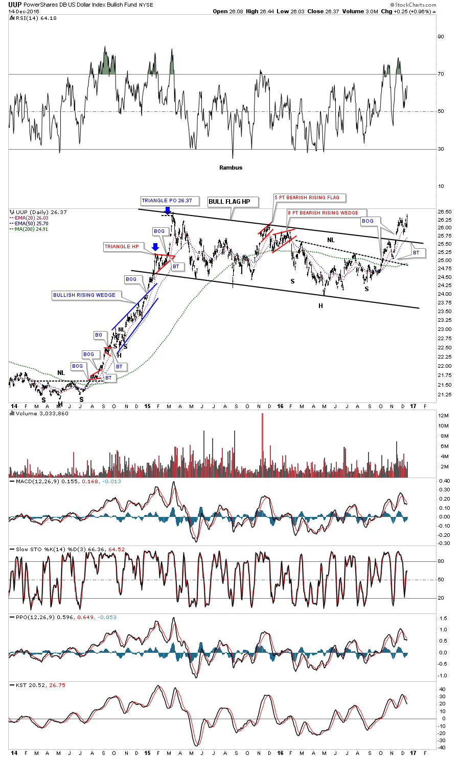
This next chart for the UUP is a daily look which shows the last impulse move up and the year and a half black bull flag complete with a breakout gap. Note the almost one year H&S bottom that formed at the last reversal point before the breakout. The rally out of the mid summer 2014 low shows you what a strong impulse move looks like, as there is a series of one consolidation pattern forming on top of the next until the price action becomes exhausted and begins to correct that big move. When all is said and done the black bull flag should look like a halfway pattern forming between the first impulse leg up, and the impulse leg that started at the fourth reversal point in the black bull flag. We have a very clean line in the sand with the top rail of the bull flag, above is bullish, and below is bearish.
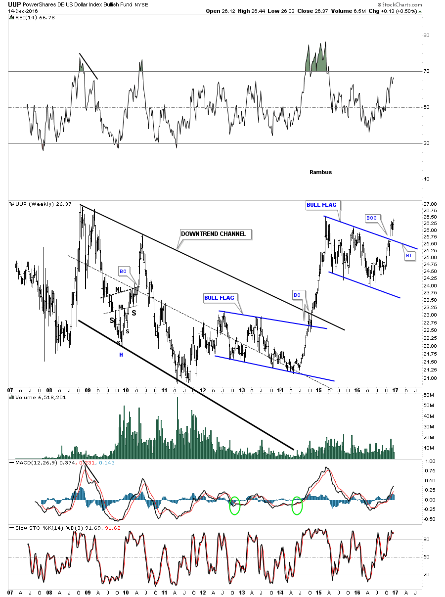
Below is a weekly chart which shows the bull flag with the 13 and 34 week crossovers for a simple buy and sell signal. Note the big breakout volume when the UUP gapped above the top rail of the bull flag. This is not a false breakout unless the UUP trades back below the top rail of the bull flag. Until that happens the breakout continues to evolve, and one should go with it instead of fighting against it.

This last chart for the UUP is another long term weekly look which shows the initial downtrend channel that formed between 2008 and 2014. Note the blue bull flag that formed just below the top rail of the black downtrend channel which gave the UUP the energy it needed to finally breakout and run to the high made in 2015, which began our recent consolidation pattern.
This next chart is a ratio chart which compares GLD to the UUP. When this ratio is falling GLD is weaker than the US dollar. The last time we looked at this chart the ratio had already broken down from the H&S top with a price objective down to the 4.16 area as a minimum downside move. The red arrows also shows you how I was expecting some possible reverse symmetry down.
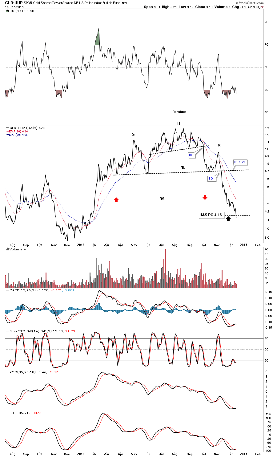
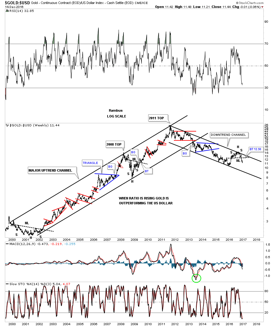
This long term chart for the gold to the USD ratio chart shows the bull market uptrend channel and the bear market downtrend channel that has been building out since the 2011 high. Where that small H&S top that recently formed just below the top rail of the downtrend channel, was a big clue that gold was in trouble which is the same H&S pattern on the daily chart above.
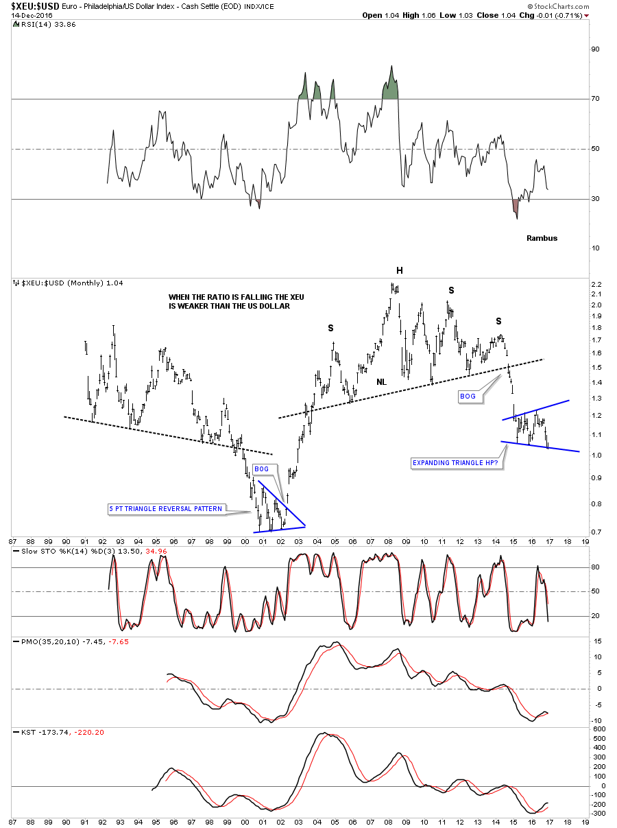
This next ratio chart compares the XEU to the USD going back some 25 years. Keep in mind this is a long term monthly chart so things move at a snails pace. You can see the massive topping pattern that has led to the most recent lows. For almost two years now this ratio has built out an expanding triangle which I believe will end up being a halfway pattern to the downside. It took nearly seven months for the XEU to find support at the first reversal point in the blue expanding triangle. We could very well see a similar move down in this ratio once the price action breaks below the bottom rail.
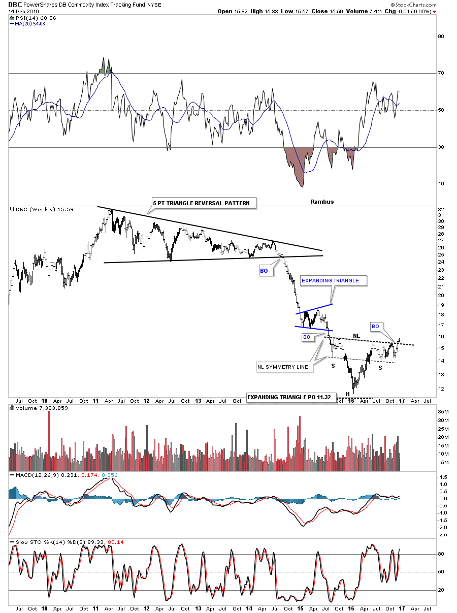
This next chart is a weekly look at the DBC, commodities index, which shows you a good example of how the blue expanding triangle worked out as a halfway pattern to the downside.
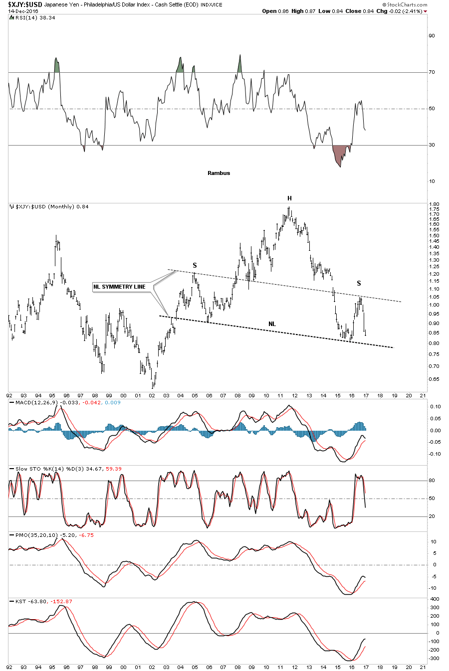
This next ratio chart compares the XJY to the USD which is forming a massive H&S top. Note how the neckline symmetry line showed the high for the right shoulder.
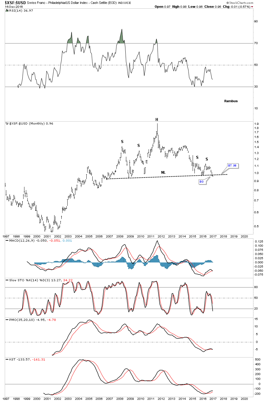
This last ratio currency chart compares the $XSF to the USD. As you can see, this month the ratio is cracking the neckline. What all these long term currency ratio charts are suggesting is that the US dollar has a long ways to run to the upside. I know it goes against conventional wisdom but what is conventional wisdom? Ill have many more charts in the Weekend Report to show you that I hope will paint a clear picture on what is actually taking place right now in the PM complex. All the best Rambus