The PM complex has been taking up most of my time the last couple of weeks so tonight I would like to update you on some of the stock market indexes. No matter how one wants to spin it the US stock markets have been in a bull market since 2009 by any trading discipline. It has climbed the proverbial wall of worry which is needed to create such a dynamic bull market. Most of the charts will be long term in nature which puts the bull market in perspective.
The first chart is a 20 year monthly chart for the INDU which shows you The most hated Bull Market in History. Below the INDU chart is just a plain chart for Gold with no annotations on it. One is in a bull market and the other isnt. Where has your money been ?
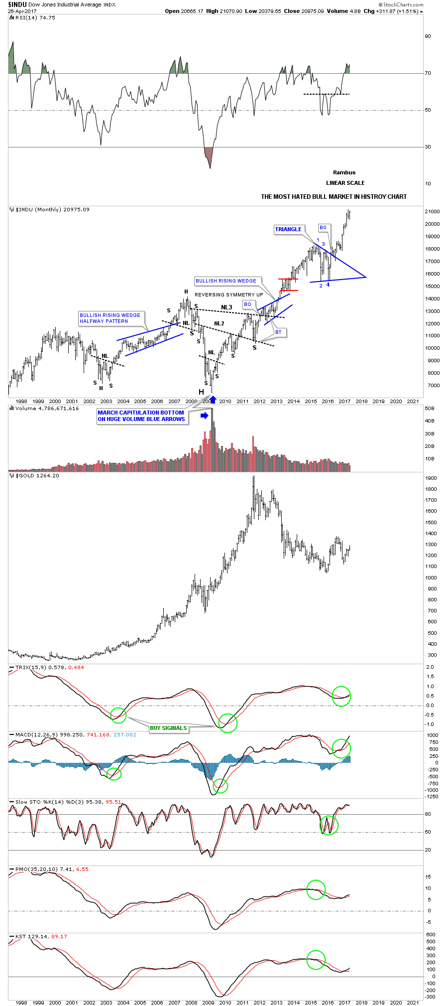
Weve been following this next chart since the day it broke out above the top rail of the Jaws of Life pattern back in November of 2013. Little did I know at the time that the backtesting process would take nearly 2 years to complete, but in the end it was worth the wait. https://rambus1.com/2014/11/19/wednesday-report-49/

The quarterly line chart shows the beautiful Jaws of Life consolidation pattern with a perfect breakout and backtest to the top rail.
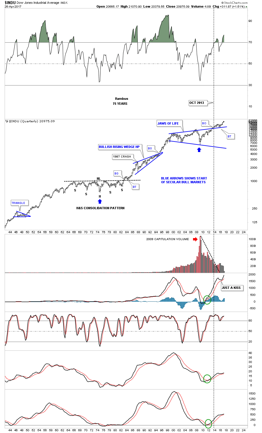
To understand what is really taking place right now in the big picture, this 75 year chart for the INDU puts everything in perspective and is probably the most important chart to view. Very few investors on the planet can even grasp what a chart like this is saying let alone let alone invest their hard earned money in what its saying. Keep in mind weve been following this Jaws of Life consolidation pattern actually before the INDU finally broke out in October of 2013. Compare the breaking out and backtesting process of our current Jaws of Life to the massive H&S consolidation pattern of the 1970. We are currently in the early stage of an impulse leg up which takes place after a consolidation pattern is finally matured.
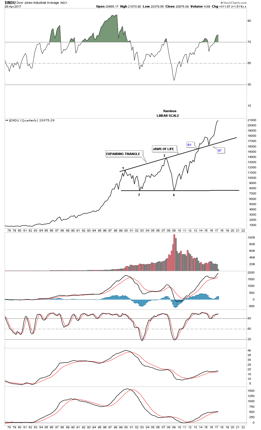
Below is a 20 year monthly chart for the SPX which broke out of its massive 13 year flat top expanding triangle in 2013 and has never looked back.
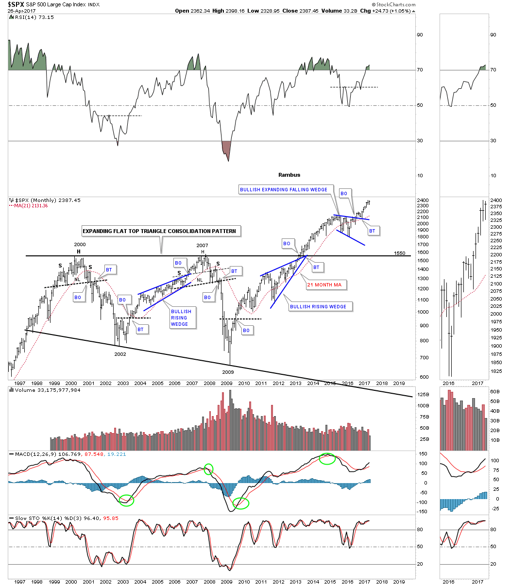
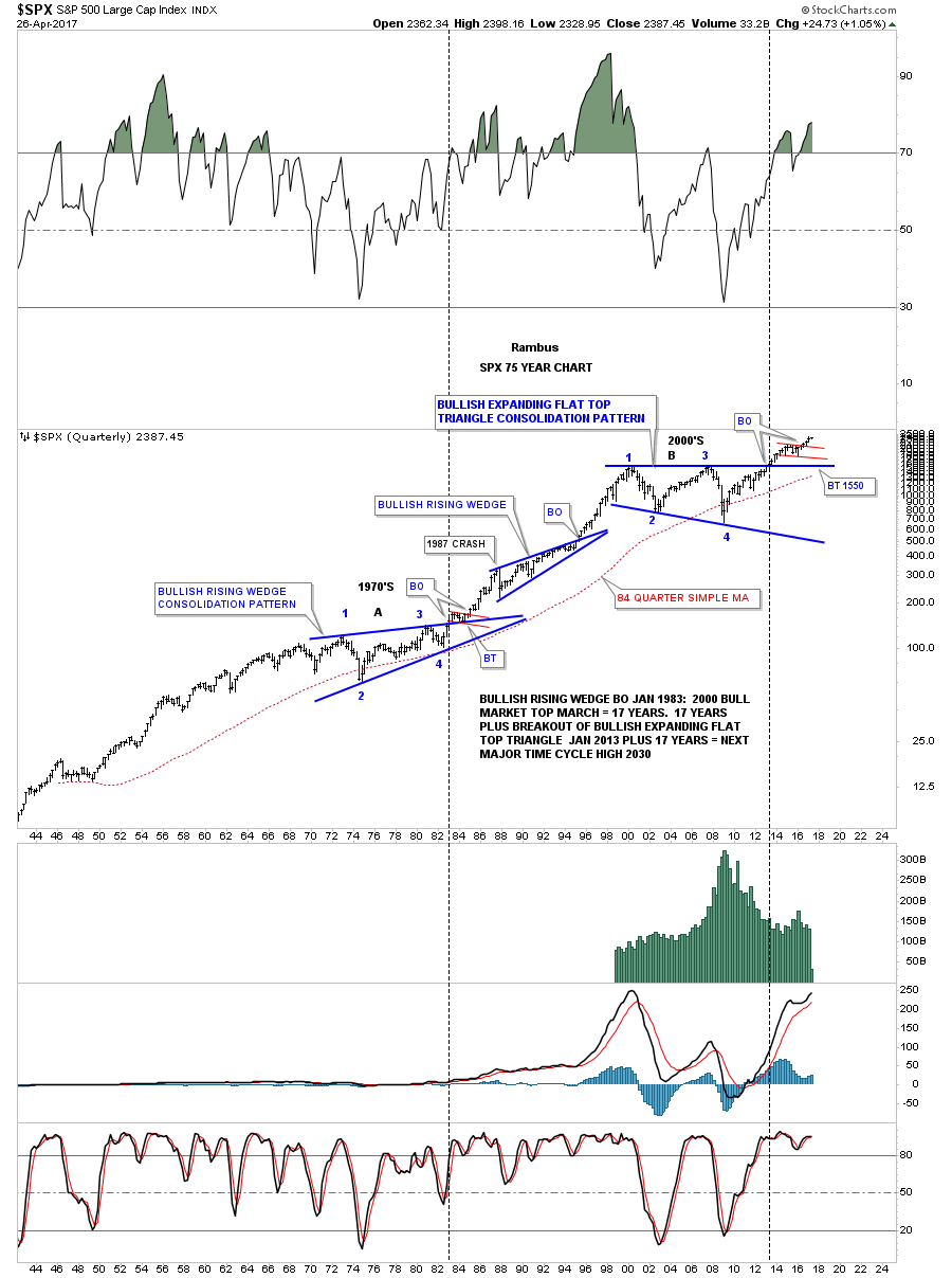
This 75 year quarterly chart for the SPX that is similar to the 75 year quarterly chart for the INDU we looked at earlier. During its 1970s consolidation period it formed a bullish rising wedge which led to its secular bull market. The 2000s built out its recent massive consolidation pattern, the flat top expanding triangle. Note how small the 1987 crash looks on this long term chart, It was was the end of the world back then.
If the 75 year charts for the INDU and the SPX are showing us that we are in a secular bull market then we should see the Transportation Average confirm the bull market is for real. Below is a 20 year monthly look at the Transportation Average which shows a very symmetrical H&S bottom with the head forming at the 2009 crash low. Note the price action at the top of the chart that broke out of a smaller well defined H&S consolidation pattern.
![]()
The 100 year quarterly chart for the Transportation Average is trading up close to its all time highs after breaking out from is large H&S consolidation pattern we just looked at on the chart above.
![]()
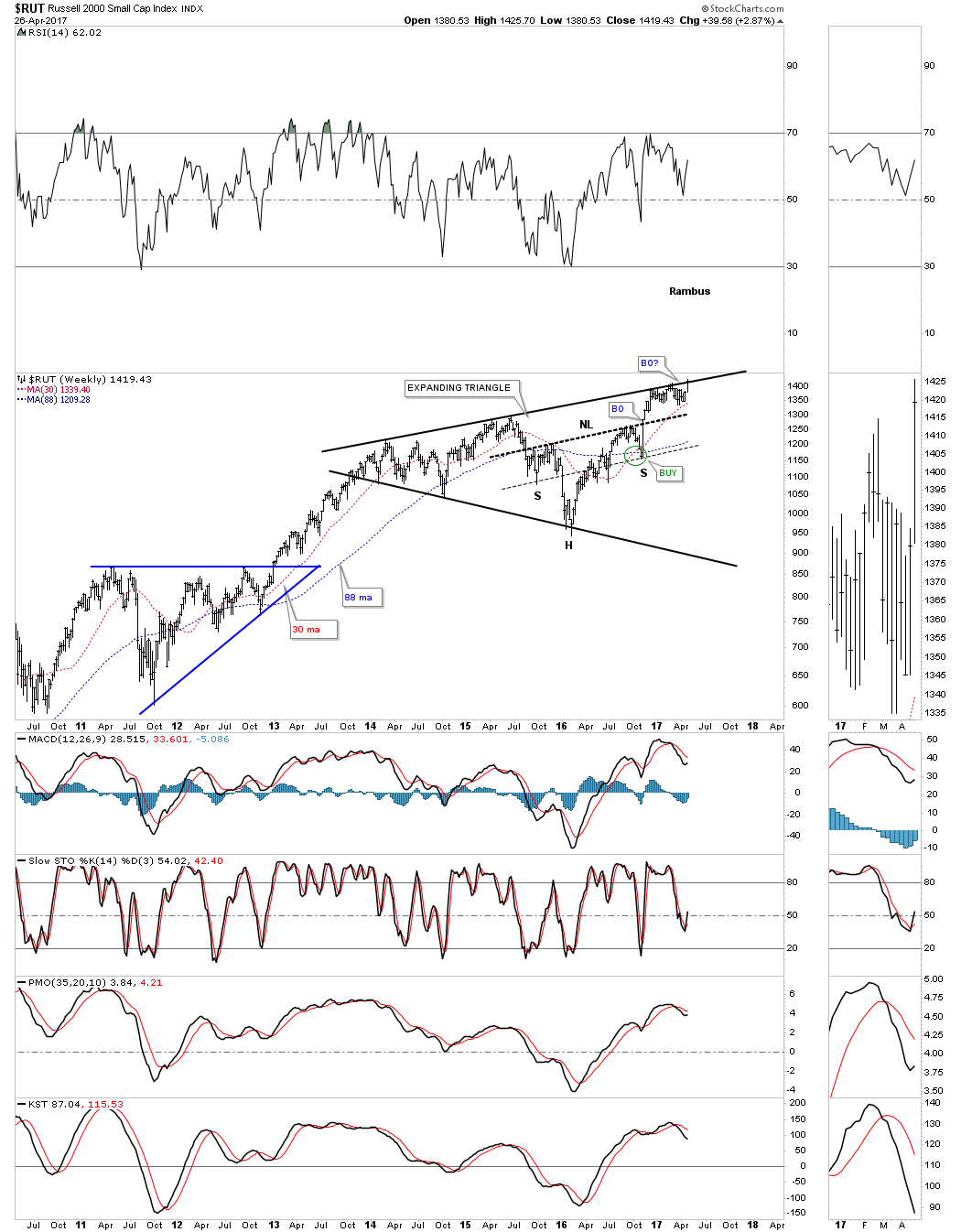
The reason the RUT has been lagging a bit lately is because it has been testing the top rail of its almost 5 year black expanding triangle. The H&S that makes up part of the expanding triangle strongly suggests that the RUT is going to breakout to new all time highs which it is doing this week.
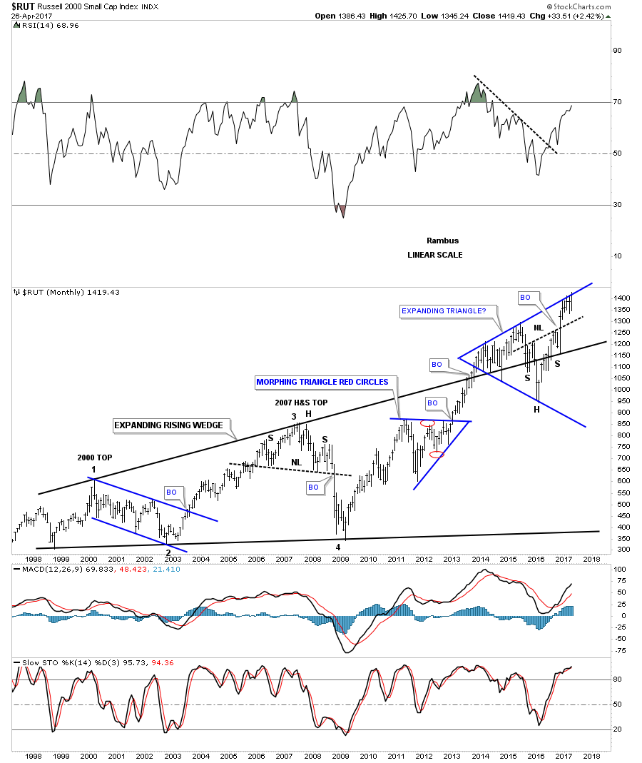
Below is a 20 year monthly chart for the RUT Ive never published before. Its similar to the Jaws of Life, but this big consolidation pattern is a 15 year bullish expanding rising wedge. Again, note the big H&S consolidation pattern that is making up part of the blue expanding triangle we looked at on the chart above. That is telling us that the breakout above the top rail of the blue expanding triangle is going to take place.
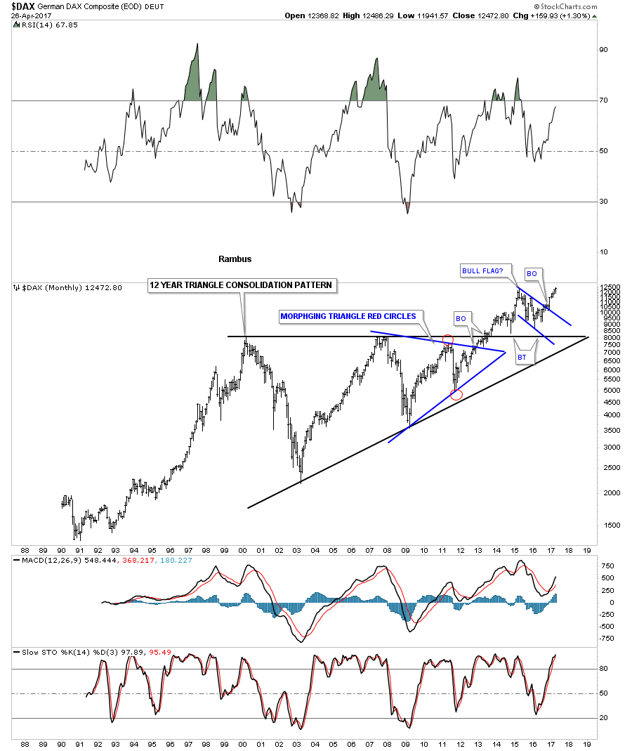
Lets now look at a few foreign markets to see what they look like starting with the $DAX. Just like the US stock markets the DAX built 12 year black triangle consolidation pattern with the smaller blue triangle pattern building out toward the apex letting us know the big pattern was going to breakout to the upside. Six months ago the DAX broke out of the blue bull flag on its way to new all time highs.
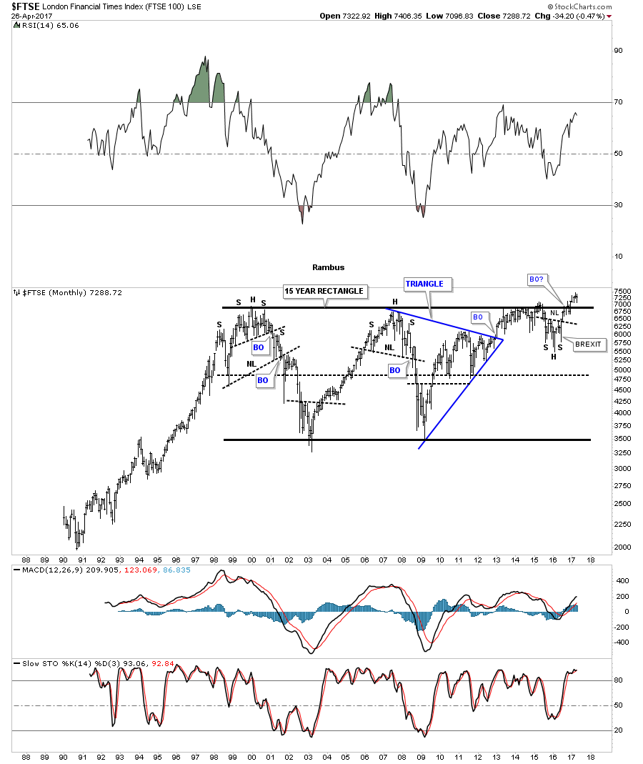
The FTSE built out a massive 15 year rectangle consolidation pattern. Note the small H&S bottom that formed just below the breakout point which told us the breakout would happen.That right shoulder was formed during the night of the BREXIT vote when it looked like the end of the world for England.
There are a few individual sectors that have been consolidating for some time now which look like they may be ready to make a move. This first sector is the $BKX, banking index, which broke out of a black expanding triangle late last year and has been in backtest mode testing the 30 week ema this week as support.

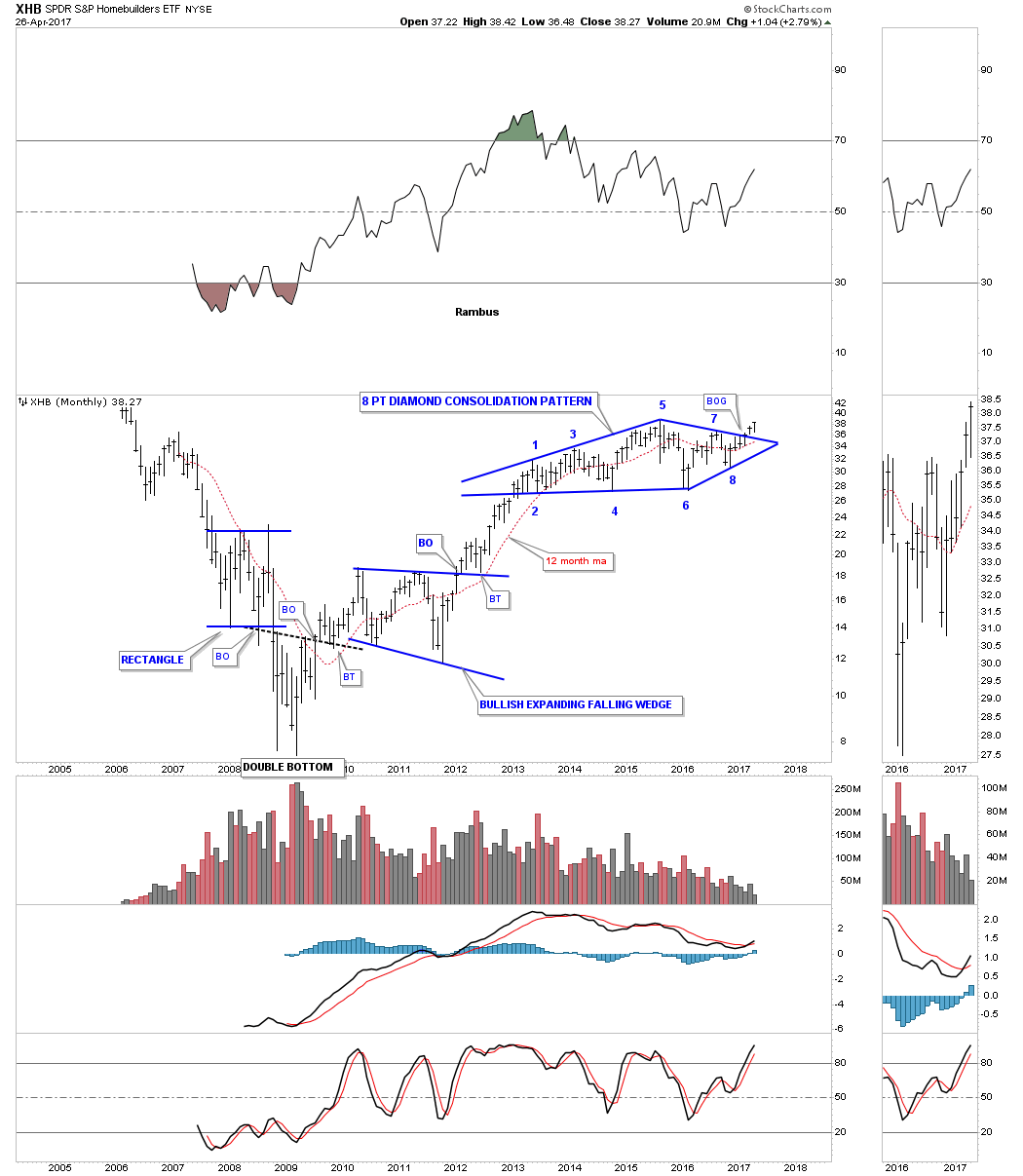
Another important sector that is just breaking out of a large consolidation pattern is the XHB, Homebuilders etf. Last month it broke out above the top rail of a beautiful 4 year 8 point diamond consolidation pattern.
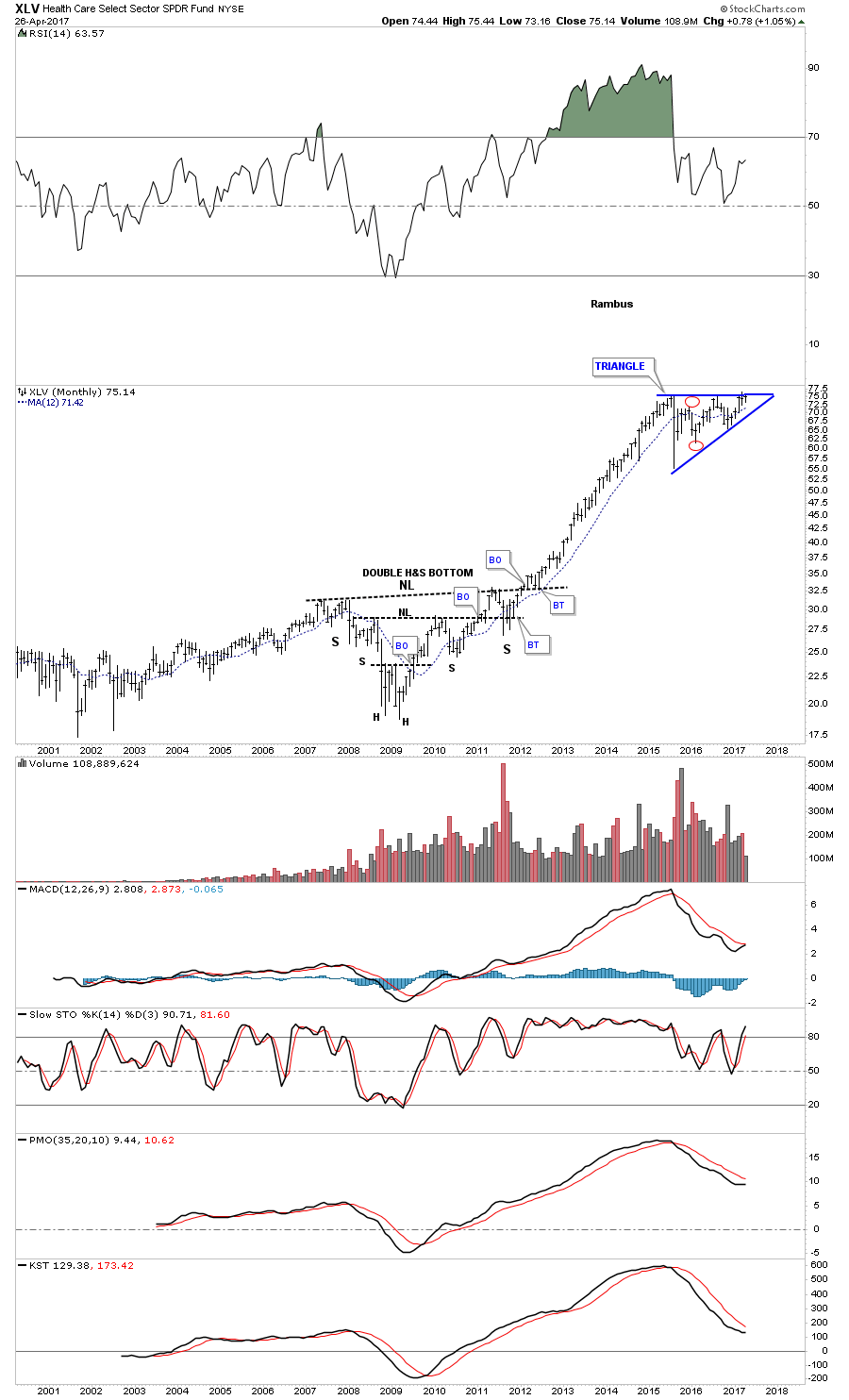
The XLV, healthcare sector, has built out a year and a half triangle consolidation pattern. As this sector was one of the strongest out of the 2009 crash low it needed to consolidate those gains by building out the blue triangle consolidation pattern.
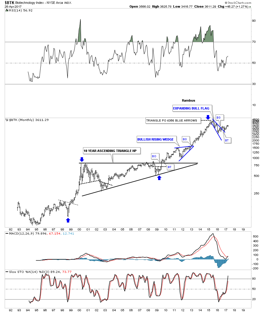
Probably the strongest sector of all out of the 2009 crash low was the $BTK, biotechnology sector, which has been consolidating for the last year and a half forming a blue expanding bull flag.
For the last year and a half the $SOX, semiconductor index, has been leading the tech sector higher.

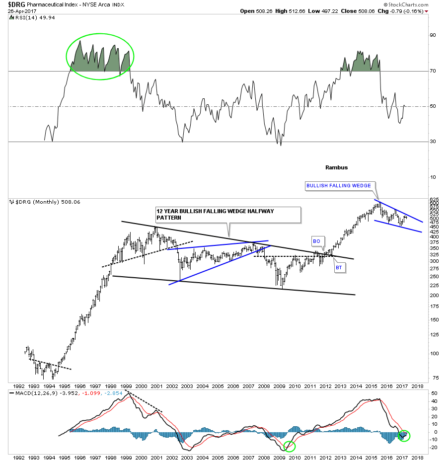
This last sector well look at tonight is the $DRG, Pharmaceutical index, which is building out a possible bullish falling wedge which has formed at the top of massive impulse leg up out of the black 12 year bullish falling wedge.
When I look at all these charts above its hard for me to see a long term bear market on the horizon. We are going to get the inevitable corrections along the way which occurs in any bull market, but knowing the main trend is the most important part of being successful when it comes to the markets. Shorting this bull market consistently has been a tough game to play vs just going with the bull market. All the best Rambus