-- Published: Friday, 17 November 2017 | Print | Disqus
By Daniel R. Amerman, CFA
There is a lot of advice out there about Social Security - most of which is based on Social Security being fully inflation indexed.
However, as we will establish in this first in a series of analyses, Social Security is only partially inflation indexed. As a matter of design it does not fully keep up with inflation.
Sound like an obscure difference?
"Partial inflation indexing" is little understood by the general public, but it could transform your standard of living - along with the quality of life of millions of others - in the years and decades to come. Indeed, partial inflation indexing can mean effectively having only 11 months of benefit purchasing power- or even 8 months - to cover 12 months of expenses each year.
Now if coming up a month or more short for the value of the benefits received each year would have a significant impact on your life in retirement, then fully understanding partial inflation indexing could change your financial planning, your decision on when to retire, and your decision on when to begin claiming Social Security benefits
There are many aspects to partial inflation indexing and they cumulatively build upon each other. Our starting point in this first analysis is going to be some seemingly obscure technicalities built into the details of how Social Security actually works that many people have likely never even thought about.
The Theory Of Full Inflation Indexing
Inflation is not an accident, but is created by the Federal Reserve as a matter of policy. The prevailing economic theory is that a slight annual reduction in the purchasing power of the dollar is good for economic growth.
Since the United States went off the gold standard in 1933 and began setting the goal of creating a low to moderate rate of inflation each year, inflation has averaged a little over 3.5% per year. In total the dollar has lost about 95% of its value over the past 84 years.
The impact of inflation is not felt evenly, and people in the workforce can keep up when their wages (hopefully) increase with inflation. However, retirees generally have the greatest exposure to inflation of any age group, as the value of their savings steadily diminishes and they no longer have wages to increase.
The Social Security Administration provides an annual COLA or Cost-of-Living Adjustment, which is intended to offset this inflation that is deliberately created by the Federal Reserve.
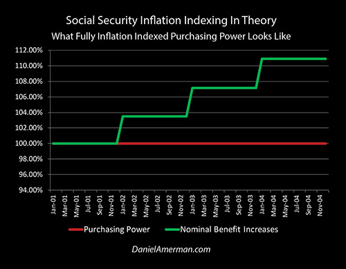
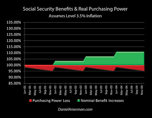
In theory, with full inflation indexing we are supposed to get something like the graph above. The green line of benefits goes up every year by an amount equal to the long-term average rate of inflation. These increases fully offset the declining purchasing power of the dollar, and this means that the retiree can rely on the red line of constant purchasing power.
So no matter what the rate of inflation is each year or how far out in time we are looking - Social Security is in theory supposed to reliably deliver the same amount of purchasing power.
How Social Security Actually Works - The Inflation Lag Calendar
What is shown above is not, however, how Social Security actually works. To understand the difference we need to get into the details of those annual benefit increases. These details may sound a bit technical to begin with - but they are well worth understanding, because they can change your personal standard of living for years or even decades.
Social Security benefits can only increase in January, and then they remain at the level of the January payment for the rest of the year.
The amount of the benefit increase (if any) is not based on average inflation over the prior year. Instead the amount of the benefit increase is based on the average of the July 1st, August 1st, and September 1st inflation indexes for the quite obscure CPI-W inflation index (more on that in the next analysis).
While this is referred to as the third quarter average, it is a little odder than that. As an example, the difference between the July 1st and August 1st inflation index measurements is based upon price data that is (primarily) gathered over the course of the month of July. Because the inflation that will occur in a month is not known on the first day of that month, what is really being reported for the three dates of 7/1, 8/1 and 9/1 is based on inflation measurements that primarily occurred during the months of June, July and August.
To understand how this can change standards of living for retirees across the country, I've created a Social Security Inflation Lag Calendar, which is broken out into four color coded zones.
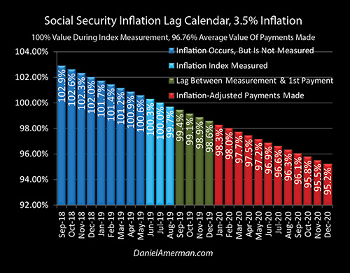
First Calendar Zone - Inflation Occurs, But Is Not Measured
The first zone is that of the dark blue bars when inflation occurs, but is not measured for inflation indexing purposes, or at least not by the Social Security Administration. This period of non-measurement includes the nine months of September through May each year, which means that 75% of each year is not taken into account. (The index for the CPI-W is in fact calculated by the Bureau Of Labor Statistics every month, but nine months are ignored each year by the Social Security Administration.)
Most annual inflation occurs during this time, which means the dollar is steadily dropping in value (assuming a level monthly rate of inflation). If the dollar has a value of 100% in the middle of our summer measurement period (the light blue bars) - that means it has to be worth more before then.
With a historically average 3.5% rate of inflation, that means that the dollar in September needs to have a purchasing power of $1.029. This is down to $1.026 in October, to $1.012 by March, and $1.006 by May.
If there are any temporary spikes in inflation during those nine months, such as with energy or food prices, that are not still there by the following summer - they are simply gone, they never existed as far as the government is concerned. There is no repayment, there is no catch-up.
Second Calendar Zone, Inflation Index Measured
The second zone is the light blue bars of the summer months when inflation is actually measured. The CPI-W indexes for July 1st, August 1st and September 1st are averaged together, and compared to the what the three month average was in the last year in which there was a benefit increase. Whatever the percentage increase is, becomes the percentage increase in Social Security payments that will occur in the following January.
For the purposes of this first analysis in a series, we will assume that this measurement is entirely fair and accurate. The beneficiary gets an adjustment that represents 100% of what they should be getting, to entirely keep up with inflation.
As can be seen in the Inflation Lag Calendar, this assumed fair setting of the value of Social Security benefit payments at 100% includes the price increases that occurred over the course of the month of July, the middle of our measurement zone (which is reported as the August 1st CPI-W).
Third Calendar Zone, Lag Between Measurement & 1st Payment
The third zone of the dark green bars is the lag between when inflation is measured, and when the first payment made upon that measurement is actually made.
Because inflation is ongoing - the value of the benefit payment is declining each month before that first payment. What was equal to a fair $1.00 in purchasing power in July is down to $0.994 by September, and $0.986 by December.
It should also be noted that a cut-off has occurred, and inflation that occurs during the fall of 2019 (in this example) will not impact the 2020 payments, regardless of the degree of inflation. Even with major and sustained inflation, it will not be measured until the summer months of 2020, and there will be no payment adjustment until January of 2021. Which means that the lag between when expenses increase and when benefits increase in response can be as great as 16 months.
Fourth Calendar Zone, Inflation-Adjusted Payments Made
With level inflation, price data collected during the month of July, (the middle of the June to August measurement zone), is effectively what determines the dollars that are available to make expense payments over the full month of January in the following year. So there is an effective full six month gap between the middle of the average measurement month and the middle of the first payment month.
With a 3.5% rate of inflation, that would mean that we would expect as a matter of a design that our January benefits will only be worth 98.3% in terms of purchasing power, as can be seen with the first of the red bars of inflation-adjusted payments being made.
So with completely historically average inflation, we will have lost 1.7% of our purchasing power to six months of inflation - before our first payment ever arrives.
And January is the best month of the year.
Because with an even 3.5% rate of inflation, our February payment buys just a little bit less, only 98 cents on the dollar.
Our July payment, one year after inflation was measured, is only worth 96.6%. Meaning that if we needed our payments in full to meet our expenses, we are coming up 3.4% short by July.
The worst month is December, as that is the last month before the new and higher payment (hopefully) arrives. With historically average inflation, our December payment only has a purchasing power of 95.2%.
So as a matter of design, in a normal year we will have two types of inflation losses. Our first payment will only be worth 98.3 cents on the dollar, because of the six month lag between when inflation is measured and when the first payment arrives.
The purchasing power of each subsequent payment falls every month until it reaches about 95 cents on the dollar in December, which is a lag of 17 months from the average index measurement month.
And on average, our benefit has a purchasing power of only 96.76% when we average the 12 benefits, meaning we lose about 3.24% of our standard of living over the year.
If we look at that on annual basis, that is about 12 days of purchasing power. So if we need every dollar of Social Security to meet our expenses in retirement, that means that over the course of each year, we are coming up about two weeks short because of the difference between theory and practice.
If Social Security were actually fully inflation-indexed, we would have 52 weeks of purchasing power. With real full inflation indexing it doesn't matter whether we have 1% inflation, 3% inflation or 10% inflation - our purchasing power is the same as if we had a 0% rate of inflation, which is a full 52 weeks.
However, because of the way Socially Security actually works, we are only partially protected, and with completely average inflation - we come up almost two weeks short.
We are taking a much more detailed look at how Social Security actually works than most people do, and there is a reason for that. At some point in their lives, Social Security will provide most or all of their income for most Americans.
Most retirees need every dollar they have if they are to live on a fixed monthly income - and they need the value of each monthly payment in full to cover expenses. They can't afford to lose two weeks, and they can't afford to have some payments worth less than others.
But yet, in all our millions, we will take those losses, because that is how the system is set up.
Surface Benefit Increases & Real Purchasing Power
We began with a theoretical graph of what fully-indexed Social Security payments would look like, with the green line of benefits going up once per year, and the red line of purchasing power staying constant at 100%.
However, when we take into account the Social Security Inflation Lag Calendar and look at the real purchasing power of our Social Security benefits in practice, we get the graph below.
The graph may look unusual at first glance, but remember it - because this is what Social Security really looks like (on average). To the extent that you anticipate Social Security paying for a substantial portion of your lifestyle either next year or down the road - this is your future that we are looking at (if the past repeats itself).
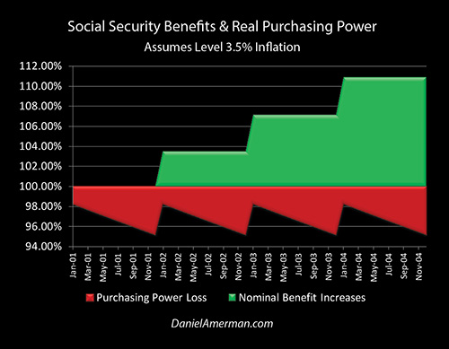
Our first year of payments is level, and in January of the second year, the green area of our monthly benefits rises by 3.5%, which is the long-term average rate of inflation for the United States. All twelve payments are at the higher level. The payments are reset up another 3.5% in January of the third year, and they go up another 3.5% in January of the fourth year.
When we look at the surface - which is how most people see the world - we are getting steadily more money over time. By the fourth year the green area of our benefit increases are up to over 110%, an increase of more than 10% from where we started, and the sum of the benefit increases is becoming quite meaningful.
There is a problem however when we look at the red area of the loss of purchasing power - none of our green gains are real. Instead we have a continuing pattern of real losses, that never ends.
Starting in the first January - we've already lost 1.7% of our purchasing power to six months of average inflation by the time our first payment arrives. As monthly inflation losses continue to build on each other, the red line slopes downward. By December, we are down to our benefits being worth only about 95 cents on the dollar.
By December, we badly need the coming increase in benefits.
Then we get the 3.5% Social Security increase in January to catch up - but we don't catch up. We start off with six months of inflation losses again. Then we again steadily lose purchasing power until our benefits are only worth 95 cents on the dollar.
We lose almost two weeks of needed standard of living - again. As we do the third and fourth years as well. Even as the green area of the dollar amount of our benefits gets ever higher.
Each and every year, there is gap between the purportedly fair measure of changes in price levels during June, July and August, which form the basis for the payment. Each year, the purchasing power of the payment is less by January, when the first month of expenses are paid out. Then during each year the value of each of our monthly payments continues to fall, as the jagged red "sawtooth" pattern of purchasing power losses that is financial reality repeats itself.
Impact Of Higher Inflation
The purpose of inflation indexing is to keep purchasing power level regardless of the rate of inflation. So our Social Security payments can always meet our needed base expenses.
This raises a question, however. What happens to our standard of living if inflation is different from the historic average?
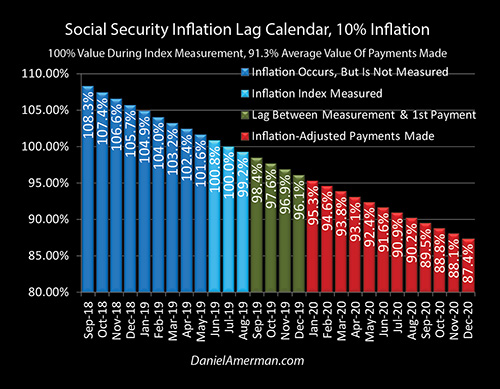
The Social Security Inflation Lag Calendar above has one crucial difference from our first calendar - for illustration and exploration purposes a 10% rate of inflation is assumed.
When we look to the dark blue zone, where inflation occurs but is not measured - the degree of losses which the government does not see and which we are not compensated for is much greater.
Instead of the dollar losing about 3% in purchasing power between the start of the unmeasured zone in September, and the middle of the measurement zone in July - the dollar loses 8% of its purchasing power with the higher rate of inflation.
It also needs to be understood that while the Social Security Inflation Lag Calendar above is focused on explaining the sources of the red bars, the actual purchasing power of the payments in January to December of 2020, it is also necessarily showing purchasing power losses for the prior two years of Social Security payment adjustments.
The declining purchasing power shown in the four dark blue bars of September to December of 2018 - will impact 2018 Social Security payments that are based upon the inflation indexes in the summer of 2017. Any inflation losses are entirely real. If the rate of inflation has risen and prices are substantially higher, then these losses will be much higher than expected, they will go straight to the bottom line of retiree standard of living, but the federal government chooses to never even see them, let alone compensate for them.
The declining purchasing power shown in the five dark blue bars of January to May of 2019 - will impact Social Security payments that are based upon the inflation indexes from the summer of 2018. Once again, any inflation losses are entirely real, they will go straight to the bottom line of retiree standard of living, but the federal government chooses to neither see nor compensate for the losses.
We reach the light blue inflation index measurement zone, and once again, we assume a completely fair and accurate inflation measurement of retiree expenses (as our starting point in this first stage analysis), and we find 100% for what is on average the month of July.
At the same time in the summer of 2019 that the measurement that will determine the 2020 payments is occurring - payments in practice are being made based upon inflation indexes from the summer of 2018. Any losses from inflation that occurs during the year between the two summers are entirely real - but despite the ongoing measurement, there is no "catch-up" provision. The Social Security beneficiary just somehow absorbs the losses on a permanent basis, taking them out of their fixed income lifestyle.
Fall Is The Cruelest Season For Retirees
There is a generally unrecognized but nonetheless potentially powerful seasonal impact on Social Security inflation losses. Because of how Social Security is designed, fall can be the cruelest season for retirees living on a fixed income.
During the time of the dark green bars, from September to December of 2019 - we are at the very greatest distance from the inflation measurement of the summer of 2018. So the payments we receive in those months are at their very lowest purchasing power levels. With 10% level inflation, all four payments are worth less than 90 cents on the dollar, compared to the inflation measurement of the previous summer.
For a retiree on a fixed income who is barely covering expenses to begin with, four consecutive months of losing 10% or more of their spending power is likely to be financially devastating. Relief in the form of the substantially higher January payment is likely to be badly needed. Since the increase in benefits will be 10% rather than a historically average 3.5%, the retiree will likely be looking for an ability to catch-up.
The problem is that the inflation measurement has already occurred, and is locked in at the June to August expense levels. The very same inflation that is destroying the current standard of living in September to December - is also simultaneously destroying the purchasing power of the future higher benefits, before they ever even arrive.
In other words, the more desperately that relief is needed - the less that the relief will be worth when it arrives. That is the cruel part. So long as the rate of inflation is level, then the mathematics of this relationship are mandatory.
So in January, instead of being worth 98.3% as it would be with 3.5% inflation - our first payment is worth only a little over 95 cents on the dollar. In other words - despite what appears to be a far more valuable 10% increase in the amount of our benefits - with a 10% rate of inflation, our starting point of the first payment in January has a much lower value than it would with a 3.5% increase and a lower rate of inflation.
From there, with the higher rate of inflation, the value of our monthly payments decreases much faster. Our July payment is only worth about 91 cents on the dollar, and our December payment is only worth about 87 cents on the dollar.
Over the course of the year, the average purchasing power of our Social Security benefit payments would fall to 91.3% - which means we are coming up 8.7% short. On a calendar basis - everyone who is getting Social Security during that time is coming up about 32 days short, which means they are missing an entire month's income.
Think about that. The retirees of an entire nation. Most are on fixed incomes, and for most of them, Social Security is either their only source of income or their largest source of income. Few of them have much income to spare, their minimum expenses consume almost everything they have.
And when it comes to what matters - which is what our dollars will buy for us - then they will all have 12 months of expenses to pay for, but effectively only 11 months of income to pay with.
How does that work out for the nation?
For all those millions of people - how do they individually solve that in their own lives? What sacrifices can they make and do they make? What happens to their quality of life, and their plans for how to live their lives in retirement?
This would all happen with all Social Security payments being made in full, and with completely accurate inflation indexing. Yet, a month per year of income could still effectively be lost for a nation.
Social Security is simply not fully inflation-indexed, it is partially inflation-indexed.
The source of the partial inflation-indexing is far from hidden. If one goes to the Social Security Fact Sheet put out by the government and linked here, the first sentence of the first paragraph explains exactly how the annual increases are calculated.
What isn't explained is the financial implications - that takes a knowledge of both the details and the applicable financial mathematics. Through creating the Social Security Inflation Lag Calculators and the graphs showing the divergence between benefits and purchasing power, I've tried to make this important information far more understandable.
Yes, the difference between "partially inflation-indexed" and "fully inflation-indexed" may sound deeply obscure to the average person. But if having 12 months of income to cover 12 months of expenses in retirement, but coming up two weeks short - or a month short - matters to someone, then this is the sort of technical "detail" that can be life changing for everyone - including the average person.
The More We Get, The Less It Will Buy
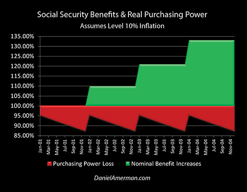
Continuing our illustration of the effects of 10% inflation, what could be called three different levels of financial reality can be seen in the graphic above.
If we look merely at the surface - which is how much of the population views the world - then the much higher annual increases in Social Security benefits are very attractive and desirable. The first year benefits jump 10%, and then another 10% on top of that, and then another 10% and so forth. That very quickly becomes a great deal more money, and looks like a really good deal for retirees.
The more financially sophisticated portion of the population will look at this in fully inflation indexed terms. In this second level of financial reality, they will see the 10% annual bumps as being effectively an illusion, and what is really there is a flat line at the 100% real purchasing power level, as we saw in the first graph "Social Security Inflation Indexing In Theory".
The third level of financial reality is to take our Social Security Inflation Lag Calendar into account. With an assumed accurate inflation index measurement in the summer, then the simple dollar amount of the bump doesn't matter - but the amount of inflation that occurs between that measurement and the 1st adjusted payment in January does matter greatly.
Because more value is lost to the higher rate of inflation - our first payment is worth substantially less. The bottom edge of the red loss of purchasing power is substantially lower than it is with average inflation.
Because of the higher rate of inflation - the initial value of that first payment erodes much more rapidly, meaning that the purchasing power of each payment falls at a faster rate.
So, the financial reality of Social Security is upside down, compared to how the average person would likely view it. The higher the annual benefit increases, then the better it looks for many people.
But yet, assuming level inflation over the time period, the higher the benefit increases as seen in the green area - then, necessarily, the greater the degree of real losses in purchasing power as seen in the red "sawtooth" area. This can be seen by taking our historically average 3.5% inflation graphic, and changing the scale so that it matches our 10% purchasing power graphic.
When we go back and forth between the 3.5% and 10% graphics using the same scale, we can gain a visual perspective for how this first component of partial inflation indexing impacts retirees. The higher the rate of inflation - the bigger the red saw. The higher the rate of inflation - the sharper and the longer the teeth of the saw become. And the higher the rate of inflation, then the deeper the saw cuts into our standard of living.
When The Money Runs Out At Varying Rates Of Inflation
As we saw in comparing 3.5% and 10% rates of inflation, there is a major difference when it comes the impact on retirees. The higher rate of inflation reduced the value of the first payment, and then increased the rate at which the next 11 payments fell in value.
There is indeed an exact mathematical relationship between the rate of inflation and the average purchasing power of Social Security benefits (assuming level rates of inflation). As shown in the table below, the higher the rate of inflation, the lower the average purchasing power of the benefits.

To make the results less abstract, they are shown not just in percentage terms, but also in terms of "Days Lost" and the corresponding date that the "Money Runs Out". Starting with 1.00% inflation, the average purchasing power of the benefits is 99.05%. This means an average loss of 0.95% over the year, and if we multiply that times 365 days, then 3.5 days of purchasing power have been lost.
If we say that a retiree on a very tight fixed budget needs 12 full months of fully inflation-indexed payments to meet 12 full months of expenses - but they come up 3.5 days short, that would mean that they run out of money during the day of December 27th each year, as shown in the far right column. (In practice they would need to cut expenses over the year, but this measure is intended to show the results in a readily understandable, personal and tangible manner.)
With 5% inflation, then the average purchasing power of Social Security benefits falls to 95.44%. This means that 16.6 days of purchasing power are lost, or close to two and half weeks. So someone who needs 12 full months of purchasing power to pay 12 full months of expenses - would run out of money on December 14th of each year.
With 9% inflation, the average purchasing power of Social Security benefits falls to 92.10%. This means that 28.8 days of purchasing power are lost, or just over four weeks. So a retiree on a tight, fixed budget who needs 12 full months of purchasing power to pay 12 full months of expenses - would run out of money on December 2nd of each year.
Another way of putting this is that with 9% inflation, every retiree in the country who is totally dependent on Social Security and on a tight, fixed budget - would run out of money by December 2nd of each year.
Social Security is simply not fully inflation indexed - it is partially indexed. The degree of the annual shortfall is dependent upon the rate of inflation that is experienced that year in practice. And if we look back over the last 50 years - there have been numerous years in which the rate of inflation has been high enough materially impact the standards of living that can be supported by Social Security.
While this analysis focused on the specifics of Social Security, it should be noted that the same general principles can apply to any worker or pensioner who gets annual COLAs. They are generally not fully inflation-indexed, and the higher the rate of inflation, then the lower the real purchasing power.
Broader Implications & The Bigger Picture
Whether viewed in isolation or as one piece of a broader retirement financial plan, Social Security is more complicated than many people realize. In this first analysis, we looked at some factors that are so technical, so seemingly trivial, that many people have no idea that they exist, or would even consider taking them into account when making financial plans.
Yet, as analyzed herein, the obscurities of the Social Security Inflation Lag Calendar in combination with even moderate rates of inflation are enough to have a meaningful impact on the standards of living that can be supported for millions of retirees across an entire nation.
One of the most important financial decisions that most people make for retirement is when to begin claiming their Social Security benefits. Unfortunately, most decision aids do not properly take inflation into account, with even the most sophisticated usually assuming full inflation indexing.
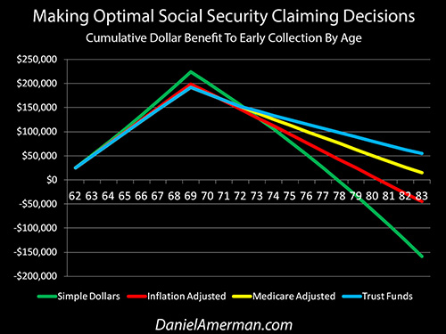
As explored in the analysis linked here, when we "up our game" and seek to make better decisions by taking more factors into account - the timing of when to claim benefits can change entirely.
The inflation-adjusted value of Social Security payments also needs to be placed in a much broader context. So long as tax collections fully keep up with the rate of inflation - but benefit payments do not - then inflation works to the financial advantage of the federal government.
The higher the rate of inflation, then the greater the losses for individual retirees - and the greater the financial gains for the government. This is true as a matter of design, it is created by the Social Security Inflation Lag Calendar.
The United States government has recently passed two financial thresholds - for the first time the national debt has passed $20 trillion and annual Social Security payments have passed $1 trillion.
The two are not unrelated. The pressures of making interest payments on the national debt, even as Social Security and Medicare expenses are projected to soar, mean that the government has powerful incentives to try to hold down the real expenses of the Social Security program - particularly if this can be done in ways that the general public does not fully understand.
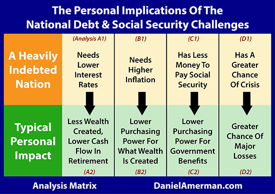
The analysis herein falls into the C2 family of analyses that can be found in the analysis matrix that is shown above and linked here. Because a heavily indebted nation has less money to pay Social Security (the C1 analyses), there is an enormous incentive for it to lower the purchasing power of Social Security payments.
There is a tight relationship between this analysis and the B series of analyses. Heavily indebted nations have major financial incentives to create higher rates of inflation for reasons that have little to do with Social Security (the B1 analyses). On a personal level (the B2 analyses), this means that the purchasing power of savings may be lower at the same time that maximum savings are needed to make up for the decline in the purchasing power of Social Security payments.
Everything is interrelated, and the nation's financial problems are all too likely to create corresponding financial challenges for savers and retirees - whether they see the mechanisms for the transmission from the nation to individuals or not. Which creates major incentives to make retirement financial plans that are aligned with this environment - rather than ignoring it.
Conclusion
This analysis is intended to be both a worthwhile standalone resource - and the first link in a chain of related analyses.
Hopefully, when you make financial plans based upon the receipt of Social Security payments, you will think of the graph above.
You will see past the green illusion of the nominal increases in benefits. You will also see past the illusion of constant purchasing power and the full inflation indexing of Social Security.
You will instead see the red "sawtooth" pattern of the third and governing level of financial reality, where inflation lags create an initial loss each January, and that loss steadily builds (on average) through December, before resetting to a new loss the following January.
With the degree of loss at the beginning of each year, and the steepness of the decline in purchasing power during the year being driven by the actual rate of inflation. And with even moderate rates of inflation being sufficient to have a material impact on the standard of living of retirees who are living on very tight, fixed budgets.
What has been left out? An enormous amount.
Starting with the next analysis we will expand our look to include some more deeply obscure technicalities, and their simply extraordinary impact on people for whom Social Security plays an important role in their retirement plans.
We will take a look at recent reported inflation, and changes in benefit payments. Using what has actually been happening, we will find what is currently hiding in plain sight, and the potentially life changing implications for anyone who is planning on relying on Social Security, with a magnitude that over time dwarfs what we have seen in this first analysis.
This analysis contains the ideas and opinions of the author. It is a conceptual and educational exploration of financial and general economic principles. As with any financial discussion of the future, there cannot be any absolute certainty. While the sources of information and the calculations are believed to be accurate, this is not guaranteed to be true. This educational overview is not intended to be used for trading purposes, those making investment decisions should do their own research and come to their own independent conclusions. This analysis does not constitute specific investment, legal, tax or any other form of professional advice. If specific advice is needed, it should be sought from an appropriate professional. Any liability, responsibility or warranty for the results of the application of the information contained in the analysis, either directly or indirectly, are expressly disclaimed by the author.
| Digg This Article
-- Published: Friday, 17 November 2017 | E-Mail | Print | Source: GoldSeek.com


