-- Published: Tuesday, 28 November 2017 | Print | Disqus
By Daniel R. Amerman, CFA
Most advice on long-term planning for retirement and Social Security benefits is based on the assumption that Social Security will fully keep up with inflation. As we are establishing in this series of analyses, the full inflation indexing of Social Security is a myth and there are major implications for standard of living in retirement as well as the associated decisions with regard to both Social Security and investment planning.
In this second analysis, we will use the actual historical data as reported by the Bureau of Labor Statistics and the Social Security Administration in recent years, instead of using long-term average inflation rates as we did in Part 1. Analysis of that data shows that the purported very low rates of inflation have been producing the equivalent of a one week bonus check for retirees each year, due to the reduction of inflation lag costs.
However, the index and methodology being used by the Social Security Administration have been producing smaller benefit increases than what the government itself has been saying is average inflation. This index mismatch, in combination with inflation lags is currently producing a steadily decreasing standard of living for retirees dependent on Social Security.
As we will explore, if what has been happening from 2015 through the current date continues into the future, then the average Social Security recipient will effectively lose a week of purchasing power roughly every four years. For someone who needs every dollar of 12 full months of income to pay 12 full months of retirement expenses, then this partial inflation indexing means that by 2024 the money will effectively be running out by December 12th, leaving the average retiree with an almost three week income shortfall.
Part One Of The Series
This analysis builds upon the Part 1 analysis, which is linked here. What was developed in Part 1 was the concept of the "Social Security Inflation Lag Calendar" as shown below.
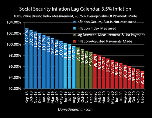
Assuming level and historically average inflation we have two lags that occur each year, each of which reduces the standard of living of retirees.
The first lag is the inflation that occurs between when the inflation index is measured (the light blue bars above) and the first monthly payment in January of the following year (the red bars).
On top of that there is a steady decline in the purchasing power of each payment over the course of the year, which with historically average inflation would mean that by the December payment the purchasing power of that benefit would only be worth about 95 cents on the dollar. This means that about a five percent reduction in purchasing power needs to be covered by the fixed income retiree in some manner.
Recent History & A One Week Bonus Check
In recent years the government has been reporting much lower rates of inflation than what we've seen over the long term.
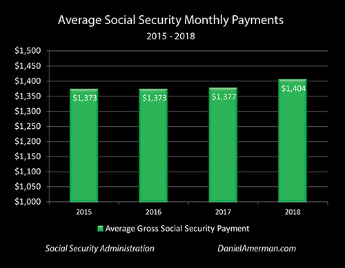
The graph above shows our actual historic benefit increases between 2015 and 2018 for someone who is receiving the average 2017 Social Security monthly benefit.
Payments have risen from $1,373 in 2015 to an average of $1,404 in 2018. On a smoothed basis if we look at the growth rate that it takes to go from $1,373 to $1,404 in that time, Social Security benefits have been rising at an average annual rate of 0.75%.
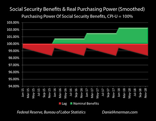
This rate of increase in Social Security benefits can be seen in the green "steps" in the graph, with benefits rising at 0.75% per year on a smoothed basis. (This type of graph was developed in Part 1 of this analysis, and while somewhat unusual, is a particularly accurate look at how Social Security purchasing power really works on average.)
Inflation as reported by the government has been about 1.216% per year. More specifically, in this case we're looking at inflation as being the widely reported Consumer Price Index for All Urban Consumers (CPI-U) as measured on September first of each year, which corresponds to the end of the annual Social Security index measurement period.
Using the government's 1.216% rate and applying it to the Inflation Lag Calendar as developed in Part 1, this would mean that the January payment would on average have a purchasing power of 99.4 cents, this would fall until the December payment came in with a purchasing power of 98.3 cents, and the average purchasing power of all twelve payments is about 98.85 cents each year.
So long as we accept the government's inflation numbers - this one aspect has been good news for retirees in recent years. With historically average inflation of 3.5% the average purchasing power of payments would be 96.76%, but with the much lower recently reported inflation, that increases annual purchasing power by just over 2%. Which means every Social Security recipient has been getting an extra 2% in purchasing power each year.
If we look at that on a 365 day basis, then retirees across the nation have been getting an extra week of purchasing power with their benefits each year as a result of reduced inflation lag losses - which could be viewed as equivalent getting a bonus check for an extra week's income each year.
Now that's helpful but we have an issue.
When The Benefit Index Is Different From The Expense Index
Our average CPI-U inflation rate as reported by the government was 1.216% per year.. But Social Security benefits were only rising on a gross basis by on average about 0.75% per year - which is a shortfall of about 0.47% per year.
This is what has been happening in reality in recent years and it illustrates a fundamental risk for retirees what if the index and the methodology that benefits are based upon rise at a slower rate than what retirees are experiencing in terms of their expenses in retirement?
Now the widely reported CPI-U inflation index is not the same thing as average retiree expenses and we'll get back to that in later analyses. But if we for this stage 2 analysis just take everything at face value and assume that the CPI-U is an entirely accurate and fair measure of inflation for retirees benefits are still not keeping up.
When we take into account both the inflation lag and the obscurities of the measurement of Social Security benefits using the CPI-W index as described in Part 1 of this analysis, we get the table below.
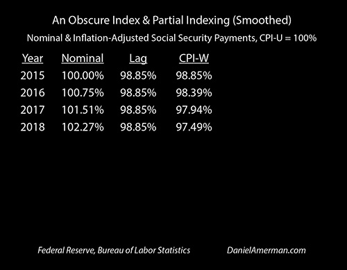
On a smoothed basis the nominal benefits do climb (on average) every year as seen in the "Nominal" column, and on the surface it looks like retirees are doing just a little better each year.
Those gains are not just entirely wiped out each year when we adjust for inflation, but benefit purchasing power drops below 100 cents on the dollar when we take into account inflation lags as shown in the "Lag" column. The inflation lag losses reset every year as inflation is re-measured and the new lags begin. So long as the rate of inflation does not change we have the same loss each year, and the purchasing power of our benefits is 98.85 cents on the dollar.
But to the extent that the methodology used with the measurement of the CPI-W index for benefits is different from what we're seeing with the CPI-U index for expenses, then we get a persistent and cumulative difference that builds over time.
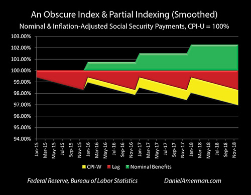
This is shown graphically above with the yellow area of lost purchasing power.
Even as the green line of benefits slightly steps up every year there is an ongoing annual loss of purchasing power every month and year that we see with the red "saw-tooth" pattern (developed in Part 1).
But if we take recent history and apply it, then we have a second source of purchasing power loss going on - the yellow area on the graph - which is our benefits not quite keeping up with inflation even as reported by the government, and this loss steadily grows over time.
It should be noted that this is a form of "blended" analysis, including both the past and the near future. Historical data is used wherever it is available, and we do know what average Social Security payments will be through December of 2018. What we don't know is what inflation will be between now and then. So the government reported rate of 1.216% is extrapolated forward until the end of 2018.
If The Recent Past Repeats Itself
The purchasing power of Social Security benefits dropping by about 2.5% over the course of several years may not seem like a particularly big deal to the average person. However, if those subtle annual differences are allowed to accumulate over a longer period of time, the strength can build to a degree that would be surprising to most people.
If we take that very mild 0.47% annual differential between inflation as measured by the CPI-U and the obscurities of the actual inflation methodology that is used by the Social Security Administration for determining benefit increases, and project further into the future, then we get the table below.
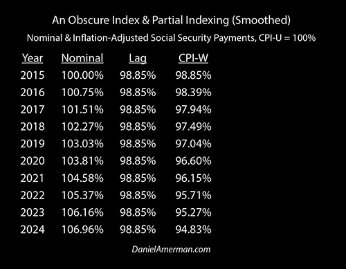
We're off a little bit more in 2018 and 2019 than we are today.
If recent history were to repeat itself and we were to continue with very low inflation and a very slight benefit and expense mismatch we will be below 97 cents on the dollar by 2020.
Then we go below 96 cents on the dollar by 2022.
And we go below 95 cents on the dollar by 2024.
Meaning if we look back and compare this to 2015 that the standard of living that can be supported in retirement is off by almost 5 percent within the next seven years, even in an environment of purportedly very low inflation.
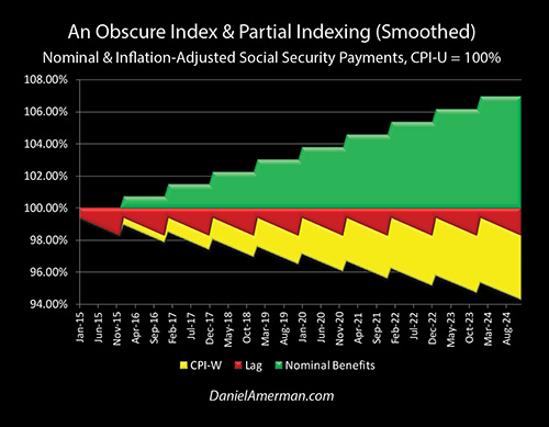
This growing discrepancy is boldly obvious when we take a visual look at the growing yellow area of lost purchasing power in the graph above.
Again this may look unusual but this is what Social Security benefits have been looking like on a smoothed basis over the last several years, and what they will continue to look like if recent history repeats itself.
On the surface, the green area of benefits will on average grow a little bit higher every year.
However this will not produce what true full inflation indexing would look like, which is a purchasing power line that is constant at 100 percent - because that is a myth.
Instead, when we look at the red area of lost purchasing power, the reality of the "saw-tooth" pattern of inflation lag losses, the benefits will buy less in January each year they did when the inflation was measured. And each subsequent payment will then buy just a little less (on average) over the course of each year.
When we go out for a period of just 10 years the cost of even a slight index mismatch become boldly apparent.
The yellow area of purchasing power losses grows steadily larger over time, even as the surface of nominal (not adjusted for inflation) benefits continues to seemingly increase.
A tangible and personal way of looking at this is to return to the approach that we developed in Part 1 of this analysis. Where we assumed that we had a retiree on a fixed income who needed every dollar available from 12 months of income to meet their 12 months of expenses over the course of the year and then we looked at what happened to them when the money ran out because of the diminishing purchasing power of their benefits.
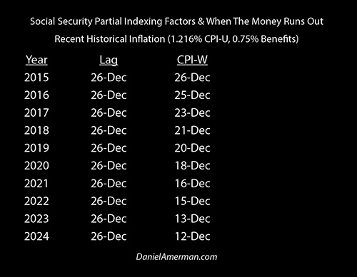
If we look back to 2015, just inflation lags by themselves are enough for the money to have run out by December 26th.
By December of 2017 the money runs out by December 23rd, as our benefit/expense indexing mismatch slowly starts to build.
By 2021 the money runs out by halfway through December - over two weeks of real income has been lost - relative to what would have been if Social Security were really fully inflation indexed.
By 2024 the money runs out by December 12th.
If recent history repeats in a manner that exactly conforms with what the government itself is reporting with very low inflation and a very slight index mismatch that means an average retiree by 2024 will be coming up short for almost three weeks of expenses per year.
Think about that for every retiree in the country - given that for most retirees Social Security is either all of their income in retirement or most of their income in retirement.
Where, exactly, are they going to do to come up with the money to pay the expenses that would have been covered with those missing three weeks worth of income purchasing power? How will they adjust their lifestyles? What will happen to their daily quality of life?
Broader Implications
There are many implications when it comes to the partial inflation indexing of Social Security benefits.
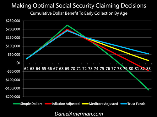
As a starting point - as explored in the analysis shown above and linked here, there can be a profound impact on the decision for when to begin collecting Social Security. Most decision aids assume full inflation indexing, which then tends to favor deferring the collection of Social Security. When partial inflation indexing is taken into account, the advantage can shift to earlier collection.
It should also be noted that the United States government has recently passed two financial thresholds - for the first time the national debt has passed $20 trillion and annual Social Security payments have passed $1 trillion.
The pressures of making interest payments on the national debt, even as Social Security and Medicare expenses are projected to soar, mean that the government has powerful incentives to try to hold down the real expenses of the Social Security program - particularly if this can be done in ways that the general public does not fully understand, such as partial inflation indexing.
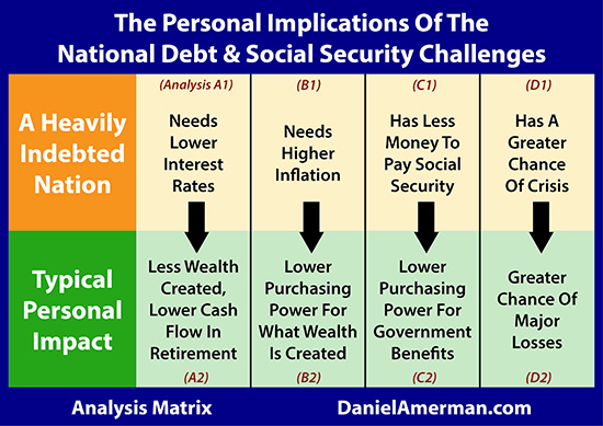
The analysis herein falls into the C2 family of analyses that can be found in the analysis matrix shown above and is linked here. Because a heavily indebted nation has less money to pay Social Security (the C1 analyses), there is an enormous incentive for it to lower the purchasing power of Social Security payments.
Conclusions
Partial inflation indexing is a subtle concept that nonetheless has the power to transform standards of living in retirement for an entire nation.
Even with very low rates of inflation and a very slight mismatch between benefits and expenses, with technical and obscure divergences that are so low that they are hard to see in any given year - the mathematics that will govern actual standard of living in retirement are nonetheless undeniable.
The subtle does become the material, given enough time.
What we have just examined is enough to reduce real annual income by roughly one week per year - every four years.
Now, let's consider someone who has just retired at 64 years of age, and for retirement planning purposes they expect to live until they are 84 years old.
If their expectations are met, that is a twenty year time frame. And even assuming Social Security payments are made in full over those years, that means living through five cycles of four years each, and losing roughly a week of purchasing power each cycle (or close thereto, the actual math is a little different).
How does that work out for an individual?
How does that work out for a nation?
Could that fundamentally change retirement planning decisions?
Could that fundamentally change investment goals and decisions?
We will continue this exploration in the Part 3 analysis.
This analysis contains the ideas and opinions of the author. It is a conceptual and educational exploration of financial and general economic principles. As with any financial discussion of the future, there cannot be any absolute certainty. While the sources of information and the calculations are believed to be accurate, this is not guaranteed to be true. This educational overview is not intended to be used for trading purposes, those making investment decisions should do their own research and come to their own independent conclusions. This analysis does not constitute specific investment, legal, tax or any other form of professional advice. If specific advice is needed, it should be sought from an appropriate professional. Any liability, responsibility or warranty for the results of the application of the information contained in the analysis, either directly or indirectly, are expressly disclaimed by the author.
| Digg This Article
-- Published: Tuesday, 28 November 2017 | E-Mail | Print | Source: GoldSeek.com

