-- Published: Tuesday, 14 August 2018 | Print | Disqus
By Rambus
For the last several months or so Ive been showing you that many of the important currencies that make up the US dollar have been breaking down from large 2 1/2 year trading ranges. If you want to know what the US dollar is going to do the first thing you need to do is look at the important currencies that make up the US dollar as the US dollar is just a derivative of those currencies. Most of the time a stock, or in this case the currencies that make up the US dollar are trading within a reversal pattern, consolidation pattern, or are in an impulse move. Its that impulse move that you want to be aware of and the earlier the better.
Tonight Im going to update most of the currencies weve been following over the last several months because I believe theyre in the process of beginning an important impulse leg down which can have a profound affect on the PM complex and commodities in general. These types of moves dont come around all that often, but when you begin to see an important setup maturing its usually worth the risk to try and take advantage of what the market will give you and impulse moves are what I live for as an intermediate term trader.
Im not going to go into a lot of detail as weve been following these different currencies pretty closely for the last two or three months. Its important to understand that most of the currencies we are going to look at have been in a bear market since the 2011 H&S top in most cases. From the initial breakdown below their respective necklines their impulse move really got underway even though it actually started at the previous high, which was the top of the right shoulder.
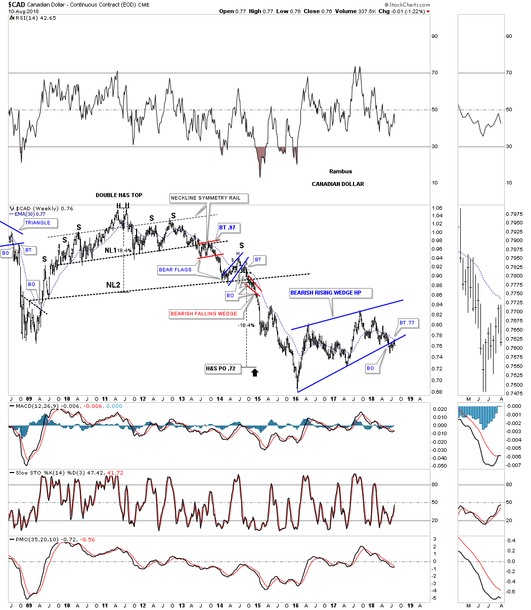
Lets start with the $CAD Canadian dollar, which formed a massive H&S top in 2011 with the first impulse leg down starting at the right shoulder high. Confirmation of that impulse leg is when the price action broke below the neckline. Like with so many things realated to the currencies, PM complex and commodities in general, 2016 marked an important low which finished up a very large impulse move down. As you can see it has taken the CAD dollar 2 1/2 years to consolidate that massive leg down. For the last several months the price action has been in breakout and backtesting mode to the bottom rail of that 2 1/2 year bearish rising wedge which Im labeling as a halfway pattern. Also keep in mind that Canada is a natural resource country.
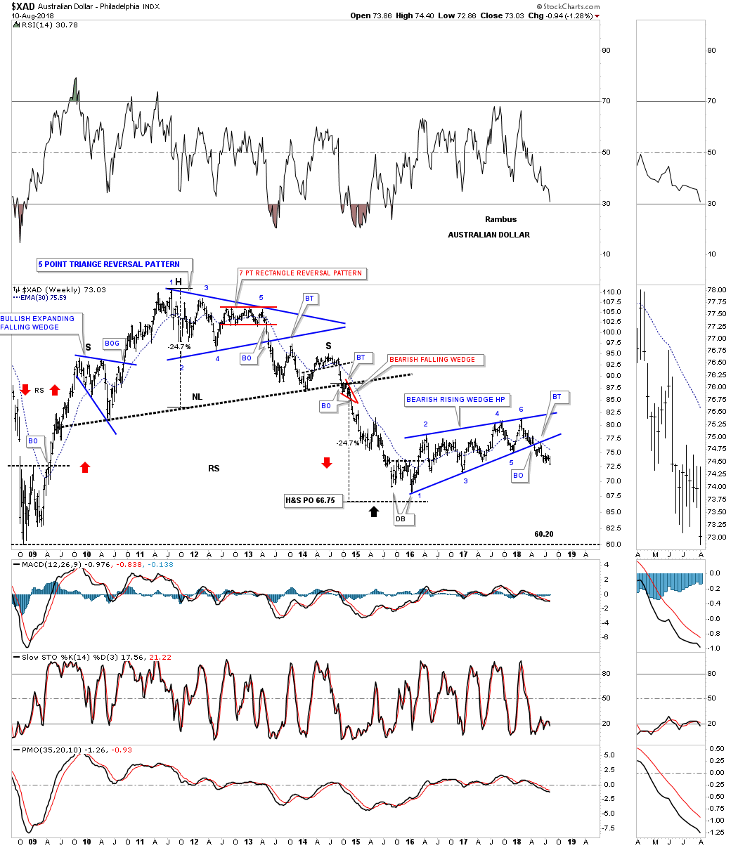
Another natural resource country is Australia with its currency looking very similar to the Canadian dollar, but is actually a little further along in its impulse move lower as it closed last week at a new low since the breakout from its bearish rising wedge. Again you can see the massive H&S top followed by the first impulse move down followed by the 2 1/2 bearish rising wedge consolidation pattern with the possible next impulse move down already underway.
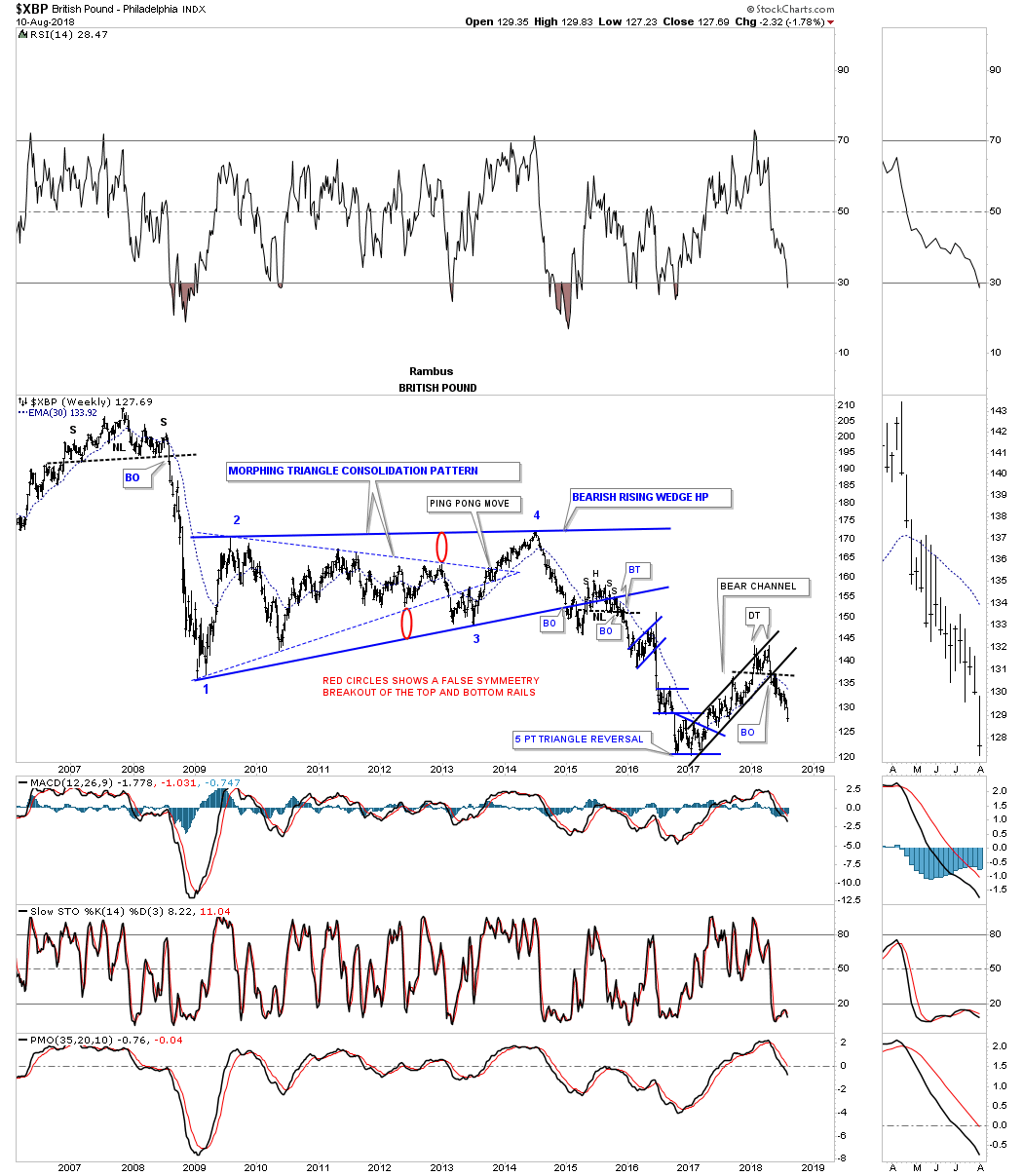
Next is the $XBP, British pound, that is setup a bit differently than the two currencies above as it built out a smaller, but just as effective as the one year H&S top in 2008. That impulse move ended in 2009 where the British pound began to consolidate that leg down by building out a massive six year morphing triangle consolidation pattern. In October of 2016 the XBP began to consolidate the impulse leg down forming a year and half rising flag formation. Early this year the rising flag formation broke out to the downside and made a new low for this move.
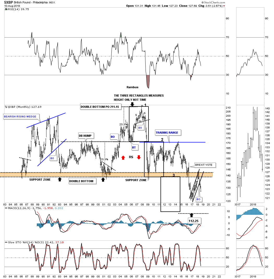
Im going to show you the monthly chart for the British pound as it shows you a good example of how support, once broken to the downside, can turn into resistance when tested from below on a countertrend rally.
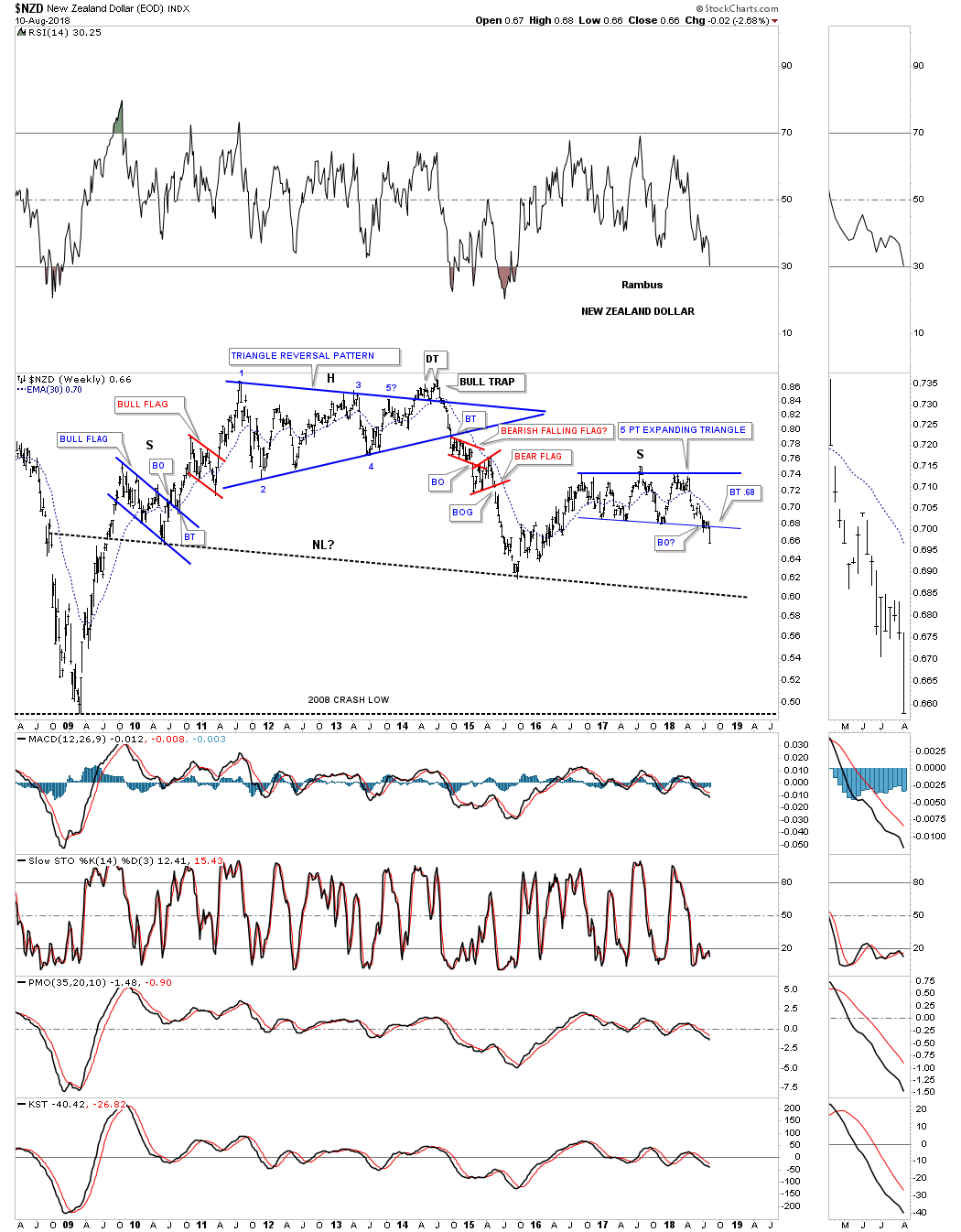
The $NZD, New Zealand dollar, topped out in 2011 but then went on to build out a large multi year triangle reversal pattern which led it its first bear market decline into the middle of 2015 low. Last week the price action broke down from the blue 5 point expanding triangle reversal pattern. Its a reversal pattern because it formed above the 2016 low.
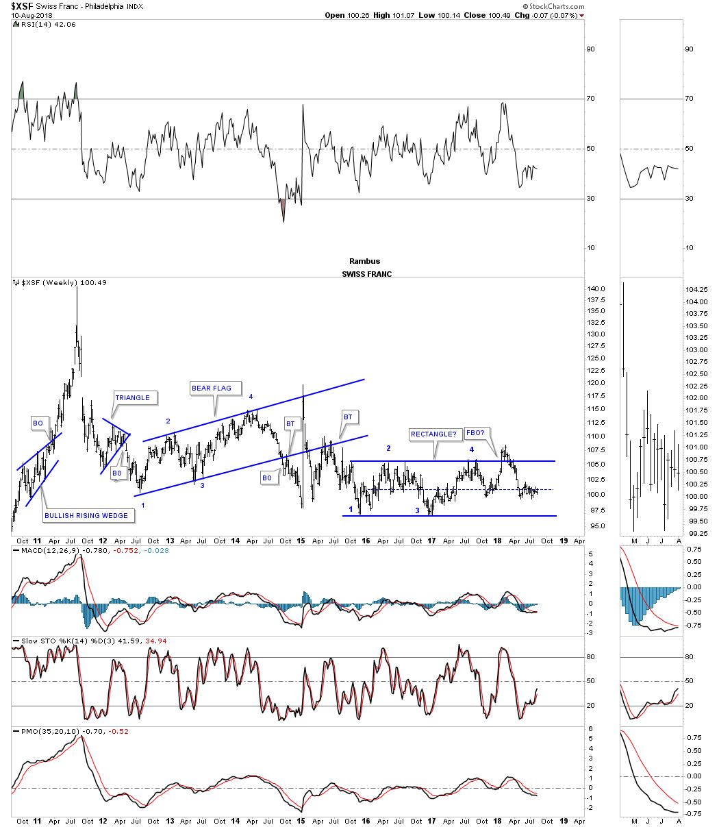
The $XSF, Swiss franc, had a parabolic spike into its 2011 all time high with the first impulse move down reversing symmetry into the January 2012 low. From that point its been on pretty much a sideways chop with a possible rectangle forming since the low in November of 2016 just over 2 1/2 years.
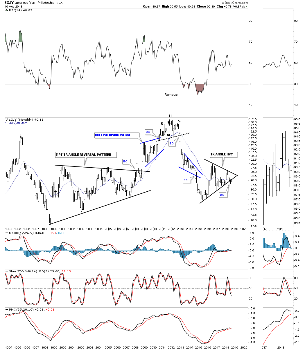
The monthly chart for the $XJY, Japanese yen, ended its bull market by building out a H&S top reversal pattern in 2011 followed by a strong impulse leg down which finally bottomed in January of 2015. From that January 2015 low the yen has been constructing a large triangle consolidation pattern with a breakout to the downside early in July of this year.
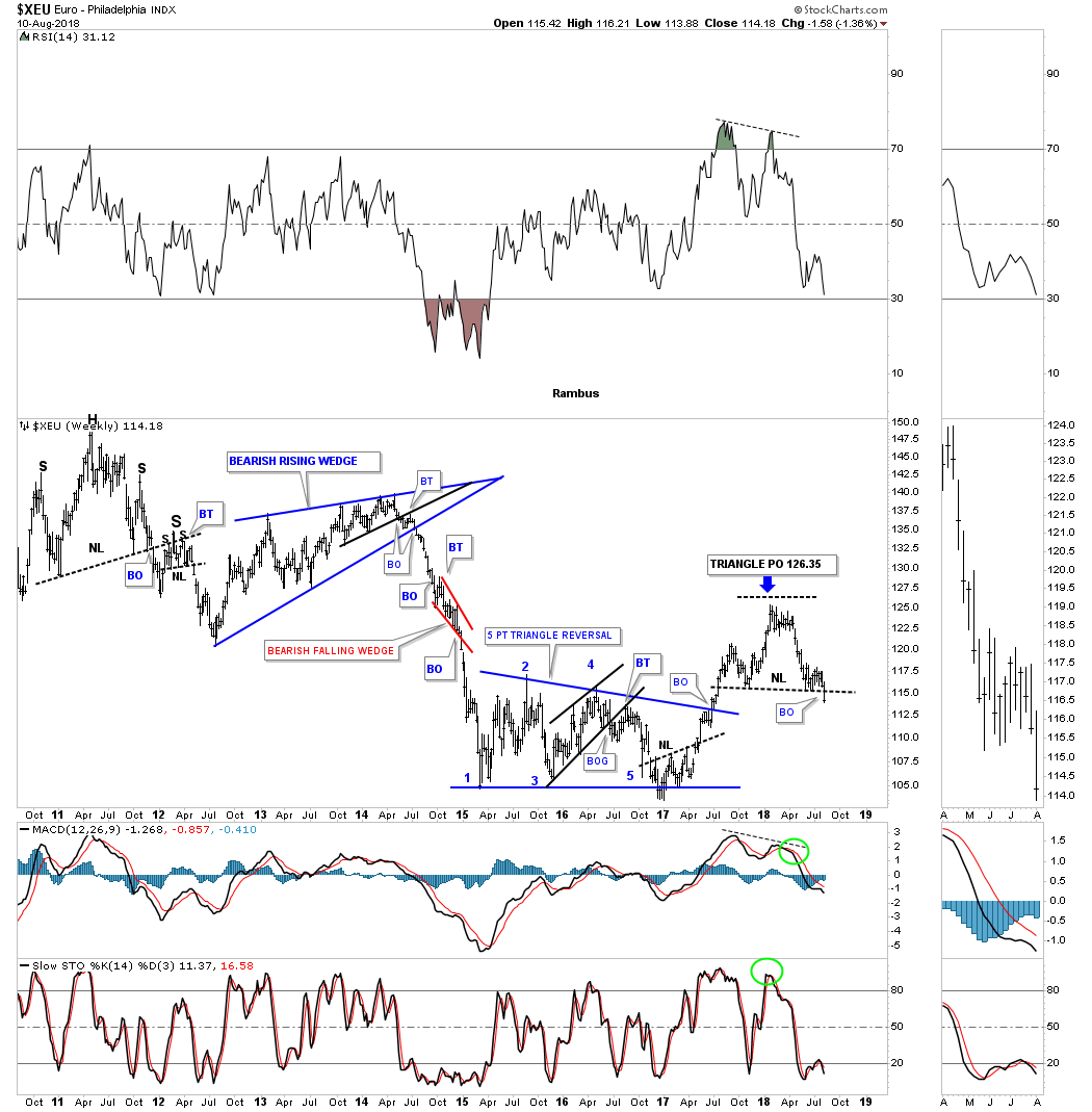
The $XEU euro, is the biggest component of the US dollar and actually topped out in 2008 building out a massive 12 year H&S top. Last week the euro broke below the neckline of its H&S top which was the backtest to that massive 12 year neckline.
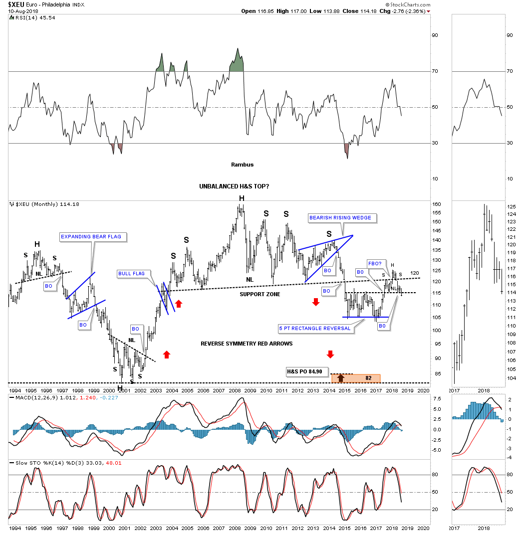
Since the XEU makes up the biggest part of the US dollar we can see a small H&S top on this weekly chart made over the last year. If the XEU is building out a H&S top, then the US dollar will have been building out a H&S bottom of that same timeframe.
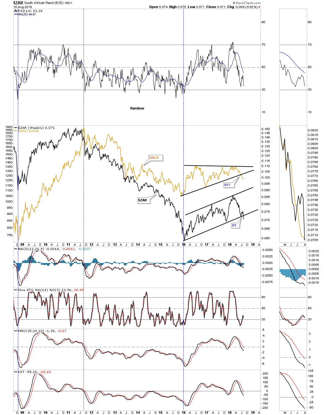
There is another currency that actually has a pretty close correlation to gold which is the $ZAR, South African Rand. Again the 2016 low marked the time when both gold and the $ZAR began their 2 1/2 year consolidation patterns.
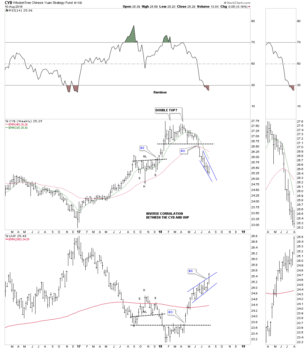
This last foreign currency well look at is on a combo chart which has the CYB, Chinese yuan on top and the UUP on the bottom. There appears to be a pretty good inverse correlation between the two.
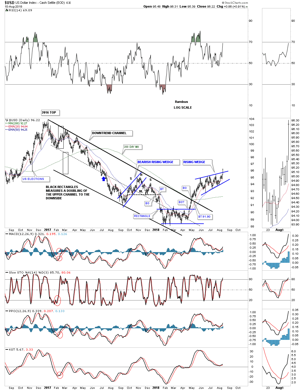
All the foreign currency charts above show there appears to be a race to the bottom which in turn should be bullish for the US dollar. Last Friday the US dollar finally broke out from its nearly three month bullish rising wedge. These types of consolidation patterns are no different than any other consolidation pattern other than they tell you the move will be strong. The price objective for this rising wedge should be in the neighborhood of 100 to 103. A backtest to the top rail would come into play around the 95.75 area.
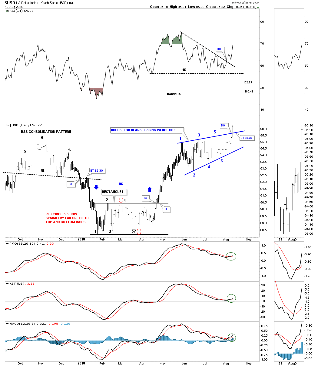
Below is a longer term daily chart for the US dollar which shows how the price action has been reversing back up after the 2017 decline.
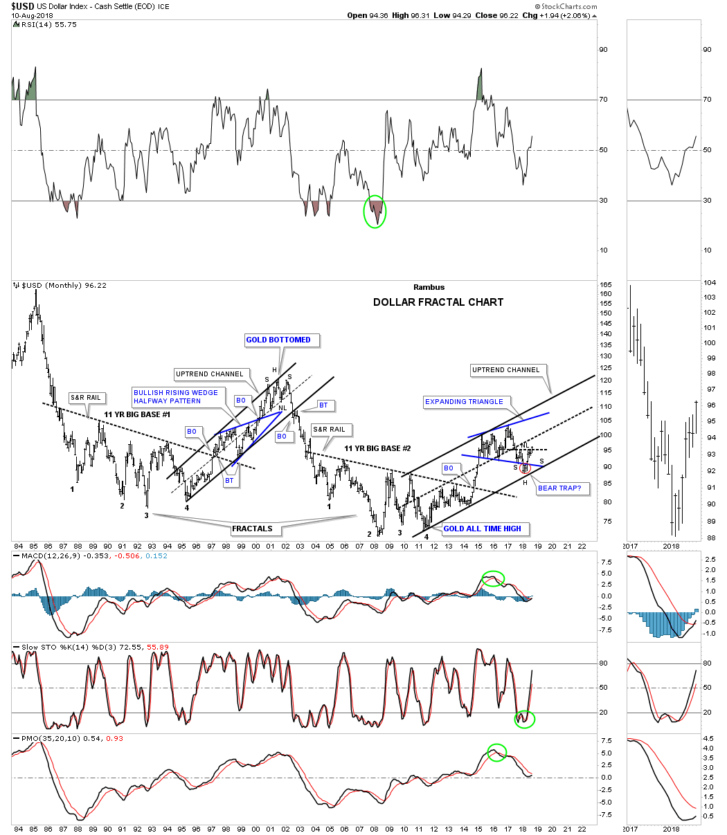
Below is a 35 year monthly chart for the USD which shows its 2011 uptrend channel with the blue expanding triangle and the red bear trap, red circle. If you look to the thumbnail on the sidebar you can see the H&S bottom a little more clearly with the bullish rising wedge being the right shoulder.
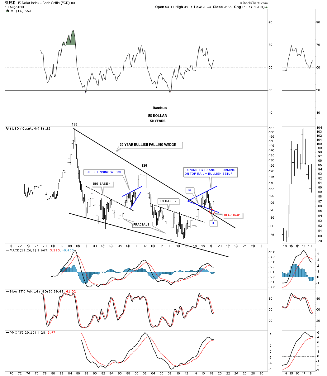
Will we ever see the 165 area again on the US dollar in our lifetime which would be the price objective of the 30 year falling wedge?
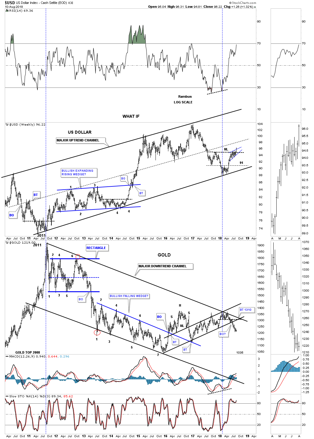
Below is a weekly combo chart which has the US dollar on top and gold on the bottom. From a short term perspective the inverse correlation can be a little ragged but on this longer term chart the big picture shows the inverse correlation to be pretty good over time.
This next chart is a 2 year static chart which shows the 2014 to the 2015 impulse leg up for the US dollar had that we followed in real time back then. As you can see the first two small consolidation patterns were the two red rising wedges. Beginning in October of 2014 the US dollar began to buildout a much bigger black bullish rising wedge which was built with two smaller consideration patterns, the blue bull flag and rectangle. Note the breakout gap above the top rail of the black rising wedge and the clean backtest which confirmed for me the black rising wedge was indeed the correct pattern. After the breakout from the black bullish rising wedge the US dollar had one more consolidation pattern to build out which was the red triangle before that major impulse move finally ran its course.
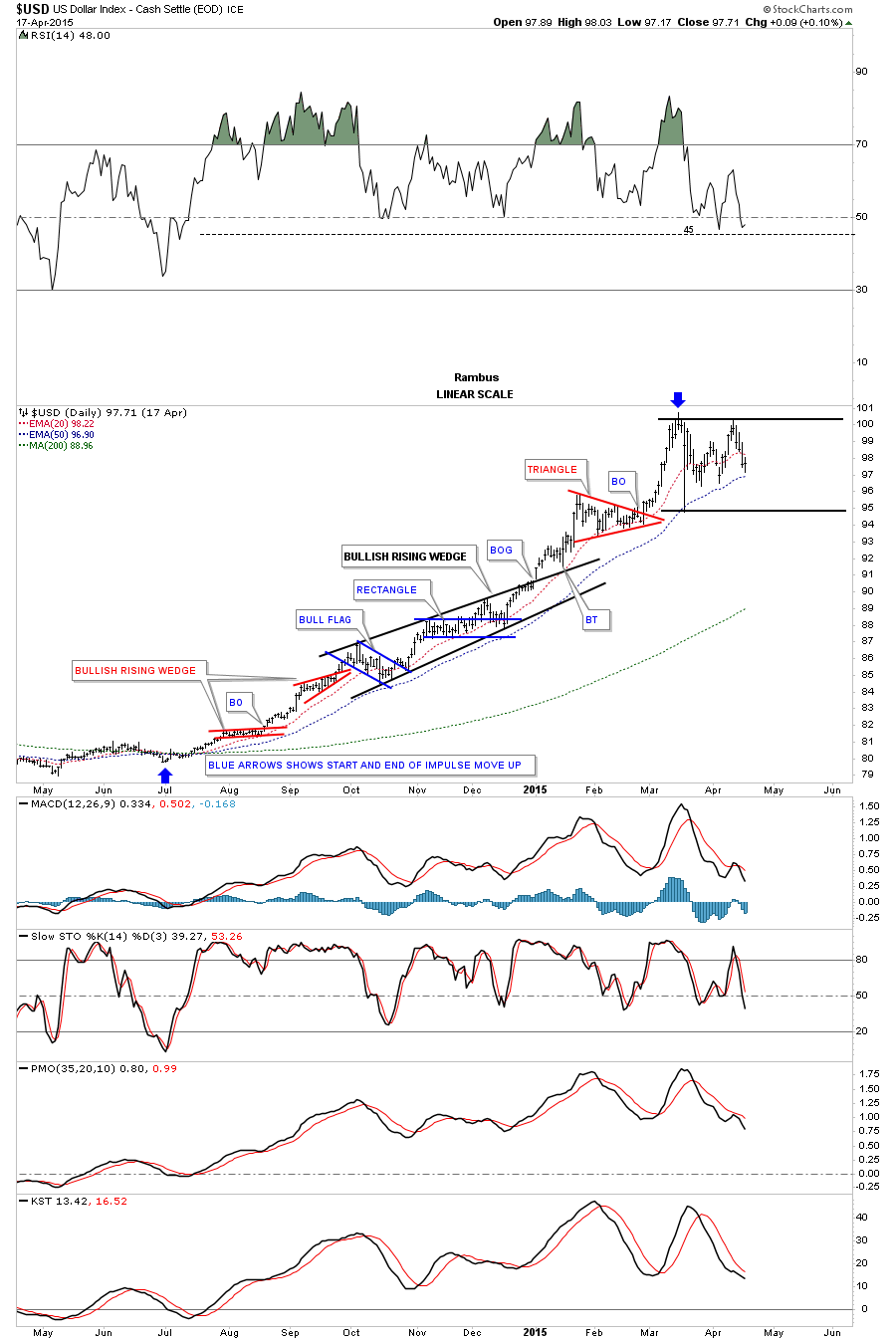
With the breakout of the bullish rising wedge last Friday there is a chance that we could see an impulse move similar to the 2014 2015 leg as shown on the chart above. If we get something similar the combo chart below shows how many of the different asset classes performed during that time. Only the TLT kept pace with the US dollar as it made a series of higher highs and higher lows. The SPX followed the US dollar higher initially but then had a small correction, black arrow, before ralling again with the US dollar. GLD and GDX bottomed initially in November of 2014, experienced a decent counter trend rally while the US dollar was still building out the black bullish rising wedge. They both declined once more as the US dollar was approaching its 2015 high but managed to close just above their 2014 low, red arrows. The WTIC declined pretty strongly during the US dollars impulse move up but also created a double bottom between its two lows. The $XEU looked like it was the weakest area to be in during the US dollars rally leg while the Japanese yen fared slightly better by not making a new low.

BONDS
Ive been writing about the bonds throwing us a possible curve ball which still hasnt made it to the plate yet. There has been a lot of chopping action over the last several weeks which is failing to give us any confirmation one way or the other. After bouncing off the possible neckline back in July the $TNX, 20 year bond, produced a possible second right shoulder of a H&S top. Fridays price action gapped below a small H&S top which formed the second right shoulder high. Now we are back down to the July lows once again. A breakout below the neckline will signal lower bond yields are coming which I think will catch a few investors off guard. In my last post on the bonds I said I would pay close attention to the price action because its such an important inflection point.
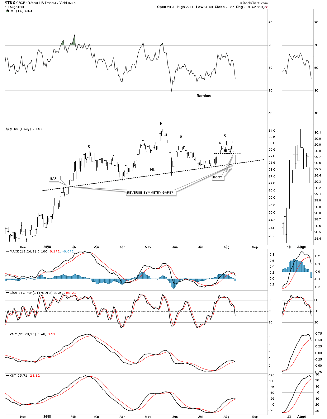
Below is a longer term daily chart for the $TNX.
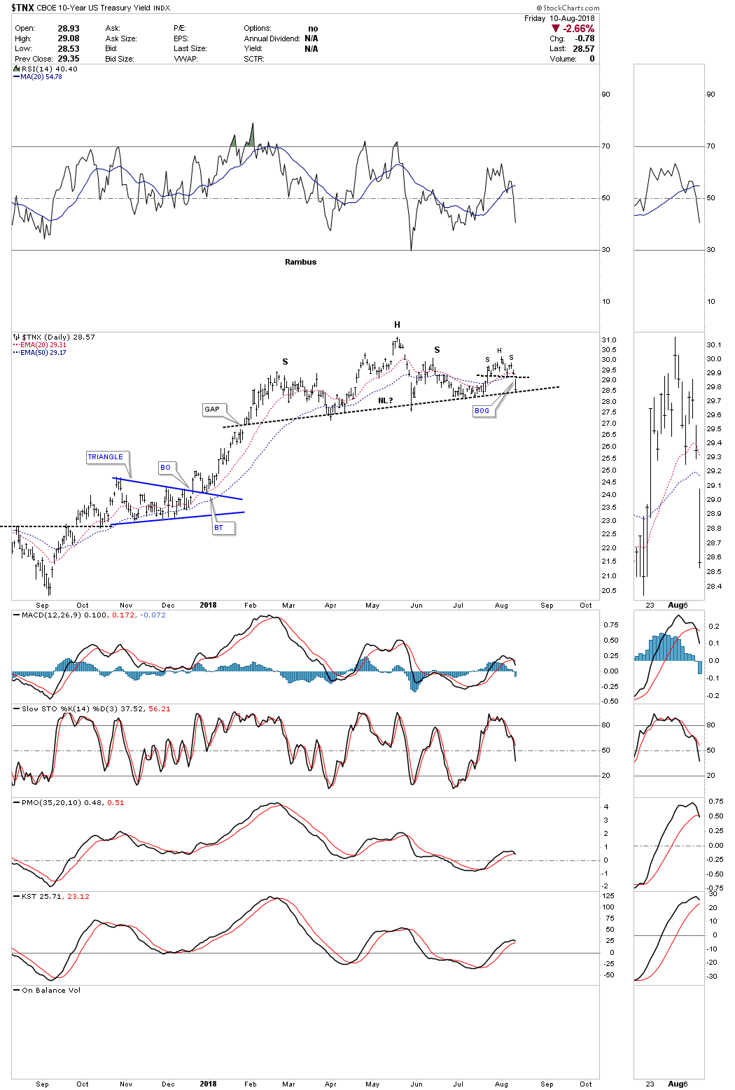
If this 2018 H&S top breaks to the downside it will complete an even bigger trading range a 2 1/2 year bearish rising wedge. Many times with a setup like this we can see the neckline and the bottom rail of the rising wedge broken at the same time with a big breakout move. This is some thing we need to keep a close eye on.
Ive been speculating for the last couple of months that instead of seeing a strong inflationary environment over the intermediate term the charts are suggesting we could see a deflationary event sooner rather than later. At this point in time I would view it more like 2014 to 2015 time frame when the US dollar had its major impulse move up while currencies and commodities had large declines. This could also give the US stock markets time to correct back down to the bottom of their January 2018 consolidation zones. These types of setups dont come around all that often, but Im perpared if we see the US dollar keep advancing while the interest rates start to decline once again. Have a great weekend and all the best
Rambus

https://rambus1.com/
| Digg This Article
-- Published: Tuesday, 14 August 2018 | E-Mail | Print | Source: GoldSeek.com

