Sometimes a stock can push you just far enough to make you doubt the validity of your analysis just at the most opportune time. Such has been the case for the US dollar where all the evidence strongly suggests its in a bull market. Im not going to go into a lot of detail right here, but I want to show you a couple of charts for the XEU and the XJY that still suggest theyre weak compared to the US dollar.
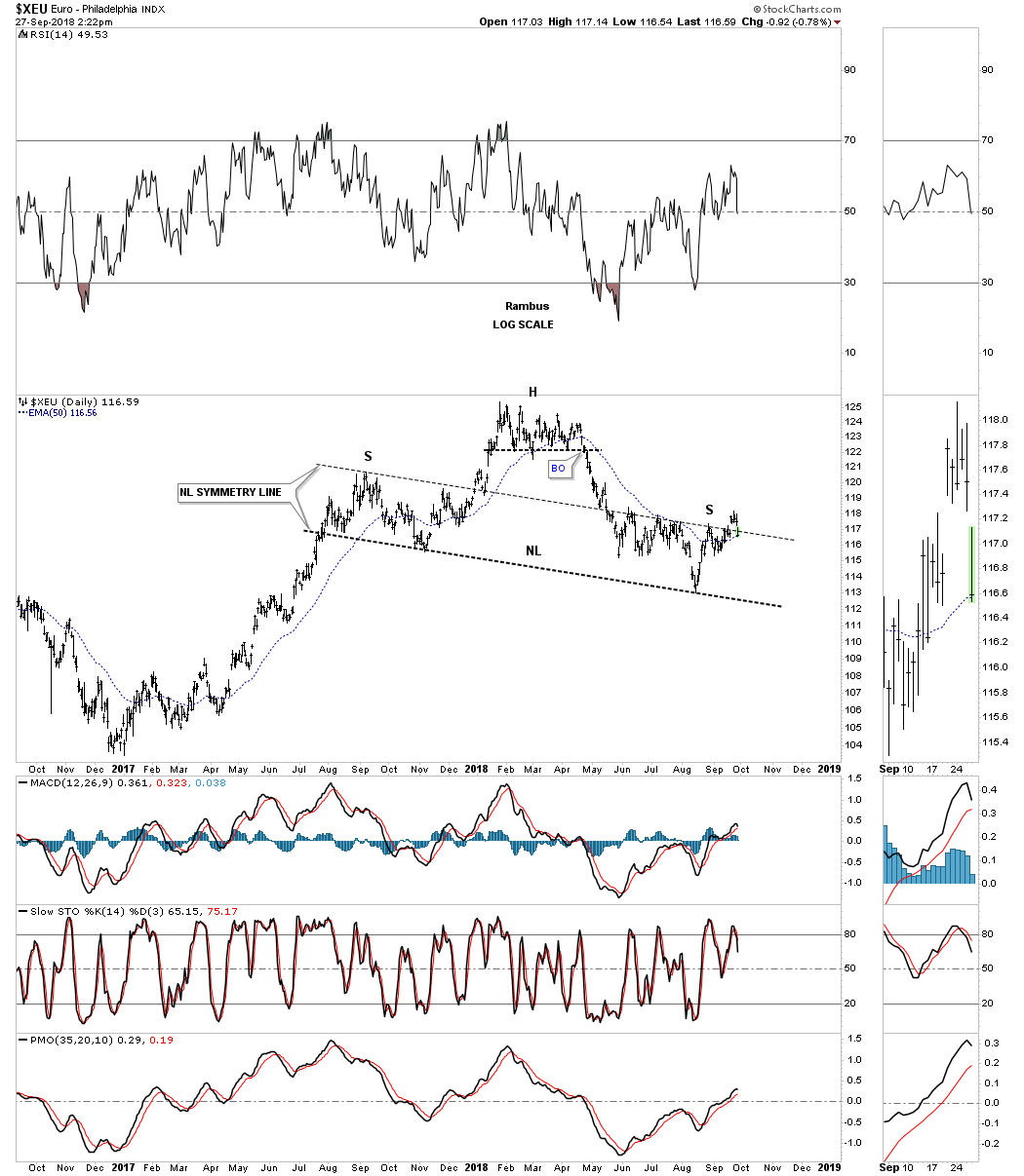
This first chart is a daily bar chart for the XEU which shows the possible H&S top building out. The last time we looked at this chart the price action was building out the right shoulder with the neckline symmetry line showing the height of the right shoulder. As you can see the XEU traded slightly higher than the neckline symmetry line which for a few days looked like the possible H&S top maybe failing. Note the gap above the neckline symmetry line and now the gap below the neckline symmetry line which shows an island reversal above the neckline symmetry line, see sidebar for more clarity. The year plus H&S top is still in play IMHO.
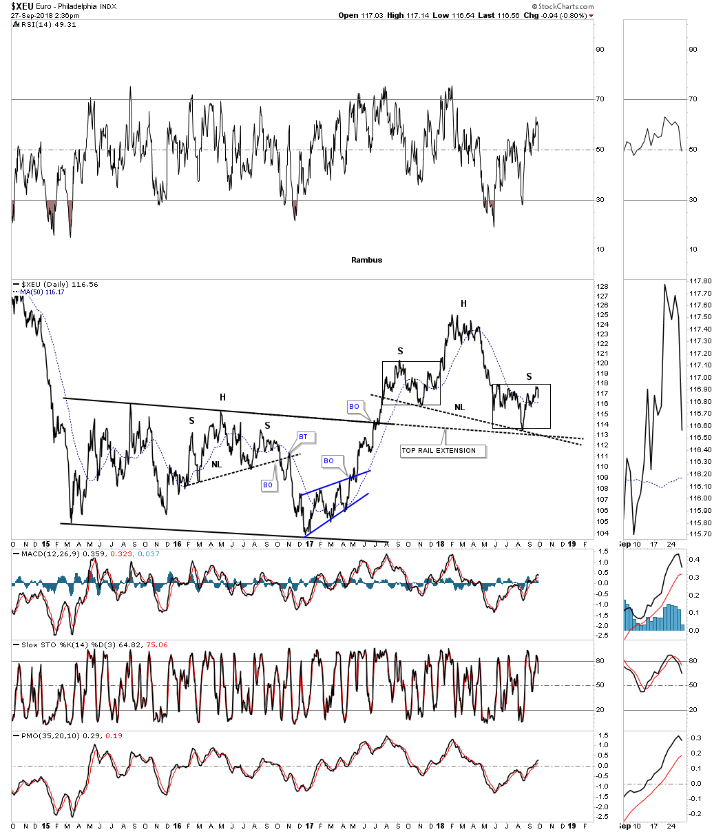
Next is a longer term daily line chart we looked at that shows how symmetrical the left and right shoulders are as shown by the black rectangle that measures time and price. This potential H&S top wont be complete until support is taken out around the 112 area where the neckline and the top rail extension line come into play.
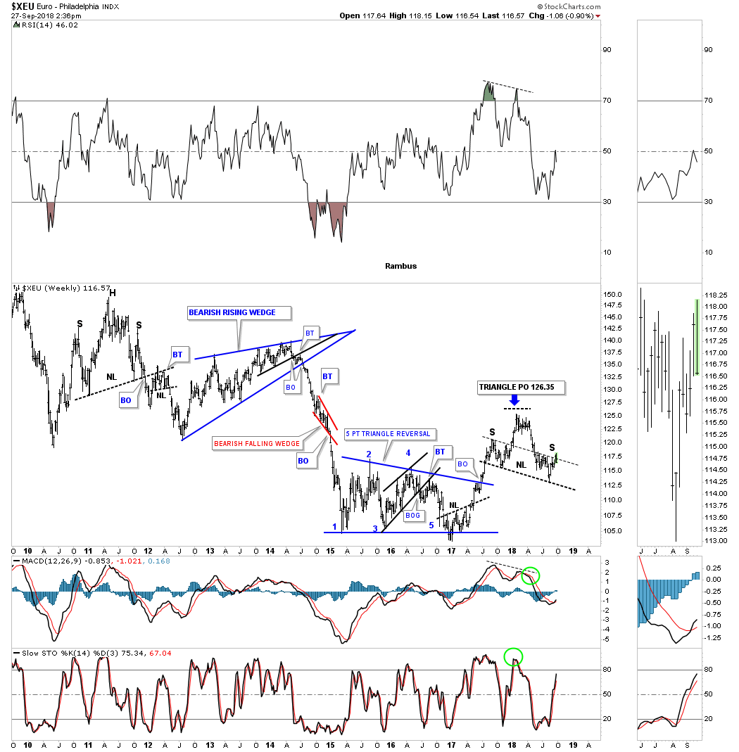
Below is the weekly look for perspective.
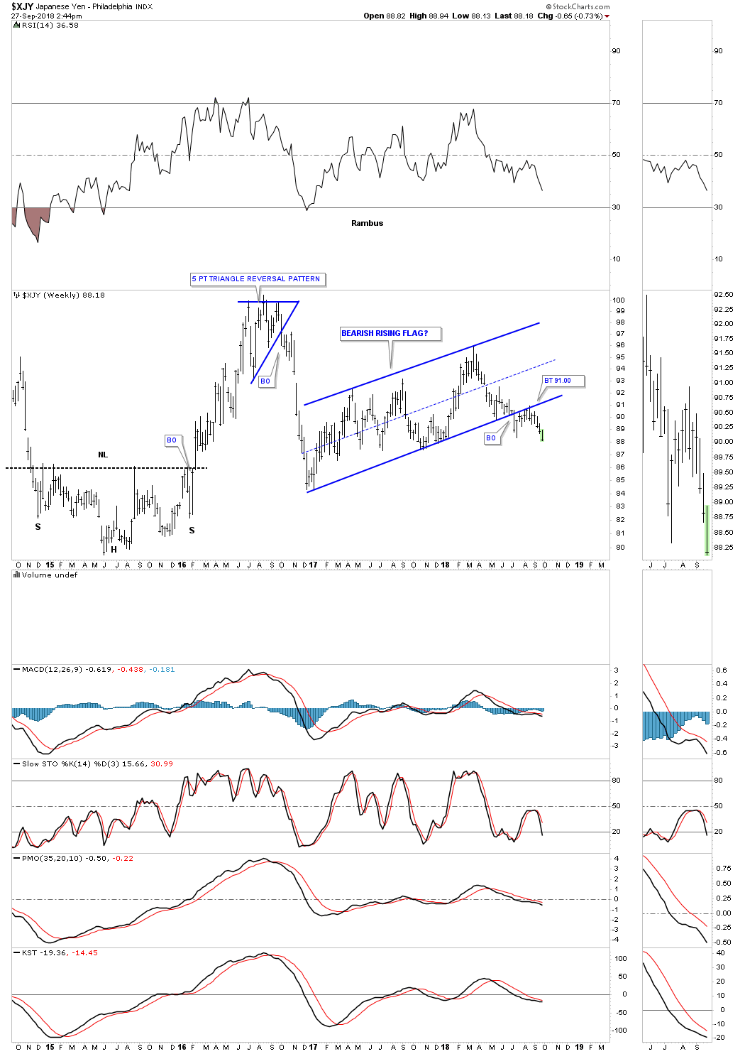
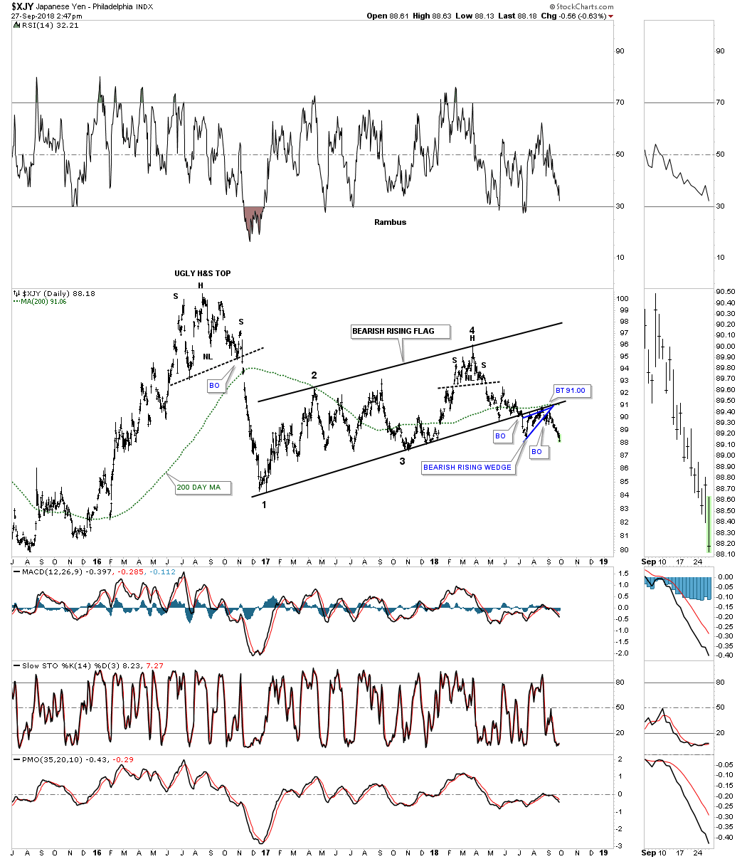
The XJY on the other hand has been straight forward in its impulse move to the downside after competing the backtest to the year and a half bearish rising flag formation. As you can see the price action is now trading slightly below the initial breakout low just before the backtest took place.
Below is a little more detailed look at the XJY chart from above which shows the backtest to the bottom rail formed a bearish rising wedge on this daily bar chart with the 200 day moving averaging helping with resistance.
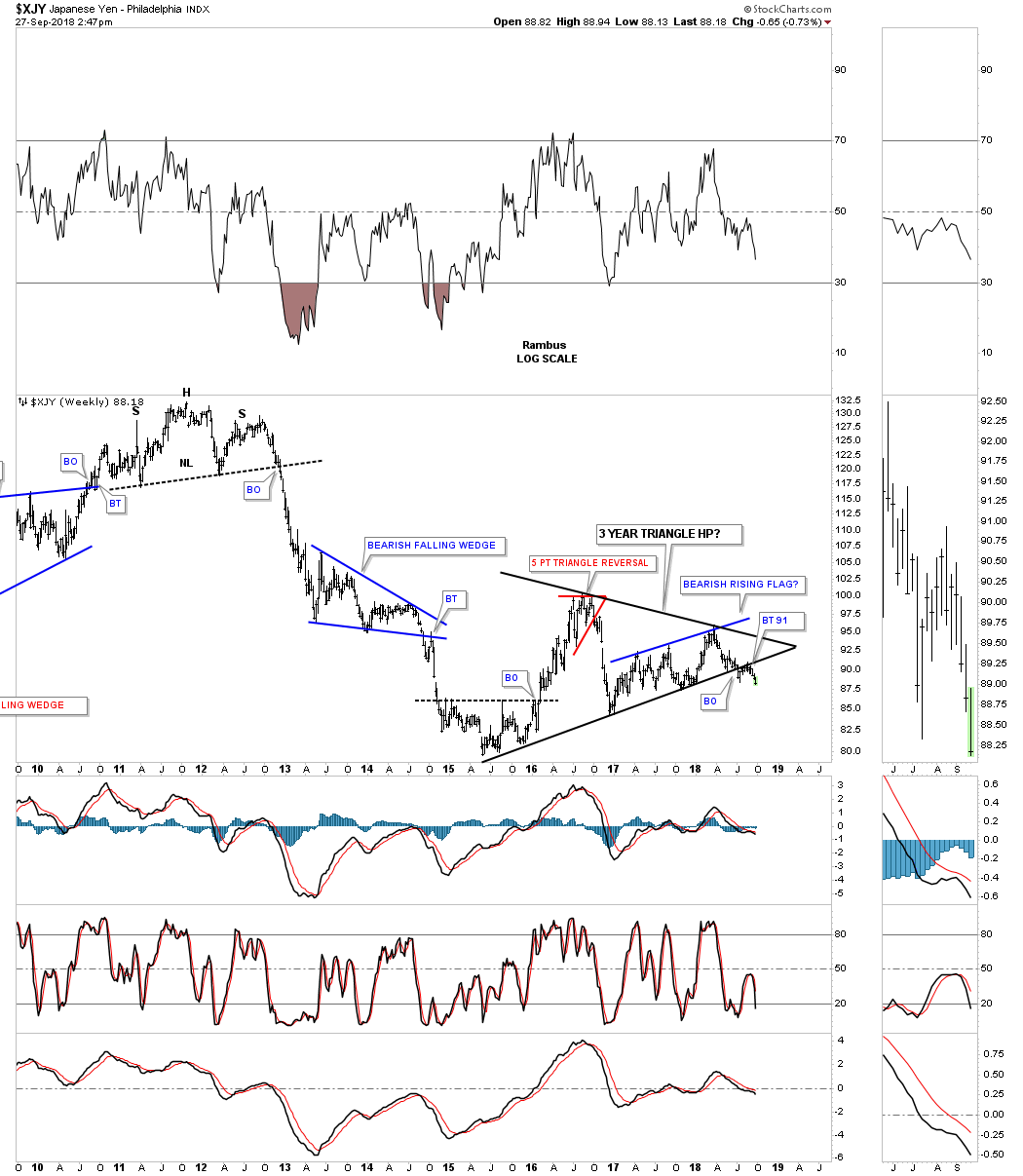
The XJY has actually formed one of the biggest consolidation patterns of all the important currencies that makeup the US dollar. While many of the currencies started to build out their consolidation patterns starting at the beginning of 2016 the XJY started to build out its consolidation pattern in the middle of 2015 creating a three year symmetrical triangle. The bearish rising flag we just looked at on the daily chart above is just a part of the bigger three year triangle consolidation pattern with its bottom rail broken simultaneously with the bottom rail of the three year triangle.
Looking at the different currencies that make up the US dollar gives you a more accurate picture for what direction the US dollar is likely to move especially in the intermediate to long term.
https://rambus1.com/


