-- Published: Friday, 2 November 2018 | Print | Disqus
By Daniel R. Amerman, CFA
Home buyers in every city and state have been benefiting from a powerful financial cycle for almost five years. Most people are not aware of this cycle, but it has lowered the average monthly mortgage payment for home buyers on a national basis by about $250 per month since the end of 2013.
The interest rate cycle in question is one of "yield curve spread" expansion and compression, with yield curve spreads being the difference between long term and short term interest rates. This interest rate spread has been going through a compression phase in its ongoing cycle, meaning that the gap between long term interest rates and short term interest rates has been falling sharply in recent years.
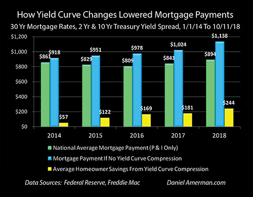
The green bars in the graph above show national average mortgage payments (principal and interest only), and they fell from $861 a month in 2013 to $809 a month in 2016, and have now risen to $894 per month. However, without the narrowing of the spread between short term rates and long term rates - mortgage payments would have been entirely different (and likely home prices as well).
Without the cycle of yield curve spread compression - then as shown with the blue bars, average mortgage payments would have been above $900 per month even in 2014, and they would have risen every year since without exception. If it had not been for compression, national average mortgage payments would have reached $978 per month in 2016 (instead of $809), and then $1,138 per month in 2018 (instead of $894).
The yellow bars show the average monthly savings for everyone buying a home during the years from 2014 to 2018. The monthly reduction in mortgage payments has risen from $57 per month in 2014, to $169 per month in 2016, to $244 per month by 2018 (through the week of October 11th).
In other words, the average home buyer in the U.S. in 2018 is saving almost $3,000 per year in mortgage payments because of this little known cycle - even if they've never heard of the term "yield curve". Indeed, while the particulars vary by location - home affordability, home prices and disposable household income have been powerfully impacted in each of the years shown by this interest rate cycle, in every city and neighborhood across the nation.
While knowledge of this cyclical cash flow engine has not been necessary for home buyers (and sellers) to enjoy these benefits in previous years, an issue has developed over the course of 2018 - the "fuel" available to power the engine has almost run out. Which means that mortgage payments, home affordability and housing prices could be traveling a quite different path in the months and years ahead.
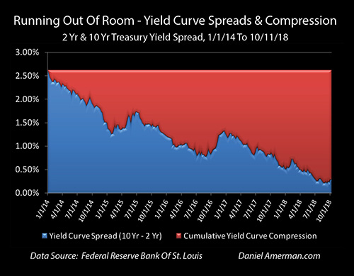
The yield curve spread is shown in the blue area above, and it was quite wide at the beginning of this particular cycle, equaling 2.62% as of the beginning of 2014. It has been steadily used up since that time, however, with the compression of the spread being shown in red. As of the current time - the yield curve compression which has powered the reduction in mortgage payments has almost maxed out, the blue area is almost gone, and the ability to further compress (absent an inversion) is almost over.
This analysis is part of a series of related analyses, an overview of the rest of the series is linked here.
(More information on the data sources and calculations supporting the summary numbers above can be found in the rest of series, as well as in the more detailed analysis below. A quick summary is that mortgage rates are from the Freddie Mac Primary Mortgage Market Survey, Treasury yields are from the Federal Reserve, the national median home sale price is from Zillow for the year 2017, and the assumed mortgage LTV is 80%.)
A Cyclical Home Buyer Savings Engine
A yield curve spread is the difference in yields between short term and long term investments, and the most common yield curve measure the markets looks to is the difference between the 2 year and 10 year U.S. Treasury yields.
An introduction to what yield curves are and why they matter can be found in the analysis "A Remarkably Accurate Warning Indicator For Economic & Market Peril" (linked here). As can be seen in the graph below and as is explored in more detail in some of the linked analyses, there is a very long history of yield curve spreads expanding and compressing as part of the overall business cycle of economic expansions and recessions, as well as the related Federal Reserve cycles of increasing and decreasing interest rates.
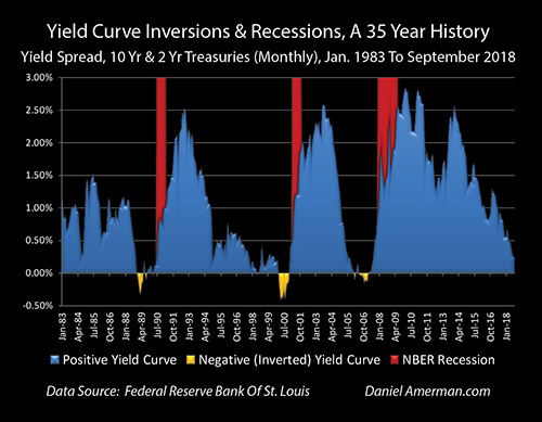
Since the beginning of 2014, the rapid shrinkage of the blue area shows the current compression cycle, and a resemblance (in broad strokes) can be seen with the compression cycles of 1992 to 2000 and of 2003 to 2006.
What has seized the attention of the markets in recent months is what followed next in some previous cycles, which is that yield curve spreads went to zero and then became negative, creating "inversions" where short term yields are higher than long term yields (as shown in the golden areas).
This is important because while such inversions are quite uncommon, when they do occur - they have had a perfect record in recent decades (over the last 35 years) of being followed by economic recessions within about 1-2 years.
However, yield curves don't have to actually invert in order to turn the markets upside down, and as explored in the analysis linked here, when the Fed goes through cycles of increasing interest rates, we have a long term history of yield curve spreads acting as a countercyclical "shock absorber", and shielding long term interest rates and bond prices from the Fed actions.
That only works until the "shock absorber" is used up, however, and as of the end of the third quarter of 2018 the yield curve "shock absorber" has been almost entirely used up. So when the Fed increased short term rates in late September of 2018 - there was almost no buffer, and that increase passed straight through to 10 year Treasury yields. The results were painful for bond prices, stock prices, and even the value of emerging market currencies.
The same lack of compression led to a sudden and sharp leap to the highest mortgage rates in seven years. Unfortunately, that jump may also potentially be just a taste of what could be on the way, with little further room for the yield curve to compress (without inverting).
Understanding The Relationships Between Mortgage Rates, Treasury Yields & Yield Curve Spreads
The graphic below shows weekly yields for Fed Funds, 2 year Treasuries, 10 year Treasuries and 30 year fixed rate mortgages since the beginning of 2014.
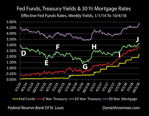
The first relationship is the visually obvious close correlation between the top purple line of mortgage rates and the green line of 10 year Treasury yields. Mortgage amortization and prepayments mean that most mortgage principal is returned to investors well before the 30 year term of the mortgage, and therefore investors typically price those mortgage rates at a spread (the distance between the green and purple lines) above 10 year Treasury yields. It isn't a perfect relationship, the 10 year Treasury tends to be a bit more volatile, but is a close relationship.
The bottom two lines are the short term yields, with the yellow line being effective overnight Fed Funds rates, and the red line being 2 year Treasury yields. Because the yield curve has been positive over the entire time period shown (as it almost always is), long term rates have consistently been higher than short term rates, and 10 year Treasury yields have been higher than 2 year Treasury yields, which have been higher than Fed Funds rates.
Now, the long term rates have been moving together, and while the relationship is not quite as close, the short term rates have also been generally moving together, with the 2 year Treasury yield more or less moving up with the Fed's cycle of increasing interest rates (each "step" in the yellow staircase is another 0.25% increase in interest rates by the Federal Reserve).
However, the long term rates have not been moving with the short term rates. As can be seen with point "D", 10 year Treasury yields were 3.01% at the beginning of 2014, 2 year Treasury yields were a mere 0.39%, and the yield curve spread - the difference between the yields was a very wide 2.62%.
About a year later, by late January of 2015 (point "E"), 10 year Treasury yields had fallen to 1.77%, while 2 year Treasury yields had climbed to 0.51%. The yield curve spread - the distance between the green and red lines - had narrowed to only 1.26%, or a little less than half of the previous 2.62% spread.
It can be a little hard to accurately track the relative distance between two lines that are each continually changing, so the graphic below shows just that distance. The top of the blue area is the yield curve spread, it begins at 2.62% at point "D", and falls to 1.26% by point "E". The great reduction between points "D" and "E" is now visually obvious.
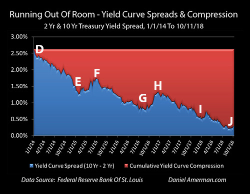
So, if there had been no change in yield curve spreads, and the 2 year Treasury had risen to 0.51% while the spread remained constant at 2.62% - then 10 year Treasury yields would have had to have moved to 3.13%.
But they didn't - the yield curve compressed by 1.36% (2.62% - 1.26%) between points "D" and "E", and the compression can be seen in the growing size of the red area labeled "Cumulative Yield Curve Compression". If we start with a 2.62% interest rate spread, and that spread falls to 1.26% (the blue area), then we have used up 1.36% (the red area) of the starting spread, and it is no longer available for us.
The critical importance of this yield curve compression for homeowners and housing investors, as well as some REIT investors, can be seen in the graphic below.
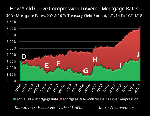
The top of the green area is the national average 30 year mortgage rate as reported weekly by Freddie Mac. That rate fell from 4.53% in the beginning of 2014 (point "D") to 3.66% in late January of 2015.
But, remember the tight relationship between the green and purple lines in the graph of all four yields / rates. Mortgage investors demand a spread above the 10 year Treasury, mortgage lenders will only lend at rates that will enable them to meet that spread requirement (and sell the mortgages), and therefore it was the reduction in 10 year Treasury yields that drove the reduction in mortgage rates. And if the yield curve compression had not occurred - then neither would have the major reduction in mortgage rates.
As we saw in the "Running Out Of Room" graphic, the red area of yield curve compression increased by 1.36% between points "D" and "E". If we simply take the red area of yield curve compression from that graph, and we add it to the green area of actual mortgage rates - then we get what mortgage rates would have been with no yield curve compression (all else being equal).
With no yield curve compression - mortgage rates of 3.66% at point "E" would have been 5.02% instead (3.66% + 1.36% - 5.02%).
With a $176,766 mortgage in late January of 2015, a monthly P&I payment at a 3.66% rate is $810. (This is based on a national median home sale price for 2017 of $220,958 (per Zillow), and an assumed 80% mortgage LTV.)
At a 5.02% mortgage rate - which is what it would have been with no yield curve compression - the payment would have been $951. This meant that for any given size mortgage - monthly payments were reduced by 15% over the time period as a result of yield curve spread compression ($810 / $951 = 85%).
Now, at that time, housing prices were still in a somewhat fragile position. The largest decrease in home prices in modern history had just taken place between the peak year of 2006 and the floor years of 2011-2012. Nationally average home prices had recovered by 9.5% in 2013, and then another 6.4% in 2014.
Here is a question to consider: would housing prices have risen by 6.4% in 2014 if mortgage rates had not reduced monthly mortgage payments by 15%?
The Next Yield Curve Spread Compression

Our next key period to look at is between points "E" and "G", late January of 2015 to late August of 2016. We are now beginning a rising interest rate cycle when it comes to short term rates. The Fed had done its first slow and tentative 0.25% increase in Fed Funds rates, and 2 year Treasury yields were up to 0.80%, which was a 0.29% increase.
All else being equal, when we focus on the yellow and red lines of short term interest rates - mortgage rates should have climbed as well. (Graphs are repeated for ease of scrolling.)

However, that isn't what happened. After a brief jump upwards at point "F", yield curve spreads had substantially fallen to 0.78% by point "G", as can be seen in the reduction of the blue area above. For this to happen, the compression of yield curve spreads had to materially increase to 1.84%, as can be seen in the growth of the red area.

In the early stages of a cycle of rising interest rates (as part of the larger cycle of exiting the containment of crisis), mortgage rates did not rise, but fell from the very low level of 3.66% at point "E", to an even lower level of 3.46% at point "G", as can be seen in the reduction of the green area.
To get that reduction in the green area during a rising interest rate cycle required a major growth in the red area of yield curve compression. To see what mortgage rates would have been without yield curve compression (all else being equal), we add the red area of cumulative yield curve compression of 1.84% to the green area of actual mortgage rates of 3.46%, and find that mortgage rates would have been 5.30% without that compression.
Returning to our $176,766 mortgage example, the monthly mortgage payment (P&I only) is $790 with a 3.46% mortgage rate, and is $982 with a 5.30% mortgage rate. Yield curve compression was responsible for a 20% reduction in mortgage payments for any given borrowing amount by late August of 2016.
However, a problem is that by late August of 2016 - the 1.84% cumulative cyclical compression of the yield curve mean that only 0.78% of yield curve spreads remained. A full seventy percent of the initial yield curve spread had been used up.
(Please note that the mortgage payments in this section of the analysis are calculated based on historical mortgage rates for the particular weeks identified. The annual average payments presented in the beginning of this analysis are the average of all weekly payment calculations for a given year, and therefore do not correspond to any given week.)
Using Up The Rest Of The Fuel (Yield Curve Spreads)

After its slow and tentative start, the Federal Reserve returned to 0.25% Fed Funds rate increases in December of 2016, and has kept up a much steadier pace since that time. As of October of 2018, Fed Funds rates are now up a total of 2% from their floor. As can be seen in the line graph of the yield curve over time, 2 year Treasury yields have also been steadily climbing, and were up to 2.85% by point "J", the week ending October 11th.
However, 10 year Treasury yields are not up by nearly that amount. By late August of 2018, 10 year Treasury yields were only up to 2.87%, which was 1.29% above where they had been two years before.

The difference can be found by looking at the very small amount of blue area left by point "J" - yield curve spreads were down to a mere 0.22% by the week ending August 29th, or less than one 0.25% Fed Funds rate increase.
This meant that the red area of total cumulative yield curve compression was up to 2.40%, which means that 92% of the "fuel" that had been driving the compression profit engine had been used up - before the Fed's 0.25% Fed Funds rate increase of September, 2018.
As explored in much more detail in the previous analysis linked here, when the Federal Reserve raised rates for the eighth time in September - the yield curve did not compress. Such a compression could have been problematic, as the yield curve would have been right on the very edge of inverting, and there is that troubling history when it comes to yield curve inversions being such an accurate warning signal of coming recessions.
Instead, the short term Fed Funds rate increase went straight through to the long term 10 year Treasury yields, full force, with no buffering or mitigation of the rate increase by yield curve compression. The resulting shock as the 10 year Treasury yield leaped to 3.22% led to sharp losses in bonds, stocks and even emerging market currencies.
The same shock also passed through in mostly un-buffered form to the mortgage market, via the demand for mortgage investors to be able to buy mortgages as a spread above the 10 year Treasury bond. Thirty year mortgage rates leaped from 4.71% to 4.90%, an increase of 0.19%, and the highest rate seen in more than seven years.
(I've concentrated on the 2 to 10 year yield curve spread in this analysis to keep things simple, to correspond to the market norm for the most commonly tracked yield curve spread, and because it has a strong explanatory power for the big picture over time. If one wants to get more precise (and therefore quite a bit messier), there are also the generally much smaller spread fluctuations between 1) Fed Funds rates and 2 year Treasury yields; and 2) 10 year Treasury yields and mortgage rates.)

When we look at the period between points "G" and "J", then it looks quite different than either of the previous periods we looked at. Mortgage rates have been rising, with the largest spike occurring at the time that the Federal Reserve proved it was serious about actually materially increasing interest rates with the Fed Funds rate increase of December, 2016 (point "H").
However, this does not mean that the money saving power of yield curve compression had lost its potency.
Between points "D" and "J", early January of 2014 and early October of 2018, average annual mortgage rates rose from 4.53% to 4.90%, as can be seen in the green area, which is an increase of only 0.37%. Meanwhile, the yield curve spread between the 2 and 10 year Treasuries was compressing from 2.62% to 0.29%, which was a yield curve compression of 2.33%. Adding the red area of cumulative yield curve compression to the green area of actual mortgage rates shows that current mortgage rates would be 7.23% if there had been no yield curve compression (all else being equal).
Mortgage principal and interest payments on a 30 year $176,766 mortgage with 4.90% interest rate are $938 per month, and they are $1,203 per month with a 7.23% mortgage rate. This means that yield curve compression has reduced the national average mortgage payment by about 22%.
Turning The Impossible Into The Possible
This particular analysis is a specialized "outtake" from the much more comprehensive foundation built in the Five Graphs series linked here, which explores the cycles that have created a very different real estate market over the last twenty or so years.
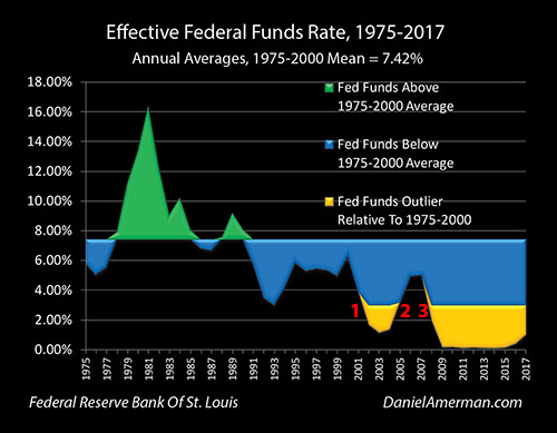
As developed in that series, as part of the #1 cycle of the containment of crisis, the attempts to cure the financial and economic damage resulting from the collapse of the tech stock bubble and the resulting recession, the Federal Reserve pushed Fed Funds rates down into an outlier range (shown in gold), the lowest rates seen in almost 50 years.
As part of the #3 cycle of the containment of crisis, in the attempt to overcome the financial and economic damage from the Financial Crisis of 2008 and the resulting Great Recession, the Federal Reserve pushed interest rates even further into the golden outlier range, with near zero percent Fed Funds rates that were the lowest in history.
By the time we reach early January of 2014 to late January of 2015, points "D" to "E", Fed Funds rates were still where they had been the previous five to six years - near zero. Mathematically, there was no room to reduce interest rates, without the U.S. going to negative nominal interest rates.
But yet - mortgage rates fell sharply from an already low 4.53% to an extraordinarily low 3.66%. This sharp reduction in rates transformed the housing markets, and would steer extraordinary profits to homeowners and investors over the years that followed. However, none of it would have been possible without the compression of yield curve spreads.
Once the past has already happened, it is easy to not only take it for granted, but to internalize it, and to make it the pattern that we believe is right and natural. Once this happens, the next natural step is to then either explicitly or implicitly project this assumed reality forward as that trend line then becomes the basis for our financial and investment decisions.
However, where this natural process can run into difficulties is when what made the past possible - becomes impossible. Yield curve spread compression took what would have been impossible - a plunge in mortgage rates even as short term rates remained near a floor - and made it possible. But that pattern can't repeat (at least not in that manner), when there is no longer the spread to compress.
This analysis contains the ideas and opinions of the author. It is a conceptual and educational exploration of financial and general economic principles. As with any financial discussion of the future, there cannot be any absolute certainty. While the sources of information and the calculations are believed to be accurate, this is not guaranteed to be true. This educational overview is not intended to be used for trading purposes, those making investment decisions should do their own research and come to their own independent conclusions. This analysis does not constitute specific investment, legal, tax or any other form of professional advice. If specific advice is needed, it should be sought from an appropriate professional. Any liability, responsibility or warranty for the results of the application of the information contained in the analysis, either directly or indirectly, are expressly disclaimed by the author.
| Digg This Article
-- Published: Friday, 2 November 2018 | E-Mail | Print | Source: GoldSeek.com

