There is nothing wrong with cash. It gives you time to think.
Robert Prechter, Jr., Elliott Wave theorist, b. 1949
Buy when you are scared to death; Sell when you are tickled to death.
Market Maxim (Cabot Market Letter, April 12, 2001)
Bear markets dont act like a medicine ball rolling down a smooth hill. Instead, they behave like a basketball bouncing down a rock-strewn mountainside; theres lots of movement up and sideways before the bottom is reached.
Daniel Turov, (Turov on Timing, Barrons, May 21, 2001), b.1947
We recently picked up an article (pitch?) touting the Dow Jones Industrials (DJI) to rise to 30,000 or even higher later this year. The run-up to record highs is then to be followed by a devastating crash that could take the DJI down as much as 90%. Now, not to knock the authors, the article was not so much a technical and economic analysis but a pitch to subscribe to their research. We see a lot of that. They tout their track record of incredible predictions and conclude with a long line of reports, many of which are initially free. At the end, of course, they hope you become a subscriber at the cost of $100s if not $1,000s annually.
Anyway, maybe they are right.30,000 DJI is only about 20% from current levels. Even we acknowledge that, under the right conditions, the DJI and the other indices could take off on a buying frenzy. Following a rather shallow 7% correction in the markets from January 1929 to May 1929, the market ran another 27% to the top in September 1929. Gold in the late 1970s was even more spectacular, running up 230% from November 1978 to the top in January 1980. And who can forget Bitcoin that fell 18% in August/September 2017, yet leaped in a frenzy of buying 350% into December 2017.
The drop this time for the DJI was more substantialalmost 20%. Some markets did enter official bear territory, falling more than 20%. But a strong push above 25,000 for the DJI and then an even stronger push above 26,000 on the DJI could send the markets into a buying panic. Buying panics are not that predictable, but they do bring in a lot of latecomers fearful of missing the move.
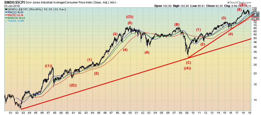
Whether the markets have the wherewithal to spike once again is another question. By many counts the DJI has completed five primary waves, up from the lows of 1982 as our long-term chart above shows. The chart is an inflation-adjusted chart. The recent drop held the up trendline from the March 2009 lows, so a rebound is, no doubt, in the works. How high it can get remains to be seen.
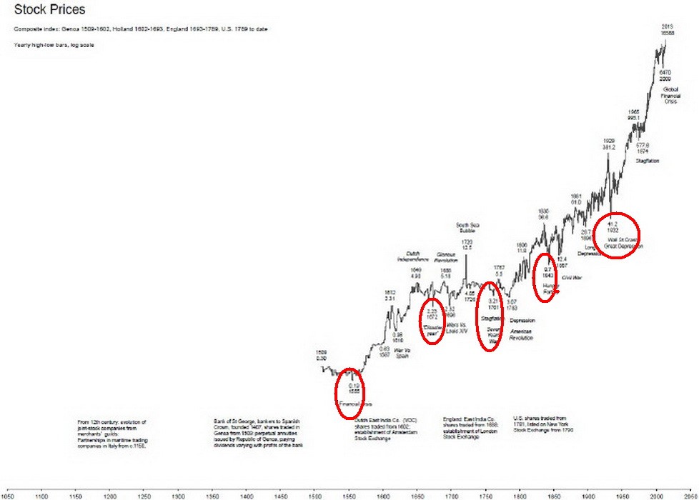
More intriguing was the articles reference to a 90-year cycle. We and others have also made reference to a possible 90-year cycle of depressions and social turmoil. Ray Merriman, a cycle analyst we follow, says the longest one they have uncovered is a stock market cycle of 75 years. The 75-year cycle subdivides into a half-cycle (37.5 years) and 18.75 years (half-cycle of the 37.5-year cycle). It is acknowledged that the last major depression low in the stock market low was 1932. The December 1974 low came roughly 42 years after 1932 and the March 2009 low was 77 years after 1932 and 35 years after the 1974 low. Assuming a 90-year cycle exists, its center would come in 2022. Merriman has acknowledged there is secondary low anywhere from 622 years following the 75-year cycle low. During the Great Depression there was a secondary depression and stock market lows seen in 1938 and again in 1942, coming 610 years after the 1932 low.
The chart dates back to about 1500. It was compiled from the following composites: Genoa 15091602, Holland 16021693, England 16931789, U.S.A. 1789present. With the exception of the term between the stock market low of 1556 and 1672 the rest were within a few years of the idealized 90-year cycle of depressions and wars. The average decline in the stock market was 65%.
90-year cycle of depressions and war
Year of stock market low
Years between major lows
Stock market decline, peak to trough
What happened
Next predicted idealized 90-year cycle low
1556
15091556
37%
Bankruptcies, credit inflation, wars, banking collapses in Germany, England, Netherlands, Spain, and France. Plagues and famine also added to the economic depression.
1646
1672
116
16491672
54%
1672 known as the Disaster Year in the Netherlands. War between England, Netherlands, France. Thirty Years War 16181648, ranked as one of the most destructive wars ever where 8 million died, contributing to plagues, famine, and war. Bankruptcies and financial collapse.
1762
1761
89
17201761
74%
Seven Years War, often billed as the first world war as it was fought on 5 continents including the Americas, Europe, India, West Africa, and Philippines. Involved the great European powers, but particularly France and England. Trade wars, banking collapses, debt collapse, cash shortages. Contributed to both the American and French Revolutions.
1851
1843
82
18351843
73%
Panic of 1837 triggered a steep depression. Banking failures, failed businesses, falling prices. Triggered by collapse of land speculation, cotton price collapse, trade wars. War between U.S. and Mexico. There was also a significant stock market low in 1857.
1933
1932
89
19291932
89%
Great Depression. Was worldwide but triggered in the U.S. stock market crash of 1929. Trade wars, banking collapses, sovereign debt collapse, droughts and famine, huge unemployment, business failures. Led to WW2.
Assuming the existence of a 90-year cycle, it is one that is clearly generational in scope. The stock market measurement only looks at the time between major lows. The depressions, wars, and more last for years. The effects are usually felt for years afterwards, even as the stock markets recover. The lead up to the stock market cycle low also takes place over a number of years.
Without going into major details, the 75-year cycle of depressions and financial collapse also has an excellent track record. If one centers the last 75-year cycle around 1932 and works back, depressions and stock market lows can be observed in 1857, 1783, 1696, 1618, and, of course, 1556. All were within an acceptable range of an idealized 75-year cycle.
The financial collapse of 2008 would be an example of the 75-year cycle (76 years after 1932). The effects of that collapse are still being felt today. Its causes were never really resolved. It has led to a sharp rise in debt levels and the rise of right-wing governments and parties, social disorder, xenophobia, dysfunctional governments, the potential for financial collapse both corporate and sovereign, and revolts on a scale not seen since the 1930s. Add in the potential calamitous effects from climate change and military tensions between the Great Powers (U.S., Britain, France, China, Russia) there is also the potential for war and famine.
None of this is a prediction. We are merely postulating what may happen, given what we see going on. Today we have trade wars, historical debt bubbles, Brexit, deep political and social divisions in the U.S., U.K., France, even Germany, the rise of right-wing governments in Hungary, Italy, Brazil and more, military tensions between the Great Powers U.S.-China-Russia, devastation from the effects of climate change with hurricanes, wildfires, freak storms, droughts, and more that are causing dislocation of populations and the collapse of species including extinction.
There will also be currency collapse. All we can do is issue the warning so that one can prepare themselves. While it would be easy to say this is just crying wolf, history is not on that side. Many did not see the 2008 financial crash coming, even as many warned it was going to or could happen. They were usually dismissed as crying wolf. Usually it takes a Black Swan event to trigger a panic and stock market collapse. History is replete with Black Swan events Pearl Harbour, 9/11, Lehman Brothers are just a few.
The best way to protect oneself from currency and financial collapse is to hold some gold. Gold has a long history of being money. A reminder that every fiat currency has either lost significant purchasing power over time or collapsed and disappeared. Gold has remained stable even as currencies devalue. It is liquid and is no bodys liability. Currently no currency is backed by gold, at least officially. Significantly, Russia and China have been accumulating gold to back their currencies the ruble and the yuan. Other countries such as the U.S. and Germany continue to hold large reserves of gold. Gold is, surprisingly, quite liquid even if it is not used for financial transactions.
Gold cannot be printed like fiat currencies. It acts as portfolio insurance. You hope you never have to use it, but it is there just in case. Surprisingly, gold is less volatile than stocks and certainly less volatile than gold stocks. Owning gold stocks is not the same as owning physical gold. Gold stocks are paper, like stocks and bonds. Physical gold does not mean ETFs or closed-end funds which are paper as well and trade like stocks, often at discounts or premiums to their net asset value.
We leave with the wise words of George Bernard Shaw:
"You have to choose between trusting to the natural stability of gold and the natural stability of the honesty and intelligence of the members of the government. And, with due respect for these gentlemen, I advise you, as long as the capitalist system lasts, to vote for gold."
George Bernard Shaw, playwright, critic, political activist, 18561950
The end of the shutdown (at least for the moment), the Fed suggesting an easing of quantitative tightening (QT), and some robust earnings all helped prevent a pullback this past week as they ended the week on a strong note. The S&P 500 finished the week down 0.2% but the Dow Jones Industrials (DJI) was up 0.1%. This was a small divergence. The Dow Jones Transportations (DJT) didnt fare as well as it fell 0.9%. However, in another divergence the NASDAQ was up 0.1%. Elsewhere, the TSX Composite, helped by golds and energy, rose 0.4%. The TSX Venture Exchange (CDNX) continued its gains after a miserable 2018, rising 1.5%, and is now up 8.5% on the year. The small cap Russell 2000 was flat.
International indices were largely to the upside. The Paris CAC 40 gained 1% and the German DAX was up 0.7%. However, pressured by the Brexit failure, the London FTSE 100 was down 2.4%. The Tokyo Nikkei Dow (TKN) was up 0.5% and the Chinese Shanghai Index (SSEC) gained 0.2%. The MSCI World Index gained 0.4%.
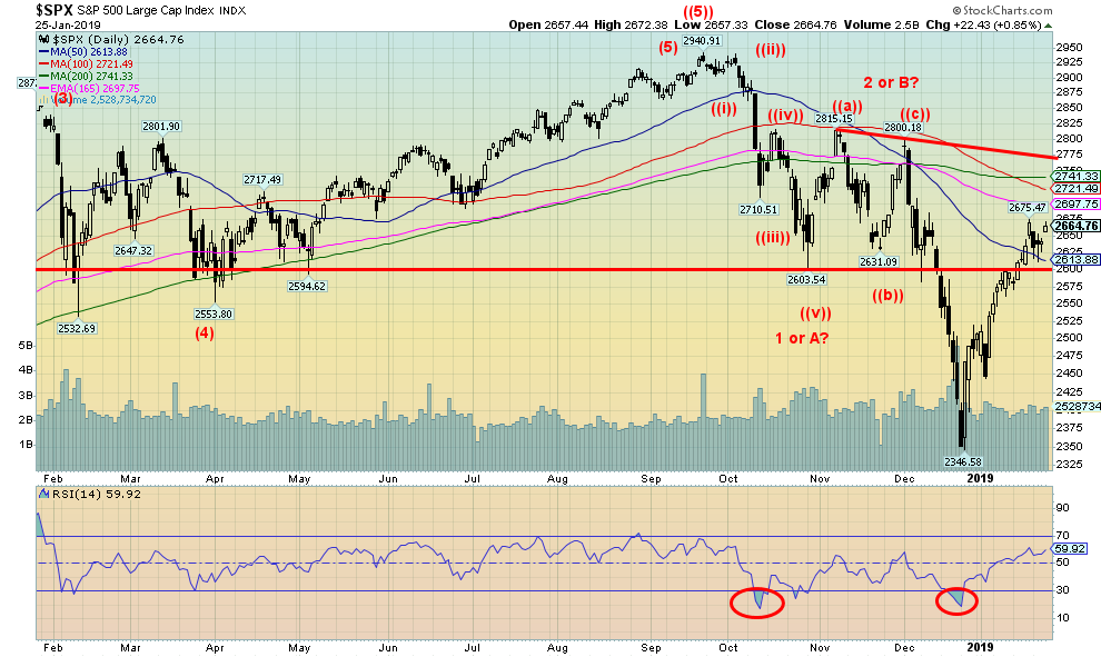
It is difficult to make much of the fact that the S&P 500 was down small while the DJI was up small. The differences were too small. If the markets are truly forming a bottom pattern, then what we need to see is a pullback so that we can gain some thoughts as to its nature. So far, any pullbacks have been very shallow. Volume has been below average for this up move which suggests to us this move is merely corrective. As well, the market has become quite bullish once again, with many calling that the bottom is in and the correction is over. Maybe they are right, but wed prefer to see a move over 2,700 and 2,800 before we are prepared to call a bottom. It is highly unlikely that the final low is in; however, we have no argument with the fact that a temporary low has probably been made. Much will be made of the markets putting in a positive January, indicating an up year. That didnt work too well last year where January was up but the year finished in the red, despite being up most of the year.
For the record, the January barometer has had only 10 errors since 1950, the latest one being 2018. Oddly enough, 7 of the errors have occurred since 2000. Maybe the January barometer doesnt work that well any more.
Given the current run-up, a breakdown under 2,550 would be cause for some concern. Otherwise, the focus remains to the upside and 2,700 and 2,800.
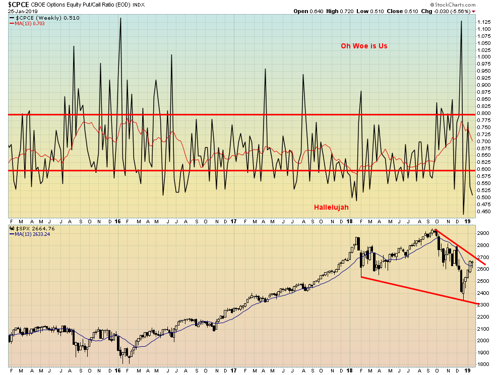
Has the market become too bullish? The CBOE options equity put/call ratio is still deep in positive territory with calls exceeding puts. The expectation here is that the market has further to rise. However, the put/call ratio tends to act as a contrarian indicator. Extreme sentiment has a tendency to show itself during bear market rallies because the market badly wants to regain its earlier glory. The S&P 500 has reached back to the 50-day MA (or just above it) on below-average volume. The 200-day MA is up at 2,740ergo, our thoughts that we would like to see a move above 2,800 to suggest to us that this might have more legs. Otherwise, we are in perfect failure territory. The reasons that sparked the markets to fall in the first place havent changed.
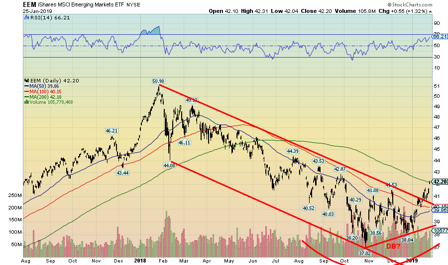
We noted a couple of weeks back that the iShares MSCI Emerging Markets ETF (EEM-NYSE) might be poised for a breakout. Well, it has now broken out and is currently testing the 200-day MA. There is a possible double bottom on the EEM that projects up to around $46.75, a further 11% move from current levels. For the record, if the EEM were to take out that point, then further potential lies above to $50 and the old highs. Volume is not overly impressive; however, one doesnt need huge volume to push it higher as offers could just step away. As well EEM is now testing the 200-day MA an area that often sees failure in bear market declines. If a more significant correction is underway then we need to push through to $46 +.
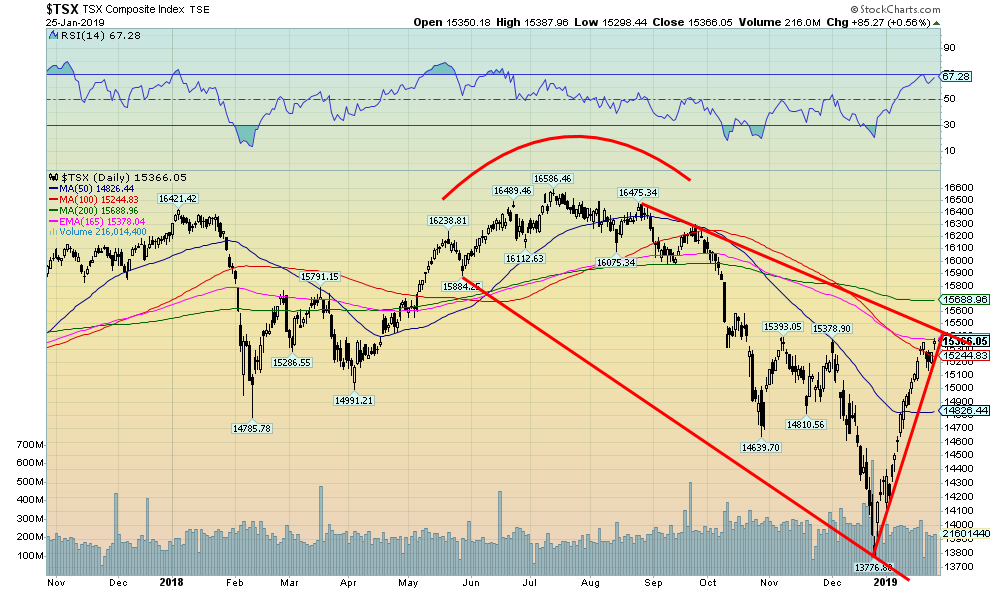
The TSX Composite has enjoyed a sharp run-up from the December low, gaining 11.5% so far. But as the chart shows, it has been almost straight up with barely a wobble to the downside. Energy and golds have been two drivers. The TSX is now running into resistance zones with the 100-day MA and just above the 200-day MA at 15,690. We are never comfortable with straight up moves like this (nor, for that matter, with straight down moves) as they are usually not sustainable. Some consolidation before a move over 16,000 would be helpful if the market is to actually move to higher levels. A move back under 15,000 would be negative.
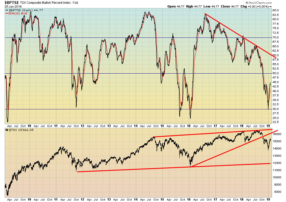
The TSX Bullish % Index remains mired in bearish territory. This could be an argument as to why the market could move higher. You can see how the index was deteriorating throughout 2016, 2017, and 2018 even as the market moved higher. So far, there are no divergences at the bear end to suggest that the bear move is actually over. Still there is little to suggest that the market couldnt move higher first before resuming the downtrend.
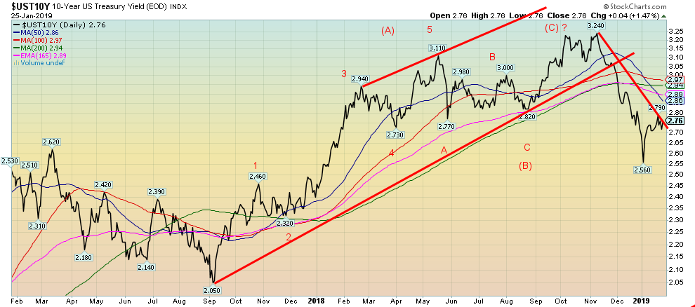
The U.S. 10-year Treasury note fell 3 bp this past week to 2.76% from 2.79%. The Fed meets next week and the wide expectation is that there will be no rate hike. The expectation now in the market is the Fed wont hike now until the June meeting, bypassing the March meeting. All of this should help push bond yields lower even if the Fed hikes once again. Bond yields are clearly now in a downtrend. A break under the recent low of 2.56% could see the 10-year fall to 2.30% to 2.35%. Only a return and move back above 2.95% might change this scenario.
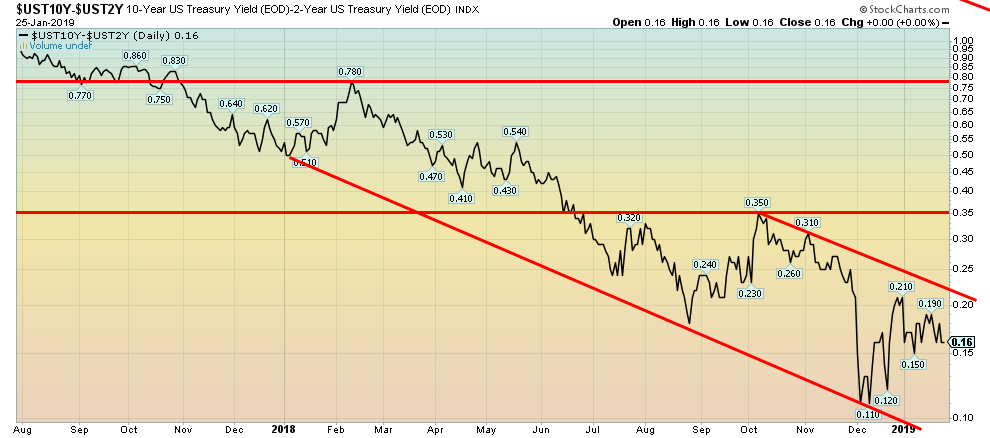
The 2-year10-year U.S. Treasury spread fell marginally this past week to 16 bp from 17 bp. In Canada, the 2-10 spread rose marginally to 10 bp from 8 bp. The trend for both is still down but it is still not negative. Our expectations are that the spread will turn negative sometime later this year. However, it needs to stay negative for a number of months before a recession might show.
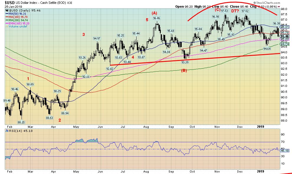
With the Fed hinting an early end to quantitative tightening (QT), coupled with a possible easing of rate hikes, the US$ Index took a hit on Friday, falling almost 0.9%. It ended the week down about 0.6%. Other currencies benefited with the pound sterling jumping 2.6%. It seems to be a case of Brexit, what Brexit? The euro gained about 0.5%, the Japanese yen was up 0.2%, and the Canadian dollar jumped about 0.3%. The Feds easing of QT and rate hikes makes one wonder whether Trumps constant bashing of the Fed and Jerome Powell was getting to them. A major beneficiary of a falling US$ Index was gold. Technically, little has changed for the US$ Index. Failure came in near the 50-day MA currently at 96.31 (high on week was 96.38). The breakdown point remains at 94. A firm breakdown under that level suggests a potential decline to 89.30. The US$ Index appears to be nearing the completion of a large topping pattern that has taken almost nine months. When the fall comes, it could be swift. Support is down to around 94.75 but below that the breakdown point at 94 looms. There is little in this chart to suggest the potential for a rebound. Only above 96.50 might it require some reassessment.
Special on Venezuela
Currency: Bolivar vs. US$
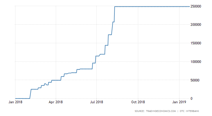
With the crisis in Venezuelathe country of two Presidentswe thought we would take a look at the performance of the Venezuelan bolivar and gold in Venezuelan bolivars. With inflation reaching upwards of 1,000,000% it is no surprise that the bolivar has been hard hit. Here it is over the past year where the bolivar has leaped from $US1 = 9.975 bolivars in January 2018 to $US1 = 248,209 in January 2019. It may be even higher now as that was from a few days ago. Thats a gain of almost 25,000% or a collapse of about 100%. An inflation rate of 1,000,000% sounds astronomical until one puts it in perspective. The record is apparently 41,900,000,000,000,000% recorded in Hungary following WW2. According to records, the highest inflation rate recorded in the U.S. was 29.78% in 1778 during the American Revolution. The collapse of the Bolivar accelerated following the re-election of the first President Maduro. The collapse of oil prices coupled with severe sanctions and bad policies contributed to the collapse.
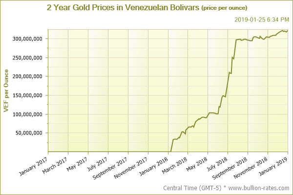
With the Venezuelan bolivar in absolute collapse it is no surprise that gold in Venezuelan bolivars has soared. An ounce of gold currently would cost 318,457,608 bolivars on January 24, 2019. Thats an increase of 2,286,636% in the past year. Once again, holding gold proved invaluable to a collapsing currency. Grant you, holding US$ would also have worked, or any prime currency such as euros, yen, Swiss francs or Canadian $. The point is that gold protects against currency devaluation, no matter what the currency.
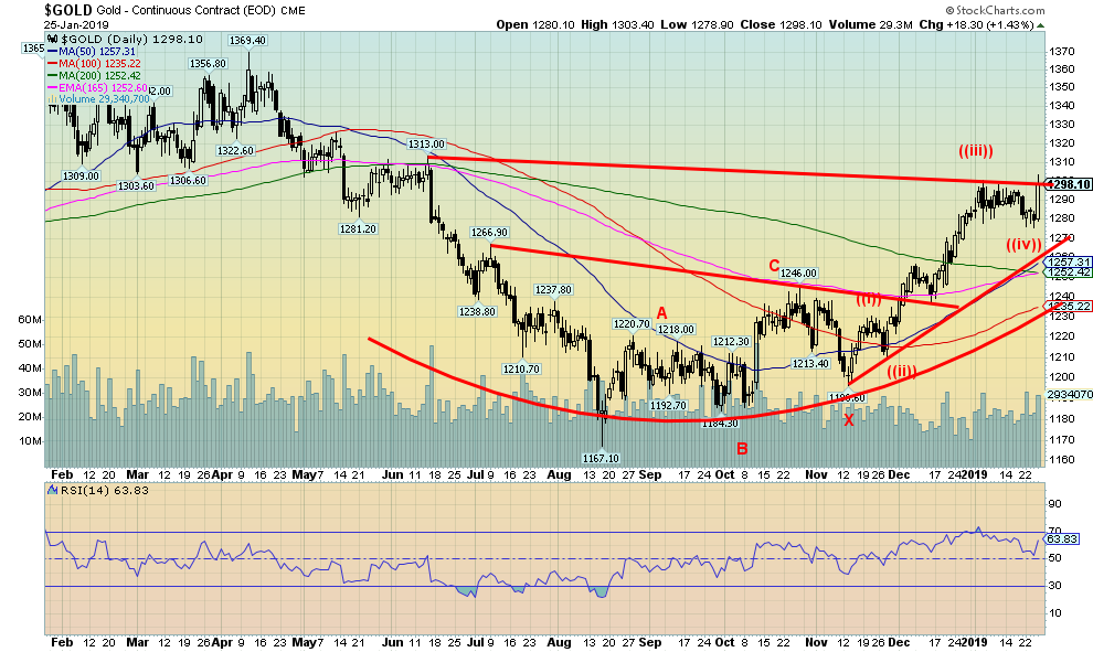
Gold finally appears poised to break through $1,300. Fridays futures closed at $1,298; however, cash gold continued to trade higher closing over $1,300. That suggests that gold should open higher on Monday above $1,300 on the futures. Initial resistance would be up to about $1,320. Firm support held at $1,280. Above $1,320 gold has the potential to rise into the $1,350/$1,370 major resistance zone. We expect the first approach to that zone will be met with stiff resistance and a pullback, possibly a sharp one. Once that is out of the way, we expect that this time gold should break up through major resistance at $1,370 and take out $1,400. Major bottoming patterns suggest that gold has the potential to go eventually as high as $1,725 later this year. However, before we get ahead of ourselves, first things first, and that centers on a move towards $1,350. Support is at $1,280; however, only below $1,250 would we be concerned that something has gone amiss.
With the ending of the shutdown, at least temporarily, we might finally get a COT report. Hope to have one for next week. Our expectations are that the commercials have increased their short position. The question is by how much.
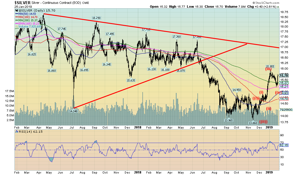
Silver successfully tested back to the 200-day MA and this time it held rather than failed as it did so many times in 2017 and 2018. Okay, at least for the moment. Silver gained almost 2% this past week, including the strong up day on Friday when it jumped 2.6% saving what might have been a down week. Gold on the other hand was up 1.2% on the week. Other metals jumped as well with platinum up 2.0% and copper up 0.4%. Palladium, following a very strong run to record highs, paused this week, losing about 1.2%. We still view palladium as a leader here, suggesting that the other precious metals should follow palladiums rise. Silver found support down near $15.20 and the 165-day EMA before rebounding. Our key resistance remains at $16. The up move for silver remains quite bullish and we should see prices rise to at least $16.25 and possibly to $16.50 before another corrective move sets in. Higher potential is also present. Support ranges down to $15.50 and down to $15.20.
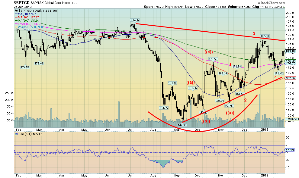
Gold stocks gapped higher on Friday with the big up day for gold and silver. The TSX Gold Index (TGD) was up 5.1% on the week while the Gold Bugs Index (HUI) jumped 5.2%. Despite the gains, both indices remain down small on the year. Numerous individual stocks in the indices are flashing buy signals. The TGD appears poised to hold the 200-day MA for the first time in monthsyears, actually. The last time the TGD held gains above the 200-day MA was back in 2016. Confirmation of the rebound would come with a move above the recent highs just under 188. The TGD breaks out over 187.50 and could project up to 235. The recent low near 171 should act as support; however, a move back under 175 would be of concern. Major support lies down near 167.
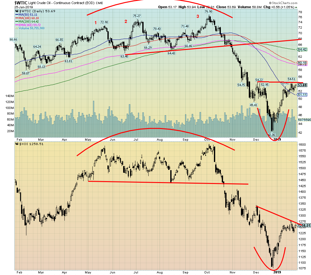
WTI oil consolidated this past week, falling about 0.7%. WTI oil remains up 18.2% on the year. The energy stocks are benefitting from the recent rise in oil prices as the Philadelphia Oil & Gas Index (XOI) is up 8.5% on the year and the TSX Energy Index (TEN) is up 7.8% in 2019. They didnt have a good week, however, as the XOI lost 1.6% and the TEN fell 3.1%. Still, both WTI oil and the energy indices continue to look bullish and appear to be forming odd head and shoulders bottoms. WTI oil breaks out over $54.50 and potentially projects up to 66.35. The XOI breaks out over 1,280 and potentially projects up to 1,550. The TEN projects up to 184.50 once it breaks out over 153.50. Whats key is that all hold levels that might suggest a broken pattern. WTI oil fails under $50, the XOI under 1,225, and the TEN under 145. The situation in Venezuela might be a catalyst for higher oil prices. Venezuela has the worlds largest oil reserves. They also export some 15,000 to 20,000 barrels a day to the U.S. Loss of that oil might cause prices to spike higher even if replacements were available. Oil production has been in a downward spiral for Venezuela for some time. Latest numbers show that Venezuela produced some 1.4 million barrels daily in May 2018 making them the worlds 12th largest producer. Venezuela produced some 3 million barrels daily when Hugo Chavez came to power in 2000. Even when Maduro came to power in 2014 Venezuela was producing about 2.5 million barrels daily. Sanctions have not helped. Current production levels are the lowest in 50 years.
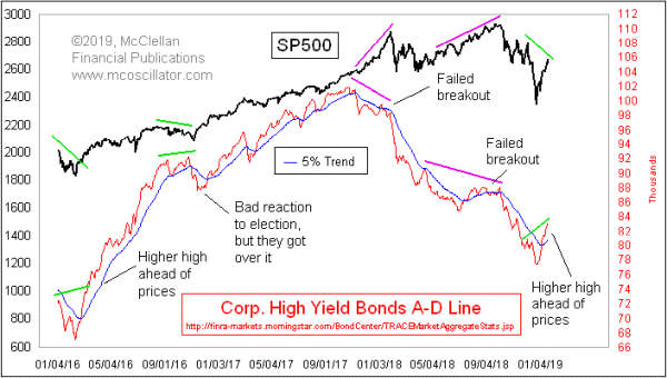
We were intrigued with the chart provided by Tom McClellan of MC Oscillator (www.mcoscillator.com). McClellan premises that junk bonds or high yield bonds trade more like stocks than they do bonds. Thats quite true as they can be quite volatile. They are also, as McClellan points out, quite liquidity sensitive. That means that when things get bad or good junk bonds often react in much more volatile manner.
Above FINRAs (www.finra.com) chart of the cumulative A/D line for the high-yield category. FINRAs website is quite interesting, and once we learn more about how to use it, we may have more charts. Note how the junk bond A/D line started falling before the stock market did. But, as it turned out, it was a sign that things might be amiss. Then, even as the stock market recovered from the February to May lows and ran to new highs, the junk bond A/D line kept falling, indicating that all might not be well.
Now, the junk bond A/D line is doing a bit of the opposite. It appears to be breaking out even as the S&P 500 has not broken out. We noted that the S&P 500 still needs to make new highs above 2,800 to convince us that new highs may be possible. The A/D line on junk bonds may not make new highs but it has broken out to the upside which is a positive development. We will try to keep an eye on this as it develops.
Copyright David Chapman, 2019
David Chapman is not a registered advisory service and is not an exempt market dealer (EMD). We do not and cannot give individualised market advice. The information in this newsletter is intended only for informational and educational purposes. It should not be considered a solicitation of an offer or sale of any security. The reader assumes all risk when trading in securities and David Chapman advises consulting a licensed professional financial advisor before proceeding with any trade or idea presented in this newsletter. We share our ideas and opinions for informational and educational purposes only and expect the reader to perform due diligence before considering a position in any security. That includes consulting with your own licensed professional financial advisor.
The content on this site is protected
by U.S. and international copyright laws and is the property of GoldSeek.com
and/or the providers of the content under license. By "content" we mean any
information, mode of expression, or other materials and services found on GoldSeek.com.
This includes editorials, news, our writings, graphics, and any and all other
features found on the site. Please contact
us for any further information.
Live GoldSeek Visitor Map | Disclaimer
The views contained here may not represent the views of GoldSeek.com, Gold Seek LLC, its affiliates or advertisers. GoldSeek.com, Gold Seek LLC makes no representation, warranty or guarantee as to the accuracy
or completeness of the information (including news, editorials, prices, statistics,
analyses and the like) provided through its service. Any copying, reproduction
and/or redistribution of any of the documents, data, content or materials contained
on or within this website, without the express written consent of GoldSeek.com, Gold Seek LLC,
is strictly prohibited. In no event shall GoldSeek.com, Gold Seek LLC or its affiliates be
liable to any person for any decision made or action taken in reliance upon
the information provided herein.