-- Published: Tuesday, 9 April 2019 | Print | Disqus
By: Rambus
In part two of the Quarterly Report Im going to update some long term charts for some of the world stock markets. As you will see many have formed massive ten plus year consolidation patterns similar of what we observed in the first installment of the Quarterly Report which are similar in duration to many of the US stock markets. Its these big multi year consolidation patterns that are strongly suggesting to us that the world as we know it is not coming to an end as so many analysis would like us to believe. For whatever reasons bear market news tends to grab investors attention much more so than bullish news. It has to work that way because if everyone was bullish, that comes at the end of a bull market, there would be no one left to buy. Ive often said that, investing in the markets is psychological warfare more than anything else.
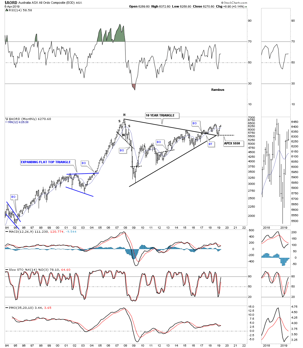
Lets get started by looking at the $AORD, Australian stock market, which built out a ten year triangle consolidation pattern. The top rail was broken to the upside in early 2017 with a small rally and now a strong backtest which found support at the last possible point which is the apex where the top and bottom rails intersect. A move below the apex would be an end around move which would have bearish implications, but until then the bull market remains in place.
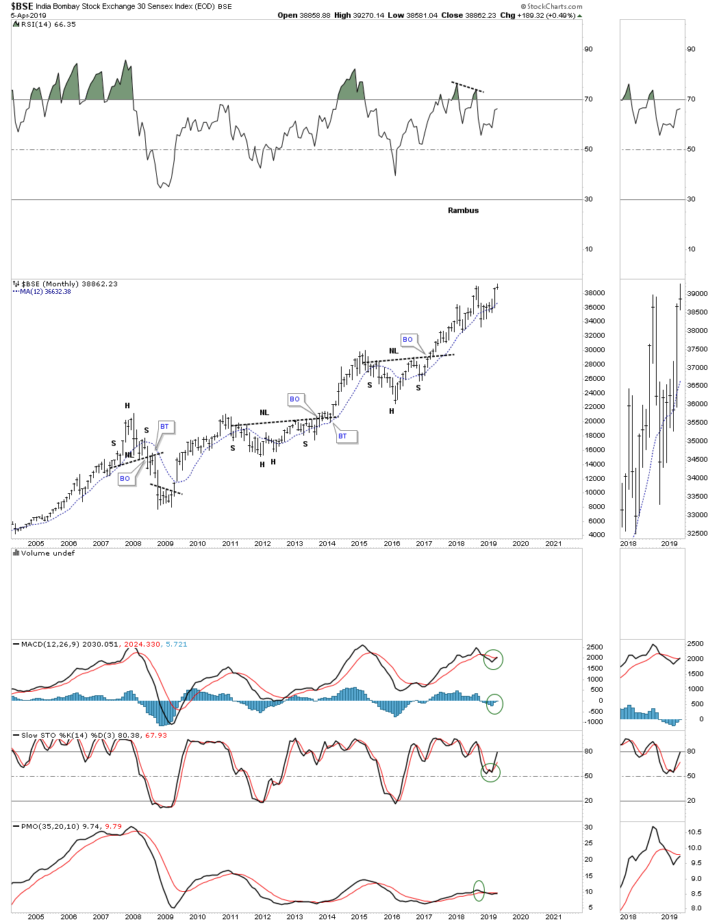
The $BSE, India Bombay stock market, has held up very well and is just a few of the markets that are testing their all time highs. Its like the energizer bunny that just keeps on going and going.
This next world stock market is the $BVSP, Brazilian Stock market, which is one of the strongest in the world right now after completing a perfect breakout and backtest to the top rail of its ten year triangle consolation pattern.

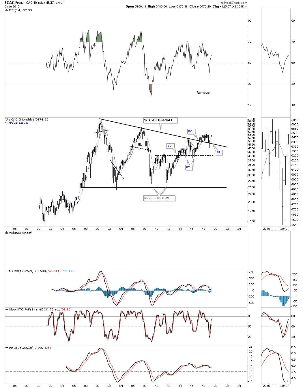
The $CAC, French stock market, is still in the breaking out and backtesting process. The strong backtest was nullified when the price action traded back above the top rail of its 17 year triangle consolidation pattern.
The $DAX, German stock market, broke out from its massive 12 year triangle consolation pattern around the same time many of the US stocks markets in 2013. Its currently working on a multi year rising wedge formation that is forming above the top rail of its 12 year triangle consolidation pattern which is generally a bullish setup, but wont be confirmed until the top rail is broken.

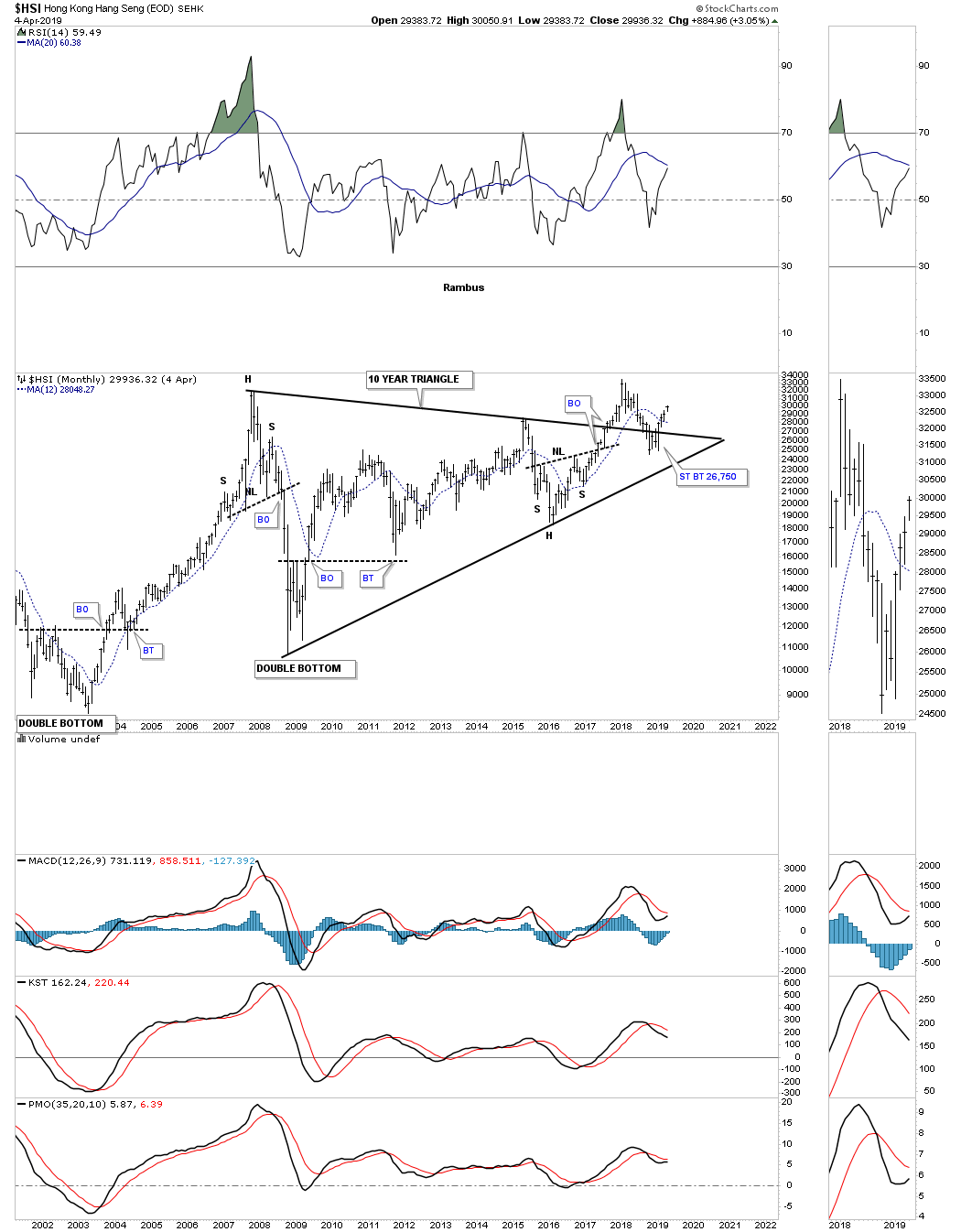
The $HSI, Hong Kong stock market, shows a similar setup to many of the stocks markets from around the world. It has formed a ten year triangle consolidation pattern with a strong backtest to the top rail that occurred late last year when the US and other world stock markets experienced the Christmas Eve shakeout move.
The $NIKK, Nikkei stock market, is one of the most important stock markets in the world so its always a good to see what its doing. The $NIKK originally topped out in the middle of 2015, but has been trading sideways and is building out a rising wedge formation. Note the backtest to the 2016 H&S bottom neckline which showed me a place to draw in the bottom rail of the rising wedge. Most will view the rising wedge as a bearish rising wedge but Il reserve judgment until I see which trendline gives way. Note the smaller blue bullish rising wedge which formed just below the bigger one.

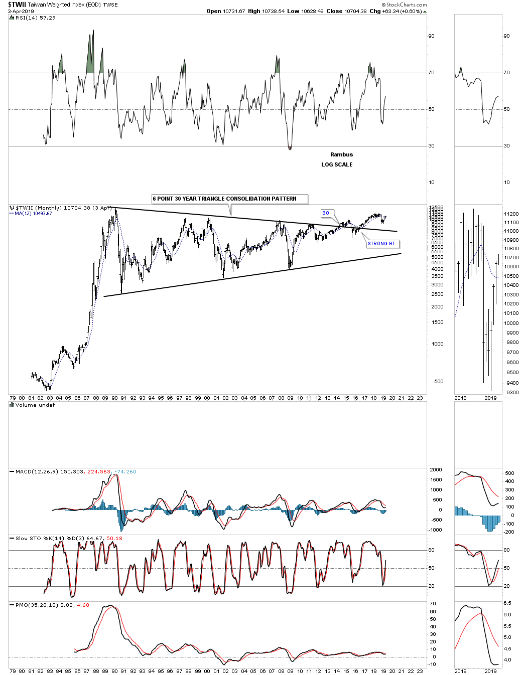
Next is the $TWII, Taiwan stock market, that has built out one of the longest running consolidation patterns Ive ever seen which took 30 years to complete. The breakout above the top rail finally took place in May of 2014 with a fairly strong backtest to the top rail doing its job of holding support.
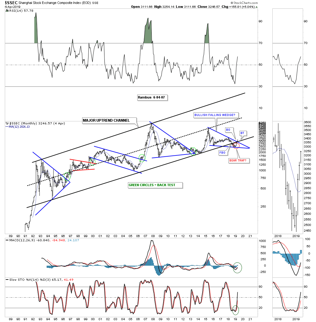
Another very important world stock market is the $SSEC, Shanghai stock exchange, which has been one of the weaker stock markets, but may be turning the corner. This long term monthly chart shows the major uptrend channel the SSEC has been in since the early 1990s when it was new to the global scene. When it gets ready to move it doesnt waste much time. This stock market index like so many weve looked at had a false breakout below the bottom rail of its major bull market uptrend channel in late 2018 which now appears to be another false breakout or bear trap. This month the price action closed above the top rail of the blue bullish falling wedge which completely changes the negativity this index has received. Normally when you see a false breakout or bear trap and price action reverses back up to negate the false breakout, you can get a stronger move in the opposite direction and in this case up.
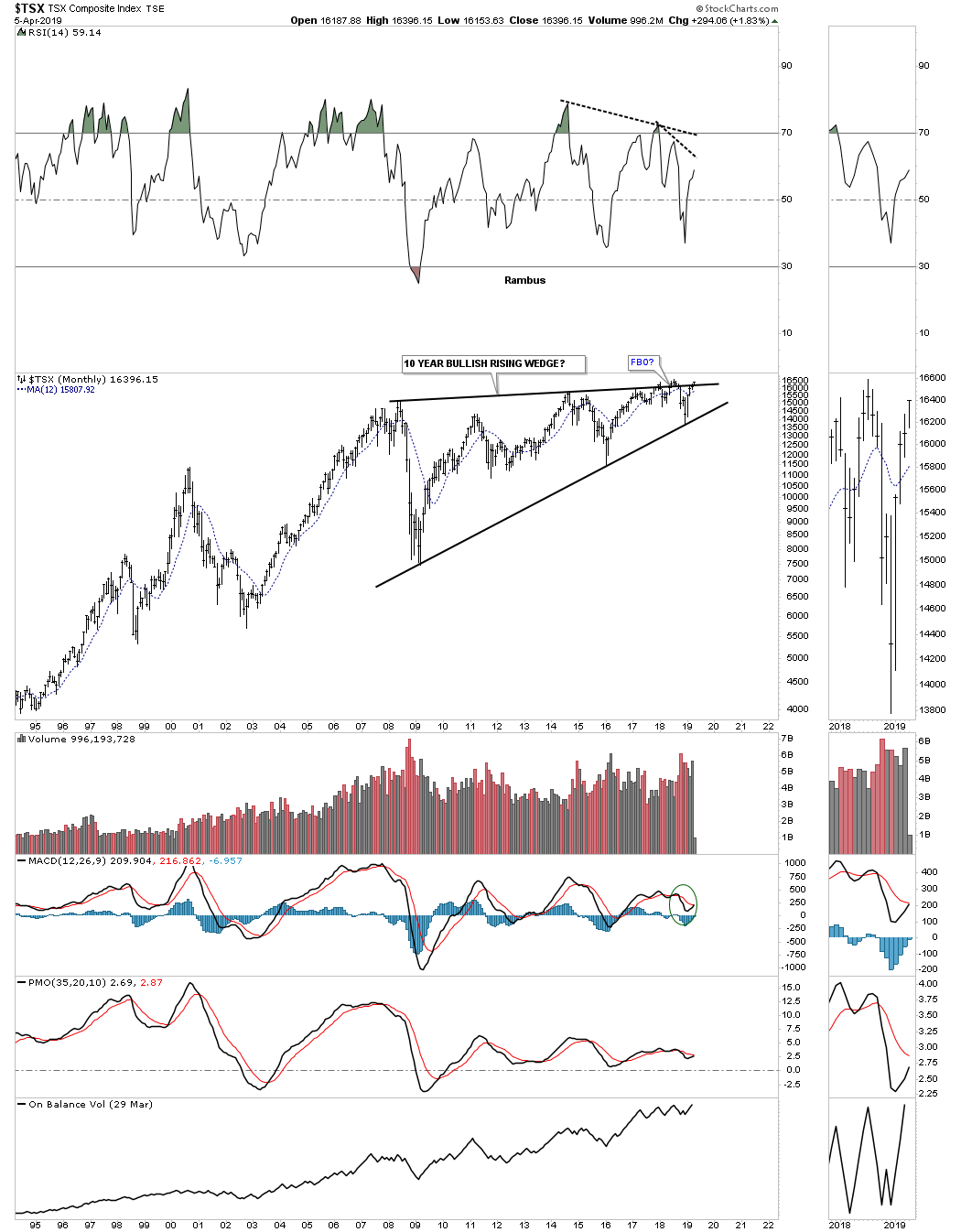
The $TSX, Toronto stock market, has been building out a ten year six point rising wedge formation. It has been attempting to breakout above the top rail for over a year which so far has failed. On the positive side the price action is trading very close to new all time highs. Since this is a commodities related stock index it should have bullish consequences for commodities in general if it can breakout strongly above the top rail.
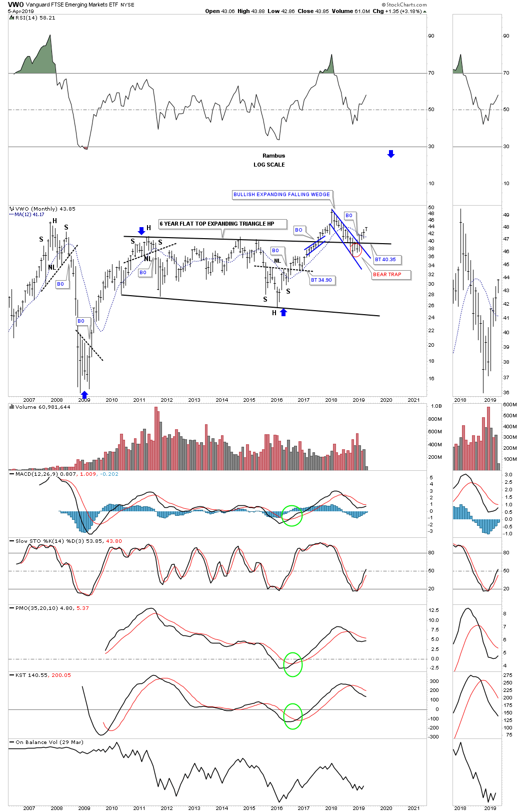
If the world is going to move forward in regards to what their stock markets are suggesting then the emerging markets should also participate. Below is a long term monthly chart for the VWO, emerging markets. After a strong rally out of its 2009 crash low the VWO has been in consolidation mode for the last six years building out the flat top expanding triangle consolidation pattern. Again, like so many other stock market indexes weve looked at, this emerging market etf also experienced a false breakout below the top rail of the expanding falling wedge, but reversed direction leaving behind a bear trap. Im also viewing the six year flat top expanding triangle consolidation pattern as a halfway pattern as shown by the blue arrows.
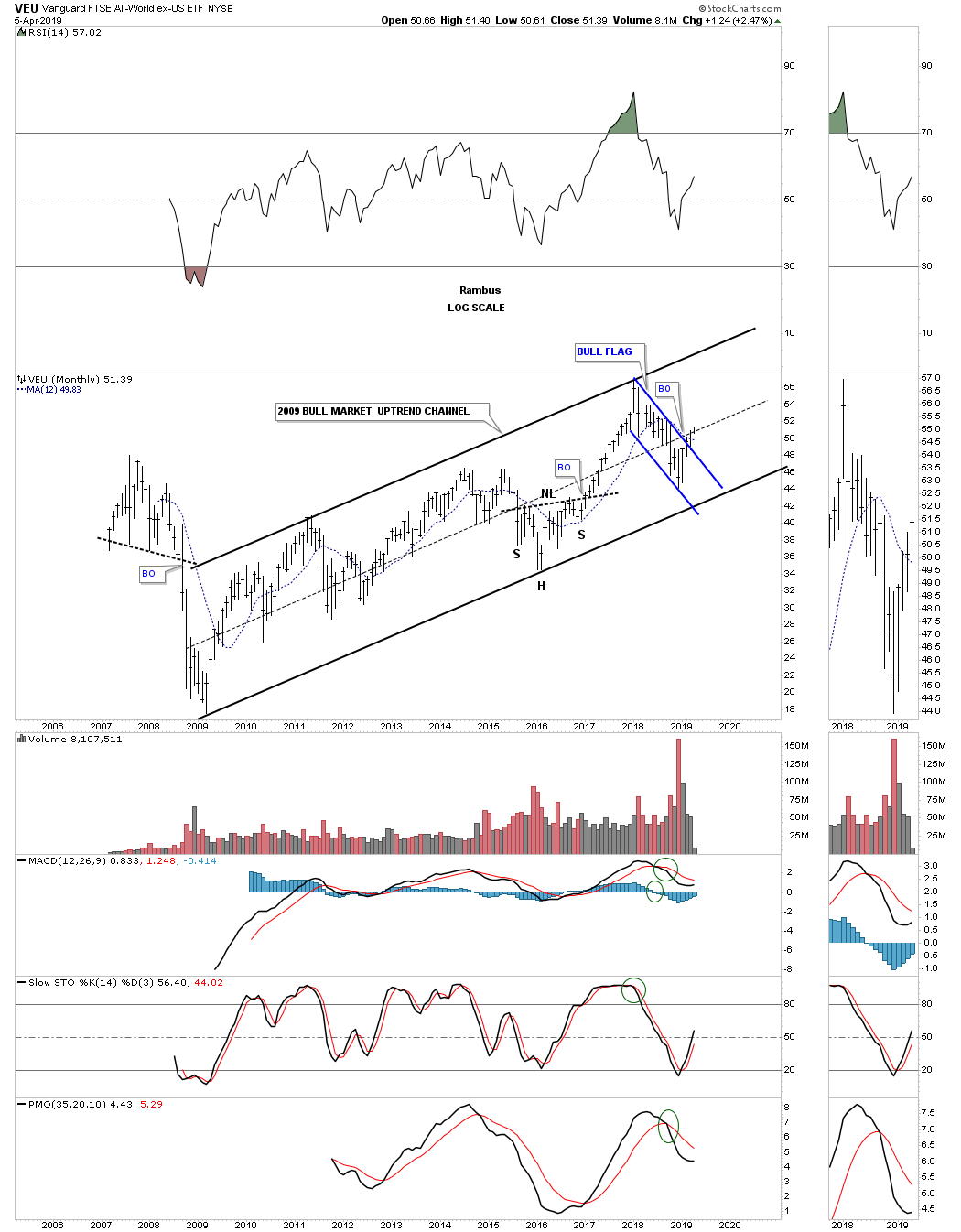
This last chart I would like to show you for this part of the Quarterly Report is the VEU,all world stock markets ex the US stock markets. The VEU has been in a nice steady bull market since its 2009 crash low. During the 2015 correction it built out a H&S consolidation pattern on the bottom rail of its 2009 major uptrend channel. Since the 2018 high when the US stock market topped out so did just about every other stock market on the planet. Since that 2018 high the VEU formed the blue flag and broke out above the top rail two full months ago.
What most of the world stock markets above are suggesting to me is that we should expect another leg higher in the secular bull market that began in 2009. Since these are long term monthly charts change comes slowly and we could see some backing and filling, but the big picture shows many of the world stock markets including our own are going to experience another leg up within their secular bull markets.
If the world stock markets are beginning to show some life then some of the underlying sectors within the stock markets should also be showing some positive chart patterns. You cant have one without the other. As with every bull market there are leading and lagging sectors, but eventually they all generally get their shot at producing their own individual bull market.
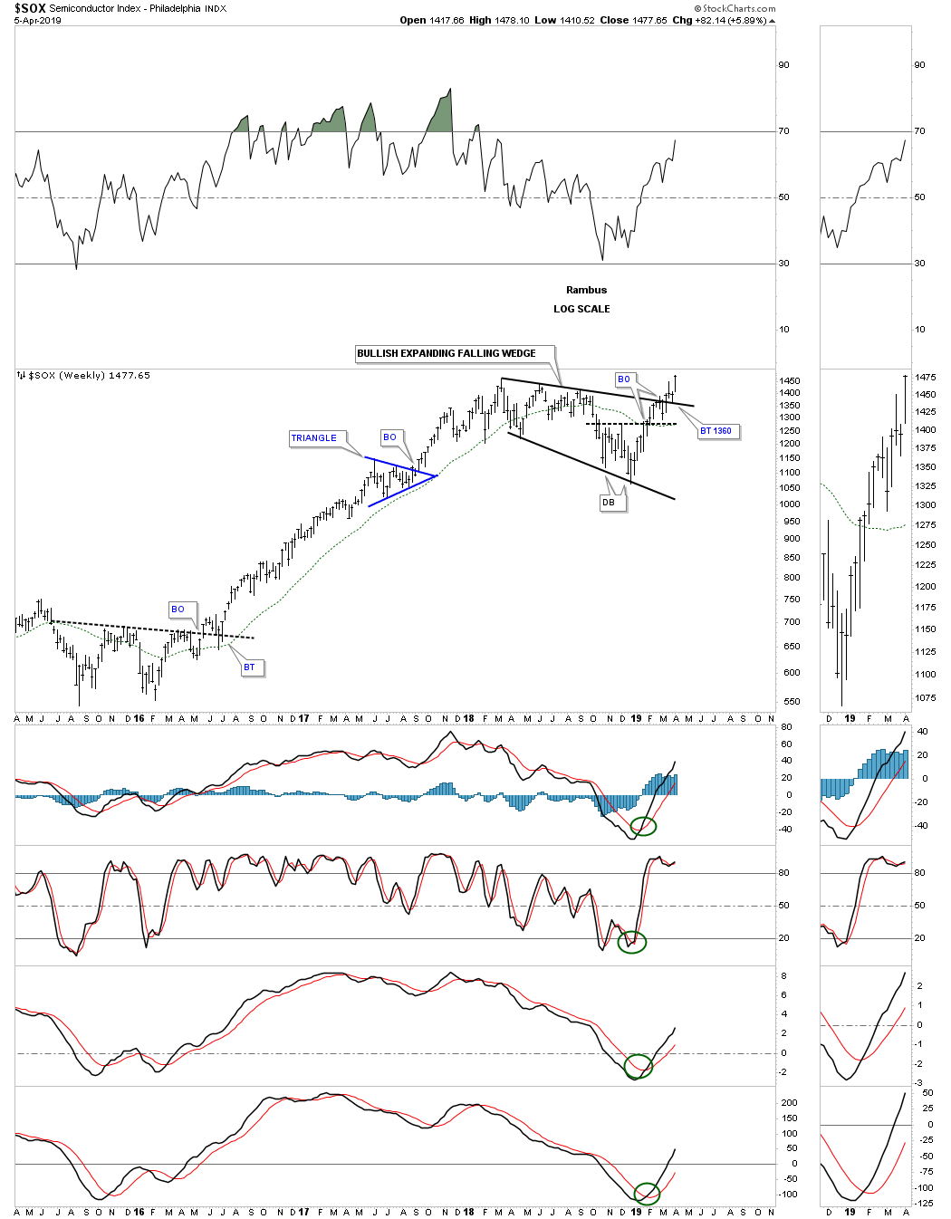
If the secular bull market is going to continue then the tech stocks will have to be one of the leading sectors. One area within the tech sector that is giving us a good clue that the markets want to go higher are the semiconductors. They are doing something they havent done since their 2000 bull market top.
Below is a long term monthly chart for the $SOX, semiconductor index, that is now breaking out to new all time highs. The Chartology has been picture perfect. Since the 2009 bear market low notice how each impulse leg up is followed by a consolidation period which leads to another impulse leg up. This is a classic example of how a bull market is supposed to look. In the early part of January 2018 when everything was topping out so did the $SOX, but it topped out at its 2000 all time high which was a perfect place to see a consolidation pattern form. Most of the time when an important trendline or in this case the all time high is reached you will see a small consolidation pattern form just below that important area of resistance. Since the SOX has been in a bull market the odds were high that it would breakout to new all time highs which it is now doing.
The consolidation pattern that formed at the all time high was the blue expanding falling wedge which is also showing up on some of the other areas within the markets. Its still possible we could see a backtest down to the 1350 area but the bulls have now taken back control of the semiconductor index. This area is going to be one of the leading sectors during the next phase of the bull market and is giving us an early warning that the bull market correction since the January 2018 may be coming to an end.

Below is the weekly chart for the SOX which shows a perfect breakout and backtest to the top rail of the January 2018 bullish expanding falling wedge.
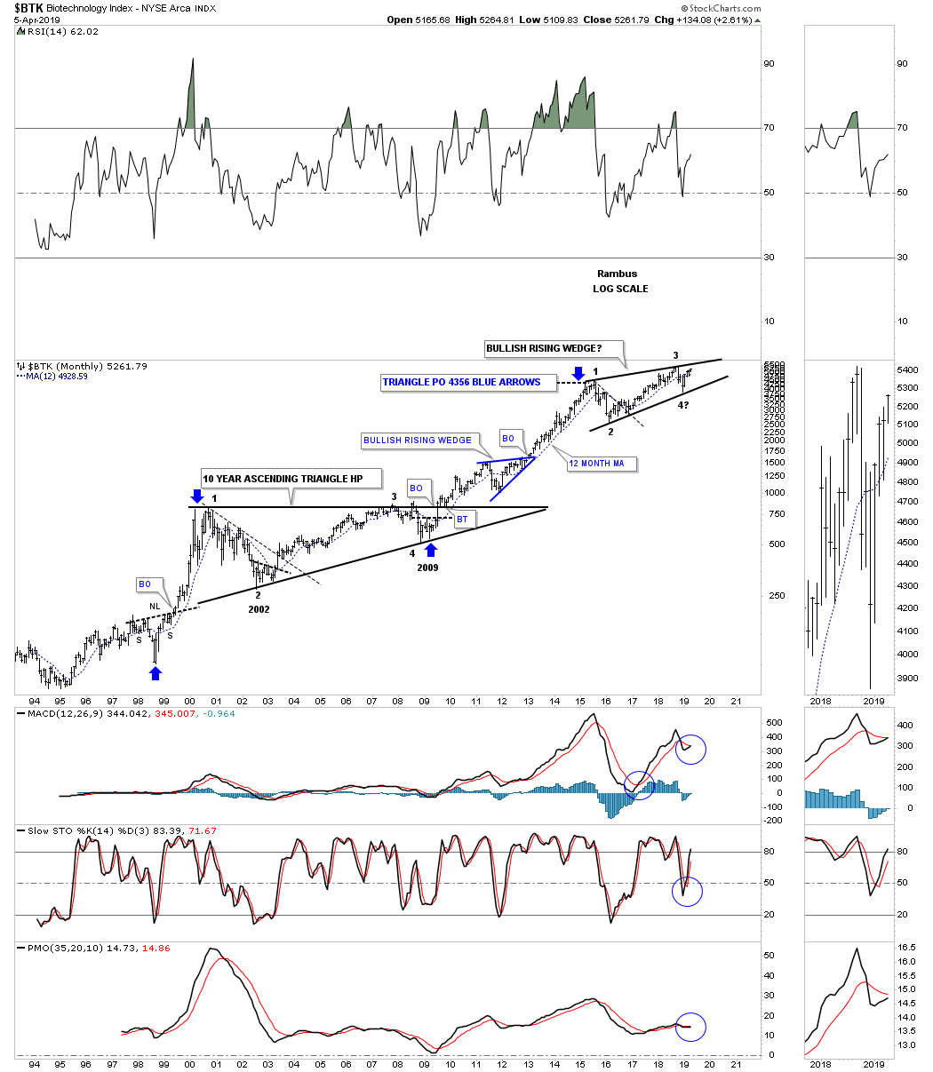
One of the strongest areas within the 2009 bull market has been the biotech stocks. The $BTK, biotechnology sector, bottomed in 2009 putting it the fourth reversal point in its ten year flat top or ascending triangle. Note how tiny the 2009 decline was compared to most of the stock markets which in many cases traded below their 2002 bear market low. This small decline was showing relative strength which showed itself in the ensuing secular bull market that is still progressing along.
The BTK has been consolidating the previous impulse leg up topping out in August of 2015 building out the nearly four year rising wedge pattern. Most will view this rising wedge as a bearish rising wedge, but since it has been forming in the secular bull market the odds favor an upside breakout. If the price action breaks out below the bottom rail then Ill be the first one to admit I was wrong.
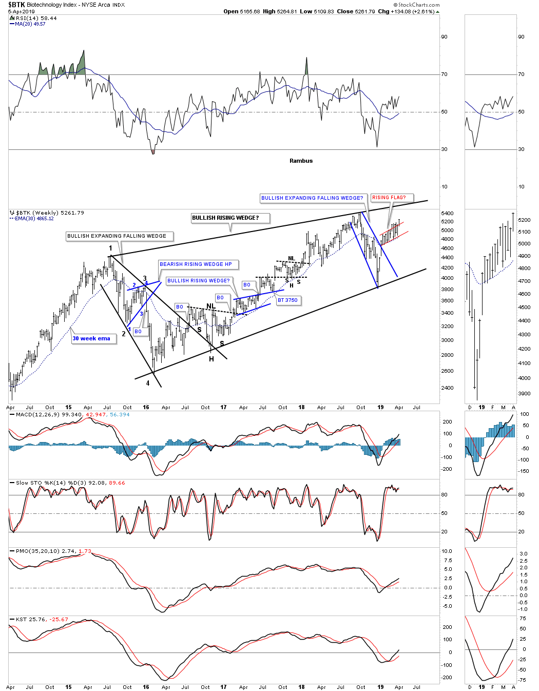
The weekly chart for the $BTK.
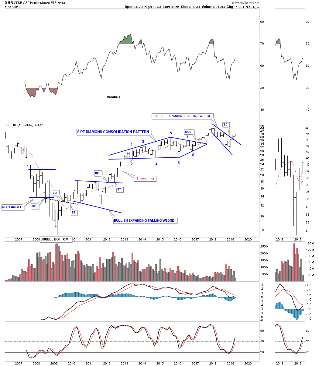
Another area we would like to see perform well is the XHB, homebuilders, which is an integral part of the economy. Here you can see another 2018 bullish expanding falling wedge breaking out and is beginning to move higher after a quick backtest to the top rail last month.
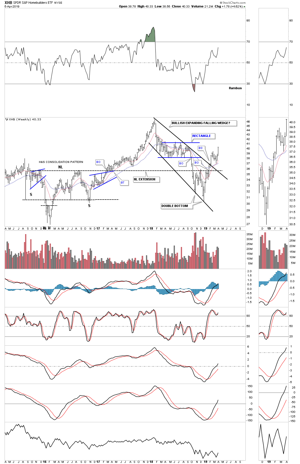
XHB weekly chart with the bullish expanding falling wedge.
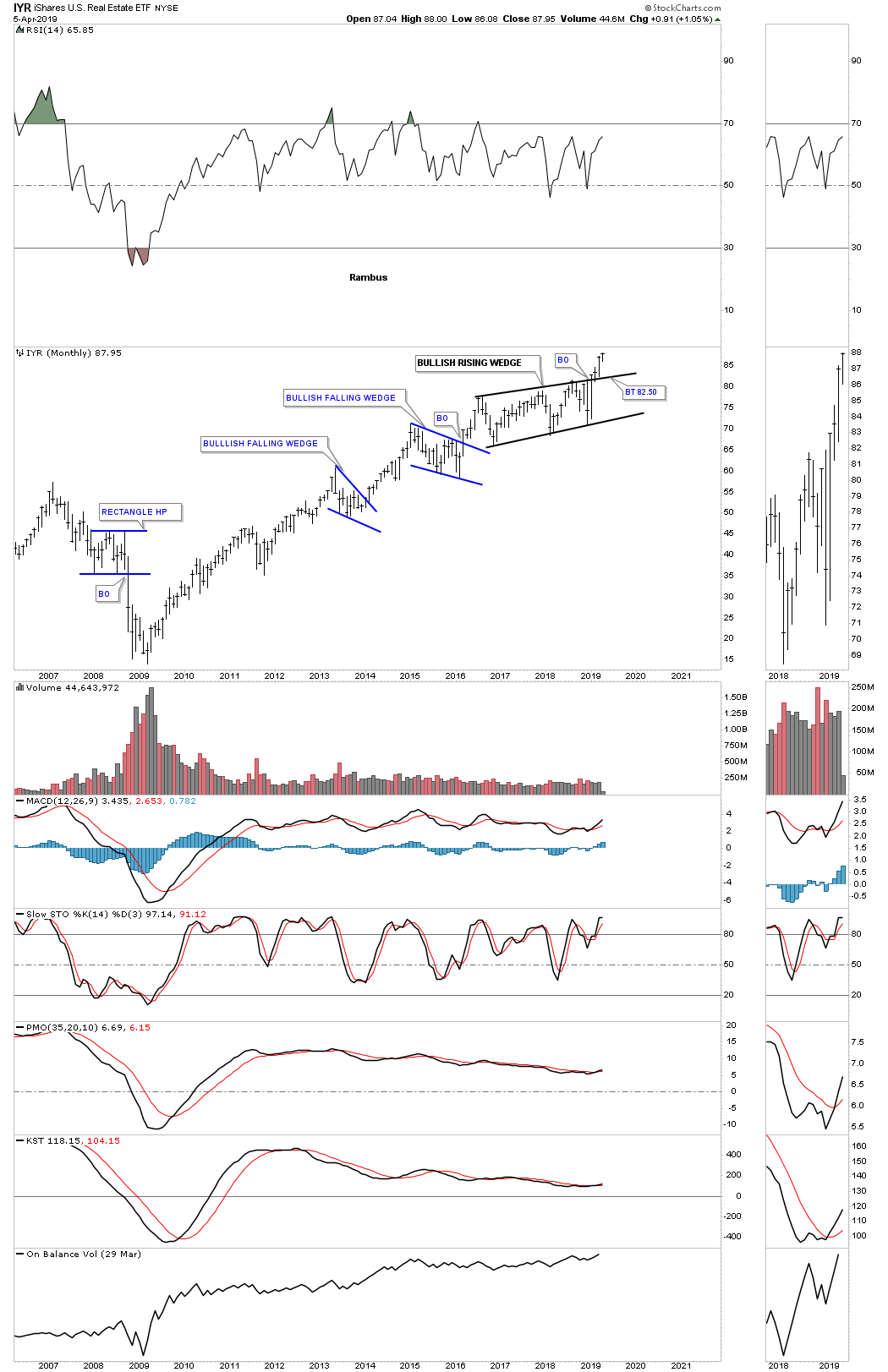
Below is the IYR, Real Estate etf, which is breaking out of from its 2016 bullish rising wedge formation in no uncertain terms. A backtest to the top rail is always possible but not necessary.
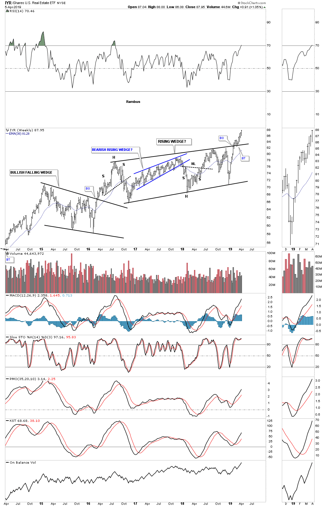
The weekly chart for the IYR.
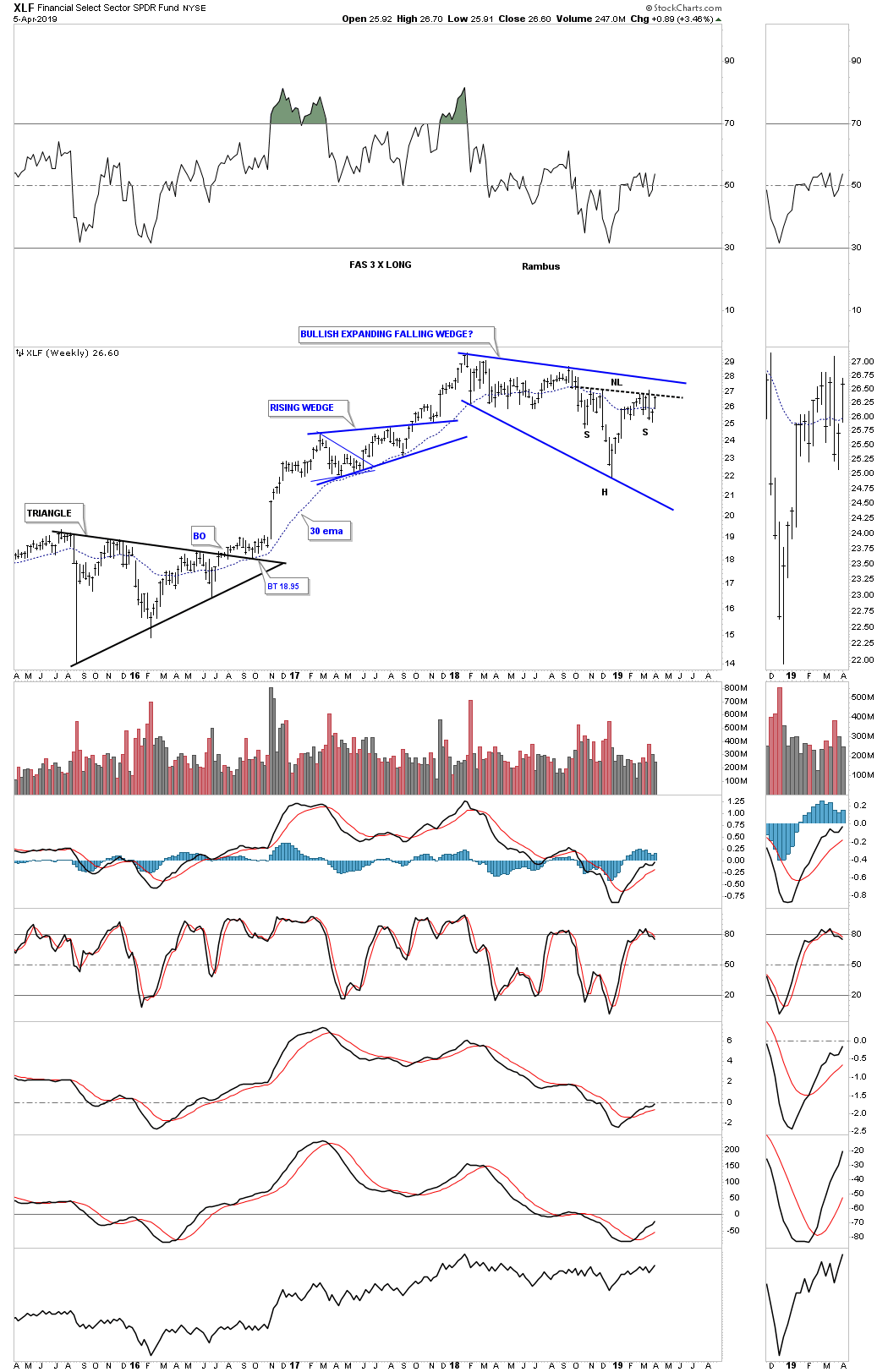
Another very important area that needs to be strong during a bull market run is the XLF, financial sector, which is building out its own expanding falling wedge formation within its 2009 bull market uptrend channel.
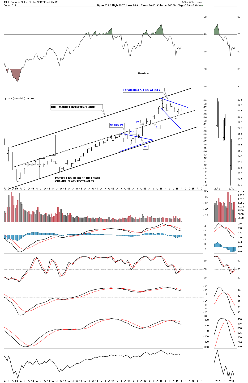
This weekly chart for the XLF shows a potential very bullish setup with a H&S bottom forming at the last reversal point in the blue expanding falling wedge. I suspect we will most likely see a ping pong move between the neckline and the top rail of the bullish expanding falling wedge before the actual breakout takes hold.
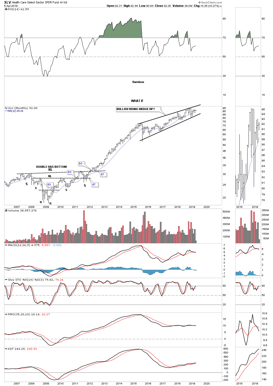
Another area that has done exceedingly well since the 2009 crash low has been the XLV, Health Care sector, which had a four year uninterrupted impulse move into the first reversal point in a growing four plus year rising wedge formation. Again, most will view the 2015 rising wedge formation as a bearish rising wedge, but, WHAT IF the rising wedge is a bullish rising wedge? Note the massive 2009 H&S bottom which led to the uninterrupted move into the rising wedge. Big patterns lead to big moves and the XLV has built out a big pattern.
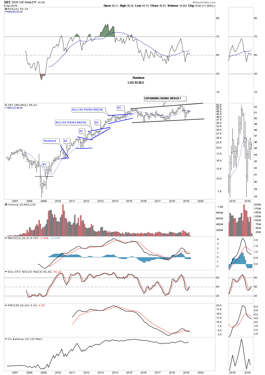
Another area that had a good bull market run out of its 2009 crash low was the XRT, Retail etf. It has been consolidating that first six year bull run forming a large expanding rising wedge formation which could very well be a halfway pattern to the upside.
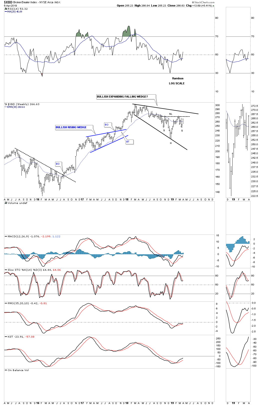
This last chart I would like to show you tonight is the $XBD, Broker/Dealer index, which is forming its own 2018 expanding falling wedge with the H&S bottom forming at the fourth reversal point which is a very bullish setup.
This completes part two of the Quarterly Report with currencies and commodities to follow. I realize how ridiculous these long term charts are to someone that has been a perma bear for the entire secular bull market that started at the 2009 crash low. How can the markets just keep going up? It makes no sense. Thats why the markets keep going up because they make no rational sense from the bearish perspective.
This greatest bull market of all time is going to come to and end one day and when it does there will be a multi year correction that could last 10 to 15 years or even longer as we saw in gold after its 1980 bull market high. Secular bull markets are rare but Ive been lucky enough to have lived and traded during the 1980 to the 2000 secular bull market that changed my life forever and now Im lucky enough to be part of our current secular bull market that began in 2009.
Experiencing one of these secular bull markets in ones lifetime is great but for most investors they will never see it until the end when everyone piles in with reckless abandon. We still havent gotten to the IPO stage where stocks that are virtually worthless will be bid up to astronomical prices. The mania phase will come but its not here yet thats what these big chart patterns are suggesting. Maybe after this next big impulse leg up well see the mainia phase and with a little luck well get out in time to enjoy our profits. All the best..Rambus
Rambus
| Digg This Article
-- Published: Tuesday, 9 April 2019 | E-Mail | Print | Source: GoldSeek.com


