-- Published: Monday, 6 May 2019 | Print | Disqus
By: David Chapman
Sell in May, and go away.
old stock market adage
All there is to investing is picking good stocks at good times and staying with them as long as they remain good companies.
Warren Buffett, CEO, Berkshire Hathaway; investor and philanthropist, b. 1930
Wall Streets graveyards are filled with men who were right too soon.
William Peter Hamilton, editor, The Wall Street Journal, The Stock Market Barometer, 1922, 18671929
May is not noted for being a stellar month. It ranks eighth or ninth with the Dow Jones Industrials (DJI) and the S&P 500. But it can be very uneven. Between 1965 and 1984, it was down 15 out of 20 Mays. However, between 1985 and 1997, it was up 13 years in a row. Since then, May has had 13 up months and 8 down months. May does not do well in pre-presidential election years. Since 1950, both the DJI and the S&P 500 ranked poorly coming in as the tenth worst month.
Sell in May, and go away. The old switching strategy does have its fans. And the overall track record since 1950 does show that the major markets outperform during the November/April period vs. the May/October period by a factor of 12.5. Since 1950, the record shows that of the 69 years since, the DJI has closed down in May/October period 27 times. In 2018 the May/October period saw a 3.9% gain. Since 2009, only three May/October periods finished in the red. The average gain since 1950 during the May/October period is a paltry 0.6%. On the other hand, the November/April period saw a decline only 14 times and the average gain was 7.5% for the DJI. Below is an interesting chart showing the performance of the May/October November/April periods over a 5-, 10-, 20-, and 50-year period and all-time.
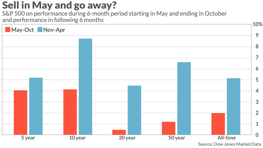
Source: www.marketwatch.com
Despite the almost 20% swoon in October/December 2018, the recently completed November/April period saw the S&P 500 gain 8.6%. April, a month noted as being stellar, saw the S&P 500 gain 3.9%. So far, things are going as history suggests. The May/October period has been battered by a few rather steep declines that contribute to its bad reputation. 15% plus declines were seen in 1974 (Arab oil embargo, Nixon impeachment, Watergate), 2001/2002 (high-tech dot.com crash, 9/11), 2008 (global financial crisis). The period also contains the notoriously weak months of August/September and the propensity for stock market crashes in October.
So, what will May 2019 and the next six months bring us? According to some pundits, they believe this time will be different. Grant you, thats an expression we have heard before. According to the most recent Fed testimony, the U.S. economy is not doing all that badly. Inflation is low. However, Fed Chairman Jerome Powell spooked markets on May 1, 2019 by using the word transitory when it comes to inflation. Markets, as usual, were getting ahead of themselves, believing that low inflation might prompt the Fed to lower rates later in 2019. Not so fast.
The Feds target inflation rate is 2% but the core PCE rate recently fell to 1.6%. With effective fed funds at around 2.4%, the spread between core PCE and FF has increased to 0.8%. That in itself is not earth shattering as FF is often above core PCE. But it is the first time since 2008 it has jumped over core PCE. Powell went on to say as well that he did not believe that asset prices are elevated. That should have been music to the ears of the market, but they were disappointed that he might not cut rates at some point this year. Naturally that also flies in the face of what Trump wants the Fed to do.
Effective Fed Funds vs. Core CPI
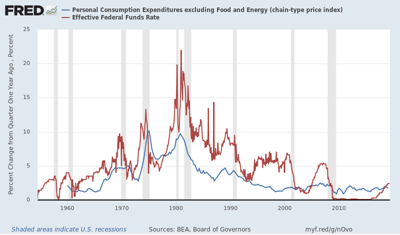
Source: www.stlouisfed.org
But low inflation and a positive U.S. economy is not all that might help ignite markets further to the upside. Earnings continue to be good. During the first quarter, earnings tended to be downgraded but then came in somewhat better than expected. Therefore, expectations of bad news on the earnings have largely dissipated. Some noted that EPS growth expectations went from 10% in September 2018 to 3.2% recently. This has helped drag down what is known as the CITI Economic Surprise Index.
So, what is the CITI Economic Surprise Index? A positive reading suggests that data is better than expected, while a zero reading indicates that data is meeting expectations. A negative reading, however, suggests that data is worse than expected. The reading recently reached negative 57.1. That would appear to suggest that data of late has been worse than expected. Every time it went this low a rally in the S&P 500 forward P/E took place. Except it has already been rising even as it is below the peak seen in early 2018.
What some analysts are suggesting is that it is too early for an earnings recession. Recent data from China has also improved and, couple that with continued hope that the U.S. and China will come to an agreement on trade, there remains considerable room for optimism. Sell in May, and go away is a catchy market jingle but a reminder that in six of the past seven years it hasnt worked. Couple this with the still rising NYSE advance-decline line and the positive ratio-adjusted McClellan Summation Index (RASI) a continued rise in the stock market seems almost a certainty. Of course, complacency can sometimes get in the way of a good narrative.
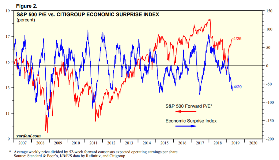
Source: www.standardandpoors.com, www.citigroup.com, www.yardeni.com, www.refinitiv.com
All of this, of course, blithely ignores the monstrous record pile of debt in the world. Stock market collapses and recessions are often about debt collapse. Do we expect this time to be different? No, but for now the market is not focused on the debt. And while there are some debt problems most noteworthy in China there has been no big collapse nor have any large funds gone under because of overexposure somewhere. The market is also not focused on the testimony of AG William Barr and the potential for a constitutional crisis, nor the crisis in Venezuela, Brexit, and a host of other things going on in the world. The market is focused on earnings and the economy. Result, the market is going higher.
The economy received a positive jolt on Friday with the release of Aprils nonfarm payroll. It came in stellar. We discuss this in our Chart of the Week.
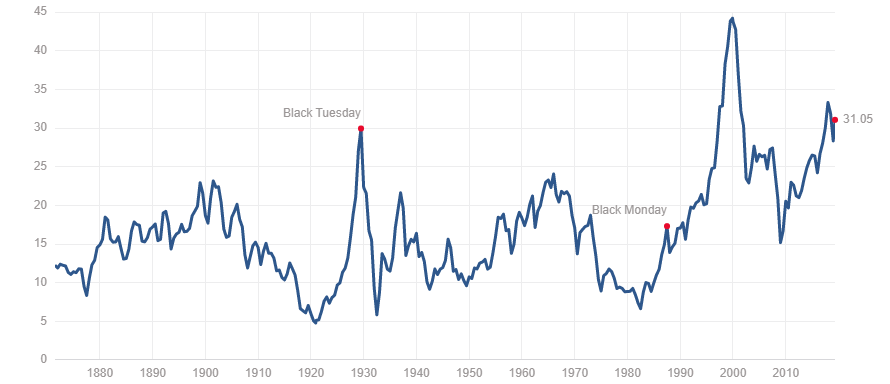
Many continue to believe the market is overvalued. The Buffett Indicator which compares corporate equities to GDP continues to hang around in lofty territory even as it has come down. And the Shiller P/E ratio also remains at lofty levels, higher than was seen before the 2008 financial collapse. So, what does it all mean, with different indicators suggesting the market should go higher and others saying it is overvalued? Well, overvaluation is a state and markets can stay overvalued longer than market shorts can stay solvent. Eventually it catches up. And eventually negative news catches up. Just not today. That doesnt make todays market any different than previous ones but it does suggest that this current market appears to have more life in it.
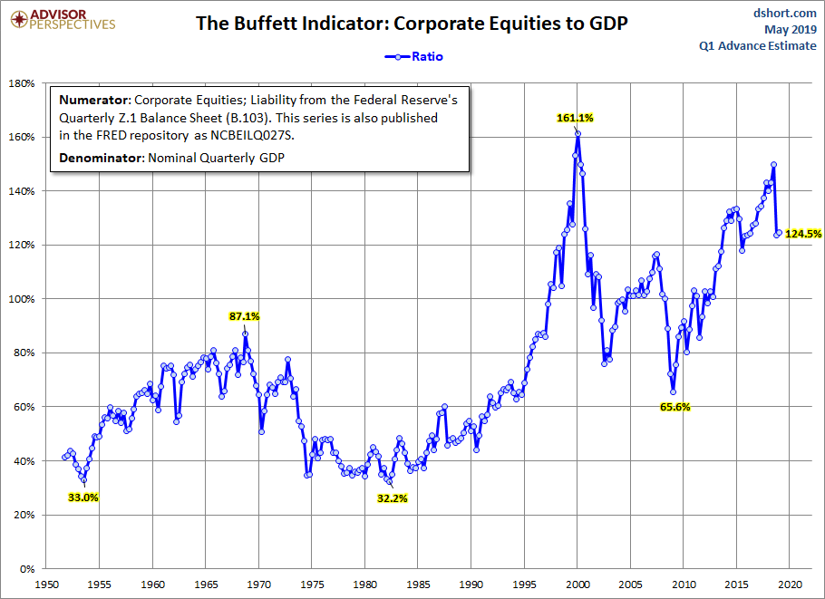
Source: www.dshort.com
Shiller P/E Ratio
Source: www.multpl.com
MARKETS AND TRENDS
| | | % Gains (Losses) Trends |
| Close Dec 31/18 | Close May 3/19 | Week | YTD | Daily (Short Term) | Weekly (Intermediate) | Monthly (Long Term) | |
Stock Market Indices | | | | | | | | |
S&P 500 | 2,506.85 | 2,945.63 | 0.2% | 17.5% | up | up | up (topping) | |
Dow Jones Industrials | 23,327.46 | 26,504.95 | (0.1)% | 13.6% | up | up | up (topping) | |
Dow Jones Transports | 9,170.40 | 10,958.53 | 0.7% | 19.5% | up | up (weak) | up (topping) | |
NASDAQ | 6,635.28 | 8,164.00 | 0.2% | 23.0% | up | up | up (topping) | |
S&P/TSX Composite | 14,322.86 | 16,494.43 | (0.7)% | 15.2% | up | up | up | |
S&P/TSX Venture (CDNX) | 557.20 | 606.42 | (0.7)% | 8.8% | down | down | down | |
Russell 2000 | 1,348.56 | 1,614.02 | 1.4% | 19.7% | up | up (weak) | up (weak) | |
MSCI World Index | 1,710.88 | 1,910.10 | (0.3)% | 11.6% | up (weak) | up | up (weak) | |
NYSE Bitcoin Index | 3,769.99 | 5,711.99 | 11.2% | 51.5% | up | up | up | |
| | | | | | | | |
Gold Mining Stock Indices | | | | | | | | |
Gold Bugs Index (HUI) | 160.58 | 152.99 | (4.7)% | (4.7)% | down | neutral | down | |
TSX Gold Index (TGD) | 186.74 | 178.46 | (4.3)% | (4.4)% | down | neutral | down | |
| | | | | | | | |
Fixed Income Yields/Spreads | | | | | | | | |
U.S. 10-Year Treasury yield | 2.69 | 2.54 | 1.2% | (5.6)% | | | | |
Cdn. 10-Year Bond yield | 1.96 | 1.77 | 4.7% | (9.7)% | | | | |
Recession Watch Spreads | | | | | | | | |
U.S. 2-year 10-year Treasury spread | 0.21 | 0.21 | (8.7)% | flat | | | | |
Cdn 2-year 10-year CGB spread | 0.10 | 0.13 | 85.7% | 30.0% | | | | |
| | | | | | | | |
Currencies | | | | | | | | |
US$ Index | 95.73 | 97.59 | (0.1)% | 1.9% | up | up | up (weak) | |
Canadian $ | 0.7350 | 0.7455 | 0.2% | 1.4% | down | down | down | |
Euro | 114.58 | 111.99 | 0.4% | (2.3)% | down | down | down (weak) | |
British Pound | 127.50 | 131.67 | 1.9% | 3.3% | neutral | up | neutral | |
Japanese Yen | 91.24 | 90.01 | 0.5% | (1.4)% | neutral | neutral | down (weak) | |
| | | | | | | | |
Precious Metals | | | | | | | | |
Gold | 1,281.30 | 1,281.3 | (0.6)% | flat | down | up (weak) | neutral | |
Silver | 15.54 | 14.98 | (0.2)% | (3.6)% | down | neutral | down | |
Platinum | 795.90 | 874.80 | (3.2)% | 9.9% | neutral | up | down (weak) | |
| | | | | | | | |
Base Metals | | | | | | | | |
Palladium | 1,197.20 | 1,358.00 | (6.2)% | 13.4% | up | up | up | |
Copper | 2.63 | 2.82 | (2.4)% | 7.2% | down | up | up | |
| | | | | | | | |
Energy | | | | | | | | |
WTI Oil | 45.41 | 61.94 | (2.2)% | 36.4% | neutral | neutral | up | |
Natural Gas | 2.94 | 2.57 | (0.4)% | (12.6)% | down | down | down | |
Source: www.stockcharts.com, David Chapman
Note: For an explanation of the trends, see the glossary at the end of this article.
New highs/lows refer to new 52-week highs/lows.
Source: www.stockcharts.com
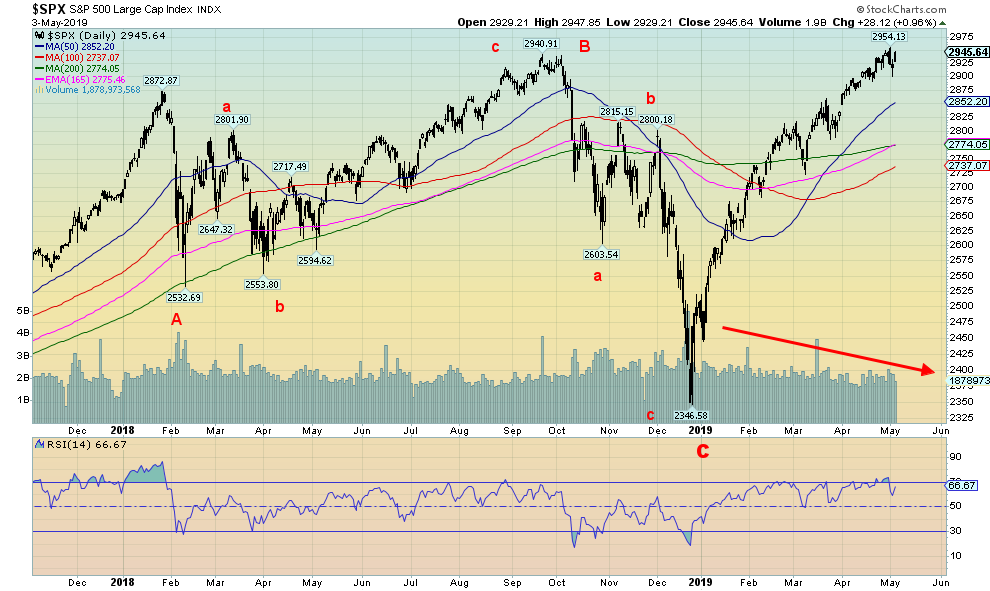
We are convinced that the action following the January 2018 top was a large ABC-type pattern that eventually bottomed in December 2018. This is also the conclusion of Elliott Wave International (www.elliottwave.com) in its recent May 2019 Financial Forecast. They have labelled this wave 4 up from the major March 2009 low. We are now working on wave 5. The final low (December 2018) came 35 months after the February 2016 low (or, if we count the August 2015 low, 41 months). This is enough to suggest that the December 2018 low may have been the 4-year cycle low (range 35 years). But still to come is the 6.5-year cycle (range 5-8 years) low due from 20202023 but more likely 20202022. The 6.5-year cycle low was also seen last in 2015/2016. We have also talked before about the possibility of a 90-year cycle of lows so, theoretically, it would be due around 2022 (1932 + 90 = 2022). Most likely the 2009 low was the 75-year cycle low (1932 + 75 = 2007).
Typically, in the past as pointed out by Ray Merriman (www.mmacycles.com) there has been a secondary depression following the 75-year cycle low some 622 years after the major 75-year cycle low. We are now 10 years from that low so, theoretically at least, we could still last out to 2031. The stronger likelihood is this low will hit sometime in the next 2/3 years as we are in the midst of other cycles that all come in around this period. So, enjoy the rally. We are not sure when it will top but appears to have more legs, as we have discussed. Our targets could still be as high as 3,500 but more likely 3,150 to 3,200. Minimum objectives would be 3,050 to 3,100. We continue to expect new highs going forward. Breakdown doesnt come until we bust under 2,700. The only thing that is noticeable is the volume which is not strong. So that tells us this rally is built on sand. The NYSE advance-decline line continues to rise in record territory so it also tells us we are going higher. Enjoy the ride, but remember things could begin to top once we start breaking above 3,000.
Source: www.stockcharts.com
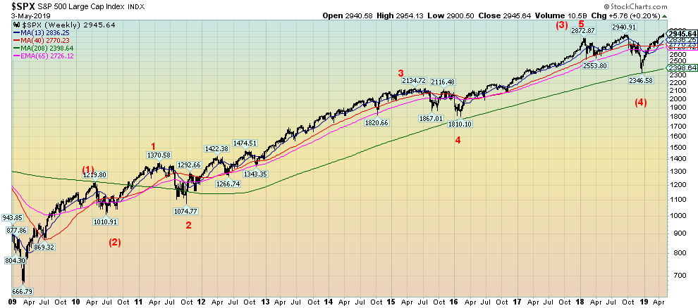
A longer term look at the S&P 500 and its potential wave count from the March 2009 low. Again, this is from Elliott Wave International (www.elliottwave.com). They have intermediate wave 1 topping out in April 2010 and intermediate wave 2 bottoming in June 2010. Then came the long wave 3, that didnt top until January 2018. The 2011 Greek/EU crisis and the 2015/2016 end of QE crisis both still stand out as corrections but of lesser degree than the one in 2010. The corrective period from January 2018 to the bottom in December 2018 is intermediate wave 4. We are now working on intermediate wave 5. The count works but we are puzzled by the acceptance of the shallow correction in 2010 that only lasted about 3 months and saw the market fall 17% which isnt bad to the downside but it is a very short correction. The EU/Greek crisis of 2011 saw the market fall 21.6%, lasting from May to October 2011 (6 months) and the end of QE in 2015/2016 saw the market fall only 15.2% lasting from May 2015 to February 2016 (10 months) although in between the two lows there was a strong rally that failed to take out the May 2015 top. Wave 4 lasted from January 2018 to December 2018 (12 months) and saw the market fall 18.3% from the January top and 20.2% from the September top. All three lows (2011, 2015/2016, 2018) tested the 4-year MA but it held. Similarly, the market first stalled at the 4-year MA in May 2010. It emphasizes the importance of the 4-year MA currently at 2,347. A serious bear market gets underway when the 4-year MA breaks for good. It did that in June 2008 and it never looked back. Once it breaks, the decline is usually steep and quick.
Source: www.stockcharts.com
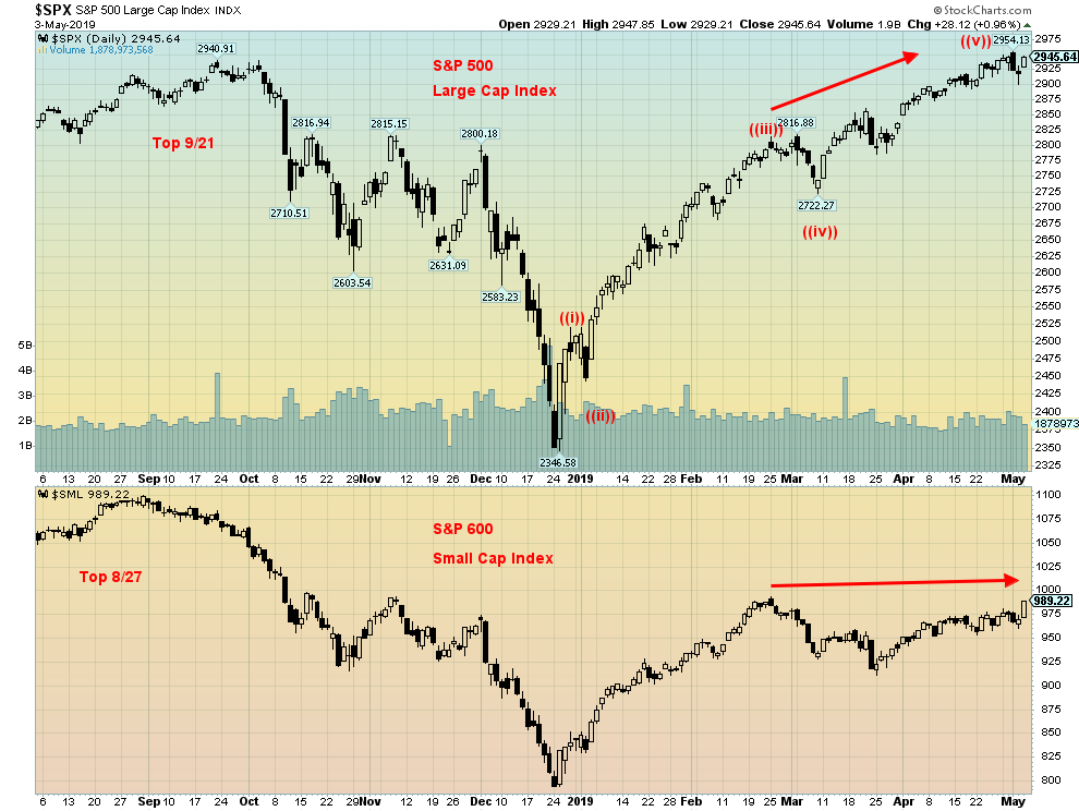
We like to look at the relationship between large cap stocks, as represented here by the S&P 500 and small cap stocks as represented by the S&P 600. Both climbed quite steadily into February 2019, but since then the S&P 600 has stalled, even as the S&P 500 kept moving higher. In a strong bull market, the S&P 600 should be leading. It is not and that is a major suspicion of this market. Both indices may go higher but something is amiss. We note that in 2017 the S&P 600 topped a good month ahead of the S&P 500 signaling that something was amiss. Sure enough, the October/December swoon followed.
Source: www.stockcharts.com
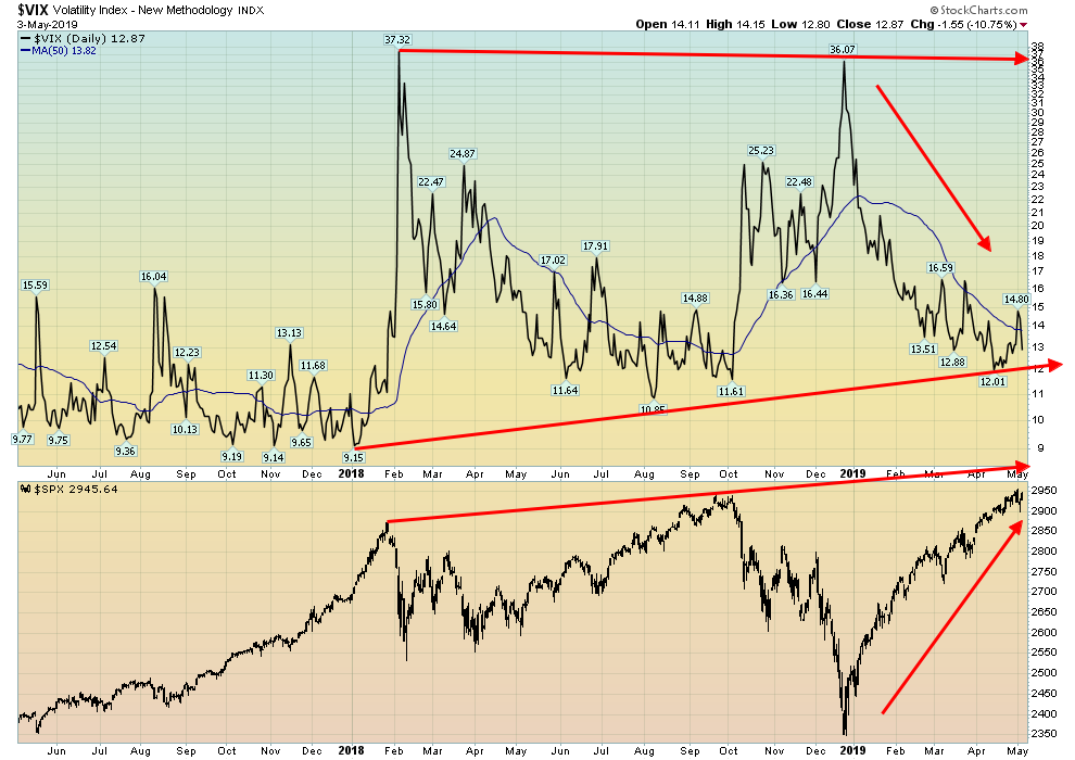
Fear and greed. Thats the VIX Volatility Index. With the VIX falling, it indicates greed is starting to rule. Okay, the VIX is nowhere near the levels seen back in 2017 when it regularly tested down towards 9. But at 13 the VIX appears to be headed lower. And the declining 50-day MA would seem to suggest as well that it is pointed lower and we have not found our bottom. The VIX moved down quickly this past week when the market rebounded into Friday following the stellar job numbers. We now need to break under 12 to suggest that the VIX could at least fall further towards support in the 10/11 zone. We dont believe well see 9 levels again. All of this supports our thesis that the stock market still has further to climb, and the VIX is indicating that greed and complacency are growing.
Source: www.stockcharts.com
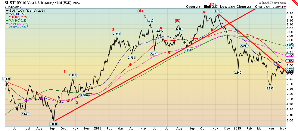
U.S. Treasuries were falling in yield but Powells inflation remarks and the strong job numbers on Friday helped push yields on the 10-year U.S. Treasury note back up. The 10-year rose 3 bp this past week. For now at least the 10-year appears to be holding a downtrend line, however, it looks vulnerable and we wouldnt be surprised to see yields climb further. A test of the 200 day MA up around 2.80%/2.83% appears to be in order. This would surprise a lot of people who assumed yields were headed lower because of low inflation and thoughts that the Fed might cut the key Fed rate. The Fed has given little indication that a rate cut is on the agenda and they continue to monitor things. However, they do not appear poised to hike rates any time soon either. Going forward it might just well be the status quo. But rising yields in the bond market also signal that the Fed might consider a rate hike if economic numbers keep coming in positive as they did Friday with the job numbers.
Recession Watch Spread
Source: www.stockcharts.com
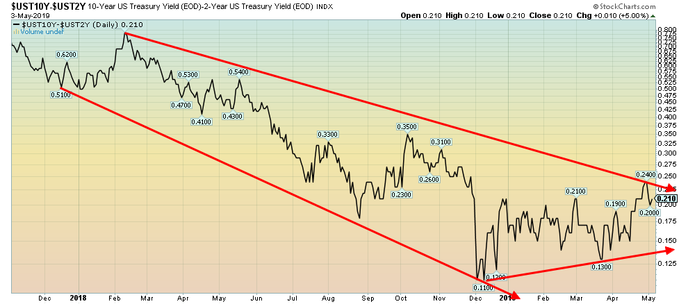
Not much to say here. The recession watch spread (10-year U.S. Treasuries minus 2-year U.S. Treasuries) is currently at 21 bp following the stellar job numbers seen on Friday. The low was 11 bp back in December when there was fear of a recession even if there were few signs of one. Now there are fewer. Just remember, Wall Street and Silicon Valley can carry the economy up on their backs.
Source: www.stockcharts.com
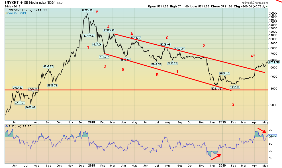
What is going on with Bitcoin and the cryptocurrencies? Bitcoin leaped 11.2% this past week and is now up 51.5% in 2019. Shades of 2017 when Bitcoin and the cryptos soared into bubble territory. Now we are reading reports of Bitcoin and the cryptos soaring back to their 2017 levels and higher. Crypto mania again? It is possible that all the bad news is out there for the cryptos. Increased regulation and scrutiny, tightening of controls to try and prevent fraudulent activity. We did bust out of the down channel and so far, the low has been seen at $3,251. At last look, Bitcoin and the other cryptos have come off their highs. There is a growing divergence in the indicators as we note with the RSI that is diverging with earlier highs in March at much lower prices. A pullback here would be positive so that we can see if Bitcoin and the cryptos really do have more legs or this was just a manipulated move. Volume is not exactly high as many have backed out of the crypto market given losses and ongoing incidences of fraud. A test of the channel breakout near $4,300 would not be unusual. But a firm break back under $4,000 would more likely suggest new lows ahead. There are still 2,149 cryptos listed at Coin Market Cap (www.coinmarketcap.com) with an aggregate market cap of $181 billion. Bitcoin alone topped out with a market cap of over $325 billion in December 2017 and the crypto market hit over $1 trillion. There are still 13 cryptos with a market cap over $1 billion, led, of course, by Bitcoin at $100.2 billion representing 55% of the entire crypto market.
. 
Source: www.stockcharts.com
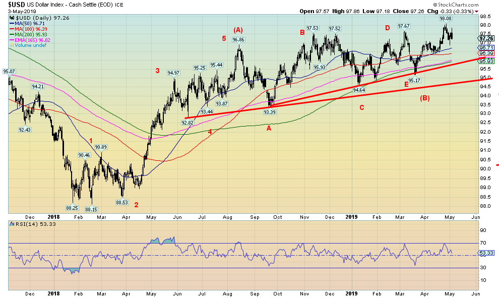
The U.S. Dollar slipped on Friday following the job numbers. Overall, it was down a small 0.3% on the week. The strong job numbers revived thoughts of interest rate hikes but it was pretty muted overall. We believe the US$ Index completed a rather complex corrective pattern with the final low in March at 95.17. The pattern also appears as a rising or ascending triangle given the series of rising bottoms and relatively flat tops at 97.53, 97.52 and 97.67 from October 2018 to March 2019. The ascending triangle projects up to about 102. The high so far is seen at 98.08. We may have completed the first good wave up and following a pullback we should resume the rise towards the potential targets. The euro remains weak, however, it gained 0.4% on the week. A surprise this past week was pound sterling that jumped 1.9% on the week after the defeat of Brexit and Conservative candidates at local elections.
Source: www.stockcharts.com
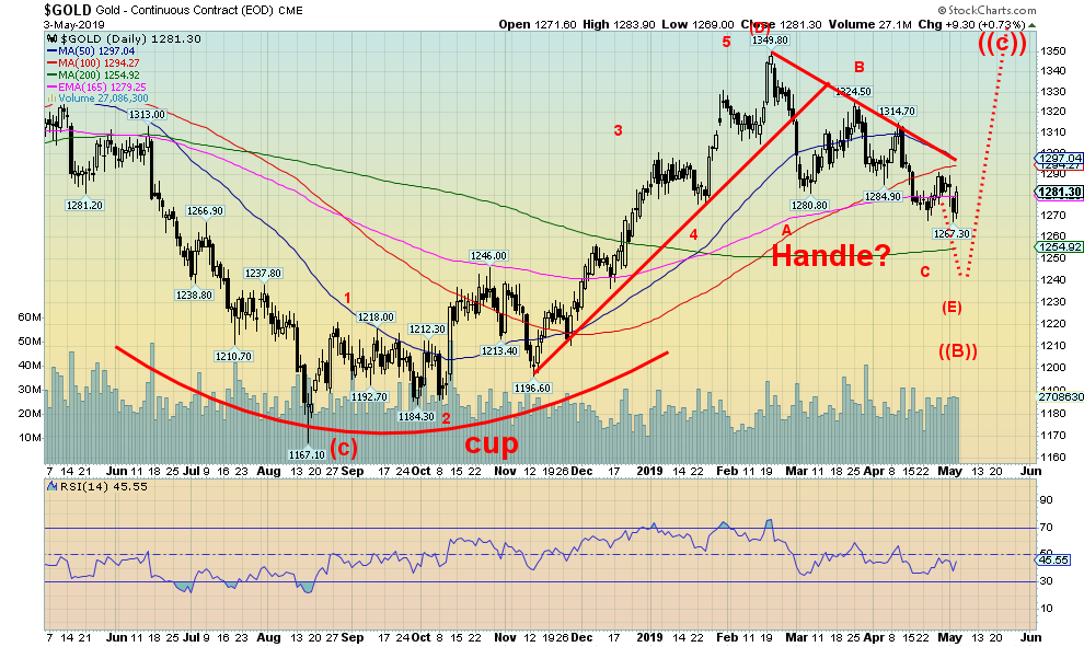
Gold prices jumped over $9 on Friday following the release of the April job numbers. Maybe gold read our assessment of the job numbers which was nowhere near as rosy as the pundits (see Chart of the Week). Irrespective of this, the jump on Friday does suggest that gold could rise to $1,300 once again before resuming its downtrend. We dont believe a final low is in and maintain our targets of at least $1,250. The low this past week was at $1,267. Gold could be forming a large cup and handle pattern. We continue to work on the handle that, as noted, may not yet be finished. Given the top on the handle at $1,350 and the bottom at $1,167 back in August 2018, once gold takes out the top at $1,350 gold prices could target up to $1,530.
However, before everyone gets ahead of themselves, we still have to make our bottom. The 200-day MA currently at $1,255 makes an inviting target. And, typically, it goes under that level which would bring us to our potential $1,250 target. But gold could dip lower as we do have a secondary target down to around $1,235. Ideally, as well gold makes a new low but silver does not as we note under our silver commentary. Gold has been forming since its high of $1,377 in July 2016 a very complex corrective pattern. We believe we are getting near the end of the pattern and this is the final wave down. Some patience is required. The final low could occur this month but we should see it by June sometime.
Source: www.cotpricecharts.com
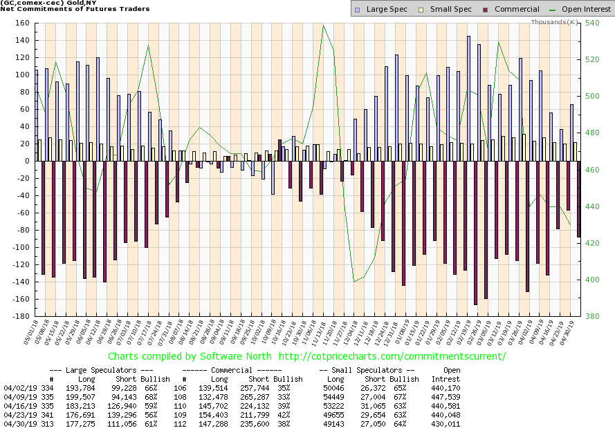
The gold commercial COT took a hit this past week, falling to 38% from 42%. Long open interest fell about 7,000 contracts while short open interest jumped about 24,000 contracts. The large speculators COT (hedge funds, managed futures, etc.) rose to 61% from 56% as they slashed their short position. We remain with the commercials which suggests we could have some more backing and filling for gold going forward despite Fridays jump in prices. The direction of the commercial COT remains positive but it does suggest that gold prices could pull back again.
Source: www.stockcharts.com
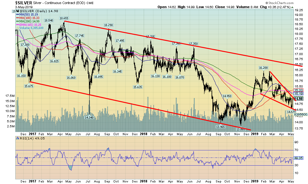
Following the U.S. job numbers silver rebounded sharply on Friday, up $0.32 or 2.5%. That almost brought silver back to unchanged on the week. Overall, silver fell 0.2% which was less than the fall in gold of 0.6%. It is very possible that the $14.57 low hit this week was the low. What is key now is that the low holds on any further pullback. Gold making a new low while silver holds it low would set up the positive divergence that we look for at important lows and highs (negative divergence at highs). Silver also appears to forming a very good descending wedge triangle. The breakout point is very close at around $15.05, although wed give it to $15.15/$15.20 to confirm the breakout. Targets would be at least $16 to $16.50. We could say silver is forming a potential cup and handle bottom, with this pullback being the handle. The bottom formed at lows of $13.96 and $13.86 back in September/November. A breakout to new highs above $16.20 could, in theory, project to $18.50-$18.75. Above that, higher prices are possible.
The next few weeks are therefore key for gold and silver. A potential important bottom could be forming. What wed like to see is gold make a new low but silver hold the $14.57 low. If not, then well assess what the new pattern means. But we like what has happened and it buoys positive going forward. But first we have to find that next low. It could still be a few weeks away.
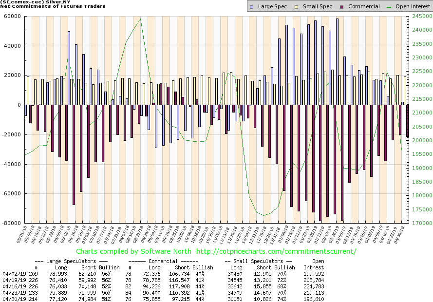
Source: www.cotpricecharts.com
The silver commercial COT slipped only slightly this past week to 44% from 45%. Long open interest fell about 15,000 contracts while short open interest was off about 13,000 contracts. The large speculators COT rose to 51% from 50%. We view the silver commercial COT as positive. While it was down this past week, it does suggest we might have a bit more backing and filling for silver but it does not indicate a sharp drop. Maybe silvers low at $14.57 has been hit. It does appear as we note at the bottom of wedge triangle.
Source: www.stockcharts.com
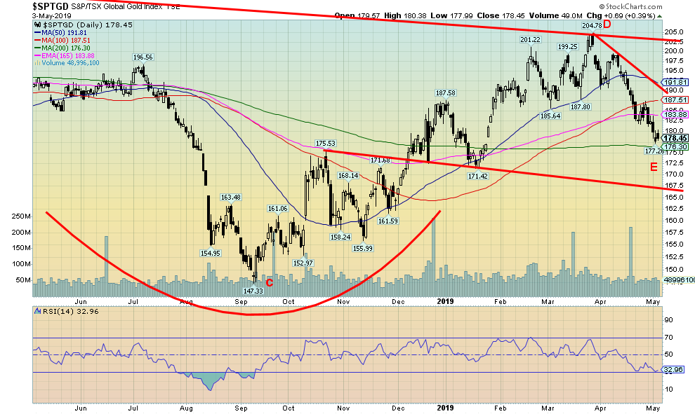
The gold stocks were hit last week with the TSX Gold Index (TGD) falling a sharp 4.3% and the Gold Bugs Index (HUI) down 4.7%. The swing down target for the TGD appeared to be at 181 once it broke the recent low near 190. It has now exceeded that target so the next target is 175. With a low this week of 177 we are very close to the target. It is only 3 points from Fridays close. We note the support at the 200-day MA (currently 176.30). It is not unusual in pullbacks in the gold stocks to test the 200-day MA before resuming the uptrend. Sentiment towards the gold stocks has fallen although it is above dire levels. The RSI is also testing the 30 level. A break under 30 indicates the market is now deeply oversold, indicating a buying opportunity. What it doesnt tell you is when the market will be poised to make an upside move. We probably have some more back and forth, much like we saw at the bottom back in August/September 2018. But overall, we are slowly moving into accumulation territory for the gold stocks. The HUI also came tantalizingly close to its next target at 149 (low this past week was 150.28). And, like the TGD, the HUIs RSI is testing down to 30.
Source: www.stockcharts.com
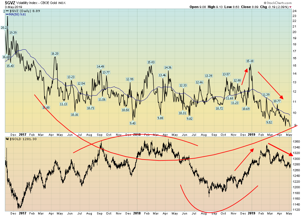
The Gold Volatility Index (GVZ) has fallen to its lowest level ever since the index was started in 2010. On Friday it closed under 9 for the first time ever. The Gold Volatility Index is a reflection of disinterest in gold at any level. Nobody cares. Unlike the VIX Volatility Index that measures fear and greed in the markets, a falling GVZ does not reflect greed. The GVZ tends to follow the price of gold, unlike the VIX which is inverse to the market. It is as if everyone in the gold market has just thrown in the towel and doesnt care. Unlike the decline in gold in 2018, the GVZ was actually trying to rise indicating interest and searching for the low. The GVZ eventually peaked but a good two months before gold actually peaked. It was as if it was anticipating a top. Now they dont even seem to be anticipating a bottom. When everyone has thrown in the towel, we view that as potential buying opportunity.
Source: www.stockcharts.com
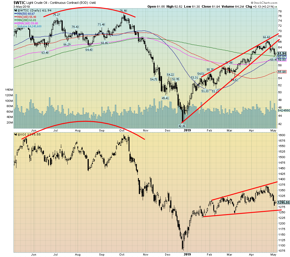
After rising steadily for 5 months, oil prices hit a bump. They also appear to have fallen out of an ascending wedge triangle. If the triangle is correct, then a fall to the $50 zone is not out of the question. During the 5-month rise, WTI oil rose 56%. And despite the recent drop, WTI oil is still up 46%. Pressure has come from Venezuela, Iran, and Libya. With oil shipments constrained from those 3 countries due to sanctions and war, this has put upward pressure on oil prices. Key players such as Saudi Arabia and Russia have not increased production to make up the difference as they both would prefer higher oil prices closer to $80. The pressure for lower oil prices actually came from the U.S. as they announced record oil production of 12.2 million bpd. As well, oil supplies unexpectedly jumped by 7 million barrels to a 17-month high of 456.6 million barrels. U.S. gasoline supplies fell, putting upward pressure on gasoline prices even as oil prices fell.
It all fed back to the energy stocks as the U.S. Oil & Gas Index (XOI) fell 2.4% this past week and Canadas TSX Energy Index (TEN) was down 5.5%. Both hit support zones late in the week and rebounded Friday following the job numbers. For WTI oil a firm break under $60 would target down to $56 and possibly down towards $50. WTI oil would need to regain back above $66 to suggest to us new highs.
Chart of the Week
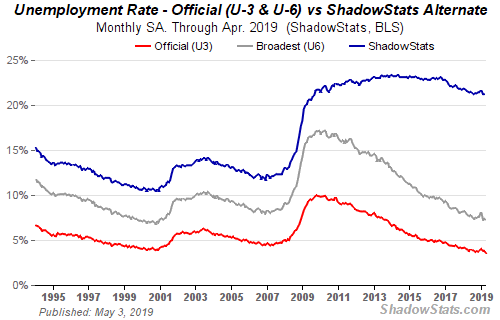
Source: www.shadowstats.com
Back in the days when we were on the trading desks of large financial institutions, the most hotly anticipated economic number of the month was the nonfarm payrolls and unemployment numbers. They always had the power, it seems, to move markets, treasuries, stocks, and gold. Nothing much has changed as this Fridays April nonfarm payrolls will atteststocks and gold jumped higher although treasuries were rather muted. The U.S. numbers always overshadowed the Canadian numbers as often the Canadian numbers were viewed as merely an echo of the U.S. numbers even if that was largely a myth. Canada releases its nonfarm payroll and unemployment levels next Friday.
Aprils nonfarm payrolls came in at a gain of 263,000, well above forecast estimates of about 190,000. The March nonfarm payrolls were revised down to 189,000. The real shocker, however, was a decline in the unemployment rate (U3) to 3.6% the lowest rate since December 1969. 1969 was the year of the moon landing and Woodstock. The Vietnam War raged on and protests on the streets of the U.S. continued.
The labour force participation rate fell to 62.8% from 63.0%. A lower labour force participation rate helps to push the unemployment rate lower as fewer people are actually in the labour force. Thats no surprise as the Fed reported 490,000 fewer people in the labour force in April than in March. It was the third straight month of declines, not only for people employed but also for unemployed. Yet somehow the economy produced 263,000 more jobs in April.
Officially the U3 unemployment rate for April fell to 3.58%, down from 3.81% the previous month. The U6 unemployment rate, the Bureau of Labour Statistics (BLS) widest unemployment measure, fell to 7.26% from 7.34%. U6 unemployment is U3 unemployment plus discouraged workers unemployed for less than 1 year plus marginally attached workers seeking full-time employment. Shadow Stats (www.shadowstats.com) unemployment number was unchanged at 21.2%. The Shadow Stats number includes long-term discouraged workers unemployed for more than 1 year and those defined out of out of the labour force in 1994.
The number of people not in the labour force rose to 96,223 thousand in April, up 446,000 from March. Of that 53,524 thousand were considered retired and another 10,133 thousand were disabled. The number of people working part-time was little changed from the previous month at 26,915 thousand.
A reminder that two employment surveys are carried out each month. One is the Household survey conducted by the U.S. Census Bureau and one is the Establishment survey conducted by the BLS. The Household survey interviews 60,000 households each month to determine whether household members are employed, unemployed, or out of the labour force. The Establishment survey incorporates the payroll records of 144,000 nonfarm employers and government agencies covering over a half a million worksites.
There are four main differences. 1. The household survey includes agricultural workers, self-employed, unpaid workers, and private workers. These groups are not a part of the Establishment survey. 2. The Household survey includes those on unpaid leave. 3. The Household survey has no duplication of individuals as they are counted only once. Multiple employed people show up in the Establishment survey more than once. 4. The Household survey is limited to those 16 years and older. There is no age limitation on the Establishment survey.
There are other differences as well, but many of the differences tend to boost the numbers as it is the Establishment survey that is reported every month whereas the census bureau data or Household survey tends to show up in the Fed numbers. That helps explain why the numbers often seem at odds with each other. It is challenging to try to square a gain of 263,000 jobs when there was 490,000 fewer people in the labour force and those not in the labour force rose by 446,000. It doesnt add up.
The numbers also belie other elements of the reports. While the unemployment rate fell to 3.6% it is not spread evenly. White male unemployment is 2.9% and has been trending down. Black male unemployment is 6.8% and has been rising. If you are a college graduate, you are lucky as the unemployment rate is 1.9%. We note from the depths of the report that the number of hours for part-time employees fell. It has been trending down. Part-timers may be working but they are getting fewer hours. It has been the same across the board as well. Wages have stagnated despite the big jump in nonfarm payrolls. The health sector has seen the largest job growth.
On the surface, the job numbers appear to be great, with lots of crowing from the White House. But underneath there are questions, things dont add up, and wage growth is stagnant. Take out the booming tech sector, and Wall Street and things are not quite as rosy.
Copyright David Chapman, 2019
TECHNICAL SCOOP Charts and commentary by David Chapman Chief Strategist, Enriched Investing Inc. Phone: 416-523-5454 Email: david@davidchapman.com dchapman@enrichedinvesting.com Twitter: @Davcha12 May 6, 2019 |


