-- Published: Monday, 10 June 2019 | Print | Disqus
Consider trade protectionism. It's been tried - and found wanting - since the Great Depression.
Elaine Chao, U.S. Secretary of Transportation 2017, Secretary of Labour 20012009, Republican Party member, Spouse Mitch McConnel, b. 1953
As we learned after President Herbert Hoover signed the Smoot-Hawley tariff at the outset of the Great Depression, vibrant international trade is a key component to economic recovery; hindering trade is a recipe for disaster.
Asa Hutchinson, Governor of Arkansas 2015, Republican party member, b. 1950
Importantly, in the 1930s, in the Great Depression, the Federal Reserve, despite its mandate, was quite passive and, as a result, financial crisis became very severe, lasted essentially from 1929 to 1933.
Ben Bernanke, economist, Chair of the Federal Reserve 20062014, Republican Party member, b. 1953
By: David Chapman
The R word seems to be on the tongues of a number of economists. On the other hand, a number of economists scoff at the R word. The R word is, of course, recession. It has been 10 years since the last recession officially ended in June 2009. It was known as the Great Recession, the longest official recession since the Great Depression and the steepest decline since the recession of 1945. Ten years with no recession matches the 10 years with no recession between March 1991 and the March 2001. If there is no recession in July, then this would become the longest uninterrupted period of growth since 1854. Right now, given the current economic signs, no recession is expected to get underway this month.
Yet there has been a frenzy of commentators saying the Fed is going to cut rates in July. Offsetting that there has been no indication from the Fed that they are about to cut rates. What Fed Chair Jerome Powell said was that the central bank was prepared to act to sustain the economic expansion if President Trump's trade war weakened the economy.
Then on Tuesday this past week Powell did say that he is open to a rate cut. That did it, and after a rather poor May when the Dow Jones Industrials (DJI) fell 2000 points the market rebounded in a fury. In all probability what is happening is a massive short squeeze on rumours of a rate cut. Some have noted that the stocks that had the highest short positions are leading the way higher. Nonetheless, the market has gone into a rate cut frenzy. Bond yields fell and gold shot up as well. His remarks sent stocks soaring as investors predicted a cut in interest rates.
Of course, at the June meeting they will discuss rates. They always do. But will they act? We do not believe a rate cut is justified despite the headwinds from the current trade wars between the U.S. and China. Actually it is more than just China as Trump goes after anybody that appears to annoy him. His approach is to tell countries what he (the U.S. government) wants them to do and if they dont fall in line, he raises tariffs, places sanctions (embargo?), and tries to cut them off from the U.S. dollar system. But a rate cut today would send the wrong message. And it would be a hint of panic on the part of the Fed.
Yes, there has been a host of soft numbers. The most recent U.S. manufacturing PMI in May fell to 50.5, the lowest reading since September 2009. New orders have also been falling, the lowest since August 2009. The recent nonfarm job numbers were disappointing, the lowest gain since February, but they were still positive (see commentary on Jobs Report). The poor results were blamed on the bad weather and flooding that have plagued the Midwest. Retail sales have softened, but consumer sentiment is the highest in a year. Maybe they are just happy and dont need a third car to make them happier.
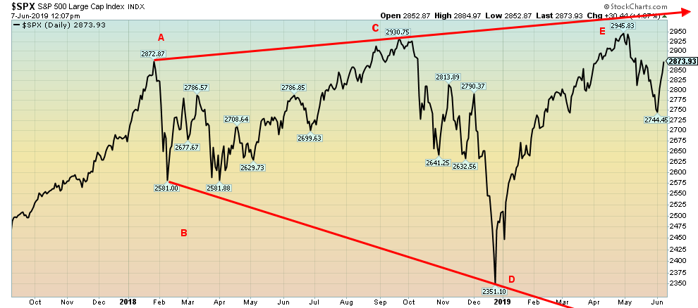
The stock markets have done nothing for the past year and half. The S&P 500 is currently around 2,875. In January 2018 the S&P 500 topped at 2,870. The TSX Composite is hovering around 16,240. In January 2018 the TSX Composite topped at 16,421. The stock markets have been up. And they have been down. It has been a roller coaster. Since the peak in January 2018 the S&P 500 fell 12%, then went up 16%, followed by another down 20%, then whee right back up again, almost 26%. Each high was slightly higher than the previous high and each low, lower than the previous one as well. In technical analysis we call this a broadening top. We have labeled the chart ABCDE. This particular labeling is to denote the broadening top and not an Elliott wave count.
This market has come from a long way, starting in March 2009. It is up 330%. Sounds spectacular. Except remember it has going up on record low interest rates combined with a massive amount of liquidity through quantitative easing (QE). If one injects $4 trillion into the market/economy then something is sure to happen. Debt exploded, adding to the massive injection of liquidity. U.S. debt is up almost $24 trillion since 2008. Globally, debt has exploded upwards by roughly $100 trillion in the same period. Housing prices went up. In Canada, markets in Vancouver and Toronto were in a bubble and now that bubble is cooling. Gold had a run from $680 to $1924 topping in 2011, a gain at the time of 183%. Gold is still up 95% from 2008, despite a rough time over the past 7 years. Antiquities rose, art rosein fact everything went up. No wonder they called it the everything bubble.
Source: www.stockcharts.com
If the bottom of the channel holds, any decline would be limited to a 24% fall from the May 2019 high. The bottom of the channel is around 2,250. That is only slightly more than the decline from October 2019 to December 2019. But if the broadening top is correct, the decline below the bottom of the channel tends to be at least equal to the breadth of the channel. That could take the market down to around 1,650 for a decline of about 44%. The good news is that is less than the 20072009 decline of 57% and the 50% drop of 2000 2002. However, it is still potentially pretty serious. The E wave may not yet be complete as the current up move could carry to the top of the channel near 3,000.
But what has really happened? In the U.S. GDP has averaged only 1.8% annually since 2009 with the best year being 2015. Between 2002 and 2007 U.S. GDP averaged 2.4% annually. The past decade has been the feeblest period of growth since the Great Depression. Global growth has been led by the Asian economies, particularly China.
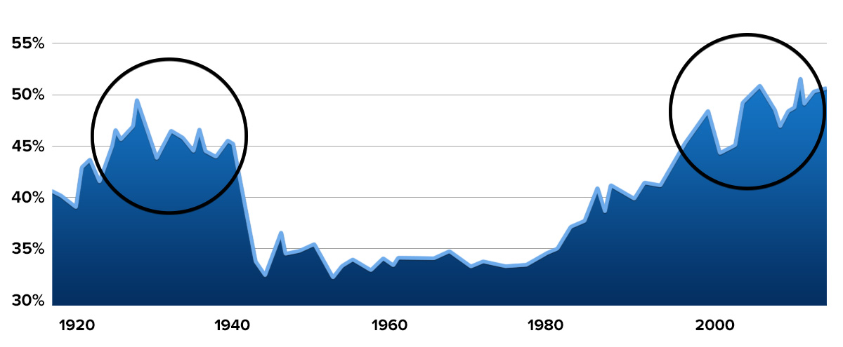
But despite the growth and the huge price increase in the stock market not everyone has benefitted over the past decade. The income share of the richest 10% is now over 50%, the highest level since the 1920s and 1930s. The same 10% also own 75% of the wealth.
Source: www.stansberryresearch.com
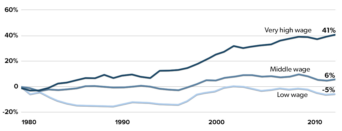
The rich are getting richer. High wage earners have seen their incomes rise 41% in real terms since 1980. Middle income earners wages have stagnated, rising only 6% while low income workers wages have actually declined in real terms losing 5%. This scenario has played itself out in the Western economies. No wonder there has been a sharp rise in nationalism, particularly nationalism that is also anti-immigration. The middle class, the backbone of the Western economies is being squeezed, but the lower end is being squeezed right out. Hence the reason that a strong man has appeal. Its happened before and it ended in WW2. The strong man in reality is a false prophet.
Source: Economic Policy Institute www.epi.com, www.stansberryresearch.com
This is being played out against the backdrop of massive debt increase. As long as the economy holds up the debt is manageable. But if the economy starts to slide into a recession the debt becomes a time bomb. Household debt, student debt, corporate debtall have exploded in the past decade. But none more so than government debt. Governments can write overdrafts; the rest cant. Eventually they get called in. In 2007 it started with Bear Stearns and ended with Merrill Lynch, Lehman Brothers, and AIG.
The Chinese banking system is overladen with debt. Much of it cannot be repaid. China does not want a trade war. It could push the debt and their banking system over the edge. That in turn could see corporations go bankrupt, resulting in a sharp rise in unemployment which in turn could trigger social unrest. Chinas central bank, PBOC, has considerable maneuverability compared to the Fed but they cant bail out everybody.
Mexico is highly vulnerable in a trade war because American companies have moved a considerable number of their operations there. A trade war with Mexico could trigger dislocations with these companies, resulting in plants shutting down or even moving their operations back to the U.S. which is what Trump wants. That in turn could trigger considerable unrest in Mexico. An unstable Mexico is far more dangerous for the U.S.s borders than the much smaller Central American countries that are currently the source of migrants coming to the U.S. (Honduras, Guatemala, El Salvador).
The trade war also reverberates back into the U.S., with corporations facing reduced sales as they would have to pass on the cost of the tariffs to the U.S. consumer. U.S. corporate debt is potentially more destabilizing than government and consumer debt.
Some have estimated that there is upwards of $20 trillion U.S. dollars outside the U.S. If the faith in the U.S. is shaken, then those dollars could suddenly be sent back as countries begin to see more value in their own currency or alternative currencies such as gold. That could result in a considerable decline in the value of the U.S. dollar.
Left out on all market commentaries is the potential cost of dealing with a host of natural disasters as a result of what many believe to be climate change. Hurricanes, floods, tornadoes, wildfires, and even earthquakes have a cost. Here in Canada it was estimated that the wildfires that consumed Fort MacMurray cost $3.5 billion. Because of the frequency of floods that have hit areas in the past few years people are going to have to be moved. Buyouts are being offered and if you dont take them you are on your own in the next flood. One could call them internal refugees. The cost of moving them could be in the billions. Over the past two decades the hurricanes and wildfires that have hit have been more frequent and more deadly. And more costly.
All good things eventually come to an end. And time is running out on this rise. Sure, there could be another run to new highs but it is against a deteriorating backdrop. A recession is coming. It is a question of when, not if. As we have written before, with trade wars there are no winners. Everyone loses. And right now, we are locked in an unprecedented trade war that has not yet played itself out. Things could become more unpredictable.
The Jobs Report
Source: www.shadowstats.com
The U.S. nonfarm jobs numbers for May were a disappointment. In Canada, it was a time to cheer. U.S. nonfarm payrolls rose 75,000 in May. The market had expected an increase of 175,000. The April nonfarm numbers were revised downward to 224,000 from 263,000. Still, the 2-month average was 150,000. The average for the past year is 162,000. May employment was up 0.9% over the past year, the weakest growth since 2013.
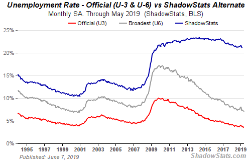
Net of revisions the two months were essentially flat. Full-time employment actually fell 83,000 while part-time employment rose 66,000. It was the third consecutive monthly drop for full-time employment. The official unemployment rate (U3) remained unchanged at 3.6% as did the labour force participation rate, also unchanged at 62.8%. In February the rate was 63.2%. What that says is that fewer people are participating in the economy. It also helps to lower the unemployment rate. The U6 unemployment rate which includes discouraged workers and longer-term unemployed but under one year came in at 7.1%, down from 7.3%. Finally, the Shadow Stats unemployment (www.shadowstats.com) came in at 21.1%, down from 21.2%. The Shadow Stats number is the U6 unemployment, which is the highest level officially reported, plus long-term discouraged workers over one year and those defined not in the labour force in 1994.
The number for those not in the labour force fell by 8,000 in May. There are 96,215 thousand listed as not in the labour force. Of that, 53,782 thousand are listed as retired while another 10,128 thousand are disabled.
Canada posted another good jobs number with a gain of 27,700 in April. The market expected only 8,000. The report, however, is tinged with a note of caution. It appears that 61,500 jobs were listed as self-employed. The actual number of employees fell 33,800. Self-employed could translate as we cant find a job that wed really like to do, so well say we are self-employed. However, the number of hours worked dropped. Despite what appears to be a good jobs number on the surface, when you look underneath it is not as good as reported. That appears to be translated into the GDP numbers that have been weak for the past two quarters.
Ontario once again produced the most jobs, up 20,900. The question is, how meaningful is it given the big jump in self-employed? The unemployment rate fell to its lowest level since records have been properly kept in 1976. The rate came in at 5.4% vs. 5.7% the previous month. The labour force participation rate fell to 65.7% from 65.9%. As the labour force participation rate falls, it helps to lower the unemployment rate. Note that there remain 1,082 thousand unemployed.
MARKETS AND TRENDS
| | | % Gains (Losses) Trends |
| Close Dec 31/18 | Close Jun 7/19 | Week | YTD | Daily (Short Term) | Weekly (Intermediate) | Monthly (Long Term) | |
Stock Market Indices | | | | | | | | |
S&P 500 | 2,506.85 | 2,873.34 | 4.4% | 14.6% | neutral | up (weak) | up (topping) | |
Dow Jones Industrials | 23,327.46 | 25,983.94 | 4.7% | 11.4% | neutral | neutral | up (topping) | |
Dow Jones Transports | 9,170.40 | 10,140.64 | 4.1% | 10.6% | down | down | up (weak topping) | |
NASDAQ | 6,635.28 | 7,742.10 | 3.9% | 16.7% | down (weak) | neutral | up (topping) | |
S&P/TSX Composite | 14,322.86 | 16,230.96 | 1.2% | 13.3% | down (weak) | up | up | |
S&P/TSX Venture (CDNX) | 557.20 | 596.54 | (0.8)% | 7.1% | down | down | down | |
Russell 2000 | 1,348.56 | 1,514.39 | 3.3% | 12.3% | down | down (weak) | up (weak) | |
MSCI World Index | 1,710.88 | 1,876.89 | 1.2% | 9.7% | neutral | neutral | neutral | |
NYSE Bitcoin Index | 3,769.99 | 8,345.19 | 2.9% | 121.4% | up | up | up | |
| | | | | | | | |
Gold Mining Stock Indices | | | | | | | | |
Gold Bugs Index (HUI) | 160.58 | 168.95 | 7.6% | 5.2% | up | up | down (weak) | |
TSX Gold Index (TGD) | 186.74 | 199.38 | 4.7% | 6.8% | up | up | neutral | |
| | | | | | | | |
Fixed Income Yields/Spreads | | | | | | | | |
U.S. 10-Year Treasury yield | 2.69 | 2.14 | (7.8)% | (20.5)% | | | | |
Cdn. 10-Year Bond yield | 1.96 | 1.46 | (2.0)% | (25.5)% | | | | |
Recession Watch Spreads | | | | | | | | |
U.S. 2-year 10-year Treasury spread | 0.21 | 0.19 | 18.9% | (9.5)% | | | | |
Cdn 2-year 10-year CGB spread | 0.10 | 0.06 | (40.0)% | flat | | | | |
| | | | | | | | |
Currencies | | | | | | | | |
US$ Index | 95.73 | 96.49 | (1.3)% | 0.8% | up | up | up | |
Canadian $ | 0.7350 | 0.7537 | 1.9% | 2.5% | up | down (weak) | down | |
Euro | 114.58 | 113.34 | 1.5% | (1.0)% | down | down | neutral | |
British Pound | 127.50 | 127.37 | 0.9% | (0.1)% | down | down | down | |
Japanese Yen | 91.24 | 92.45 | 0.2% | 1.3% | up | up | up (weak) | |
| | | | | | | | |
Precious Metals | | | | | | | | |
Gold | 1,281.30 | 1,346.10 | 2.7% | 5.1% | up | up | up | |
Silver | 15.54 | 15.03 | 3.2% | (3.3)% | up | neutral | down | |
Platinum | 795.90 | 806.10 | 1.5% | 1.3% | down | down | down | |
| | | | | | | | |
Base Metals | | | | | | | | |
Palladium | 1,197.20 | 1,356.00 | 1.7% | 13.3% | neutral | up (weak) | up | |
Copper | 2.63 | 2.63 | (0.4)% | flat | down | down | neutral | |
| | | | | | | | |
Energy | | | | | | | | |
WTI Oil | 45.41 | 53.99 | 0.9% | 18.9% | down | down | neutral | |
Natural Gas | 2.94 | 2.34 | (4.5)% | (20.4)% | down | down | down | |
Source: www.stockcharts.com, David Chapman
Note: For an explanation of the trends, see the glossary at the end of this article.
New highs/lows refer to new 52-week highs/lows.
Source: www.stockcharts.com
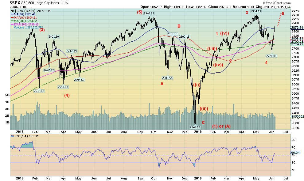
Attempting to figure out where we are is difficult, particularly given the complexities of the wave structure since the market topped back in January 2018. This is just one interpretation. We count five waves to a top in October 2019. The October/December 2019 decline we have labeled wave 1 down or it could be an A wave. We are currently working on the 2 or B wave. Once this wave is complete the market should have substantial decline for wave 3 or wave C down. That wave most likely would be a multi-year decline that would bottom somewhere between 2020 and 2022. We are sure there are other interpretations, but this is our best for now.
Source: www.stockcharts.com
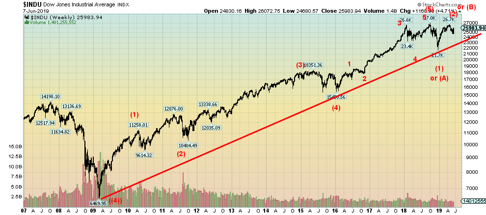
With rumours of a rate cut in the background, the markets soared this past week. The S&P 500 gained 4.4%, the Dow Jones Industrials (DJI) was up 4.7%, the Dow Jones Transportations (DJT) gained 4.1%, and the NASDAQ jumped 3.9%. The small cap Russell 2000 gained 3.3%. Interestingly, the Dow Jones Utilities (DJU) continues to make new highs, jumping 2.8% this past week. However, on Friday the DJU put in an outside reversal day after once again making new all-time highs. Is that a signal that the DJU is about to fall? Well keep an eye on the DJU.
Elsewhere, the TSX Composite gained a more subdued 1.2% while the small cap dominated TSX Venture Exchange (CDNX) fell 0.8%, thus remaining in its rut. The world MSCI Index gained 1.2%. In Europe the London FTSE 100 was up 2.6% following PM Mays resignation, the Paris CAC 40 was also up, gaining 2.2% while the German DAX was up 2.7%. In Asia, Chinas Shanghai Index was battered by negative trade news and fell 2.5% while Tokyos Nikkei Dow also fell, down 0.8%
News that the U.S. and Mexico found a deal to satisfy Trump on the weekend should help propel the markets higher on Monday. That will squeeze the shorts even further. The S&P 500 has potential to rise to about 3,000 this time. If that happens, we will watch closely for divergences between the indices, meaning some make new highs but not all. The market is in a bit of a frenzy right now. At the recent low, sentiment had fallen under 12% bulls a sign that the market might be making a low. In one week, sentiment has jumped to 48%. An extreme is noted when sentiment hits 90% or higher. We appear to be entering a period of irrational exuberance and that never ends well.
Source: www.stockcharts.com
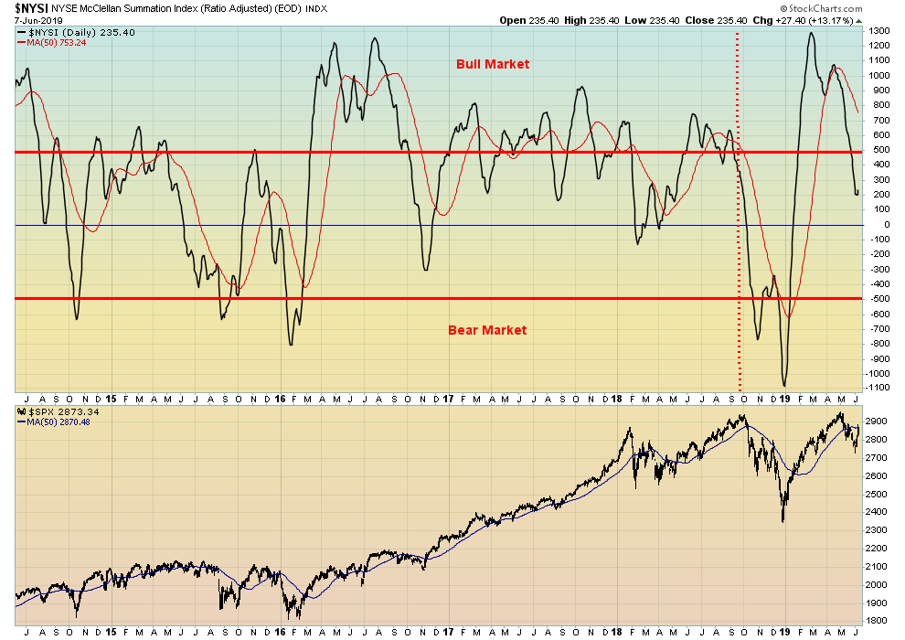
It was interesting to note the action on some indicators this past week, given the sharp jump in the stock markets. The NYSE advance-decline line rose, but has not yet made new highs. However, the NYSE new highs minus new lows jumped sharply to the highest level it has seen since the mini-bull began in December. At 246 it is not far from 300. Readings over 300 are rare and usually indicate a top. However, the indicator that didnt budge this past week was the McClellan ratio adjusted Summation Index known as the RASI. Well keep an eye on this one because if the RASI fails to make new highs with the market it would be an important divergence. Well also watch the NYSE advance decline line for new highs as well. That indicator, as we have noted before, could be misleading the market. Thats something that happens rarely.
Source: www.stockcharts.com
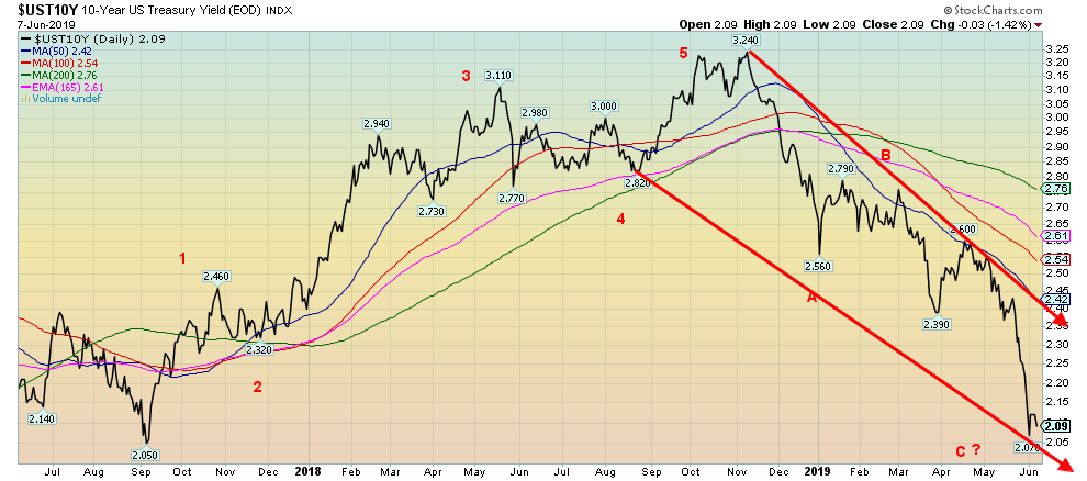
Given the backdrop of rate cut frenzy, it is not surprising that bond yields tumbled this past week (prices that move inversely to yields moved higher). The U.S. 10-year Treasury note fell as low as 2.07% this past week, closing at 2.09%. Thats the lowest level since September 2017. Not surprisingly, sentiment has hit over 90% bulls. That is more indicative of a potential bottom in yields (top in price). The trouble is, we dont know how that will play out. A period of sideways movement would be enough to cool the high sentiment readings. Would we be surprised to see yields fall further? No, as we could fall to 2.05% or even lower given the current frenzy in the market. Right now, regaining back above 2.20% would be mildly negative.
Recession Watch Spread
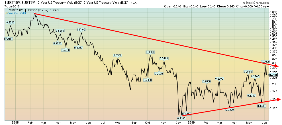
Source: www.stockcharts.com
Another frenzy the market has been in is bond and note yield spreads turning negative. Yes, a number of yield spreads have turned negative. We note 10 year 3 mth. - Negative 19bp, 10 year 3 mth. Libor Negative 33bp, 5 year 2 year Flat, 3 mth. Fed Funds Negative 4bp, 2 year Fed Funds Negative 8bp, 10 year 3 mth. Libor negative 33bp. However, we note that the 10-year2-year yield spread is positive 24bp. Another one worth watching is the 30-year10-year spread. It is positive 48bp. Both those spreads did go negative for a few months before the 20012002 recession and the 20072009 recession. All the other spreads were admittedly much more all over the map and not as reliable indicators as the 10-year2-year or even the 30-year10-year yield spreads. And the spreads need to go negative for at least 3 months before a recession. Our closely watched 10-year2-year yield is not indicating a recession.
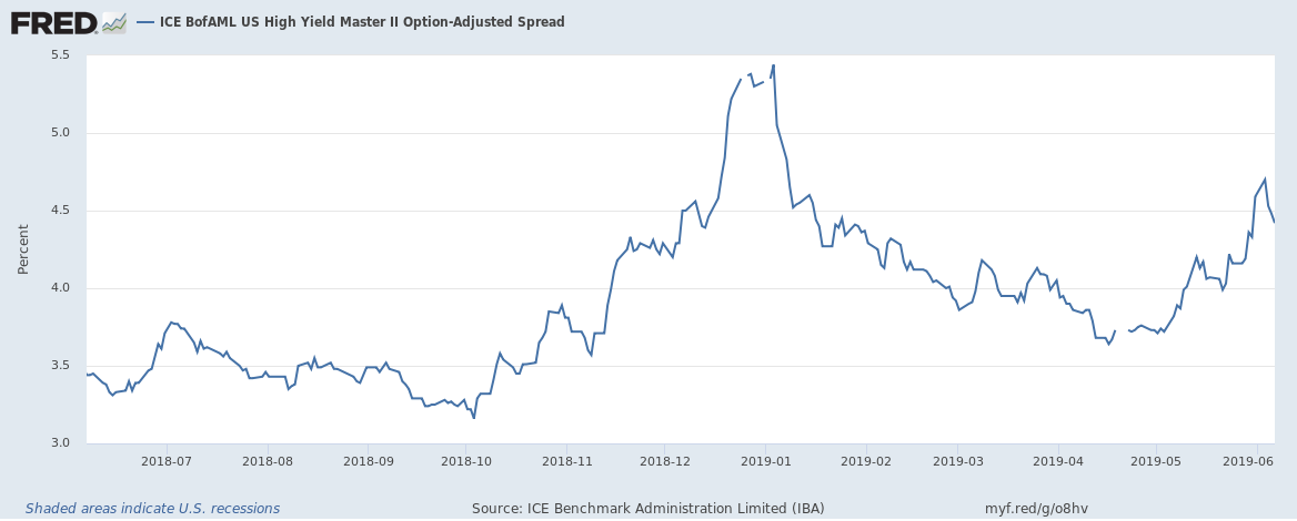
Source: www.stlouisfed.org
Recession, what recession? We would have expected high-yield bond spreads to widen this past week given the frenzy over a rate cut and the potential for a recession. Instead, the spreads went lower. What? Me worried? Obviously not, or spreads would have widened. The spread fell from 4.47% o 4.42% this past week. We will continue to monitor this.
Source: www.stockcharts.com
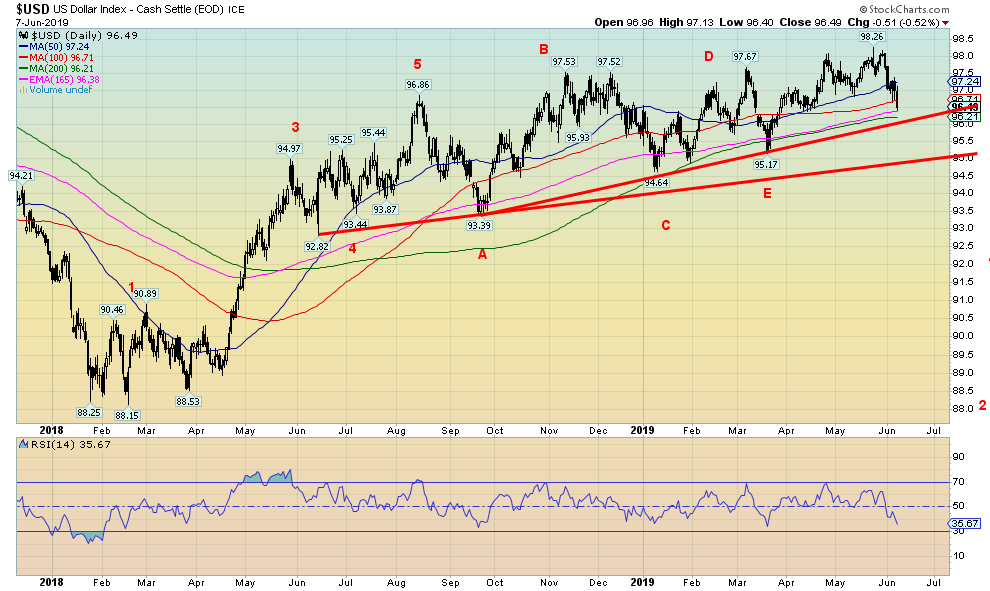
All the frenzied talk of a rate cut sent the U.S. dollar lower this past week. The US$ Index lost 1.3% this past week. The euro gained 1.5%, the British pound was up 0.9%, and the Japanese yen gained a small 0.2%. The Canadian dollar leaped on the news of the jobs report on Friday, gaining 1.9% on the week.
The US$ Index has fallen into a band of support that ranges from 96 to 97. The US$ Index is currently in the middle of that range. A breakdown under 96 would most likely send the US$ Index down to the next support level of 94.80 to 95. A breakdown under 94.80 would signal that the major rally that got underway back in January 2018 was officially over. Currently the US$ Index is approaching oversold levels. The fact that it is the frenzy over a possible rate cut is not a solid reason for the US$ Index fall. Seems to be sell the rumour. We await buy the news. A return and breakout over 97.50 would signal that the US$ Index is prepared to resume its uptrend. It is possible that the US$ Index has topped. The recent high at 98.26 barely met the minimum target of the ascending triangle that formed over the past several months. That also could be a sign of failure. A breakdown under 96 would signal that a new U.S. dollar bear is underway.
Source: www.stockcharts.com
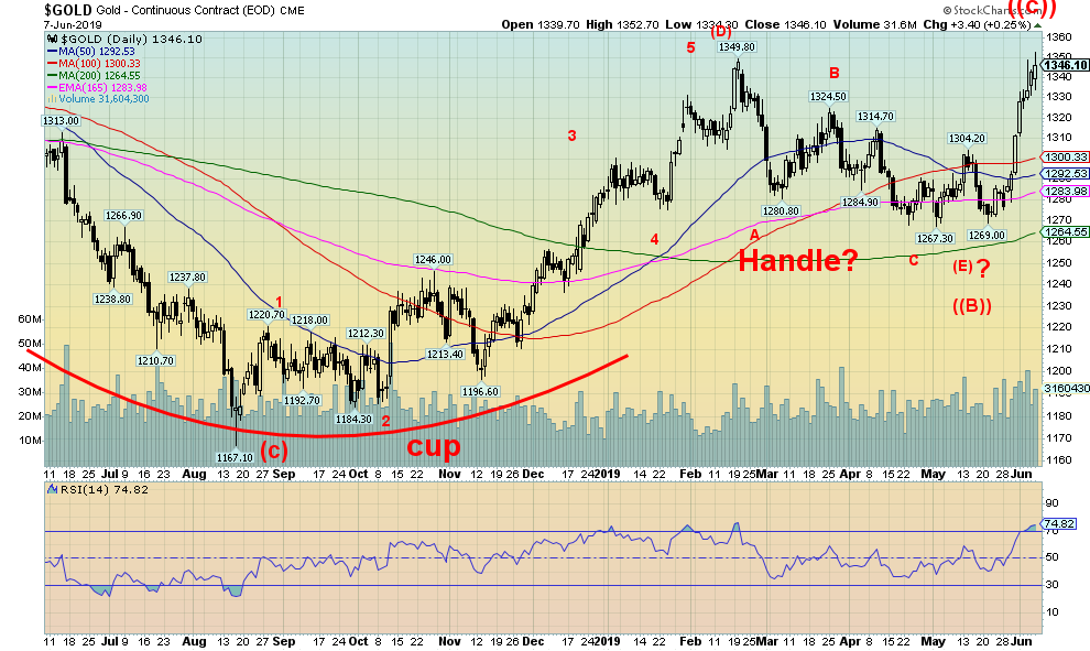
Gold jumped this past week as the rate cut frenzy took hold. Gold was up 2.7% while silver jumped 3.2%. Platinum lagged even further, gaining 1.2% while palladium, considered more an industrial metal, gained a small 0.7%. Copper fell on the week losing 0.4%. Gold hit a high this past week at $1,352 which was above the $1,350 high seen on February 20, 2019. But rather than bust through that zone, gold pulled back closing at $1,346. Given that the U.S. appears to have a cut a deal with Mexico to avoid tariffs it is possible that the U.S. dollar will rise on Monday and gold will fall.
The $1,350 to $1,370 is extremely important for gold. Anyone that follows gold knows this is the zone of the highs since 2016the high in July 2016 was $1,377. Subsequent highs were seen in September 2017 at $1,362, April 2018 at $1,369, and the recent high in February 2019 at $1,350. If gold were to fail to hold this zone and were rejected, then we could see another run down towards $1,250 and the $1,235$1,250 zone we had targeted previously for a final low before we take off on a new bull. On the other hand, if gold were to successfully charge through $1,370 and the July 2016 high of $1,377 then we would know for sure we are on our way higher to at least $1,400 to $1,550. The trouble is, every gold bug follows this and they will all go bananas when it busts through $1370 to $1,377. Whats key however, is that above $1,400 the institutions should start to get in and the junior exploration stocks will finally show some signs of life. Currently, we dont believe managed futures and the hedge funds are fully in.
The recent move appears to have happened too fast. Usually these types of moves are not sustainable as they are based more on speculation than they are based on any fundamental shifts. We notice stocks were not responding at the end of the week as gold went higher. This may be a divergence that also bears watching, especially if gold pulls back.
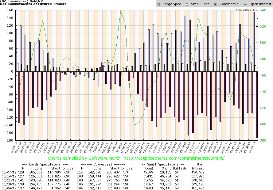
Source: www.cotpricecharts.com
If we are to take the commercial COT seriously, then we must pay attention to the latest. The commercial COT for gold fell to 30% from 39% this past week. On the other hand, the large speculators COT (managed futures, hedge funds, etc.) leaped to 74% from 64%, the highest level seen in months. The commercial COT is signaling that gold should fall in the near term. In one fell swoop the commercial COT is down at levels last seen in January 2019 just before gold topped. The commercial COT has suddenly turned bearish.
Source: www.stockcharts.com
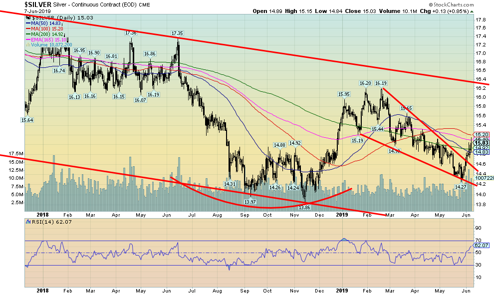
Silver, like gold, enjoyed a good week this past week, gaining 3.2%. Silver appears to have broken out of a descending wedge triangle. The descending wedge triangle projects silver to rise back to the recent highs just over $16. Silver rose into a zone of resistance with the 50, 100, and 200 DMA. The 100-day MA is just above $15.20. A break above that level could take silver to $16 and higher. Only a return back below $14.85 could see silver once again test down towards $14.
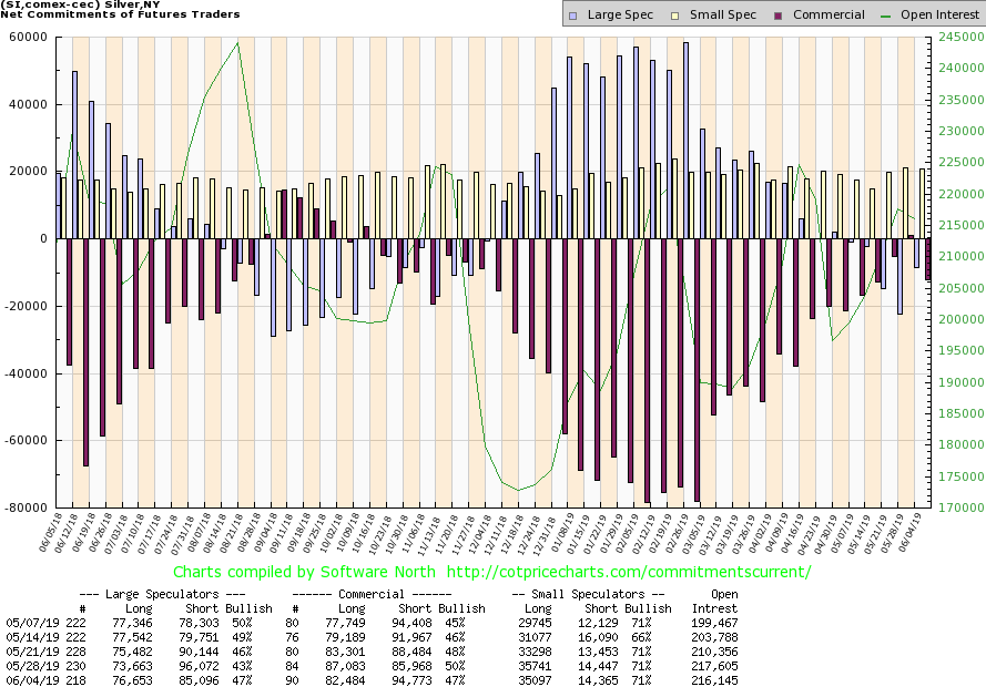
Source: www.cotpricecharts.com
The silver commercial COT fell to 47% this past week, down from 50%. Unlike the gold commercial COT, the drop this past week is not that bearish. The silver commercial COT is still bullish. What we dont want to see is for the commercial COT continue to maneuver lower. This past week long open interest fell almost 5,000 contracts while short open interest rose around 9,000 contracts. The large speculators COT rose to 47% from 43%. This indicator, while weakening, is still not particularly bearish. Silver could well start to outperform gold going forward.
Source: www.stockcharts.com
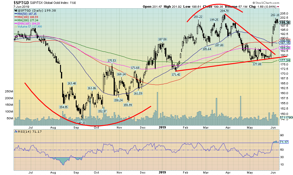
The gold stocks enjoyed a strong up week as gold and silver rose as a result of the frenzy surrounding rate cuts. The TSX Gold Index (TGD) rose 4.7% and is now up 6.8% on the year while the Gold Bugs Index (HUI) was up even more, gaining 7.6% on the week. The HUI is now up 5.2% on the year. However, despite a rise in gold prices again on Friday the gold stocks were decidedly moody. The TGD fell 0.8%. Both the TGD and the HUI have seen their RSIs above 70, usually a danger zone. But oversold conditions can remain in place for some time especially in a strong bull market. Despite the run-up, the TGD remains just short of the March high of 204.78. The breakout on the triangle suggested a target of 210 with potential to rise to 232. Fridays action appeared to indicate at least a pause to the sharp rise. There is considerable support down to 190. The entire 200210 zone is resistance. A breakout above 210215 would suggest a move to 232 or higher.
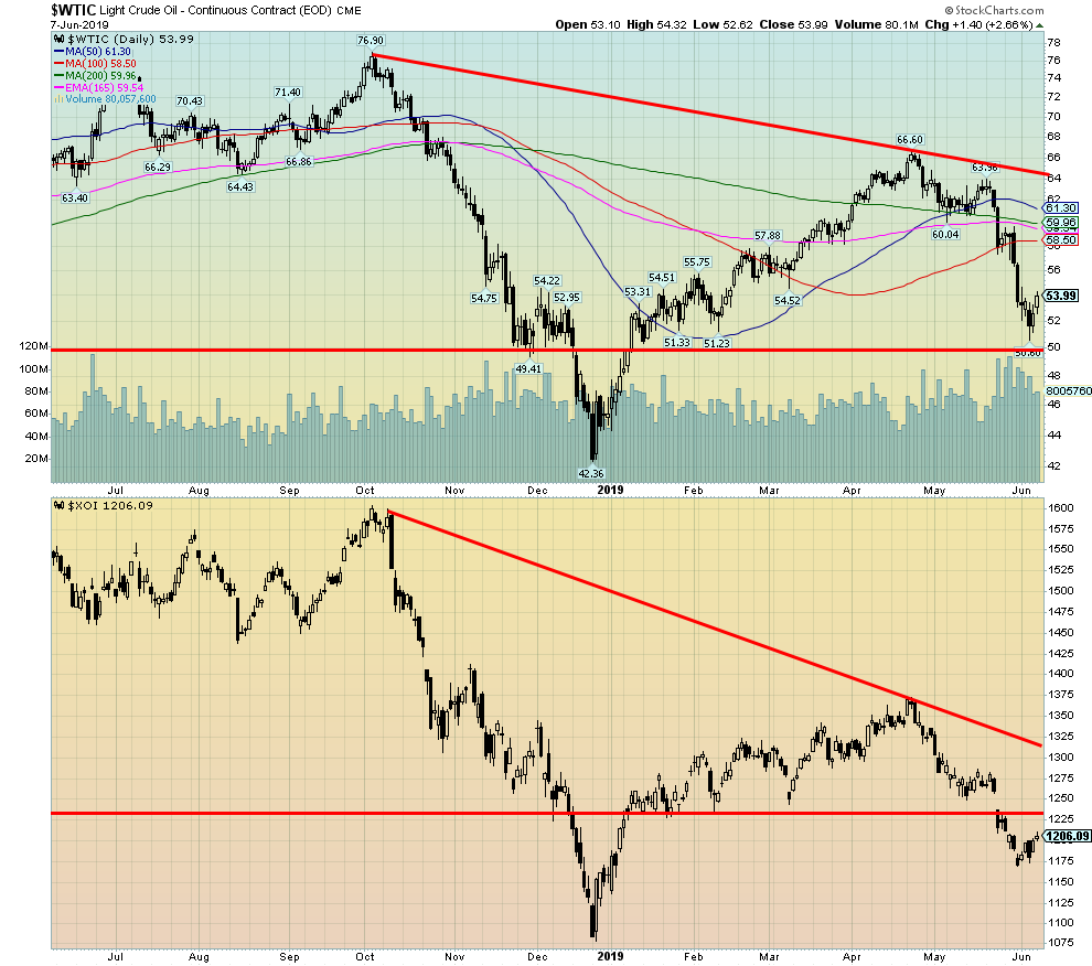
Source: www.stockcharts.com
WTI oil finally managed an up week, gaining 0.9%. It helped that both Russia and Saudi Arabia once again talked of supply cuts to help boost the price of oil. We had previously noted that there was good support down to $50 but below that level a strong test of the December lows at $42 would take place. Volume was quite strong on the recent drop, indicating that this was no weak bear move down. The market appears to be shrugging off the posturing of the U.S. vs. Iran. Despite the rhetoric and troop buildup in the Persian Gulf there is little expectation that the U.S. is going to attack Iran. Quite simply, Iran is not Iraq. It has a strong army and decent weaponry although they are clearly inferior to the U.S. It is a large country compared to Iraq and while there are internal problems between the regime and the people, if invaded the people will come together to thwart any invasion. As well, the Iraq government has given support to the regime in Tehran. That would open another front in Iraq. The U.S. has moved people out. The energy stocks managed to find some stability as well this past week, given the recent sharp drop. The U.S. Oil & Gas Index (XOI) gained 3.0% but the TSX Energy Index (TEN) failed to follow losing 2.4%. WTI oil has considerable resistance up to $55 and $56, so our expectations are low for a sudden rebound here. A consolidation is more likely.
Chart of the Week
Source: www.armstrongeconomics.com
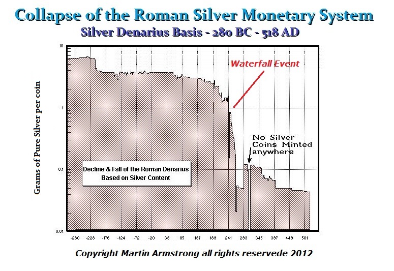
I confess, I love this chart. It has a striking resemblance to the chart on the next page. Quite simply, they are pictures of a currency slowly becoming worthless. No, it does not happen overnight. Not only does it take years, but it takes centuries. The decline of the Roman silver denarius stretched from before 280 BC to 500 AD, a period of nearly 8 centuries. The chart on the U.S. dollar below only goes from 1774 to 2012 (it is probably lower today), a period of only about two and half centuries. Could it be possible that we have devalued the value of the U.S. dollar faster than the Romans devalued the silver denarius?
The real decline in the value of the silver denarius came after 180 AD and death of Marcus Aurelius (161180). Succeeding emperors moved to cutting the amount of silver in the denarius. The emperor Caracalla (198217) introduced the antoninianus in 215. It was worth roughly 2 denarii even though the silver content was actually only worth about 1.5 denarii. The Iberian silver mines were running out, and the emperors needed the silver to pay their armies and buy loyalty. Following the death of Marcus Aurelius, the empire soon fell into chaos with usurpers seizing the throne and in one instance a senator buying the throne (Didius Julianus, March to June 193). The emperor Maximinus (235238) declared simply that all wealth belonged to the state. Society began to break down and people began to hoard money as the economy went underground.
There were attempts at reform, but the silver content in the antoninianus kept falling until it was just bronze by the late 3rd century. Further attempts at reform were made but that all generally failed. By the end of the fifth century, money became essentially worthless with the exception of the gold solidus that had replaced the gold aureus.
Collapse of the U.S. Dollar Monetary System
Source: www.goldchartsrus.com
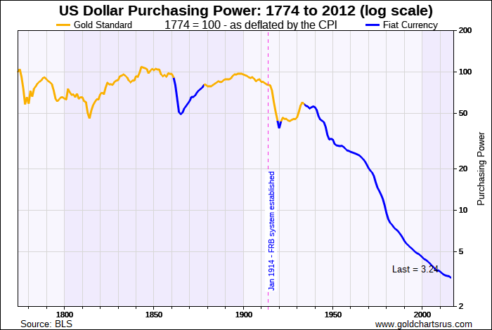
Will the U.S. dollar eventually meet the same fate as the Roman silver denarius? We dont wish to speculate, but the fall has been nothing short of spectacular. There are more and more U.S. dollars floating around the world. But what a dollar will purchase has fallen sharply since the Fed was formed in 1914. The second fall came in 1934 when gold was confiscated and the U.S. dollar was devalued with gold being revalued upwards to $35/ounce from $21.67/ounce. Since the end of the gold standard in August 1971 the purchasing power of the U.S. dollar has fallen precipitously. More and more dollars are needed to make a purchase. Significantly, debt also exploded following the end of the gold standard and defense spending went skywards to pay for the ongoing U.S. wars. Sound familiar? It rings with the need for the Roman emperors to pay their armies as the third, fourth, and fifth centuries were ones of constant warfare.
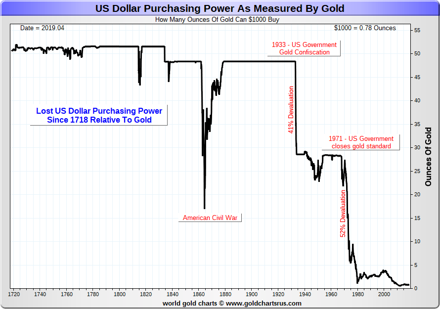
The loss of purchasing power for the U.S. dollar is best illustrated with the chart below that shows the purchasing power of the U.S. dollar vs. gold. For many years the price of the U.S. dollar was relatively stable and $1,000 would buy you more than 50 ounces of gold. Not any more. Today US$1,000 would only purchase roughly 0.75 ounces of gold. Canadian $1,000 would buy you even less, given a rate of Cdn $1 = US$0.745. Cdn$1,000 would buy only about 0.59 ounces of gold.
Collapse of the U.S. Dollar Monetary System
Source: www.goldchartsrus.com
Despite years of quantitative easing (QE) and record low interest rates coupled with easy monetary policy, economic growth is roughly 20% below the where it was before the financial collapse of 2008. More and more dollars are thrown at the economy, yet all it has generated is lower growth and massive debt. And, like the Roman emperors of the third century, governments are looking for money through their agenciesthe IRS, CRA, FACTA, and FINTRAC. Does history repeat itself?
TECHNICAL SCOOP Charts and commentary by David Chapman Chief Strategist, Enriched Investing Inc. Phone: 416-523-5454 Email: david@davidchapman.com dchapman@enrichedinvesting.com Twitter: @Davcha12 June 3, 2019 |
Copyright David Chapman, 2019
GLOSSARY Trends Daily Short-term trend (For swing traders) Weekly Intermediate-term trend (For long-term trend followers) Monthly Long-term secular trend (For long-term trend followers) Up The trend is up. Down The trend is down Neutral Indicators are mostly neutral. A trend change might be in the offing. Weak The trend is still up or down but it is weakening. It is also a sign that the trend might change. Topping Indicators are suggesting that while the trend remains up there are considerable signs that suggest that the market is topping. Bottoming Indicators are suggesting that while the trend is down there are considerable signs that suggest that the market is bottoming. |
Disclaimer
David Chapman is not a registered advisory service and is not an exempt market dealer (EMD) nor a licensed financial advisor. We do not and cannot give individualised market advice. David Chapman has worked in the financial industry for over 40 years including large financial corporations, banks, and investment dealers. The information in this newsletter is intended only for informational and educational purposes. It should not be considered a solicitation of an offer or sale of any security. The reader assumes all risk when trading in securities and David Chapman advises consulting a licensed professional financial advisor before proceeding with any trade or idea presented in this newsletter. David Chapman may own shares in companies mentioned in this newsletter. We share our ideas and opinions for informational and educational purposes only and expect the reader to perform due diligence before considering a position in any security. That includes consulting with your own licensed professional financial advisor.


