-- Published: Monday, 5 August 2019 | Print | Disqus
- Rambus
There has been a lot of discussion lately about some deflation coming into the big picture. In this Weekend Report I will show you what the Chartology is suggesting. I have literally 100s of charts on commodities that Ive been building over the last 15 years from short term to the very long term quarterly charts. Many of the long term charts should look familiar to our long term members as they played a key role in the last deflationary event back in mid 2014 to the first half of 2015.
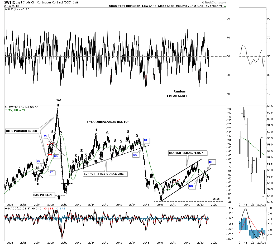
Lets start with the most important commodity on the planet oil. Back in 2007 the WTIC formed an unassuming H&S bottom which ended up being the spark to launch oil on its parabolic run to 147 in just under a year. That parabolic move ended when the WTIC formed a large H&S top which is hard to see on this long term daily chart. The price objective was down to 33.61 which was hit dead on the money.
After that low was established in early 2009 oil began a countertrend rally which would last for a couple of years. The WTIC then began to form one of those very large and drawn out topping patterns that would take 5 years to complete. Similar to the 6 year H&S consolidation pattern that weve been following on gold, the WTIC touched it neckline on many occasions but just couldnt break through. The big advantage of recognizing a large pattern like this early on is that you can prepare for the eventual breakout when it occurs which we did. Keep that big impulse leg down out of the unbalanced H&S top because most commodities experienced a similar fate back then.
Note the 2016 bearish rising flag that has completed the breaking out and backtesting process. At a minimum the WTIC should reach the 2016 low around the 25 area.
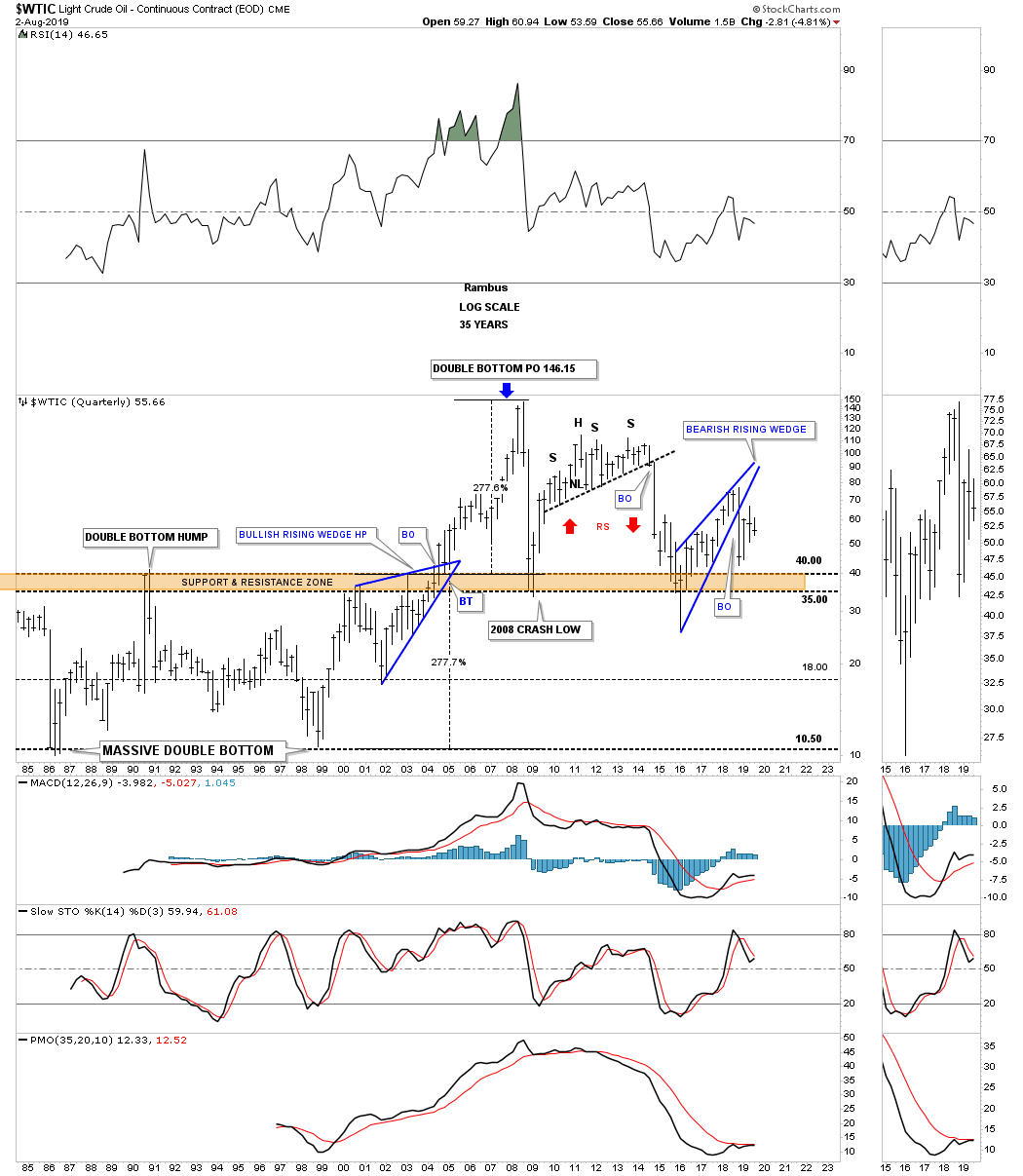
This second chart for WTIC is a long term 35 year quarterly chart which shows the 2014 2015 impulse move down. At the time we were looking for initial support to come into play in the brown shaded S&R zone which was hit. For awhile when oil spiked below the brown shaded S&R zone it looked like it could move to the bottom of the very large trading range but support was finally found and the counter trend rally began negating that possibility.
When I first posted this chart years ago I showed how the WTIC had traded in a large trading range between 10.50 and 40 for many years. I labeled that very large trading range as a double bottom. That massive double bottom had a price objective up to the 146 area as shown by percentage change indicator which was 277%.
Note the blue bullish rising wedge which formed just below that massive 20 year brown shaded S&R zone which was needed to help get oil over that long term resistance zone. The current blue bearish rising wedge could give the WTIC the energy it needs to break below the brown shaded S&R zone in the future as a halfway pattern.
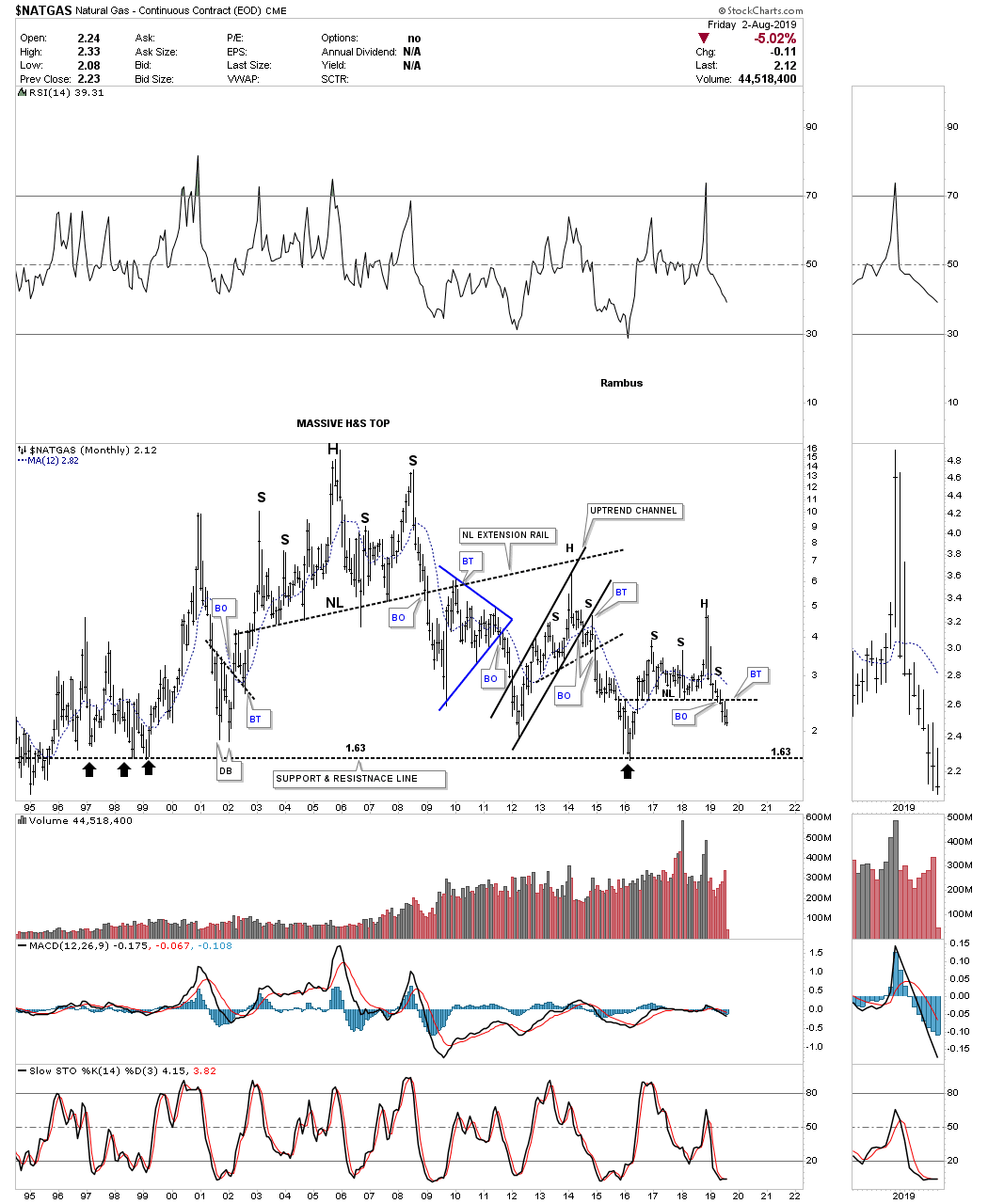
Natural Gas produced its own massive H&S top which has led to a 10 year bear market since the neckline was broken. Just like oil on the chart above natural gas also formed two well defined brown shaded support and resistance zones. The 2014 2015 impulse leg down traded to the bottom of the upper S&R zone before the price action began to bounce. Since then the NATGAS has built out a very large blue bearish rising wedge which is showing some inverse price action in regards to the bullish falling wedge which formed in the second half of the 1990s. Is it possible that NATGAS could trade down to the lower brown shaded S&R zone on this go around?

This next chart for Natural Gas is a monthly look which shows a little more detail than the quarterly chart we just looked at on the chart above. A move down to the 1.63 area will put natural gas at a 25 year low. No inflation here.
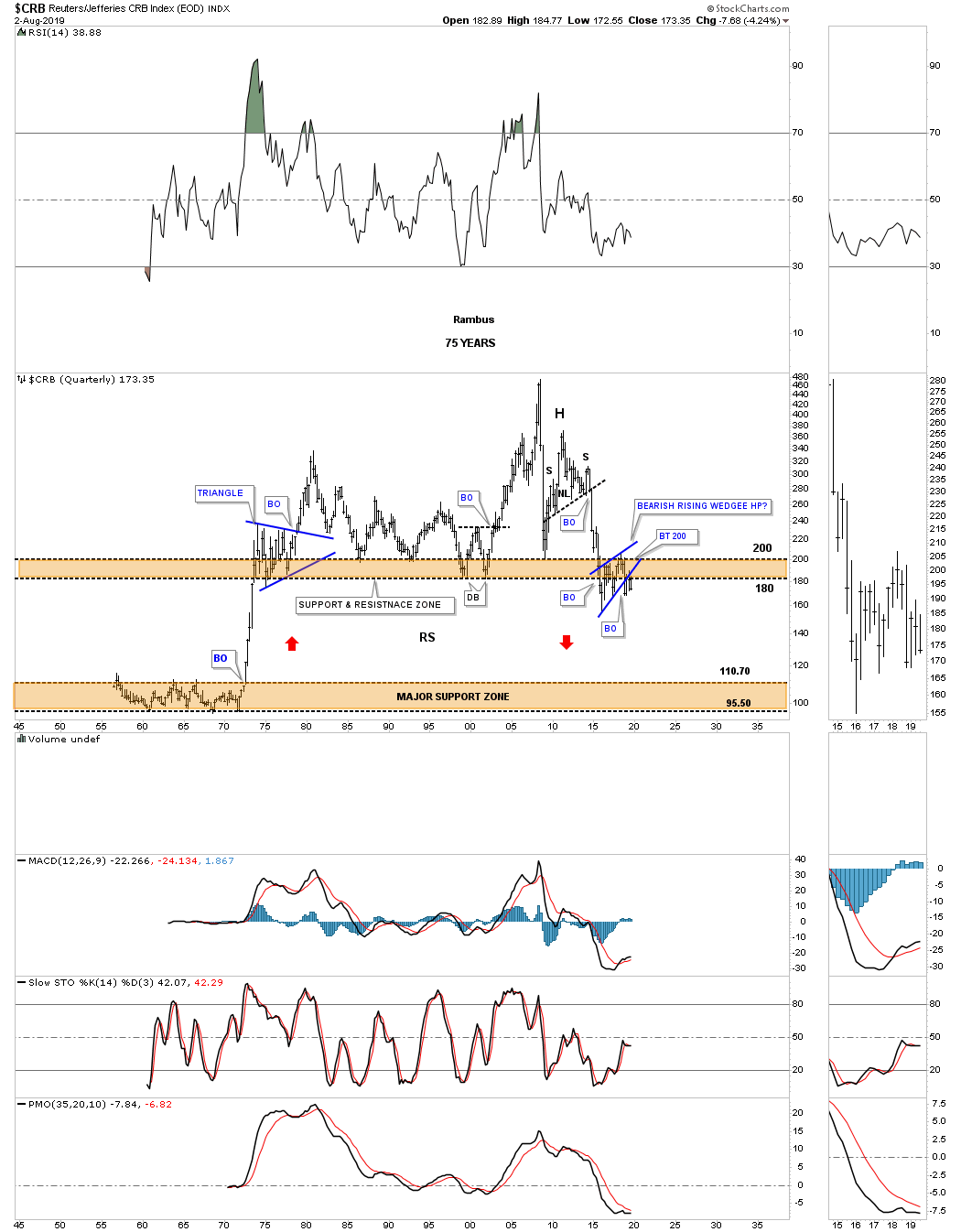
There is one more very long term chart I built out years ago which is the 75 year quarterly chart for the CRB index. It looks very similar to the long term quarterly chart we looked at earlier for the WTIC. What this long term quarterly chart shows are two distinct trading ranges. The lower one formed between the mid 1950s to the early part of the 1970s. Once the CRB index broke above the 1965 highs it was off to the races in a vertical move that finally came to and end about 2 years later in 1973. For the next 40 years or so the upper brown shaded S&R zone held strong support until the impulse move down from mid 2014 to the first half of 2015.
As you can see the price action has failed to rally back above the brown shaded S&R zone but instead has formed the blue bearish rising wedge just below the S&R zone. What is taking place is that the 40 year S&R zone held support for all those years but during the 2014 2015 decline that support zone was broken. Now it has reversed its role to resistance which is what you would expect. Since the multi year blue bearish rising wedge has broken down below its bottom rail is it possible we could see the lower brown shaded S&R zone come into play sometime in the future? I can tell you that if the blue bearish rising wedge plays out as a halfway pattern the price objective would be down into the middle of the lower brown shaded S&R zone. The Chartology is there now we just need to watch the price action and see if it plays out.
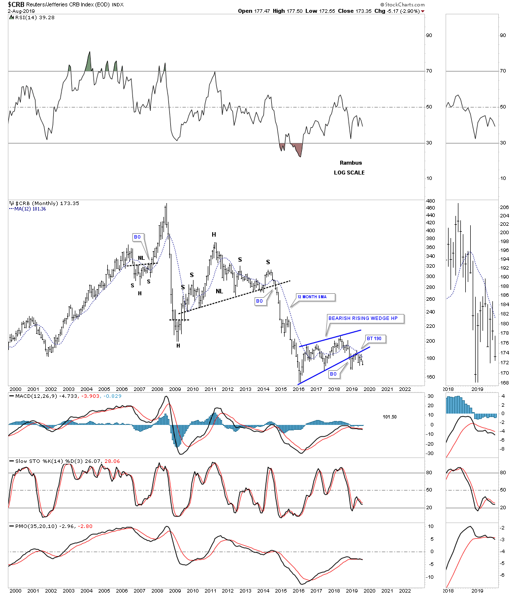
This last chart for the CRB index is a 20 year monthly chart which shows more details vs the quarterly chart above. Here you can see the H&S top that formed in 2011 with the strong impulse move to the downside once the neckline was broken. That impulse move ended in January of 2016 which led to the rise of the 2 1/2 year bearish rising wedge which has completed the breakout with a backtest in place. What we want to see next is for the price action to take out the previous low which will set up a new downtrend.
I know this is hard to digest as it means the benchmark commodity index the CRB looks likely to be back at levels last seen in the 1970s. Back to the Future ?
Im just scratching the surface of all the charts I have for commodities and a possible deflationary event that could come to pass. I will be on the road for the next two days but when I get settled in Ill have many more charts to post. Al the best
Rambus
Rambus
| Digg This Article
-- Published: Monday, 5 August 2019 | E-Mail | Print | Source: GoldSeek.com

