-- Published: Thursday, 5 September 2019 | Print | Disqus
Daniel Amerman
The fears of imminent recession have been multiplying, and this has led to 1) plunging long term bond yields; 2) yield curve inversions and near inversions; and 3) a fearful Federal Reserve going into "dovish" mode in the attempt to prevent such a recession.
We've been here before, or at least we have with regard to those three particular components in combination. And the result was a tripling of already elevated stock market values in a little more than two years. With that tripling then being followed by a historic tripling of inflation-adjusted gold prices over the next decade.
History does not exactly repeat itself - but it does contain some powerful and surprising lessons that are well worth studying, particularly during times of market volatility.
This analysis is part of a series of related analyses, which support a book that is in the process of being written. Some key chapters from the book and an overview of the series are linked here.
A Historical Outlier With Information Value
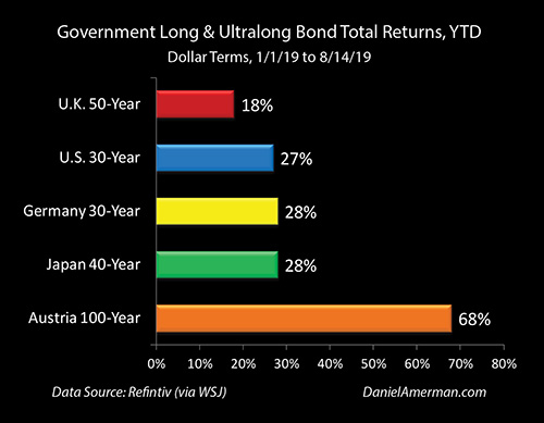
We are currently in a situation where long term interest rates have been plunging because the bond market thinks we may be entering a recession. As covered in the previous analysis (link here) and shown above, the plunge in rates is not based on fear so much as greed by profit-seeking investors, and this has lead to near record setting profits for those investing in long term bonds.
We are also on the edge of a yield curve inversion, with 10 year Treasury yields becoming lower than 2 year Treasury yields - which has historically been a highly accurate warning of a near term recession, with a perfect track record over the last three decades (link here). Indeed, the crucial 2 year / 10 year Treasury yield curve spread has been more or less "flickering" with inversion, going briefly negative but without the consistency that would produce more conviction.
At the same time, the Fed paused its increasing interest rate cycle - and has now started a reversal of course, dropping Fed Funds rates at its July, 2019 meeting for the first time since 2008.
When we put those factors together - there is a lot of fear out there that the stock markets could plunge, and there is certainly justification for those fears. As explored in Chapter 15, there are valid reasons - from several perspectives - to believe that the next 2-3 years could produce some of the largest stock market losses in history.
That said - devastating losses are not the only possibility. Indeed, what history shows us is that a situation similar to this preceded some of the largest stock market gains in history. Extraordinary stock valuations such as Dow 40,000 or above are in no way assured, but so long as the U.S. economy can avoid actually going into recession, such a scenario has to be considered a realistic possibility.
To see why, let's go back to December of 1997 and revisit what was happening then, as well as what would follow.
What Happened In 1997 To 2001
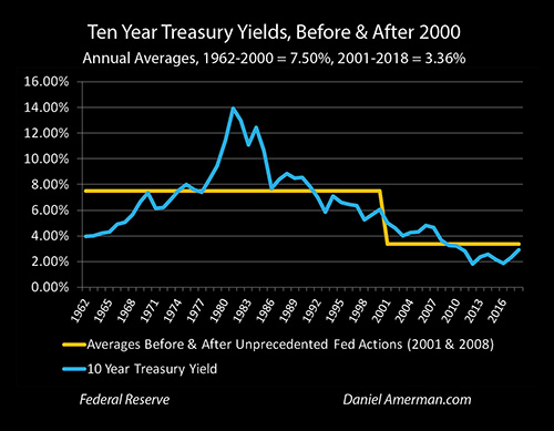
As a starting point, ten year U.S. Treasury yields were falling fast in 1997, moving from 6.89% in April, down to 5.81% in December (monthly averages). This is similar to the reduction in 10 year yields between the fall of 2018 and the early summer of 2019.
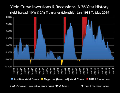
If we look carefully at the yield curve graph above, the spread between the 2 and 10 year Treasuries almost went to zero, but didn't quite, bottoming out at +0.05% for the month of December, 1997. While the specifics and situation vary - in broad strokes, this is also quite similar to what we have seen since the fall of 2018.
The Fed did not raise Fed Funds rates any further at the end of 1997, but would bring them down by about 1.25% over the following 14 months. This helped to avert a recession.
So, in 1997, we had 1) a fast falling 10 year Treasury yield; 2) a near yield curve inversion that did not quite occur; 3) the Fed going to "dovish" mode in advance of a potential recession; and 4) a recession that didn't then happen (yet).
Now, let's take a look at what happened with the stock markets, using the NASDAQ as an example.
The NASDAQ was 1,570 at the end of December of 1997.
The NASDAQ was 4,697 at the end of February of 2000.
So, with a near - but not quite - yield curve inversion, and a dovish Fed, there was room for the NASDAQ to very quickly climb 3X from where it was at the time of the close call with inversion. This extraordinary tripling came on top of a base of what were already highly elevated stock prices, and it occurred in the remarkably short time period of only 26 months.
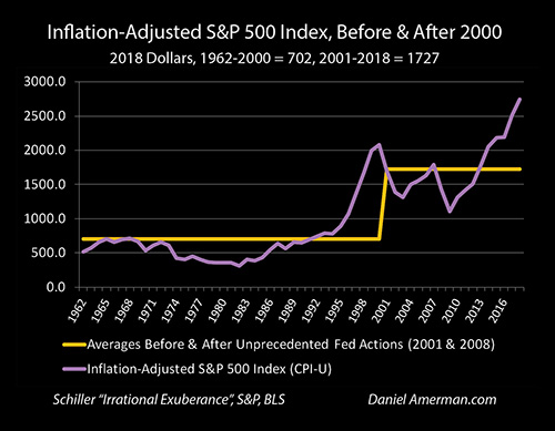
The graph above is in inflation-adjusted terms, and it is of the broader S&P 500 index instead of only the tech-heavy NASDAQ, but we can clearly see what happened. By 1997 the broader stock market had already completely broken out of its previous range (as it has again today). And from that highly elevated base, and a "dovish" Fed - there was still room to quickly move up a good 50% in price over the following years.
So, even with the far less dramatic gain for the broader stock market, it is still accurate to say that in inflation-adjusted terms, the gain by itself in the S&P 500 in the three years from 1997 to 2000 of 717 points, exceeded the total value of the S&P 500 in any year prior to 1991. (These are annual averages, using 2018 dollars, and the prior maximum index value before 1991 was 712 in the year 1968.)
Setting Up An Asset Bubble Collapse
As can be seen above, the dovish Fed did not so much prevent yield curve inversion or recession, as it did defer them. The golden area of the yield curve inversion did eventually occur anyway, starting in March of 2000, which was 27 months after the first close brush with inversion. The next recession then did indeed follow (on schedule) a year later, starting in early 2001.
The extraordinary heights that the stock markets had climbed to - in what would later be almost universally recognized as an asset bubble of historic proportions - would be reversed with a collapse of tech stock prices in particular. It would devastate the portfolio values and net worths of millions of investors who had been riding the tech stock bubble upwards, thinking it would never end.
In the broader markets, the S&P 500 index would fall by an inflation-adjusted 766 points over the three years from 2000 to 2003. So, a three year gain that resulted in more wealth creation than the total value of the stock markets prior to 1991, was followed by a three year loss that was greater than the total value of all stock market wealth in any year prior to 1991, even after adjusting for inflation. (There are a lot of parallels here with Chapter 15.)
Cycles Of Crisis And The Containment Of Crisis
This analysis is not a forecast - the situation today is very different with regard to trade conflicts in a globalized (and slowing) economy, with highly elevated starting asset prices in multiple investment categories, with far more pervasive Federal Reserve interventions already in place, and with much lower starting interest rates than those of 1997.
That said, there are also a number of similarities between 1997 and the current situation, and if the Fed were to give the markets, the financial media and the President what they want, then what history shows us is that Dow 40,000 - or something possibly much higher - has to be considered to be a possible scenario. Indeed, if this scenario were to occur, then short term consequences for stocks, bonds and real estate could all feel euphoric.
But we have to be careful of what we ask for, because what history also quite clearly shows us is that the end result of the Federal Reserve deferring the market and economic pain via a preemptive "juicing" of the economy and markets is a dangerous process that can create rapid asset bubble inflation - even from an already historically elevated base - and could lead to a far more devastating crisis and market collapse than if we were to have an immediate recession at current stock market levels.
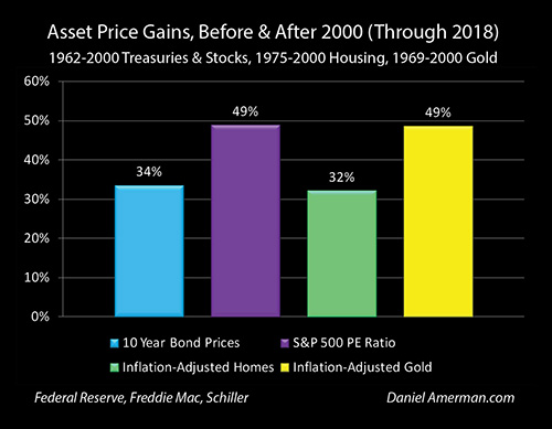
Critically, it was the attempt to contain the collapse of that first asset bubble that led the Fed to slam interest rates down to 50 year lows. Those very low rates set the stage for the creation of the real estate bubble. The collapse of that second bubble then led to the amplified interventions of zero percent interest rates, quantitative easing, and ultimately - our current situation of historically elevated asset prices for stocks, bonds, real estate and gold, as can be seen from the graph from Chapter 1 below.
It was the collapse of that first asset bubble that set off the cycles of crisis and the containment of crisis that continue with us through today. And the best framework we have for sorting out the amplified new risks and opportunities - is that of those same cycles.
The end results of the Fed's heavy-handed interventions have created historically abnormal losses, such as those associated with the Financial Crisis of 2008 and the Great Recession. The danger is very real that we could see that again, and potentially on an amplified basis this next time around, as explored in detail in Chapters 12 and 15.
But yet, a traditional "doom and gloom" perspective completely misses the dominant investment change that we have seen in the investment markets over the last almost 20 years - the highest average prices for stocks, bonds, and real estate that we have experienced (as covered in Chapters 3, 7, 9, 11, and 13). The cycles can amplify gains every bit as much as they can amplify losses.
A framework that I have created to help people understand how heavy-handed Federal Reserve interventions can create both record profits - and record losses - is the Red/Black matrix that is shown below.
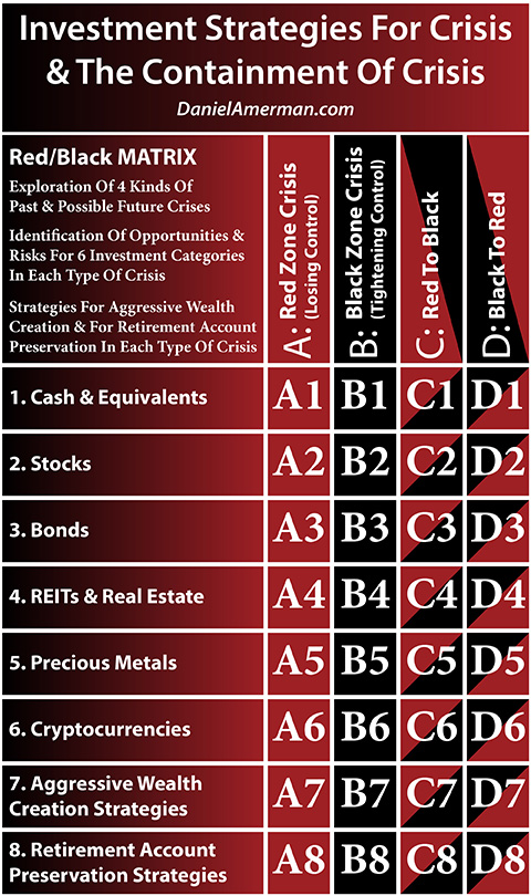
(More information on the matrix and how to use it is linked here).
What we have reviewed is the historical impact of a "Black to Black" intervention, i.e. a preemptive attempt to avert a recession, on the second investment category row of stocks. However, the implications go far beyond just the second row.
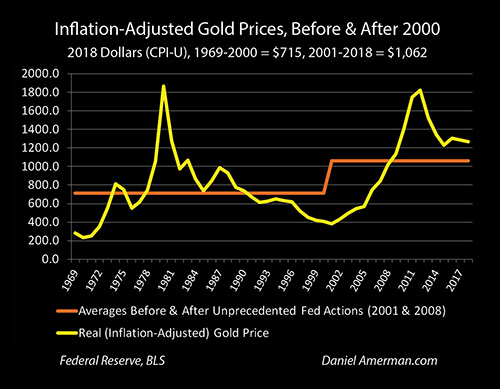
The Fed going dovish at a time of a near yield curve inversion did indeed produce a tripling in the NASDAQ (matrix row 2), that ultimately proved to be fleeting and ended in disaster. Yet, if we look carefully at the graph above, there was another tripling that occurred over a much longer time period and was much more persistent - with this being the tripling of inflation-adjusted gold prices (matrix row 5).
Gold prices had been falling in inflation-adjusted terms for almost two decades. "Dovish" Fed policies during a time of fast falling long term bond yields and near yield curve inversion then created a historic asset bubble in stocks. And we then saw a historic move in gold prices, breaking the near two decade decline and moving upwards to far higher levels - but not in response to inflation or monetary collapse.
I would argue that the dramatic but quite different moves in stocks and gold are logical and self-consistent, when we use the framework of cycles of crisis and the containment of crisis. Understanding those relationships between the investment rows at various stages in the cycles can then be crucial for both short and long term investment decision making - particularly if the Fed does continue to drop interest rates in the attempt to prevent recession in the coming months.
Daniel Amerman
http://danielamerman.com
(This analysis is a brief "outtake" from one of the many topics explored in depth at the August, 2019 workshop. "Wargaming" the possibilities and implications of this happening again as part of the currently developing "Black to Black" attempted preemptive containment of crisis by the Federal Reserve will also be part of the October workshop discussion, in this crucial time as the cycles change for the first time in more than a decade.)
This analysis contains the ideas and opinions of the author. It is a conceptual and educational exploration of financial and general economic principles. As with any financial discussion of the future, there cannot be any absolute certainty. While the sources of information and the calculations are believed to be accurate, this is not guaranteed to be true. This educational overview is not intended to be used for trading purposes, those making investment decisions should do their own research and come to their own independent conclusions. This analysis does not constitute specific investment, legal, tax or any other form of professional advice. If specific advice is needed, it should be sought from an appropriate professional. Any liability, responsibility or warranty for the results of the application of the information contained in the analysis, either directly or indirectly, are expressly disclaimed by the author.
| Digg This Article
-- Published: Thursday, 5 September 2019 | E-Mail | Print | Source: GoldSeek.com


