-- Published: Monday, 4 November 2019 | Print | Disqus
Rambus
Ive been holding off on writing this Weekend Report for the US stock markets until I got just a little more confirmation that the next impulse move higher is underway. Last weeks price action is strongly suggesting that the nearly 2 year consolidation phase is drawing to a close. Lets say Im seeing some green shoots sprouting up in many different areas of the markets.
Most investors rely on the fundamentals in which to make their trading decisions because that is how its been since the beginning of trading the markets. Fundamentals do have a place in investing in the long term trend but they usually lag at the beginning of a major turn in the markets. Normally when the fundamentals turn up at the bottom of a bear market the price action has already turned up many months in advance. The same thing is also true at tops. Before the fundamentals turn down the smart money has already gotten out while those looking at the fundamentals are left holding the bag.
If what Im seeing in the charts right now is correct then the Chartology is going to show you what the fundamentals will be like in 6 month or longer down the road. Most fundamentalist have been looking for the stock markets to crash based on their own interpretation of the fundamentals. At some point they will be right, but until then they have missed out on the biggest bull market in history which only comes around once or twice in a lifetime.
At this point in time Chartology is suggesting there will be some good fundamentals that will drive the stock markets higher over the next year or two. Right now investors who look at the fundamentals think that Europe and the emerging markets are on their death bed with no heartbeat, but the Chartology is strongly suggesting something entirely different is taking place. With weak energy prices and commodities in general that suggests a weak global economy which has only one direction to go which is down, but the Chartology is suggesting something else is brewing. We keep hearing that the Fed is going to blow another bubble in the money supply which is going to crash the markets this time, but this is the same story weve heard over the last 10 years. At some point the fundamentals are going to be correct, but at what point, one year, two years, five year maybe another ten years in the future? The fundamentals cant tell you when that day of reckoning will come but Chartology will give you a much quicker heads up when some type of reversal pattern shows itself.
Keep in mind we still havent even seen the blow off phase in the stock markets yet which will be another good clue that the markets are becoming exhausted as everyone and their brother want in. If you were trading in the late 1990s you know exactly what I mean. The pessimism right now with many investors is too strong for the bull market to end. When they finally relent and begin to turn bullish you will then know the bull market is living on borrowed time.
Lets start by looking at some mechanical trading systems weve been following for many years now which takes all the emotions out of the equation. Mechanical systems dont care about interest rates, unemployment, currencies or anything else that can affect ones judgment. Its pure and unbiased.
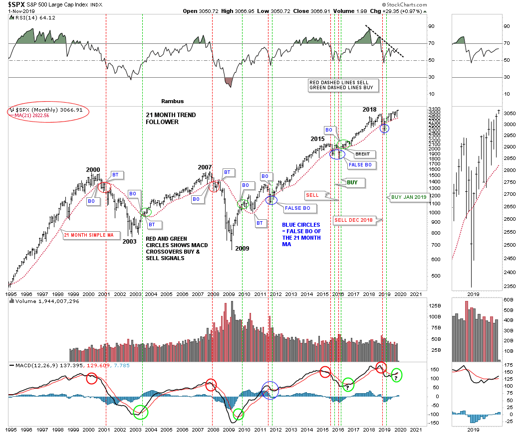
This first mechanical trading system is the 21 month trend follower chart which I wont go into a lot of details as weve covered this chart for many years. Its very simple and easy to understand. When the SPX is trading above its 21 month simple moving average you are on a long term buy signal and when the price action closes a month below the 21 month sma you are on a sell signal. This 25 year monthly chart shows just two outright sell signals, one in 2000 and the other in January of 2008. Note how the price action interacts with the 21 month sma which works like a moving trendline. After a breakout above or below the 21 month sma you will generally see a backtest to confirm either the buy or sell signal as shown by the red and green circles.
Over the last 25 years there were just four small whipsaws as shown by the blue circles. The first one occurred in 2011 that lasted just one month. The second one happened during the consolidation phase in 2015 which was a particularly touch correction when you live though it in real time. The last one took place about 10 months ago on Christmas Eve 2018 which lasted just one month.
As you can see this 21 month mechanical trading system has been on a buy signal since January of 2019. Note how well the 21 month sma has held support since the beginning of the year. At some point when this new impulse move gains strength we should see the SPX start accelerating away from the 21 month sma which it may be in the process of doing as this month is still young and the SPX is trading above the previous monthly bar. Currently the SPX would have to close this month below the 21 month sma which is at 2822 to confirm a new sell signal.

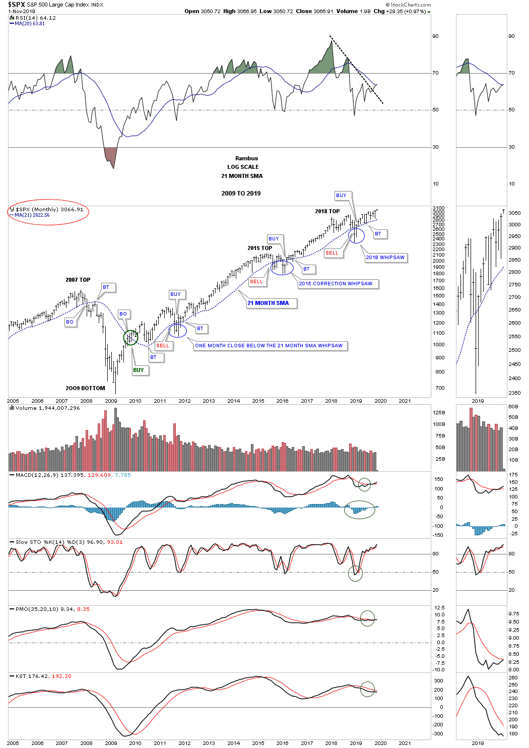
This shorter term monthly chart shows how the 21 month sma has done since the 2009 crash low. Keep in mind when the price action breaks below the 21 month sma you are on an automatic sell signal with confirmation when the backtest is complete. Just the opposite is true for a buy signal. Since the bear market low in 2009 the SPX has only spent 5 months on a closing basis below the 21 month sma which is pretty incredible when you think about it.

This second long term buy and sell signal chart I like to use in conjunction with the 21 month sma Trend Follower mechanical systems which uses the the MACD and blue Histogram. Again this mechanical system is very easy to understand. A long term buy signal is given when the black line crosses above the red line on the MACD, red circles. Confirmation of that buy signal is when the blue Histogram crosses above the zero line as shown by the green circles. Note how our latest buy signal was executed just 2 months ago in September which now confirms the 10 month January buy signal on the 21 month Trend Follower chart.
Back in 2015 when we were waiting for a new buy signal to take hold I compared how similar the 2015 low looked to the 2002 low. The point I was making at the 2015 low was how low the MACD was in comparison to the price action on the SPX. While the MACD was just crossing over to the bullish side, the SPX was trading right near its all time highs which strongly suggested that the SPX would experience a big move until the next sell signal showed up on the MACD which happened 2 years later in November of 2018. As you can see we have a very similar setup right now with the MACD just beginning to turn up while the SPX is trading in new all time high territory.
The last point I would like to make on this chart is the buy signals that occur on the RSI at the top of the chart. So far every buy signal over the last 25 years has occurred when the RSI broke above its down sloping black dashed line at the same time as the blue histogram bars and the MACD. As you can see the black dashed downtrend line on the RSI is currently giving way to another buy signal.

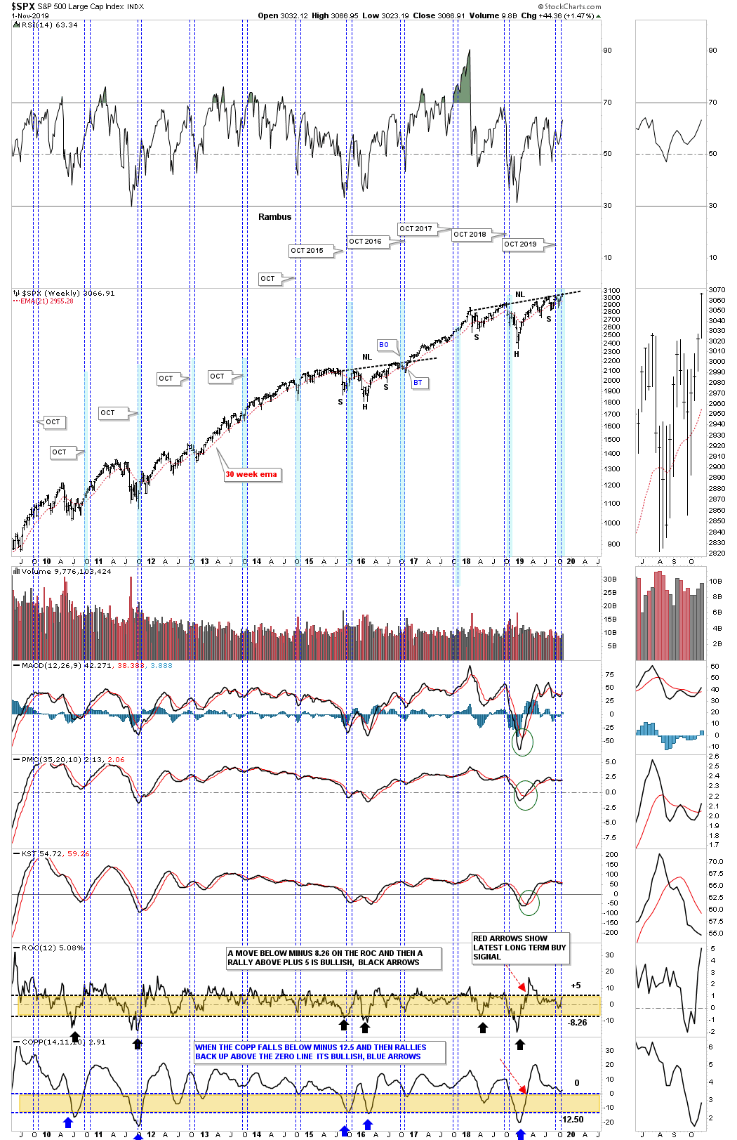
Generally the two weakest months of the year are in the stocks markets are September and October with October being regarded as the crash month. This year all we heard was how the markets were going to crash in October and the new bear market would begin and the world as we knew it was going to come to an end according to the fundamentals. A funny thing happened on the way to the crash scenario, the SPX ended up making a new all time high.
This next chart is a long term 10 year weekly chart in which I show the price action for each October going back to 2009. Generally speaking October is a great time to buy your favorite stock as the stock markets are entering into the strongest period of the year that usually runs until May of the following year. This years looks to be no different as the SPX is breaking out to new all time highs. Ive been showing the H&S consolidation for quite some time now which is on the verge of breaking out which ties into the strong period of the stock markets. Note the impulse move that followed the breakout from the 2015 H&S consolidation pattern.
At the bottom of the chart there are 2 long term indicators that give long term buy and sell signals which I describe on the chart.
Im just scratching the surface using charts to show you how the next impulse leg up is unfolding in the stock markets. I have some daily and weekly charts that I havent shown you yet that are strongly suggesting the breakout is underway. I realize that most only care about the PM complex but I believe that having some positions in both the stock markets and the PM complex is justified IMHO. I have many more charts that I will share with you in the Wednesday Report.
All the best
Rambus

https://rambus1.com
| Digg This Article
-- Published: Monday, 4 November 2019 | E-Mail | Print | Source: GoldSeek.com

