Technical Scoop - The biggest financial disaster in history?
-- Published: Monday, 13 April 2020 | Print | Disqus
Fear is our greatest enemy, and hope is our greatest weapon against the disease.
Robert Merivel, played by Robert Downey Jr. in Restoration (1995), a film set against the backdrop of 17th century England, during the time of the Great Plague of London, 16651666
The rules are simple. At least that is how my brother sees it. One, avoid the infected at all costs. Their breath is highly contagious. Two, disinfect anything youve touched in the last 24 hours. Three, the sick are already dead, they cant be saved. You break the rules, you die. You follow the rules. You live.Maybe.
Danny Green, played by Lou Taylor Pucci in Carriers (2009), a film about a world devasted by an outbreak. As the lethal virus spreads, four friends seek a reputed plague-free haven while avoiding the infected. But then the travelers turn on each other.
The average person touches their face 2-3,000 times a day. Three to five times every waking minute. In between, were touching doorknobs, water fountains, elevator buttons, and each other. Those things become fomites.
Dr. Erin Mears, played by Kate Winslet in Contagion (2011), a film about a contagion spread by a mysterious virus, where healthcare officials, government officials, and everybody else find themselves in a world shut down because of the pandemic as the CDC races to find a cure.
With natural disasters there is usually a beginning and an end, although the economic effects might linger for longer. So, what are natural disasters? They include earthquakes, floods, fires, hurricanes (aka cyclones or typhoons), tsunamis, heat waves, cold waves, volcanic eruptions, blizzards, ice storms, droughts, tornadoes, avalanches or landslides, hailstorms, and, yes, even thunderstorms. Natural disasters, particularly if they hit in a populated area cause death, destruction, and can cause long-lasting economic damage, particularly in poorer countries but even in some wealthier countries too. Natural disasters might be quite localized or spread out over a wide area. Some, like droughts, can linger for more than a few years. While deaths can be in the tens of thousands, particularly for earthquakes and tsunamis, more typical are deaths that can range from under a hundred to several thousand.
But pandemics, epidemics, outbreaks, and endemics are completely different. Epidemics can impact a large population but often are contained within a certain population or region. Endemics are something that is particular to that region of the world, like malaria. Outbreaks are endemics that suddenly occur in a different region than usual and can become an epidemic. But a pandemic is an epidemic that spreads itself over many countries and continents. COVID-19 is a pandemic. COVID-19 started as an epidemic (localized in China) and quickly became a pandemic. An epidemic that travels everywhere. It respects no borders.
The world has a long history of pandemics. They have sometimes been game changers. The European plagues of the 16th to 19th century devastated the indigenous populations of the Americas, leading to the complete collapse of the Aztec and Inca empires. These plagues weakened the other tribes to the extent that they were no match for the invading European countriesSpain, Portugal, England, France, and the Netherlands. The Antonine plague of 165180 AD laid waste to the Roman army and brought an end to Pax Romana 27180 AD. After that, instability was a key word in the Roman Empire leading to civil wars and invasions from the barbarians. The Plague of Justinian (527565 AD) led to the collapse of the last vestiges of the Roman Empire and its successor the Byzantine Empire, plunging Europe into the Dark Ages. This led to the rise of the Arab world as they conquered most of Southern Europe and ruled from roughly the 7th century to the 15th century.
One plague that may have actually been beneficial was the bubonic plague or Black Death in the mid- 14th century. It killed so many (estimated 200 million, upwards of half the population of Europe at the time) that there were labour shortages, leading to better pay for workers, the end of serfdom and helping to spur technological innovation. The Black Death supposedly got its start in China, and then spread west like wildfire through a world that was already interconnected by trade. The Spanish flu of 19181920 was devastating in terms of the number killed; it certainly slowed down post-WW1 recovery and led to a steep depression in 19201921. It also spurred more innovation and led directly to the period of the Roaring Twenties.
The Asian flu pandemic of 19571958 led to a very steep recession and killed more than one million worldwide with 116,000 deaths in the U.S. alone. But there were no mass shutdowns. The same was seen during the H1N1 or Swine flu of 2009, a flu that infected over 1.4 billion worldwide and killed upwards of 500,000 people. But again, there were no mass shutdowns and it led to stronger flu vaccines.
So, whats different about COVID-19 that has sparked such a drastically different response? The major difference is what is known as the R0 or basic reproduction number. The R0 number or, as it is said, the R naught number is an estimate of how many people will be infected by an average individual with the disease. For the regular flu and, even as it turned out, for the H1N1 flu it is roughly 1.3. For COVID-19 it is 22.5. The hospitalization rate is also a lot less: 2% vs. nearly 20%. Similarly, note the incubation period of 14 days for the regular flu vs. 114 days for COVID-19. Finally, the death rate is a lot higher, 0.1% or less for the regular flu and even the HIN1 vs. upwards of 3.5% for COVID-19. Thats between 25 to 35 times the death rate for COVID-19. Far deadlier.
However, as many have asked, including President Trump, is the cure worse than the disease? Locking down the economy as China and other more authoritarian economies in Asia have done may work there, but will it work in the Western economies where people are more accustomed to the ability to move about freely. China effectively forced quarantines, including separating entire families if necessary, if anyone was suspected of having the disease. Everyone else was in enforced lockdown in their homes with business shut. There was no voluntary self-isolation or social distancing put in place. Both were susceptible to fines or jail if broken. No one could get into Wuhan and no one could get out.
Here in North America and in the EU, it is self-isolation, lockdown (except to obtain food and medicine), and social distancing. Numerous businesses were shut down initially, starting with what were deemed non-essential businesses and then spreading to many businesses initially deemed essential. This massive shutdown is creating unprecedented unemployment, which will result in potentially thousands of bankruptcies, both individual and business, and, given the crash in the stock market, shattering the retirement funds of millions. A world built on globalization is also being shattered as supply lines are fractured. Entire industries are being crushedrestaurants, entertainment, cinema, tourist, airlines, cruise lines, and more. Governments are about to be overwhelmed with debt, putting a monstrous burden on the younger generation. Public infrastructure such as transit, public health systems and education, already under pressure due to underfunding, could crumble further. The health care systems were grossly unprepared for what happened, leading to a shortage of beds, masks, ventilators, and more. The fracturing of supply lines became evident when it was realized that the bulk of necessary medical supplies were not manufactured in North America but instead in China and elsewhere.
The economic ramifications may just be starting to become apparent. Millions have applied for employment benefits (latest initial claims in the U.S. were 6.6 million, well above expectations adding to the 6.9 million the previous and the 3.3 million the previous a total of 16.8 million), including tens of thousands who make their living in the gig economy or are self-employed. The benefits flowing are not endless. And, if the lockdown continues for more than a couple of months (there are modeling estimates that suggest this could last up to 18 months), the social ramifications could start to become apparent.
Resentment will build if it is perceived that large corporations and financial institutions are benefitting more than people and the small businesses that make up 70% of the economy. Social breakdown becomes probable, with a rise in depression, domestic abuse, alcoholism, robberies, smuggling, homicides, suicides, and a potential rise in gangs. Weve already seen an uptick in robberies in places like Italy and even here in North America as people take advantage of closed businesses. Protests and confrontations with the authorities could also rise and with that crackdowns and the rise of more authoritarian governments, coupled with a huge loss of freedomssomething that is already apparent under the lockdown. We are already seeing a rise in authoritarian governments taking advantage of the situation. China put in place enforced lockdowns. Other countries that have increased surveillance and/or ruling by decree including Israel and Hungary.
Just how fast is the COVID-19 spreading? Since January 10, 2020 when we learned of the first cases out of China, there are now over 1.7 million reported cases with over 100,000 deaths. The COVID-19 has spread to 210 countries out of 235 countries and dependent territories listed at Worldometer (www.worldometers.com). They have also reported outbreaks on at least three international conveyances (cruise ships) plus unreported cases on a number of others. Not included in the numbers were at least 100 from the USS Theodore Roosevelt, a U.S. navy aircraft carrier. The actual numbers could be even higher.
There have been reports of suspected outbreaks on other non-U.S. navy ships. There have been rumours of unreported deaths in New York City that are not being reported as COVID-19. As well, there are no reports of cases or deaths from North Korea, a country of almost 26 million between China and South Korea. Another country reporting no cases is Turkmenistan one the most repressive regimes in Central Asia. Experts doubt that either are virus-free. It is also feared that there are numerous unreported cases in difficult to access slums in places like India, Bangladesh, Indonesia, Africa and more as well in the barrios of Latin America. During the 1918 Spanish flu, India was estimated to have lost as many as 17 million. As well, there is the potential for high number of cases in the refugee camps of the world with an estimated population of 70 million. Most would be desperately ill-equipped to withstand an outbreak. Africa is dealing not only with the COVID-19, East Africa is also dealing with the most devastating locust invasion in years raising the spectre of famine on a wide scale.
Finally, there are many who believe that China is currently under-reporting, although that is difficult to verify, and they have re-opened Wuhan where this supposedly all started. This is quite something as Wuhan is a city of 11 million people. Wuhan had thousands of migrant workers who are now being released. These workers are needed elsewhere. Wuhan had been locked down for 77 days as an enforced lockdown. To help further contain it, residents have to download a phone app that contains their health information. China also has aggressive screening measures; temperatures are taken at the entrance of almost anywhere one goes, including private facilities. Similar types of measurements are in place in Taiwan and Singapore and have recently been adopted in South Korea, helping to explain their lower numbers. Taiwan, with a densely packed population of upwards of 24 million on an island, has a very low case and death rate compared to almost anywhere else. The island nation continues to function quite normally with bars, restaurants, and businesses open and kids in school. That seems to be wishful thinking for the U.S., Canada, and the EU.
Using current daily cases and death rates and assuming that trend continues, there is the potential over a year of there being 26 million cases and 2 million deaths. We are only three months into the pandemic. A sobering thought.
It is the economic damage that is difficult to predict. Over 50% of world GDP is in lockdown. The potential damage to the economy should far exceed anything recorded in any previous recessions since the Great Depression. The numbers being bandied about are not recession numbers. They are depression numbers. Not unsurprisingly there are many that believe this will be over with quickly and at worst there will be a brief but intense recession. Evidence thus far does not appear to support that premise.
Tens of thousands of individuals, possibly millions, cannot survive past April without a paycheck because so many live paycheck to paycheck and have little set aside for an emergency. Either rents or mortgages will be deferred or evictions are going to rise sharply and following that homelessness will rise even faster. And its not deferments that are going to help. It is forgiveness. Living rent-free. That in turn puts extreme pressure on landlords to either evict or negotiate their mortgages. It feeds on itself.
With sales collapsing at a horrendous rate, even large firms and large retailers are seeking rent deferment or outright forgiveness. Malls have become ghost towns. Most firms cannot survive beyond two to four months before they run out of cash and face bankruptcy and just close their doors for good. Many restaurants could face that even sooner. Many plants also face a grim future. Global oil demand has fallen by a good third. Shipments of parts and supplies on railways have crashed some 70%. Firms will have to reconfigure supply lines. On a positive note, some manufacturing previously done overseas may come back home.
Trying to predict unemployment numbers or future GDP is a difficult game. Potential unemployment has ranged from a rate of 10% to 30%. (Note: we cover the Canadian employment numbers in our chart of the week). Contraction in the economy has ranged from 5% to 25% for Q2 in particular. With many also expecting Q1 GDP to be negative, that would give rise to an official recession (defined as two consecutive quarters of negative GDP growth). The worst contraction seen since 1950 was the Great Recession of 20072009 when the U.S. economy contracted 5.1% peak to trough. Canadas steepest recession was the 19811982 recession when GDP fell 4.1% peak to trough.
And what kind of recovery is expected? That can vary as well. Recoveries are defined in alphabet terms. A V recovery assumes a quick end to the current lockdown situation. While the Q2 contraction will be steep (some say 25%), the Q3 recovery will show a sharp rebound. The odds of that happening are unlikely as the lockdown would have to end, probably by May. Many do not expect this to at least flatten out until the summer. A U-shaped recovery assumes the current conditions could last to at least June and things will take their time to recover. There will be damage, structural unemployment, bankruptcies, but the recovery will take shape. The odds? Its possible, but we wont see any real results until late in 2020. An L shaped recovery assumes the lockdowns will last well into the summer or even beyond. This will extend recessionary conditions right into Q3 and possibly into Q4. Recovery wont begin to be seen until sometime in 2021 and even then, it will be sputtering. Defaults and bankruptcies will soar and high unemployment will persist. Equity markets will languish despite all the monetary stimulus. More and more stimulus may be required. The odds for this scenario: probably good since modeling suggests this could last upwards of 18 months. Besides, one has to consider if progress is made on controlling the number of cases, the assumption will be that lockdowns work. So, lockdowns will continue.
But there are other types of recoveries as well. A W shaped recovery assumes easing of lockdowns and a quick recovery, only to be hit by a setback that puts us back in the deep freeze for another few months. Its a lurching type of plunge and recovery followed by another plunge. Double-dip is what economists call it. The oddsits possible. A swoosh recovery (named after the Nike slogan) assumes a quick recovery but it quickly levels or peters out. Debts are simply too high for any kind of a sustained recovery. The odds here are that its quite possible. One last one might be what we call a stuttering recovery. Japan knows all about those, having gone through it since the 1990s. Recoveries are feeble, followed by a pullback, and then the scenario just keeps repeating. Kind of like spinning in place. The oddsgood. This is not too dissimilar to a swoosh recovery.
Debt levels are just too high. According to the Institute of International Finance (IIF), global debt hit $255 trillion in 2019. Already we are hearing about downgrades from the rating agencies as BBB-rated debt is downgraded to BB debt and BB debt is downgraded further. It is estimated that upwards of $200 billion of BBB rated debt could be downgraded to junk this year.
In late March Moodys recorded 69 downgrades, bringing the record to 180 downgrades in the past year. The biggest names we saw were Ford Motor, MGM, AMC, Four Seasons, Hyatt Hotels, Marriot, Occidental Petroleum, Kraft Heinz and Macys. S&P was also busy downgrading even more, some 300 in the past year. A notable was Cirque de Soleil, down to CCC which is as low as you can go. Entertainment, automobiles, hotels, cinemas, casinos, and more were amongst the victims. They cant all be bailed out and investors should be prepared for a severe beating. The result is that lenders are pulling back that smells of too risky or they are demanding even higher interest rate premiums.
Things are so bad with the Fed and the Treasury prepared to bail out just about everybody, including (incredibly) cruise linescould we be witnessing the nationalization of the economy? The Fed is buying all sorts of debt including junk bonds. With the Fed buying junk bonds accusations are flying that the Fed is effectively bailing out the hedge funds and private equity firms that hold these bonds. The BOJ bought stock. Could the Fed resort to buying stock? It apparently is being considered. Anything is possible and the negative political optics appear to be merely an after thought.
Sovereign debt is also at risk. Argentina defaulted on local law US$ denominated debt. It was only $10 billion, but then it has put their entire international debt in question. S&P cut Argentina to selective default. Argentina has some US$323 billion in debt outstanding and all of it is now at risk. Others at high risk or in the process of default include Venezuela, Iran, Iraq, Ukraine, and a host of African and Polynesian countries. Big names potentially in trouble include Italy, Greece, Austria, and some eastern European countries. Germany and France are in no position to bail them out and the ECBs hands are effectively tied.
We are most likely a year away from the debt implosions hitting us in a meaningful way, but the reality is the inevitable is building and it will happen. It is a question of when, not if.
Will this be a steep recession or will it turn into a depression? From what weve seen, the odds favour a depression. Unemployment is going to be off the charts, although income programs will help soften the blow. The service sector, which is 70% of the economy has been walloped. It will be months in recovery and many businesses will not return. Retailers are being walloped as well and after the shock of this collapse people will more likely sit on their money rather than spend it. Many industries will remain in a depression. Airlines, hotels, shipping, restaurants. Cruise lines may well just disappear.
Yes, the stock market will rebound, but any thoughts of the start of a new bull market are probably just the bulls wet dream. A key driver of the bull market was companies buying back their own stock. That is coming to a halt. But with the stock market rally over the past couple of weeks the talk has shifted to the bear is dead, long live the new bull. It is an election year and presidents dont get re-elected with the stock market crashing.
Consumers have been battered and it is just a matter of time before their biggest asset, their house, also crashes like the stock market. People are hoarding and that has a negative impact on the economy as well. Most Americans and Canadians have little or no savings and what they have will quickly evaporate. Debt (corporate, consumer) is just too high and that will remain a major drag on the economy going forward. People will now be reluctant to pile on even more debt. Expect food banks to see a sharp rise in use. Could we once again have soup kitchens? We have seen what are being called bread lines in Miami right in the shadow of Mar-a-Lago. If everyone is worried about the COVID-19, their worry about the economy could soon surpass that. Consumer confidence is already plunging.
Could we not be cheerier? The biggest saving grace out of this is that we might see basic income programs become entrenched and the U.S. might finally get universal health care. Not that both wont be opposed, but the COVID-19 and the economic collapse might see these realized. After all, out of the Great Depression came social security, unemployment insurance, strengthened labour laws, deposit insurance for the banking industry, strengthened health care, and more. Some good may come out of this after all.
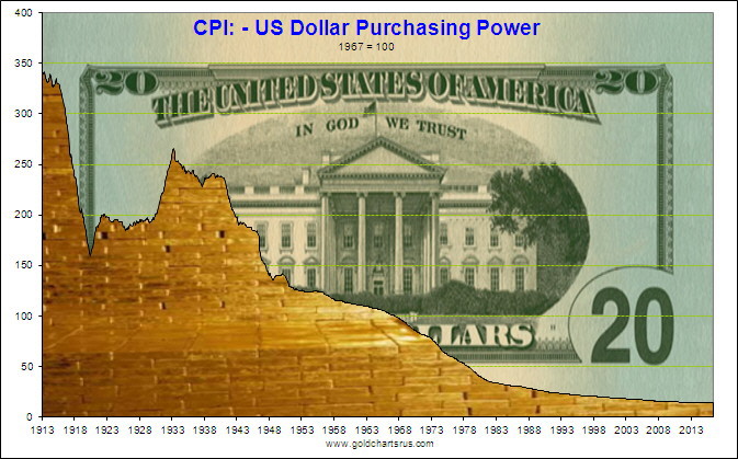
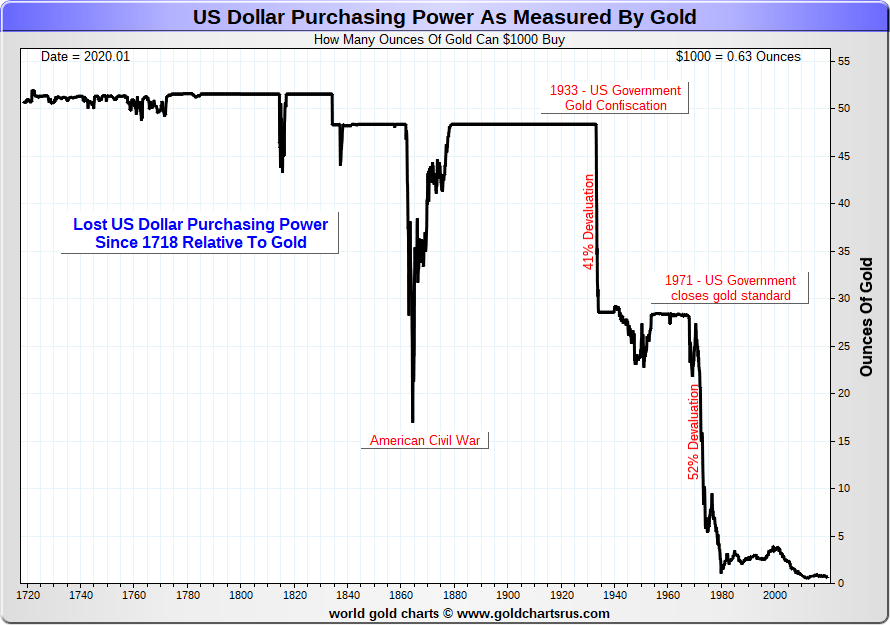
Our final question is: how long can the U.S. dollar last as the worlds reserve currency? The U.S. dollars purchasing power just keeps on going down, down, down. Two charts are shown below: U.S. dollar purchasing power adjusted for CPI and the U.S. dollar purchasing power as measured by gold. In the end, the Romans kept debasing their currency until it was effectively worthless and no one would accept it any longer. As well, given all the uncertainties that prevailed through the 3rd to 5th centuries, people hoarded money. With rumours of a coming digital currency (so far mostly in the EU) what would that bring? Well it could trigger a two-tiered economy with the second one going underground, using whatever works. We live in interesting times.
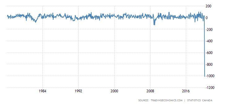
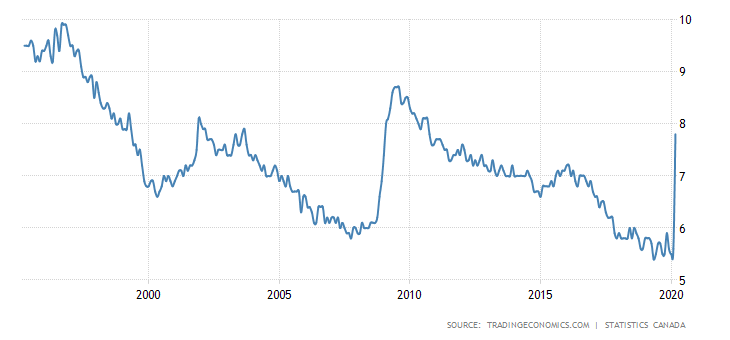
It was a shocker! One million, ten thousand, seven hundred (1,010,700) jobs lost in March 2020 in Canada. Wowzer! The market had expected only 350,000. The unemployment rate soared to 7.8% vs. the 7.2% expectation. The job losses were a record, far surpassing the worst of the 20072009 Great Recession. It was, as they say, off the charts. There are some expectations that April could be even worse.
First the numbers. 474 thousand full-time jobs were lost along with 536.7 thousand part-time jobs. Ontario was the highest, losing 403 thousand. But all provinces lost jobs. Youth employment fell 392,500 as the 1524 group took the biggest hit. The biggest losses were in accommodation and food services 294,400, wholesale and retail trade 207,500, educational services 125,400, information culture & recreation 103,700, and health care & social assistance 100,000. The labour force participation rate fell to 63.5% down from 65.5%. If it had remained the same, the unemployment rate would have been closer to 9%. The lower participation rate tells us that a lot of people just dropped out. When there are so many unemployed how does one look for a job?
The real unemployment could be higher because of a number of factors. In February, 19.2 million had jobs. By March only 18.0 million had jobs. Over 200,000 effectively dropped out of the labour force because there was really nothing to look for. Some 1.3 million worked but were not paid; however, they were still counted as employed. Another 800 thousand worked about half the time they normally would. Canadas R8 unemployment rate (similar to the U.S.s U6 rate that includes discouraged workers and involuntary part-timers) leaped to 11.7% from 8.5%. Canada has no Shadow Stats rate, so if those that have dropped out were included, we are sure it would be even higher.
Some good news was that Air Canada was prepared to hire over 16,000 workers back because of the offers of the government wage top-up programs. As well, there are jobs in delivery, groceries, long-term care homes, and more. Whether there are matches between the newly unemployed and where there are jobs available is another issue.
The highest recorded unemployment rate since 1970 was seen during the recession of the early 1980s when it hit 13.10%. In one fell swoop the unemployment rate has soared almost as high as it was during the 20072009 Great Recession. At the peak of the 1930s Great Depression, unemployment hit 30%. Real GDP fell 10% in both 1931 and 1932. Could we see that again? Hard to say. As we have discussed earlier, it depends on how long the COVID-19 crisis lasts.
It should be noted that some 5 million or 1 in 4 workers have applied for emergency support since the government-imposed lockdown. But again, a lot depends on long this lasts. If the lockdown is over by June, the bounce-back could occur sooner. But if this lasts through the summer or longer, then all bets are off. The government support programs are now estimated to send the deficit into the stratosphere, estimated at $184 billion for fiscal 2020.
To say we were gob-smacked would be an understatement.
In the U.S. the weekly initial claims came in at 6.61 million. The market had expected only 5.5 million. The previous weeks initial claims were revised upward to 6.87 million. It was the third consecutive week of multi-million claims. There are so many unemployed that both websites and phone lines were jammed. The expectations now are that the April unemployment rate will soar to 15%. Against this backdrop the Fed announced that they were providing an additional $2.3 trillion in aid, including buying state and muni debt.
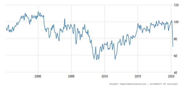
It is probably no surprise that consumer confidence is plunging. The Michigan Consumer Sentiment Index plunged to 71 for April 2020 down from 89.1 in March. That was still below expectations of a reading of 75.
What a week! The bulls ran wild. Who cares, it seems, about the coronavirus and the U.S. with the highest case count in the world and now the highest death count as well.Who cares about record initial job claims? Who cares about huge job losses with even more to come? Who cares about the potential for growing bankruptcies? It was a week of buy, buy, buy. Damn the torpedoes. $10 trillion was erased from the markets and, poof, just like that $4 trillion is put back on. As one pundit said, what fool buys this market? Well, it seems lots of them when we havent even seen the collapsed earnings, the full results of the job losses, or the sure to be rising bankruptcies, and the soon to be corporate bond defaults. So, who cares? Be happy. Buy.
Course it helps that the Fed is buying up everything in sight. The motto buy because the Fed has your back. Dont fight the Fed.
The S&P 500 gained 12.1% this past week, the Dow Jones Industrials (DJI) was up 12.7%, the Dow Jones Transportations (DJT)home to crashing airlines and sinking cruise linesleaped 12.8%, while the NASDAQ was a laggard, up only 10.6%. The S&P 600 small cap was a big winner, up 19.4%. Small caps usually lead in a bull market. But elsewhere it was the same, although not with the same fervor. The TSX Composite gained 9.5% while the TSX Venture Exchange (CDNX) was up 9.9%. The World MSCI Index gained 6.4% and even Bitcoin was up 8.1%.
Overseas, the London FTSE gained 9.0%, the Paris CAC 40 was up 6.9%, and the German DAX jumped 8.5%. In Asia, Chinas Shanghai Index (SSEC) was up a paltry 1.9% but the Tokyo Nikkei Dow (TKN) gained 8.6%. What a week. Rejoice. What does the stock market think they are? Gold stocks? Okay, as we note later, the Gold Bugs Index (HUI) was up 16.1% and the TSX Gold Index (TGD) jumped 13.6%. Everybodys happy. But keep in mind we are still down some 9.1% for the NASDAQ and 27.2% for the S&P 600. Everyone else is in between. Except for the gold stocks, as the TGD is up 10.5% on the year now.
It was one of the best weeks percentage-wise since the 1970s. If we recall, the 1970s saw some great rallies that were followed by equally great plunges and for 16 years the markets churned up and down, going nowhere. Inflation-wise, though, it was a steady downward trek. Maybe it really is all this money the Fed is throwing at the market. But the companies arent going to be buying back much of their stock any longer in this environment and many are, we hear, poised to cut dividends. That might sober a few up.
Maybe everyone is looking ahead to the eventual end of the pandemic. And while many companies might disappear, the ones that survive will (hopefully) be stronger. But the strongest companies to survive were probably already the strongest companies. Maybe as well, the stock market is anticipating an early end to the coronavirus shutdown. And if it does last longer the Fed will add even more. Dont worry, the Fed has your back.
V bottoms are extremely rare. And usually not when it comes to major stock indices. They are seen more frequently with penny mining stocks. Unless the S&P 500 has suddenly turned into a penny mining stock. And we guess the final word goes to President Donald Trump. Presidents dont get re-elected when the stock market is tanking. Ask George W. Bush; well, actually, his successor John McCain who placed behind Democrat Barrack Obama in the 2008 election while the 2008 financial crisis was raging and the first major round of bailouts by the Fed and the Treasury were underway.
Or, as Jim Sinclair writes all the time, QE to Infinity, followed by Gold balancing the balance sheets of the sovereign balance sheet disasters. Just as there is no tool other than QE to feign financial solvency, there is no tool to balance the balance sheet of the offending entities other than Gold. It is just that simple. Jim Sinclair is a precious metals specialist and President of the Sinclair Group of Companies. His prime holding is Tanzanian Royalty Exploration (TAN-TSX). Hes also an author and he can be found at (www.jsmineset.com). For the gold bugs, hopefully he is right.
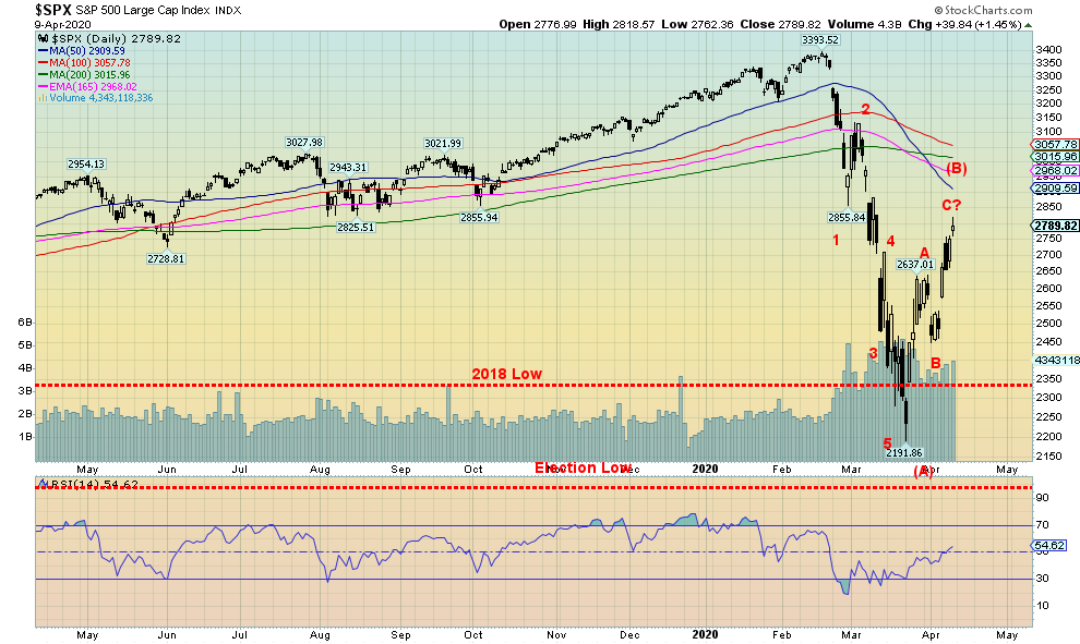
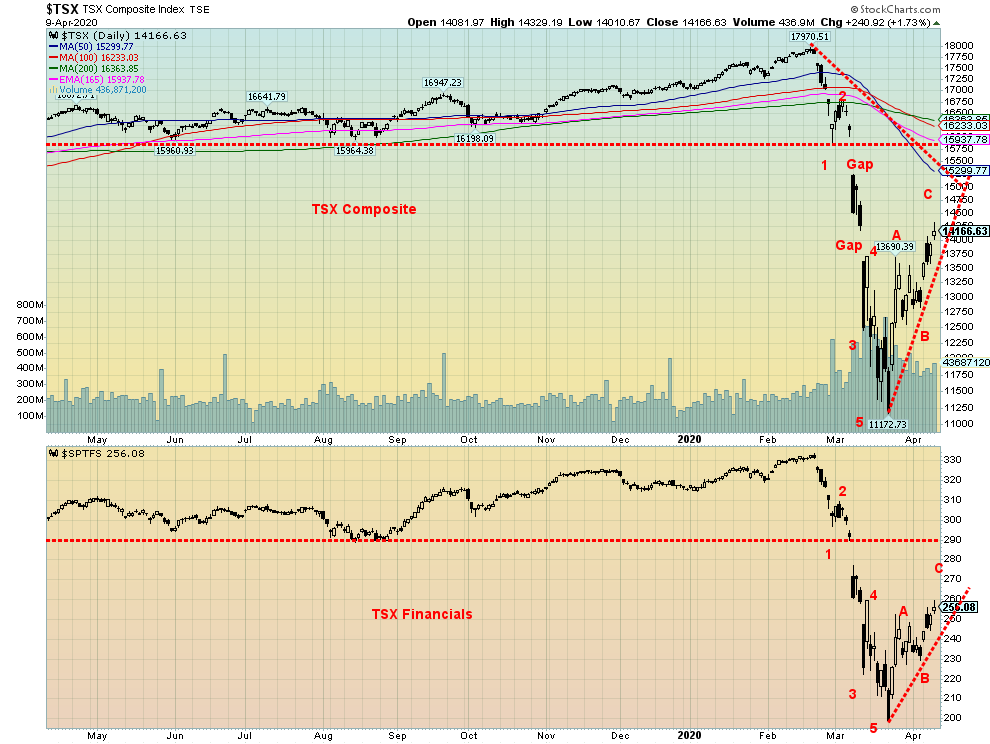
It is possible that the S&P 500 completed a 5-wave decline from the high on Feb 19. Now, what follows is an ABC correction for wave B. That could be followed by another decline to new lows or a failed low for wave C. That would complete wave A down of a higher degree. Bear markets are not over in 33 days, no matter what any bull thinks. If so, then it was the shortest bear market on record. We doubt it very much. If anything, bullish sentiment is too high too fast and we are not even back at the Feb highs. We could still go higher here and test the falling 50-day MA near 2,910. Note the 50-day MA has crossed over the 100- and 200-day MAs. There is considerable resistance up to 3,100. Over 3,110, the market could return to the highs and even see new highs. But we still believe it would only be making a spectacular B wave. We have seen similar ones in the past.
The breakdown point is at 2,450, but the warning point is at 2,575. We took out the lows all the way back to 2018 and some indices went back to the election of 2016. Taking out prior year lows is important in signaling a bear market. As well, we broke the uptrend line from 2009 and broke down under the 4-year MA.
A new paradigm and a new bull market? This time its different? We doubt it. But well take bear market rallies.
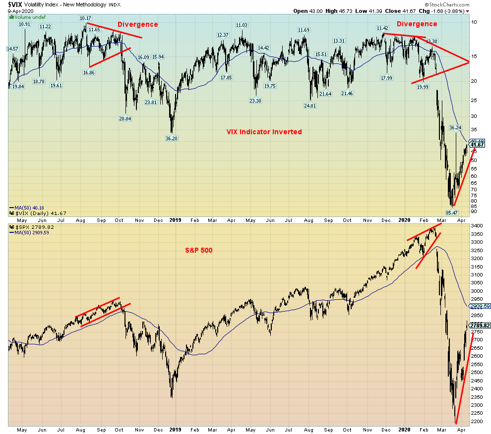
The S&P 500 and the VIX Volatility Indicator made strong divergences at tops seen in 2018 and again in 2020. However, we have no such divergences this time around, although the VIX did make its low on March 16 before the S&P 500 made its recent low on Mar 25. A slight divergence. We usually like to see the divergence more pronounced and spread out over a longer period of time as it did at the tops. That has made us suspicious that we havent seen the final low yet where we could then see the S&P 500 make new lows but not the VIX. Watch for it.
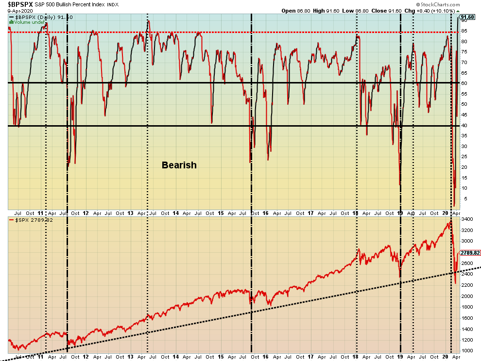
Of all the indicators to get exceptionally bullish this past week, it was the S&P 500 Bullish Percent Index (BPSPX) that hit an incredible 91.60 this past week, the highest we have ever seen since they started this index back in 1995. We can only take it as a warning sign that the S&P 500, and by extension the stock market, is now vulnerable for, at minimum, a pullback after a rather spectacular run-up this past week. Beware is all we can say. The indicator has never hit 90 before, although it has come very close on a few occasions. Note we are hitting these levels despite being sharply below the all-time high. The bulls are running rampant and there is this sense out there that we are now starting the new paradigm and the new bull market for stocks. The bear is dead. Long live the bull.
The TSX Composite joined the party this past week, gaining 9.5%. That wasnt as good as the U.S. indices, but nonetheless more than acceptable. It eased some of the pain experienced over the past couple of months. The TSX is still down 17.0% on the year. The junior TSX Venture Exchange (CDNX) also rose up 9.9% but remains down a steep 26.9% in 2020. The question is, as it is with the U.S. indices, is it sustainable? We are closing one of the gaps and if the TSX can successfully rise above 14,500, then we could be up next to test the first gap left in early March between 15,900 and 15,240. A breakdown under 12,525 would negate that and instead suggest a test of the recent lows.
The TSX sub-indices were all up on the week led by Consumer Discretionary (TCD) up 21.0%. The biggest loser, if one wants to call it a loser was, oddly, Consumer Staples (TCS), up a small 1.5%. Double-digit gains were seen for Income Trusts (TCM) up 16.1%, Financials (TFS) +10.5%, Golds (TGD) +13.6%, Health Care (THC) +14.8%, Materials (TMT) +11.5%, Real Estate (TRE) +17.2%, Utilities (TUT) +11.0%, Metals & Mining (TGM) +11.4%, and Information Technology (TIT) +10.4%. Industrials (TIN) was up 8.9%, Energy (TEN) +4.2% and Telecommunications (TTS) +1.9%.
The TSX should continue to follow the U.S. exchanges. The first sign of some trouble would come under 13,250.
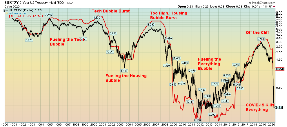
We saw a comparable chart of this at Tom McClellans site (www.mcoscilator.com). The premise was how the Fed creates bubbles through monetary policy. Low interest rates played a role. And, while this is not shown, money supply as represented by M2 has been growing quite rapidly. Certainly, following the 2008 financial crisis, the Fed was buying billions of dollars of treasuries, MBS, and more. They created what many called the everything bubble. But low interest rates and a flooding of the financial system with money, along with debt growth, also fueled the housing bubble of 20012006 that eventually led to the sub-prime mortgage crisis and the 2008 financial crisis. Ditto back in the 1990s when Fed Chair Alan Greenspan kept the pedal to the floor, creating what even he called irrational exuberance. It resulted in the high-tech/dot.com bubble and the collapse of 20002002. Note how the 2-year yield actually peaked before the Fed started cutting interest rates. You can see that in 1999, again in 2006, and more recently in 2018. In other words, the 2-year started falling in yield before the Fed actually started cutting interest rates, effectively presaging the Feds rate cutting. Now the 2-year yield is down where it was in 20112013, helping to fuel the stock market and every other asset except, oddly, gold that collapsed in 2013 after peaking in 2011. The 2-year yield is now above the Fed Funds rate and usually when that happens it helps fuel the stock market and the NYSE advance-decline rises as well. So maybe that is playing a role behind the recent jump in stock prices.
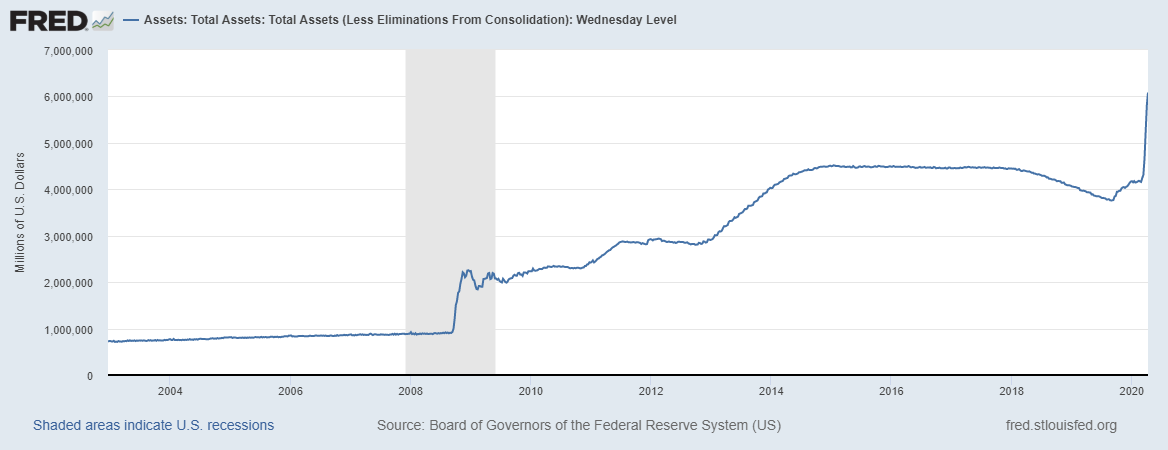
The Feds balance sheet continues to explode. The Feds balance sheet now stands at $6.1 trillion and rising. There are many who expect it to soon hit $7 trillion with some seeing it rise to $9 trillion. The peak, following the 2008 financial crisis, was at $4.5 trillion. We are now 36% higher. We are also up $2.3 trillion since September when the Fed first started the repo program. Given the Fed is now almost buying anything and everything in sight, growing to $7 trillion should not be an issue. They have injected some $1.5 trillion into the market through the repo program. QE4 as it is now being called is expected to inject $6 trillion into the market. Officially it is not a QE. They are buying anything and everything including junk bonds. But what happens when they want to unwind this again as they attempted to do in 2017-2018? If one recalls, that is when the stock market started faltering, having topped in January 2018. Because of the size and the scope of the program critics are already calling this the nationalization of the Fed. And the president realizes this chances of re-election are low if he doesnt pull out all stops and gets the stock market back into the stratosphere once again.
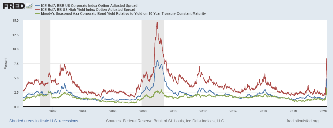
Spreads Moodys Aaa, BBB Corporate, BB Corporate Over U.S. 10-Year Treasuries
The spreads continue to widen and the potential dangers in the U.S. corporate bond market continue. Moodys Aaa corporate bond spreads have gone from 1.10% to 1.79%, although that is down from the recent high of 3.20%. BBB corporate bonds, the lowest investment grade, stands at 3.83%, up from 2.05% but down from the high of 4.74%. Finally, BB corporate bonds, the highest non-investment grade, are at 6.39% although that has also come off a high of 8.37%. With a number of downgrades having taken place, it may be that investors are feeling better about the new batch, thus lowering the spreads. A number of BBB bonds were downgraded to BB and so on. But even in the rise seen in 2008 there was a period where the spreads rose, and then pulled back before resuming their rise to the ultimate high in 2009.
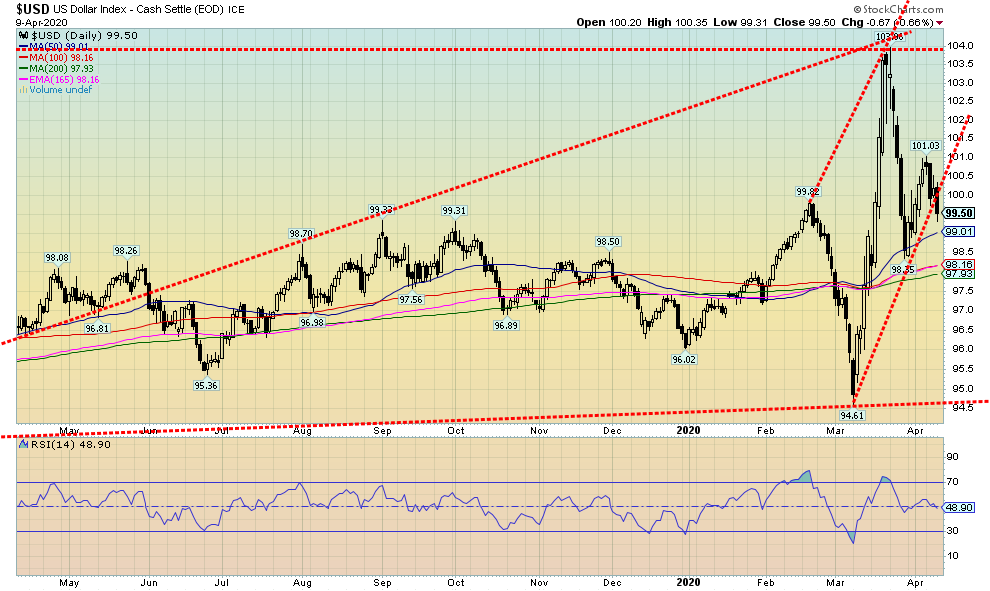
Is the U.S. dollar rally over? On Thursday the US$ Index fell, taking out the uptrend line from the spike low seen in early March at 94.61. We peaked out at 101.30 on this rebound but closed the week at 99.50. The result has left a potential multi-year double top on the charts with the first top coming in January 2017 at 103.82 and the second top the recent one at 103.96. In theory that is a bit far apart for a double top but we do find it intriguing. Indeed, the charts would show a potential multi-year topping pattern that stretches from late 2014. Confirmation of a breakdown comes when the US$ Index starts trading under 97. The US$ Index breaks down from the multi-year topping pattern under 95. It projects down to 79.
This past week the US$ Index fell 1.2%. All the other major currencies gained, except for the Japanese yen which was flat on the week. The euro gained 1.0%, the pound sterling was up 1.7%, the Swiss franc up 0.9%, and the Canadian$ jumped 1.4%.
The above scenario for the US$ Index would change if the index were to regain back above 101. However, the drop this past week suggests at least a retest down to the recent low near 95. The drop this week comes despite what appeared to be a steady flow of funds coming into the U.S. from China, the EU, and other emerging markets as they fled instability and the coronavirus. Funds were flowing into U.S. treasuries and now, it appears, into the stock market as well.
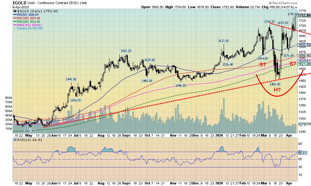
Has gold successfully broken above a potential head and shoulders bottom pattern? We like to think so, but wish volume had been higher. Maybe no one wants to believe it. On Friday we broke over the neckline of a potential head and shoulders bottom. New highs for the week were made at $1,754 before closing at $1,752. It is the highest level seen since 2012. The high in 2012 was at $1,798.
This was futures, but cash kept trading after the close of futures and it did pull back, suggesting if gold stayed there the futures could open lower on Monday in the $1,735 to $1,740 range. The breakout of the head and shoulders implies a potential target for us up to $1,930-$1,950 with an outside chance of up to $2,000. That would get the gold bulls excited. While positive sentiment is growing, it has some room to get higher and with the RSI at 67 it also has a bit of room before moving above 70. With the Fed flooding money everywhere, buying up almost anything that moves and the real threat of debt collapse, it is an ideal condition for gold as confidence is lost.
Gold gained 6.5% on the week and is now up 15.1% on the year. Physical gold is the best and safest way for investors to invest in gold. Gold stocks are still paper but are highly leveraged to the price of gold. Silver gained 10.8% on the week but platinum continues to drag, gaining only 4.3%. Palladium, mostly an industrial metal, may have seen its top but it is not collapsing. Palladium fell a small 0.5%. Copper gained 3.2% but, overall, remains in a bear market.
A story we have been following concerns the apparent lack of physical stock at both the LBMA and the COMEX if there is a demand for delivery. Mostly traders never demand delivery but instead roll over contracts. Irrespective of this, the COMEX reported a mysterious jump in holdings this past week of 6.5 million ounces. There was no word where it came from but it eased thoughts of a COMEX collapse if someone were to ask for delivery. Spot prices for physical are still commanding high premiums to spot if you can find product. At Silver Gold Bull (www.silvergoldbull.ca) there is product, but mostly what we call tourist coins and bars which tend to demand even higher premiums. There seems to be a lack of gold or silver maples or American eagles. Or bars. We saw 2020 American Silver Eagles at a 54% premium to spot. A random year Silver Maple Leaf was at a 45% premium. A Canadian Gold Maple Leaf coin traded at a 14% premium to spot while a Gold American Eagle was at a 13% premium.
Nonetheless, the story out of the LBMA and the COMEX seems to be changing constantlyat one moment we have them in imminent collapse, and then in the next moment everything is fine. Recall it was the collapse of the London Gold Pool in the late 1960s that helped trigger the demand on the U.S. to exchange US$ for gold. That in turn prompted the closing of the gold window by President Nixon in August 1971 and set gold on its course of rising from $40 to $875 over the next nine years. It wasnt straight up as gold first ran to $200 then collapsed back to $100 before making the final run to $875. Comparable today would see gold rising from its low in 2015 at $1,045 then rising to $1,375 in 2016 before eventually falling back to a low of $1,167 in 2018.
Gold remains in a firm uptrend. A test back to the breakout line near $1,675 would not be a surprise. Gold is rising into new territory as we have not been this high since 2012. There is resistance up to $1,800, but above that level it could be clear sailing to $1,900. A breakdown below $1,570 would negate the bull scenario.
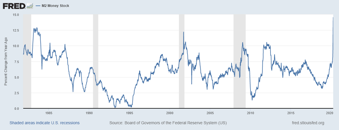
However, with the U.S. (and Canada) flooding the markets with money to prevent a complete economic collapse, it is fuel for gold and silver. M2 money supply is exploding upward. The year-over-year change to March 30 is at 14.6% the highest seen in 2000 and higher than at any time over the past 40 years. In the week ended March 30 M2 exploded upward by $370 billion, the most ever seen in 40 years. This is explosive. No wonder gold is rising.
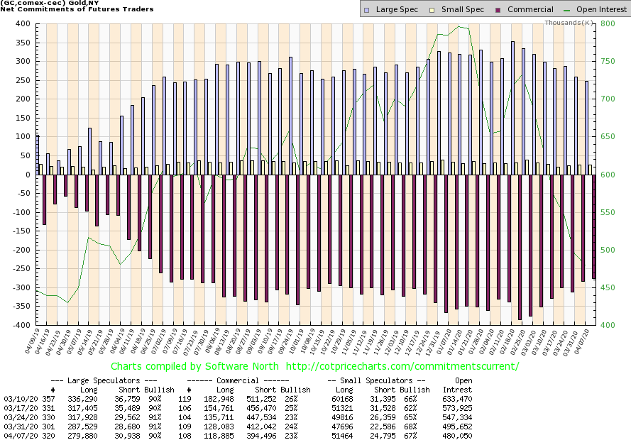
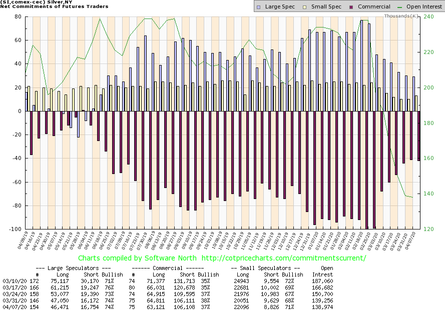
The weekly COT report was released on Friday as is usual. We had not expected to see it until Monday. The gold commercial COT slipped to 23% from 24% this past week. But again, it was because of a decline in open interest. Long open interest fell over 9,000 contracts while short open interest fell 17,500 contracts. This continues a trend we have been seeing over the past few weeks. The large speculators COT (Hedge funds, managed futures etc.) dropped to 90% from 91%. Oddly enough they saw a rise in short open interest by over 2,000 contracts and a drop in long open interest of about 8,000 contracts. The gold COT remains bearish but the ongoing fall in short open interest for the commercials indicates they are getting out of their shorts a positive development.
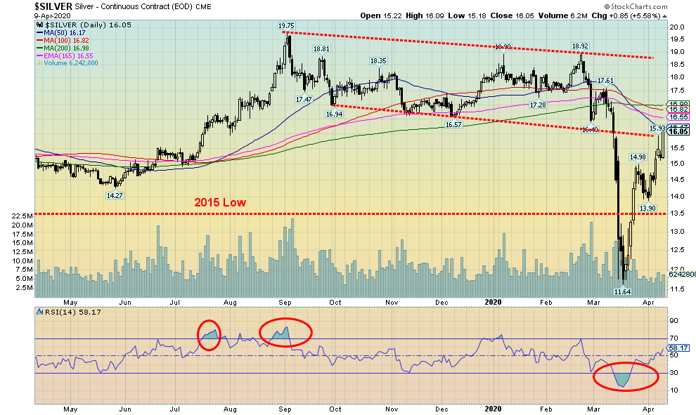
Silver enjoyed a strong up week, gaining 10.8%. However, silver remains down on the year by 10.4%. Silver is now running into a resistance zone at the falling 50-day MA. Further resistance lies up to $17.00. A break over $17.25/$17.5 would be a very positive development and suggest that silver could make new highs above $18.92, the high last seen in February. After that there is the high of September 2019 at $19.75 and finally the high of July 2016 at $21.23. We have constantly noted that silver has failed consistently at making new highs even as gold made new highs. On the other hand, the recent drop did see silver bust through its 2015 and 2018 lows while gold was nowhere near comparable lows. A divergence on the downside? Silver has a lot of work to do here. But first we need to regain above $17.25 to suggest we are going to move higher. The breakdown point would come at $13.90. We do not want to fall below that level again.
The silver commercial COT slipped to 37% from 38% this past week. It was mostly because long open interest fell almost 2,000 contracts. Over all open interest was off small.
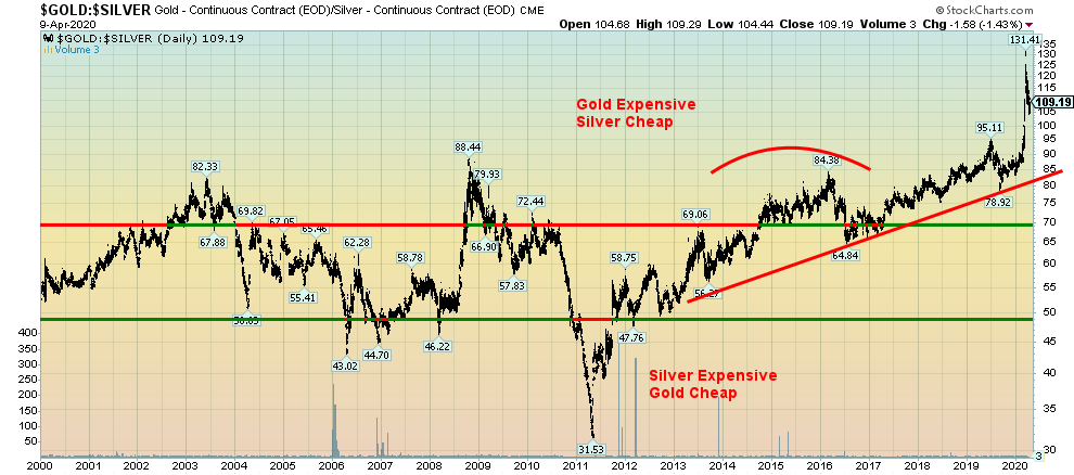
The Gold/Silver ratio continues to improve, but it is nowhere at a point that would make silver expensive to gold. This past week the ratio closed at 109, off the recent high of 131 (a record) but still too high. A break under 85 would bust the uptrend line that has been place since 2013. A break under 70 (seems far away) would put the ratio at least in neutral territory for the first time since 2016. At the low in 2011 the gold/silver ratio fell to 31.5. To reach that now, silver would have to be currently at least $55. In the past, a high gold/silver ratio has led to a huge rally for both gold and silver with silver leading the way. Note the peaks in 2003 and 2008. That proved to be the low for both gold and silver. Peaks for gold and silver appear to coincide with lows in the gold/silver ratio.
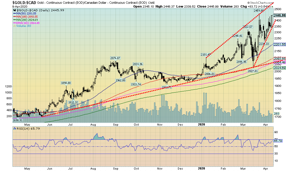
Gold in Canadian dollars is now close to breaking out to new highs. Gold in Cdn$ has retraced 93% of the recent drop, suggesting that we should now see new highs above $2,460. Since we are also in the zone that could leave us with a double top on the charts, we would not want to see gold in Cdn$ fall back below the recent low at $2,235. Gold expressed in euros, Japanese yen, and Swiss francs did make new all-time highs this past week. That is encouraging and we have expressed that, given gold has been making new all-time highs in numerous currencies, it suggests to us that eventually gold should make new all-time highs in U.S. dollars as well.
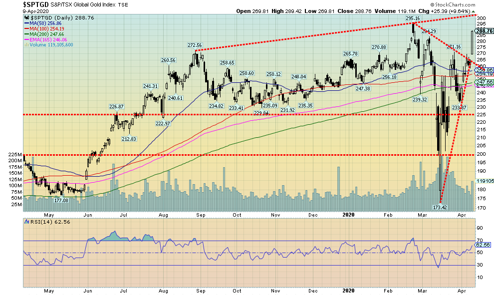
Gold stocks enjoyed a strong up week with the TSX Gold Index (TGD) gaining 13.6% while the Gold Bugs Index (HUI) leaped 16.1%. The TGD is now positive on the year up 10.5%. The TGD is now within shouting distance of the February 24 high at 295. There is further resistance up to 300. Once firmly through 300, the TGD could have an ultimate target of 385/390, a 34% move from current levels. Two things are needed to suggest that target is viable. First, we must firmly break above 300 and second, we need to hold 250 on the downside with 235 being the drop dead zone. Below 235, the TGD could retest the recent lows at 173. A number of gold stocks enjoyed strong up weeks. Many of them are still trading below their breakout zones. We have also noted that a number of the junior gold mining exploration stocks were active this past week as well. These have been a wasteland for some time. So, for that sector to come alive, it would be a shot in the arm for them. Some have struggled to find financing but many with potentially good projects have been able to secure financing. A perk up in the sector could bring more funds into the funds that invest in the gold mining sector, thus providing another source of financing for the miners.
We note that the Gold/HUI ratio is currently at 7.53. That is down from a recent high at 10.41. By that measurement the gold stocks are still cheap when compared with gold. Important peaks for the Gold/HUI ratio were seen in 2000 and again in 2015. There was a peak in 2008 as well but it was not an extreme one. All proved to be ideal times to be buying gold stocks. All peaks proved to be bottoms for both gold and the gold stocks.
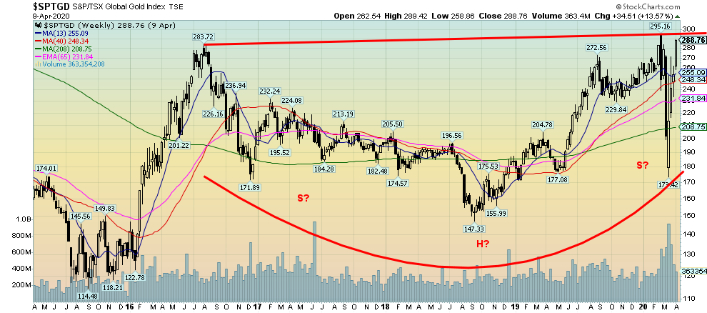
Maybe we are reading too much into this chart, but it does look intriguing. This is the weekly chart for the TGD, dating back to the latter part of 2015. It appears to be taking on the look of a potential head and shoulders bottom. A little awkward as the rise on the right shoulder hit a high of 295 vs a high of 284 with the left shoulder back in 2016. The HUI looks more normal with the right shoulder high below the left shoulder high. Nonetheless, well take it. As we noted, we need to see a firm breakout over 300. If successful, the possible head and shoulders pattern has potential targets up to 435, a good 50%+ move from current levels. Both the daily and weekly charts are telling us a similar story. But key here is we break out over 300. And, of course, never breach the recent low at 173.
Saudi Arabia and Russia have agreed to help stabilize the oil market. OPEC agreed to cut 10 million BPD. It is hoped that this will help put the price war behind them. The deal includes cutting 10 million bpd through May and June. However, the devil is in the details.
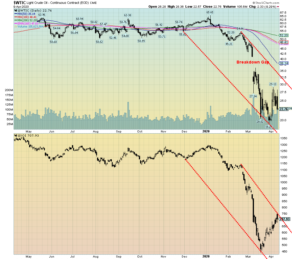
The deal could still fall apart. Mexico has, so far, refused to participate. The U.S. and Canada are not participating. No word on other OPEC members. And it doesnt account fully for the drop in demand as a result of effectively shutting down the global economy to deal with COVID-19. It is estimated that demand has fallen by upwards of 30 million bpd. Couple that with a number not participating and it was no surprise that oil prices immediately turned south as WTI oil fell $2.33 Thursday or 9.3%. On the week, oil was down $5.58 or 19.7%.
Energy stocks also reacted negatively and fell Thursday. However, both indices still ended the week in the green with the ARCA Oil & Gas Index (XOI) gaining 11.4% and the TSX Energy Index (TEN) up 4.2%. Both indices remain down on the yearXOI off 44.3%, TEN down 54.9%. Natural gas (NG) fared a little better, gaining 9.9% on the week, but it too faded on Thursday after the lack of clarity in the agreement, an agreement that could still fall apart.
Below lie a couple of key numbers. First, the March 18 low at $20.52. If oil prices can hold above that level there is an outside chance that WTI oil could start to form a potential head and shoulders bottom pattern. If not, then next up is the March 30 low of $19.27. If the March 18 low falls, then the odds increase that the March 30 will also fall. Only regaining new highs above $29.13 could suggest higher prices and at least an attempt to test the falling 50-day MA, currently at $38.14.
There remain forecasts that oil will fall into the teens, and some are even predicting a fall to under $10. Western Canada Select closed Wednesday at $9.69. We receive prices on a one-day delay so we dont know where it closed on Thursday. Last Friday, April 3, WCS closed at $12.94.
Neutral Indicators are mostly neutral. A trend change might be in the offing.
Weak The trend is still up or down but it is weakening. It is also a sign that the trend might change.
Topping Indicators are suggesting that while the trend remains up there are considerable signs that suggest that the market is topping.
Bottoming Indicators are suggesting that while the trend is down there are considerable signs that suggest that the market is bottoming.
Disclaimer
David Chapman is not a registered advisory service and is not an exempt market dealer (EMD) nor a licensed financial advisor. We do not and cannot give individualised market advice. David Chapman has worked in the financial industry for over 40 years including large financial corporations, banks, and investment dealers. The information in this newsletter is intended only for informational and educational purposes. It should not be considered a solicitation of an offer or sale of any security. The reader assumes all risk when trading in securities and David Chapman advises consulting a licensed professional financial advisor before proceeding with any trade or idea presented in this newsletter. David Chapman may own shares in companies mentioned in this newsletter. We share our ideas and opinions for informational and educational purposes only and expect the reader to perform due diligence before considering a position in any security. That includes consulting with your own licensed professional financial advisor.
The content on this site is protected
by U.S. and international copyright laws and is the property of GoldSeek.com
and/or the providers of the content under license. By "content" we mean any
information, mode of expression, or other materials and services found on GoldSeek.com.
This includes editorials, news, our writings, graphics, and any and all other
features found on the site. Please contact
us for any further information.
Live GoldSeek Visitor Map | Disclaimer
The views contained here may not represent the views of GoldSeek.com, Gold Seek LLC, its affiliates or advertisers. GoldSeek.com, Gold Seek LLC makes no representation, warranty or guarantee as to the accuracy
or completeness of the information (including news, editorials, prices, statistics,
analyses and the like) provided through its service. Any copying, reproduction
and/or redistribution of any of the documents, data, content or materials contained
on or within this website, without the express written consent of GoldSeek.com, Gold Seek LLC,
is strictly prohibited. In no event shall GoldSeek.com, Gold Seek LLC or its affiliates be
liable to any person for any decision made or action taken in reliance upon
the information provided herein.