-- Published: Thursday, 30 April 2020 | Print | Disqus
Rambus
Before we look at tonights Precious Metals charts I would like to make a comment on the US stock markets. I will take some flack over some of the comments Im going to make but thats fine as it wont be the first time nor the last.
Let me start by saying, The only rule when it comes to trading the stock markets is, There Are No Rules. The other important rule that I live by is that, the markets are always right regardless of what I think. Its interesting to hear comments like, the markets dont trade like they used so its not any fun anymore. Even trading during the mania phase in the tech bubble parabolic rise wasnt easy. Or the markets cant keep going up because of no volume or interest rates are too high or countless other reasons that only make sense according to traditional investing.
I personally fight everyday to keep an open mind to any possible scenario that may arise even if it doesnt seem possible. I would venture to say that 90% of our members think Im off the deep end because I believe there is a possibility that the 2020 crash low may already be in place and a new bull market could be setting up. How many are simply amazed by the strength the stock markets are showing? How can it keep going up with all the negative news about the Coronavirus and what its doing to the US and world economies.
Chartology is the study of chart patterns and human emotions which make up those chart patterns that are formed each and everyday. Ive often said that we are playing a game of psychological warfare more than anything else. When the herd is moving one way it is very difficult as a human to move in the opposite direction because thats our nature for survival. That works great in the real world but not so much when it comes to trading the stock markets.
Iv tried just about every trading discipline there is but Ive always come back to building chart patterns and trying to interpret their meaning. From a Chartology perspective all the information an investor needs is in the charts. All the charts we look at everyday are made up from actual investors, institutions, mom and pop, the risk taker or the conservative trader with their hard earned capital on the line. Its their view on the fundamentals or technicals or whatever it is that makes them want to invest in that stock that makes it go up or down.
The bottom line is that when a market or stock doesnt do what you think it should be doing dont blame it on the stock or the market because they are always right. Its our interpretation of the information that is flawed. It can be a hard pill to swallow but thats the nature of the game we choose to play. If it was easy everyone would be a millionaire, but then there would be no markets to trade.
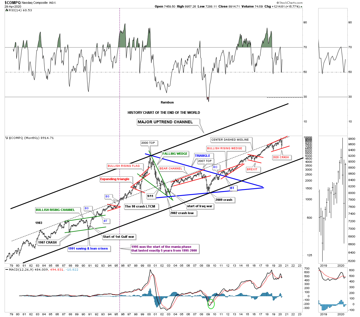
Last month when the 2020 crash put in the initial bottom I posted the, History Chart For the End of the World, that goes back to1979. This historical chart shows all the end of the world events that I have personally traded through. I wont go into a lot of detail since we just looked at this chart last month but for new members just start at the 1987 crash low which literally felt like the end of the world and is still the biggest one day decline in history on a percentage basis. Then just work your way to the right to see all the other history making events and chart patterns that felt like the end of the world when they occurred.
I view the center dashed midline as the most important line on this chart. It stretches all the way back to 1983 and kept the secular bull market in check until it came time for the tech parabolic move to take off beginning in 1995. In 1995 the price action was finally able to trade above the center dashed midline. With no overhead resistance the sky was the limit. After the 2000 top was in place the bear market crossed back below the center dashed midline once agin where it turned back into resistance until the infamous 2007 top which led to one of the strongest bear markets in history. Since the 2009 crash low, which felt like the end of the world, its been very difficult for many investors to believe one of the biggest bull markets in history has occurred. Ask yourself a simple question. How much of the 2009 bull market have you actually felt comfortable trading if any? How many reasons have you read that the rally was living on borrowed time or the fundaments were sooo bad that there was no way the rally could continue.
So here we are again at another very important inflection point in regards to the 2020 crash. Is this time going to be different and the end of the world is now upon us or are we witnessing another historical buying point? Note the small red rising flag that is forming just below the center dashed midline that is getting close to completing its 4th reversal point. We will get our answer if the top rail of the red rising flag and the center dashed midline are finally broken to the upside. Could we then see something similar to what we saw back in 1995 when the tech stocks went parabolic for 5 years? History has taught me not to bet against it.
The rest of this report is for members
Tons of Gold Miner Charts :
https://rambus1.com/
| Digg This Article
-- Published: Thursday, 30 April 2020 | E-Mail | Print | Source: GoldSeek.com


